期刊图片复现|Python绘制双向子弹图+百分比环图组合图
- 2026-07-06 16:12:40
期刊图片复现|Python绘制双向子弹图+百分比环图组合图

论文:Global subsidence of river deltas 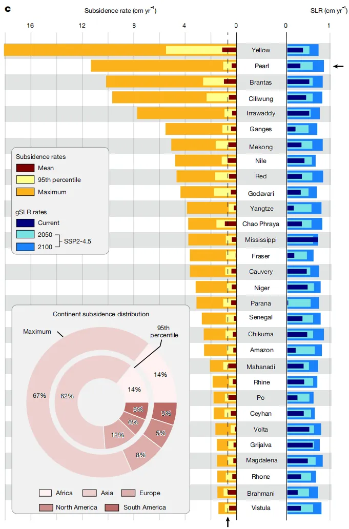
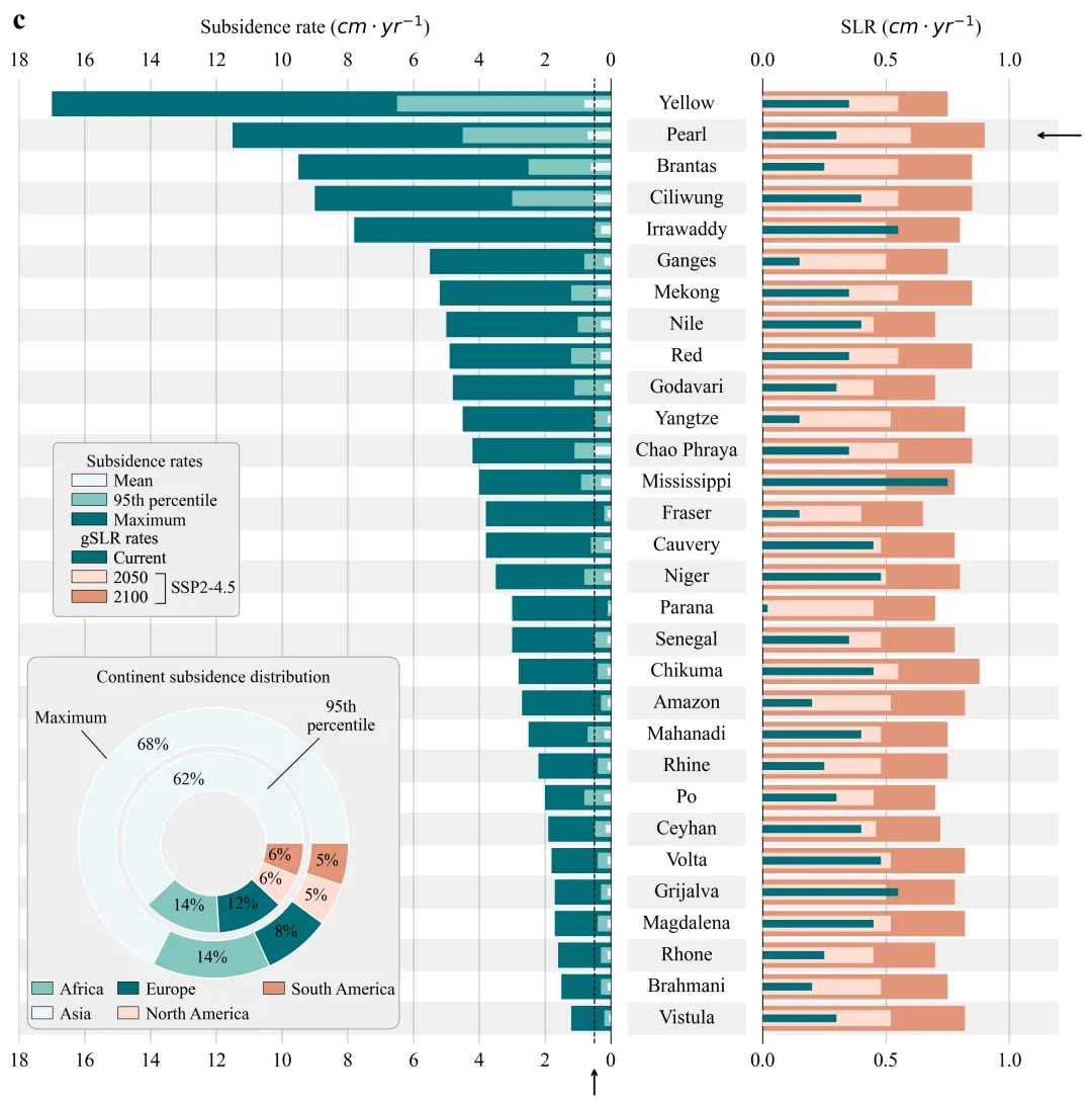
论文原图 这张图展示了全球30个主要河口三角洲的地面沉降速率与地心海平面上升速率的定量对比及分布特征 。图表主体以中间纵列对齐的三角洲名称为轴心,分为左右两个坐标系。 左侧横坐标轴表示沉降速率,单位为cm yr⁻¹;通过叠加的条形图展示三种沉降指标:深栗色竖线代表平均沉降率,浅黄色条块代表第95百分位沉降率,而延伸最长的橙色条块代表最大沉降率 。 右侧横坐标轴表示海平面上升(SLR)速率,单位同样为厘米/年;该区域通过条形图展示不同时期的SLR速率:深蓝色代表当前速率,浅青色代表SSP2-4.5情景下的2050年预测值,天蓝色代表同情景下的2100年预测值 。图中包含两个关键的黑色箭头指示:右侧有一个水平箭头指向“珠江”三角洲所在的行,对其进行特指;左侧底部有一个垂直向上的箭头,指向一条贯穿左侧图表的黑色垂直虚线,该虚线标示了所有三角洲中2100年预估的最大海平面上升率,作为一个基准,凸显出绝大多数三角洲的沉降速率远超气候驱动的海平面上升速率 。 左下角内嵌了一个同心环形图,展示了沉降现象在各大洲的分布比例:外环代表最大沉降率的分布,内环代表第95百分位沉降率的分布;图中使用不同颜色区分大洲,并标注了具体数值。 注意,此为个人理解,可能存在错误,具体内容还请阅读原文进行理解。 
仿图 
多种配色 


库的导入以及字体设置 

颜色库设置以及配色方案的选择 

内嵌饼图绘制函数,用于在主图的特定位置绘制一个带背景的双层环形图,展示不同区域的统计分布。在绝对位置创建一个子图。 利用


图例绘制函数,手动构建图例项,通过


期刊图片复现|Python绘制二维偏依赖PDP图 期刊复现|python绘制基于SHAP分析和GAM模型拟合的单特征依赖图 期刊图片复现|python绘制带有渐变颜色shap特征重要性组合图(条形图+蜂巢图) 期刊复现|用Python绘制SHAP特征重要性总览图、依赖图、双特征交互效应SHAP图,解锁XGBoost模型的终极奥秘 期刊图片复现|Python绘制shap重要性蜂巢图+单特征依赖图+交互效应强度气泡图+交互效应依赖图(回归+二分类+分类) 

公众号中的所有所有的免费代码都已经下架了,都并入到付费部分里了,付费合集代码和数据的购买通道已经开通,全部合集100元,后续将会持续更新,决定购买请后台私信我,注意只会分享练习数据和代码文件,不会提供答疑服务,代码文件中已经包含了每行代码的完整注释,购买前请确保真的需要!!!
代码绘制成果展示
代码解释
第一部分
# =========================================================================================# ====================================== 1. 环境设置 =======================================# =========================================================================================import matplotlib.pyplot as pltfrom matplotlib.patches import Patch, FancyBboxPatchimport pandas as pdimport numpy as npimport matplotlibfrom matplotlib.lines import Line2Dplt.rcParams['font.family'] = 'serif'plt.rcParams['font.serif'] = ['Times New Roman']matplotlib.rcParams['pdf.fonttype'] = 42matplotlib.rcParams['ps.fonttype'] = 42
第二部分
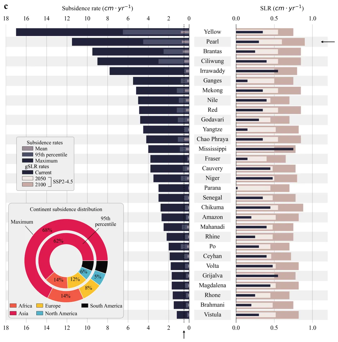
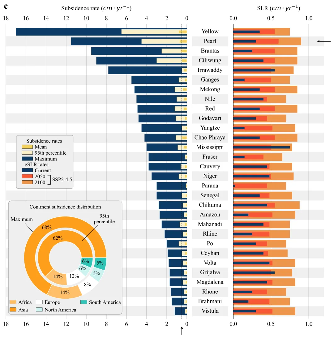
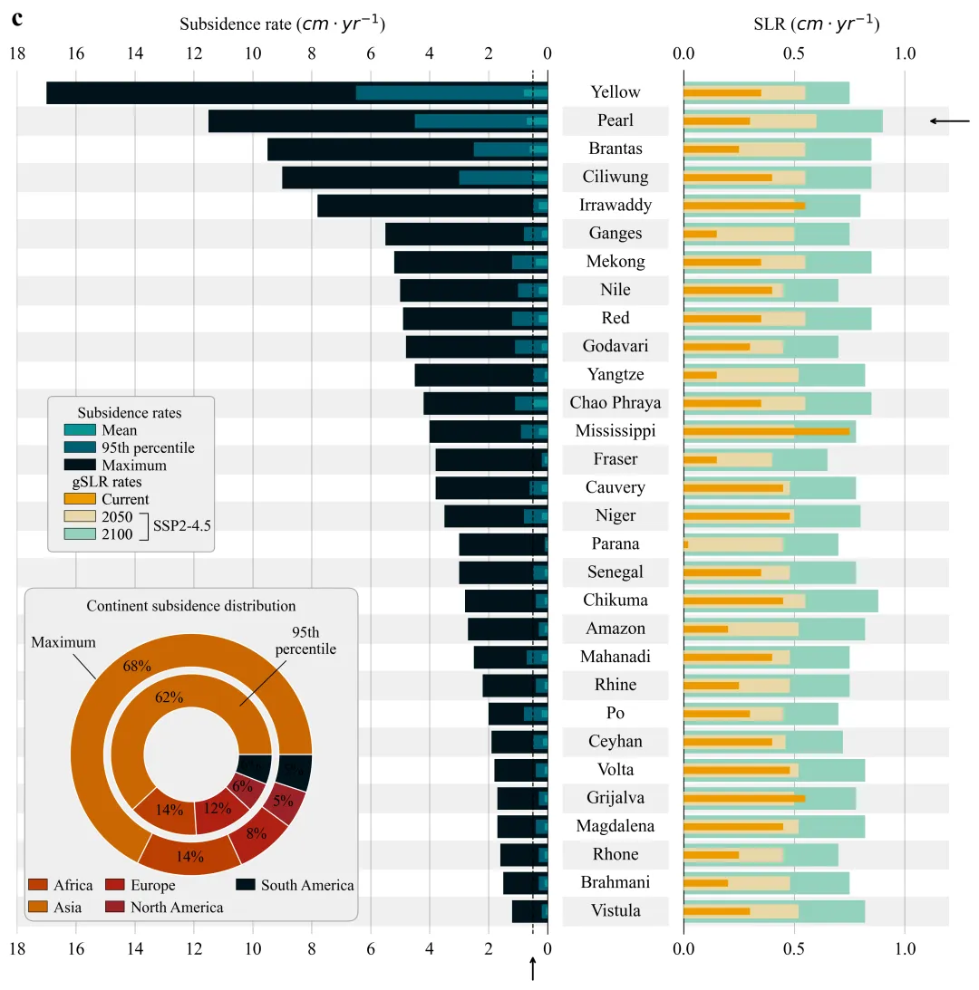
# =========================================================================================# ======================================2.颜色库=======================================# =========================================================================================COLOR_SCHEMES = {1: {'sub_max': '#FFA500', 'sub_95': '#FFFACD', 'sub_mean': '#800000','slr_2100': '#4169E1', 'slr_2050': '#87CEEB', 'slr_curr': '#000080','pie': ['#EBCBCB', '#FFFAFA', '#D49A9A', '#C67E7E', '#B06666']},}SCHEME_ID = 40 #选择配色方案colors = COLOR_SCHEMES.get(SCHEME_ID, COLOR_SCHEMES[1]) # 获取颜色方案
第三部分
内嵌饼图绘制函数,用于在主图的特定位置绘制一个带背景的双层环形图,展示不同区域的统计分布。在绝对位置创建一个子图。 利用 FancyBboxPatch 绘制一个圆角矩形背景,增加图表美观度。绘制双层饼图。使用 ax.annotate 添加箭头指引,说明外圈和内圈的含义。最后手动生成自定义图例,以确保图例顺序和颜色对应正确。
# =========================================================================================# ======================================3.内嵌饼图绘制函数=======================================# =========================================================================================def draw_styled_pie_chart(fig, box_position, df_pie):ax = fig.add_axes(box_position) # 在图形的指定位置添加一个新的坐标轴ax.axis('off') # 不显示边框和刻度bg_color = '#EEEEEE' # 背景颜色border_color = '#A0A0A0' # 边框颜色# 创建背景fancy_box = FancyBboxPatch((0, 0), # 左下角坐标1, # 宽1, #高度boxstyle="round,"# 样式"pad=-0.005,"# 内边距"rounding_size=0.03", #圆角大小facecolor=bg_color, # 填充颜色edgecolor=border_color, # 边框颜色linewidth=0.8, # 线宽transform=ax.transAxes, # 坐标系zorder=0, # 设图层顺序,mutation_scale=1 # 设置变形比例)# 注释文本ax.annotate('Maximum', # 文本xy=(-0.7, 0.55), # 箭头指向的坐标点xytext=(-0.95, 0.8), # 文本显示的坐标点# 箭头属性arrowprops=dict(arrowstyle="-", # 样式color='black', # 颜色lw=0.8), # 线宽fontsize=14, # 字体大小ha='center') # 水平居中leg = ax.legend(handles=reordered_handles,#指定要显示的图例句柄列表loc='lower center', # 位置bbox_to_anchor=(0.5, -0.02), #位置ncol=3, # 列frameon=False, # 不显示图例边框fontsize=14, # 字体大小handlelength=1.2, # 图例句柄长度handleheight=0.7, # 图例句柄高度columnspacing=0.8, # 列间距handletextpad=0.4) # 图例形状和文本的间距ax.set_aspect('equal') #设置坐标轴纵横比
第四部分
图例绘制函数,手动构建图例项,通过Patch 对象手动定义每个色块的颜色和标签。使用 Line2D 手动绘制了一个方括号形状的线条。
# =========================================================================================# ======================================4.组合图例绘制函数=======================================# =========================================================================================def draw_combined_legend(fig, box_position):ax = fig.add_axes(box_position) # 添加坐标轴ax.axis('off') # 关闭坐标轴显示bg_color = '#EEEEEE' # 背景色border_color = '#A0A0A0' # 边框色# 创建背景矩形fancy_box = FancyBboxPatch((0, 0), # 位置1, # 宽1, # 高boxstyle="round,pad=-0.005,rounding_size=0.03", # 样式facecolor=bg_color, # 填充色edgecolor=border_color, # 边框色linewidth=0.8, # 线宽transform=ax.transAxes, # 坐标系zorder=0, # 图层顺序mutation_scale=1 # 变形比例)ax.add_patch(fancy_box) # 添加背景# 创建图例leg2 = ax.legend(handles=handles_slr, #指定要显示的图例句柄列表title='gSLR rates', # 标题loc='upper left', # 位置bbox_to_anchor=(0.02, 0.58), # 位置frameon=False, # 无边框fontsize=14, # 字体大小title_fontsize=14, # 标题大小labelspacing=0.2, # 标签间距borderaxespad=0.5, # 边界间距handletextpad=0.4) # 图例形状和文本的间距ax.add_line(line) # 添加线条# 添加文本ax.text(line_x + 0.08, #x位置(line_y_top + line_y_bottom) / 2, # y位置'SSP2-4.5', # 文本内容va='center', # 垂直居中ha='left', # 水平左对齐fontsize=14, # 字体大小transform=ax.transAxes) # 坐标系变换
第五部分
双向子弹图+百分比环图组合图绘制函数:创建画布与布局初始化
# =========================================================================================# ======================================5.双向子弹图+百分比环图组合图绘制函数=======================================# =========================================================================================def plot_delta_chart(df, df_pie):fig = plt.figure(figsize=(15, 14)) # 创建图形# 添加网格布局gs = fig.add_gridspec(1, # 行3, # 列width_ratios=[6, 1.2, 3], # 列宽比例wspace=0.05) # 列间距ax_sub = fig.add_subplot(gs[0]) # 左侧子图ax_mid = fig.add_subplot(gs[1]) # 中间子图ax_slr = fig.add_subplot(gs[2]) # 右侧子图
第六部分
双向子弹图+百分比环图组合图绘制函数:背景斑马线与条形图绘制
y_pos = np.arange(len(df)) # 生成y轴位置数组h_large = 0.8 # 大柱子的高度h_med = 0.5 # 中柱子的高度h_small = 0.25 # 小柱子的高度for i in range(len(df)): # 遍历每一行数据ax_sub.barh(y_pos, #ydf['Sub_Max'], # 数据height=h_large, # 高度color=colors['sub_max'], # 颜色label='Maximum', # 标签zorder=2)ax_sub.barh(y_pos, df['Sub_95'], height=h_med, color=colors['sub_95'], label='95th percentile', zorder=3) # 绘制95分位数条形图ax_sub.barh(y_pos, df['Sub_Mean'], height=h_small, color=colors['sub_mean'], label='Mean', zorder=4) # 绘制均值条形图
第七部分
双向子弹图+百分比环图组合图绘制函数:左侧坐标轴设置
ax_sub.set_xlim(0, 18) # x轴范围ax_sub.invert_xaxis() # 反转x轴方向ax_sub.set_ylim(-0.8, len(df) - 0.2) # y轴范围# 网格线ax_sub.grid(axis='x', #x轴linestyle='-', # 实线alpha=0.5, # 透明度color='gray') # 灰色# 设置标题ax_sub.set_title('Subsidence rate ($cm \cdot yr^{-1}$)', #文本内容pad=15, # 标题距离fontsize=16) # 字体大小# 绘制垂直辅助线ax_sub.axvline(0.5, # x坐标color='black', # 黑色linewidth=1, # 线宽linestyle='--', # 虚线zorder=200)
第八部分
双向子弹图+百分比环图组合图绘制函数:右侧条形图与设置
# 绘制2100ax_slr.barh(y_pos, #y坐标df['SLR_2100'], # 数据height=h_large, # 高度color=colors['slr_2100'], # 颜色label='2100', # 标签zorder=2)ax_slr.barh(y_pos, df['SLR_2050'], height=h_med, color=colors['slr_2050'], label='2050', zorder=3) # 绘制2050ax_slr.barh(y_pos, df['SLR_Current'], height=h_small, color=colors['slr_curr'], label='Current', zorder=4) # 绘制当前ax_slr.set_xlim(0, 1.2) # x轴范围ax_slr.set_ylim(-0.8, len(df) - 0.2) # y轴范围ax_slr.tick_params(left=False, # 隐藏左侧刻度线labelleft=False, # 隐藏左侧标签bottom=False, # 隐藏底部刻度labeltop=True, # 显示顶部标签top=False, # 隐藏顶部刻度线labelsize=16) # 标签大小# 设置标题ax_slr.set_title('SLR ($cm \cdot yr^{-1}$)', #文本pad=15, # 距离fontsize=16) # 字体大小
第九部分
双向子弹图+百分比环图组合图绘制函数:中间文本列设置
ax_mid.set_ylim(-0.8, len(df) - 0.2) # 中间子图y轴范围ax_mid.axis('off') # 关闭坐标轴显示for i, name in enumerate(df['Delta']): # 遍历称ax_mid.text(0.5, # x坐标i, # y坐标name, # 文本ha='center', # 水平va='center', # 垂直fontsize=16, # 字体color='black') # 颜色
第十部分
双向子弹图+百分比环图组合图绘制函数:内嵌饼图绘制、图例绘制、箭头设置、结果保存
# 调用绘制饼图函数draw_styled_pie_chart(fig,[0.13, # 左0.12,#下0.28,#宽0.30],#高df_pie) # 数据# 调用图例函数draw_combined_legend(fig, [0.15, 0.45,0.14, 0.14])#子标题fig.text(0.12, # x0.92, # y'c', # 文本fontsize=24, # 字体大小fontweight='bold') # 粗体plt.subplots_adjust(wspace=0.01) # 调整子图间距
第十一部分
执行部分
# =========================================================================================# ======================================6.执行部分=======================================# =========================================================================================if __name__ == "__main__":excel_filename = r'Data.xlsx' # 文件路径df_bar = pd.read_excel(excel_filename, sheet_name='Bar_Data') # 读取柱状图数据df_pie_data = pd.read_excel(excel_filename, sheet_name='Pie_Data') # 读取饼图数据df_data = df_bar.iloc[::-1].reset_index(drop=True) # 数据反转plot_delta_chart(df_data, df_pie_data) # 调用绘图函数
如何应用到你自己的数据
1.设置颜色方案:
SCHEME_ID = 40 #选择配色方案2.提取百分比环形图数据:
labels = df_pie['Continent'].tolist() # 获取标签sizes_max = df_pie['Max_Percent'].tolist() # 获取最大百分比数据sizes_95 = df_pie['95th_Percent'].tolist() # 获取95分位数百分比数据
3.设置绘图结果的保存路径:
plt.savefig(fr'{SCHEME_ID}.png', dpi=300, bbox_inches='tight')plt.savefig(fr'{SCHEME_ID}.pdf', format='pdf', bbox_inches='tight')
4.设置原始数据的路径:
excel_filename = r'_Data.xlsx' # 文件路径推荐
获取方式
本文来自网友投稿或网络内容,如有侵犯您的权益请联系我们删除,联系邮箱:wyl860211@qq.com 。

