Python绘制不同区域相关性分析对比复合热图
- 2026-07-01 21:40:58
Python绘制不同区域相关性分析对比复合热图

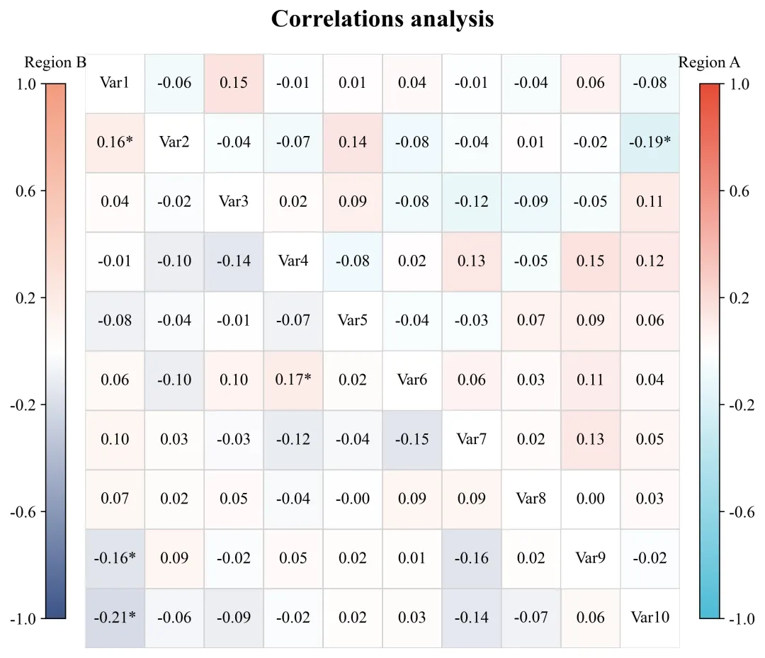
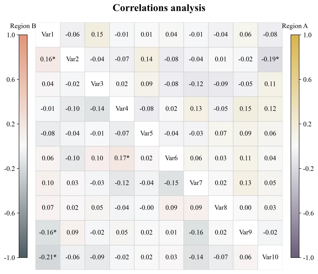
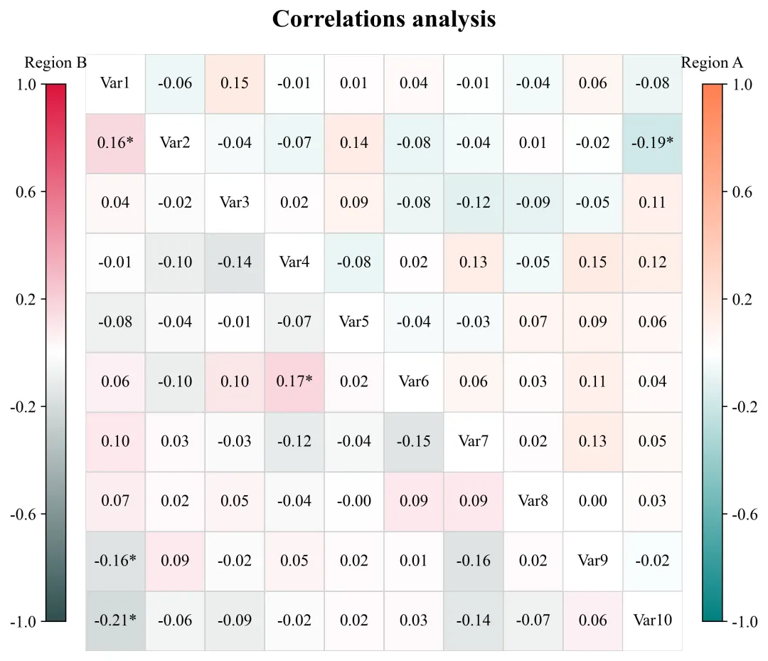
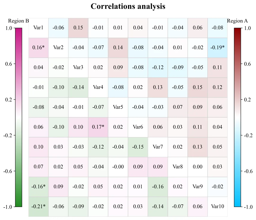
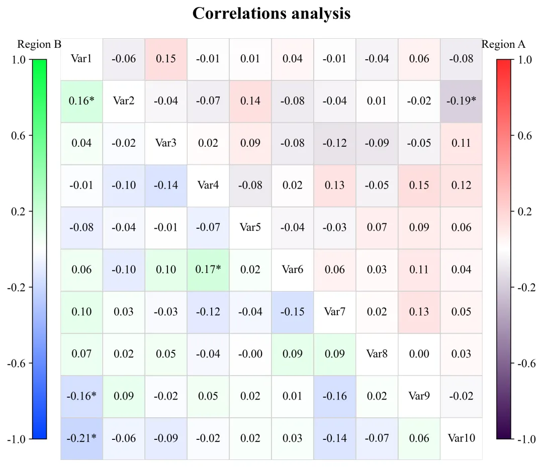
绘图结果 此图直观地对比了多个变量在两个不同区域之间的相关性分布特征。主对角线用作变量标签的占位,将其划分为上三角区域和下三角区域来表示不同区域数据分析结果。从具体数值来看,无论是在Region A还是Region B中,绝大多数变量对之间的相关系数绝对值都处于较低水平;尽管整体相关性偏弱,但矩阵中仍有少数几个特定的变量组合带有星号标注,表明这几组的线性关系达到了统计学上的显著性水平。 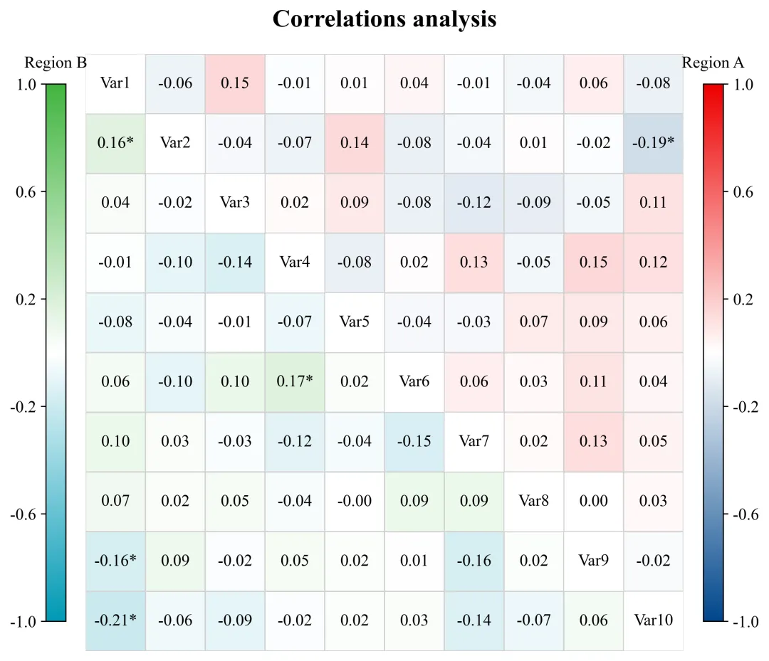
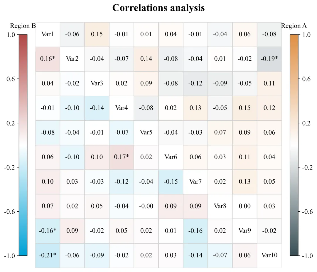
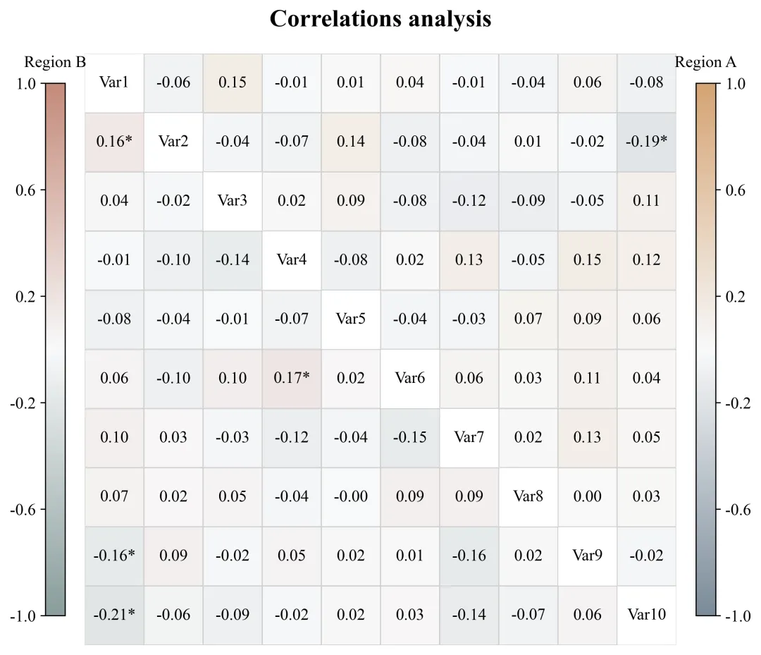
多种配色 


库的导入以及字体设置 

设置颜色库 

绘图函数:热图标注文本生成 

绘图函数:掩码与画布初始化 

绘图函数:绘制双拼色热力图 

绘图函数:对角线与主图格式化 

绘图函数:颜色条布局与生成 

执行部分:包括绘图数据的读取、分析、绘图函数调用 


期刊图片复现|Python绘制二维偏依赖PDP图 期刊复现|python绘制基于SHAP分析和GAM模型拟合的单特征依赖图 期刊图片复现|python绘制带有渐变颜色shap特征重要性组合图(条形图+蜂巢图) 期刊复现|用Python绘制SHAP特征重要性总览图、依赖图、双特征交互效应SHAP图,解锁XGBoost模型的终极奥秘 期刊图片复现|Python绘制shap重要性蜂巢图+单特征依赖图+交互效应强度气泡图+交互效应依赖图(回归+二分类+分类) 

公众号中的所有所有的免费代码都已经下架了,都并入到付费部分里了,付费合集代码和数据的购买通道已经开通,全部合集100元,后续将会持续更新,决定购买请后台私信我,注意只会分享练习数据和代码文件,不会提供答疑服务,代码文件中已经包含了每行代码的完整注释,购买前请确保真的需要!!!
代码绘制成果展示
代码解释
第一部分
# =========================================================================================# ====================================== 1. 环境设置 =======================================# =========================================================================================import matplotlib.pyplot as pltimport seaborn as snsimport numpy as npimport pandas as pdfrom matplotlib.patches import Rectanglefrom scipy import statsplt.rcParams['font.family'] = 'serif'plt.rcParams['font.serif'] = ['Times New Roman']plt.rcParams['axes.unicode_minus'] = Falseimport matplotlibmatplotlib.rcParams['pdf.fonttype'] = 42matplotlib.rcParams['ps.fonttype'] = 42
第二部分
# =========================================================================================# ======================================2.颜色库============================================# =========================================================================================COLOR_SCHEMES = {1: ('RdBu_r', 'coolwarm'),}
第三部分
# =========================================================================================# ======================================4.绘图函数============================================# =========================================================================================def plot_advanced_correlation_chart(df_corr_a, df_corr_b, p_matrix_a, p_matrix_b, labels_diag, scheme_id,color_schemes):num_vars = len(labels_diag) #变量数量annot_combined_text = np.empty_like(df_corr_a.values, dtype=object) #用于存放带星号的注释文本# 遍历行#转为DataFrame供热力图调用df_annot_combined = pd.DataFrame(annot_combined_text, #注释文本index=labels_diag, #行标签columns=labels_diag) #列标签
第四部分
mask_a = np.ones_like(df_corr_a, dtype=bool) #初始化A区全掩码mask_a[np.triu_indices_from(mask_a, k=1)] = False #开放上三角,遮挡其余部分plt.subplots_adjust(left=0.20, #左right=0.80, #右top=0.85, #上bottom=0.08) #下
第五部分
cmap_a, cmap_b = color_schemes[scheme_id] #提取配色sns.heatmap(df_corr_a, #数据mask=mask_a, #上三角掩码annot=df_annot_combined, #文本fmt='s', #字符串cmap=cmap_a, #配色ax=ax, #轴**common_heatmap_kws) #参数#下三角热力图sns.heatmap(df_corr_b,#数据mask=mask_b, #下三角掩码annot=df_annot_combined, #文本fmt='s', #字符串cmap=cmap_b, #配色ax=ax, #轴**common_heatmap_kws) #参数
第六部分
ax.set_aspect('equal') #X轴Y轴比例#遍历变量名对角线填充变量标签ax.set_xticks([]) #去掉X轴刻度线ax.set_xticklabels([]) #去掉X轴刻度文本ax.set_yticks([]) #去掉Y轴刻度线ax.set_yticklabels([]) #去掉Y轴刻度文本#标题ax.set_title("Correlations analysis", #文本fontsize=12, #大小fontweight='bold', #加粗pad=20) #间距
第七部分
cbar_width = 0.02 #颜色条宽度cbar_height_ratio = 0.9 #颜色条相对主图的高度占比cbar_bottom = ax.get_position().y0 + ax.get_position().height * (1 - cbar_height_ratio) / 2 #颜色条y轴起始点cbar_height = ax.get_position().height * cbar_height_ratio #颜色条绝对高度gap_heatmap_to_cbar = 0.02 #主图边缘到颜色条的水平间距heatmap_left = ax.get_position().x0 #主图左侧x坐标heatmap_right = ax.get_position().x1 #主图右侧x坐标cb_b.ax.yaxis.set_ticks_position('left') #左侧颜色条刻度线cb_b.ax.yaxis.set_label_position('left') #左侧颜色条刻度数值cb_a.ax.tick_params(labelsize=8) #右侧颜色条刻度字体大小cb_b.ax.tick_params(labelsize=8) #左侧颜色条刻度字体大小
第八部分
# =================================================================================================# ======================================5.执行部分=====================================================# =================================================================================================if __name__ == '__main__':excel_file_path = r'data.xlsx'#原始数据#读取两个区域的数据df_data1 = pd.read_excel(excel_file_path, sheet_name='Region_A')df_data2 = pd.read_excel(excel_file_path, sheet_name='Region_B')plot_all = Trueif plot_all:for scheme_id in COLOR_SCHEMES.keys():selected_hex_colors = COLOR_SCHEMES[scheme_id]print('正在绘制并保存方案:', scheme_id)plot_advanced_correlation_chart(df_corr_a, #相关系数df_corr_b, #相关系数p_matrix_a, #p值p_matrix_b, #p值labels_diag, #变量名scheme_id, #配色方案COLOR_SCHEMES) #颜色库else:scheme_id = 1selected_hex_colors = COLOR_SCHEMES[scheme_id]print('正在绘制并保存方案:', scheme_id)plot_advanced_correlation_chart(df_corr_a, df_corr_b, p_matrix_a, p_matrix_b, labels_diag, scheme_id,COLOR_SCHEMES)
如何应用到你自己的数据
1.设置原始数据的保存路径,执行部分:
excel_file_path = r'data.xlsx'#原始数据2.读取两个区域的数据,执行部分:
df_data1 = pd.read_excel(excel_file_path, sheet_name='Region_A')df_data2 = pd.read_excel(excel_file_path, sheet_name='Region_B')
3.设置是否进行批量绘图,执行部分:
plot_all = True4.设置绘图结果的保存地址,绘图函数部分:
plt.savefig(fr'{scheme_id}.png', bbox_inches='tight', dpi=300)推荐
获取方式
本文来自网友投稿或网络内容,如有侵犯您的权益请联系我们删除,联系邮箱:wyl860211@qq.com 。
随机文章
-
 10个月宝宝每天需要喝多少奶粉?
- 【python3.10.1】安装包python3.10.1setup激活教程(超详细小白版)安装包及安装步骤
- Linux系统部署大语言模型:API调用版 + 本地开源模型 (附Codex编程助手)
- Python快速入门学习笔记三十六:线程(二)线程池 ThreadPoolExecutor
- 零基础怎么学Python?100道例题帮你少走弯路
- 2026年信息素养大赛初中组初赛-Python
- 最强Python库TOP
- Python自动化办公全流程,存一下吧
- Python其实很水,反反复复就这63页
- python基础入门
- 告别代码混乱!Python 现代最佳实践目录结构,工程化项目必备规范
