期刊图片复现|Python实现TabPFN等多模型对比与拟合优度分析
- 2026-09-02 15:56:28
期刊图片复现|Python实现TabPFN等多模型对比与拟合优度分析

论文:How does urban-rural integration shape land green use efficiency? Spatial and non-linear effects from Northeast China 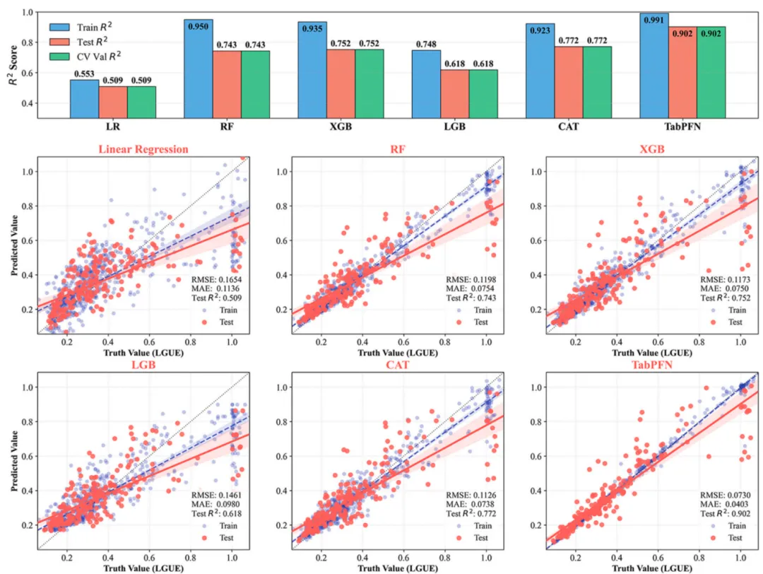
论文原图 此段代码实现了一个自动化机器学习回归分析流程,依次涵盖了数据集的读取与切分、结合Pipeline机制的数据标准化、基于网格搜索的多模型交叉验证与超参数寻优,以及最终结果可视化。采用了传统线性模型、梯度提升树及TabPFN模型进行了系统性训练、预测与多维度指标量化评估,内置了包含60种色彩方案的专业绘图引擎,能够一键输出高度定制化的符合学术期刊标准的评估对比图。 该图表直观地展示了六种机器学习回归模型对y的预测性能对比。上半部分的分组柱状图以六种回归模型为x轴、R2为y轴,展示了各模型在训练集、测试集、交叉验证中的综合表现。下半部分的六个散点图则将这些结果具象化,其x、y坐标分别代表目标变量的真实值与预测值,对角线黑色虚线为1:1完美预测基准;浅蓝色与红色散点及其对应的线性趋势线分别刻画了训练集与测试集的预测分布,散点越紧密地聚拢在基准线周围,代表预测误差越小,而各子图右下角固定的RMSE、MAE及测试集R2数值则提供了精准的量化指标支撑。 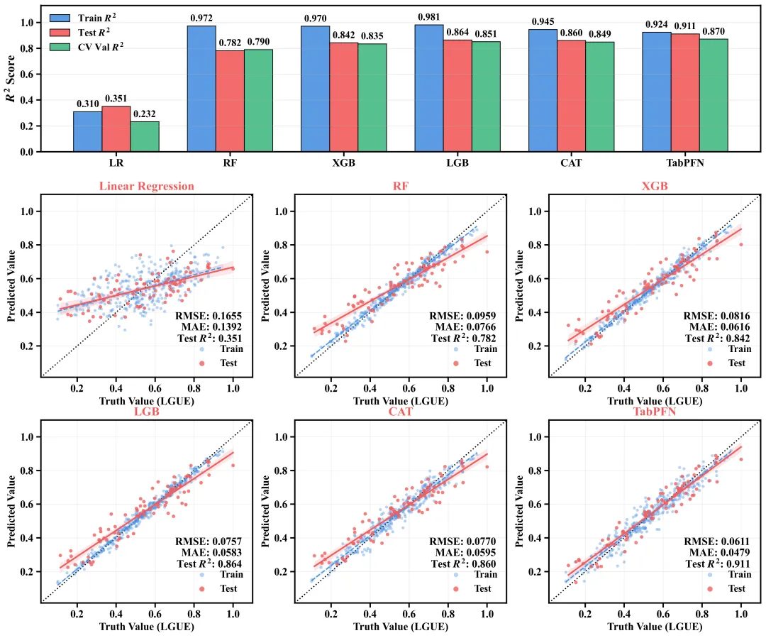
仿图 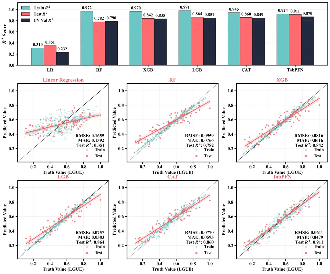
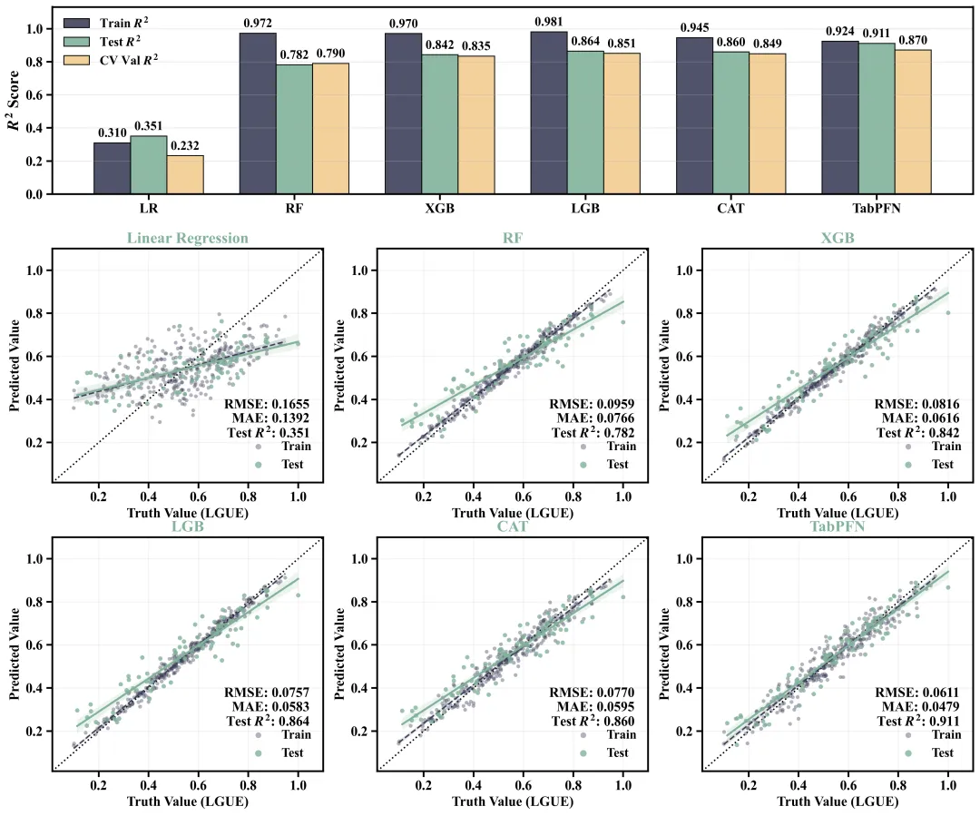
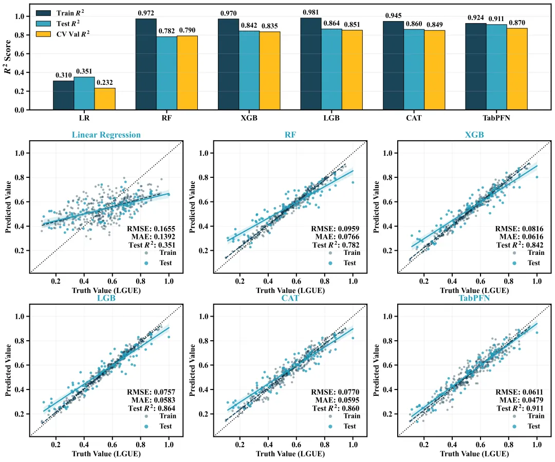
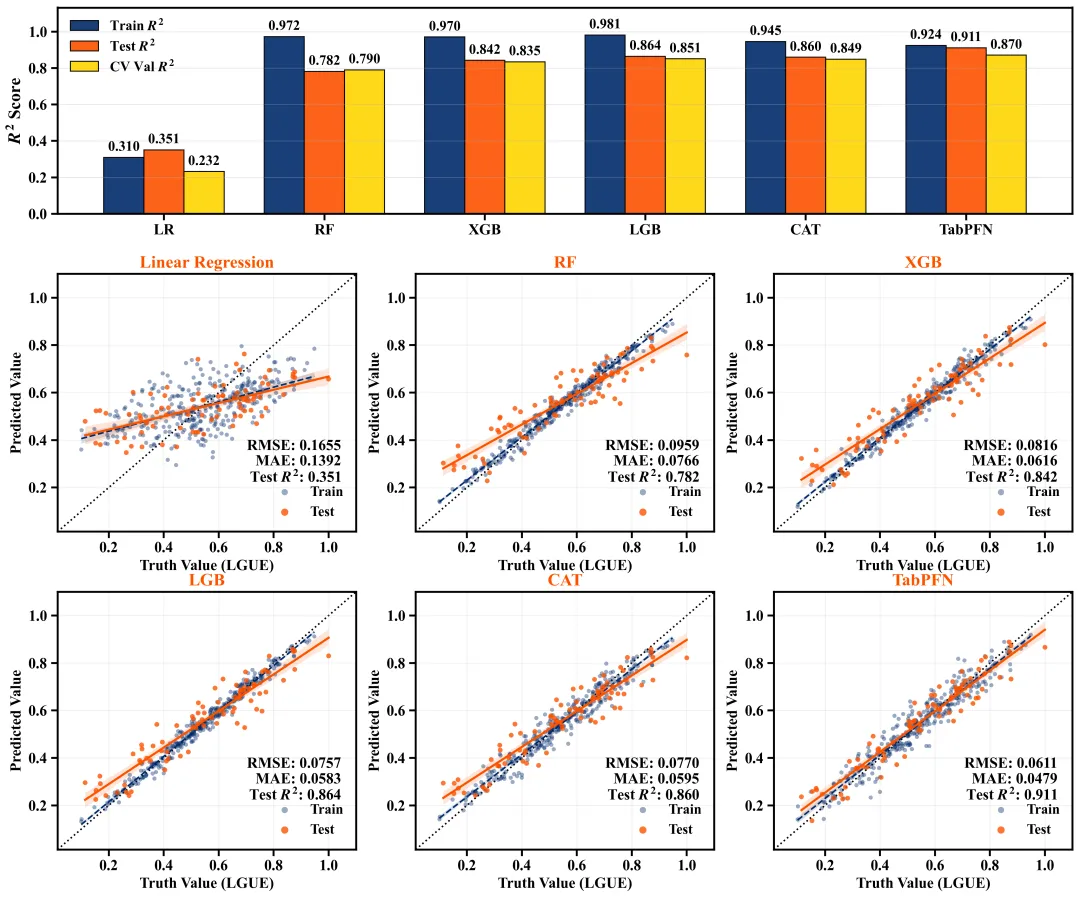
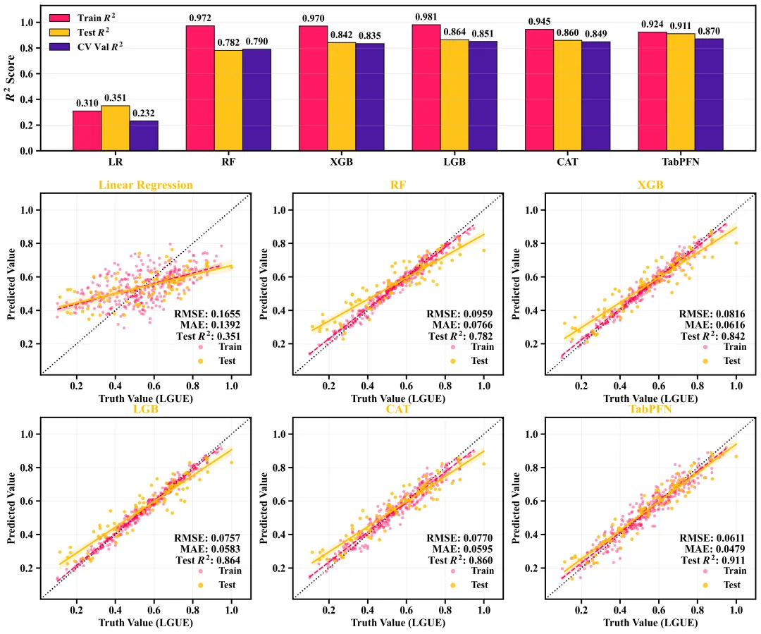
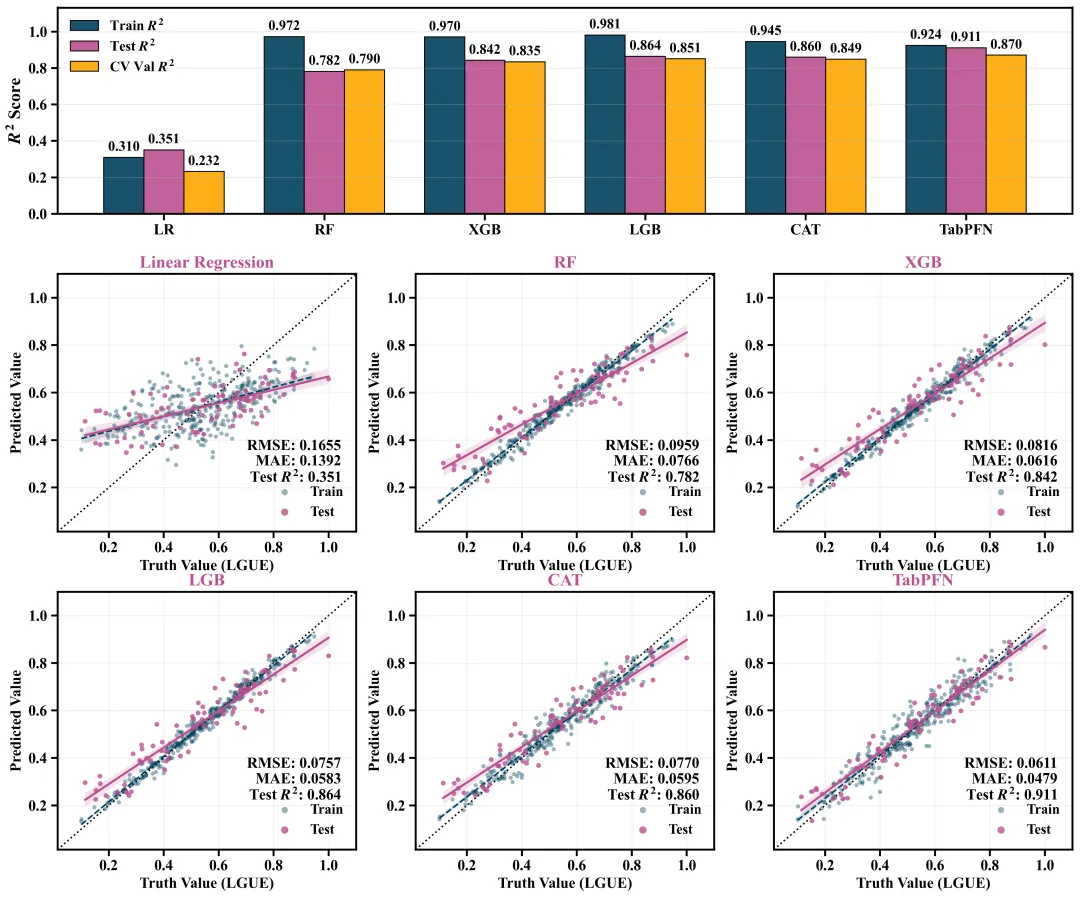
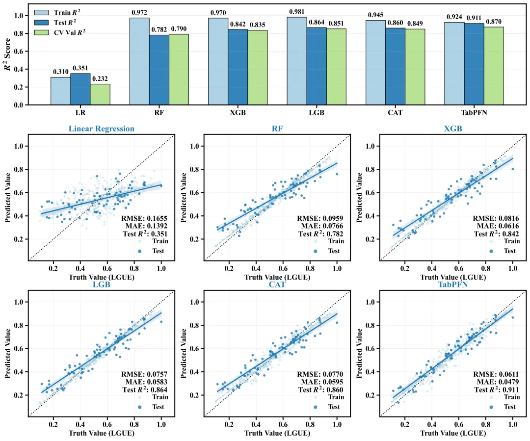
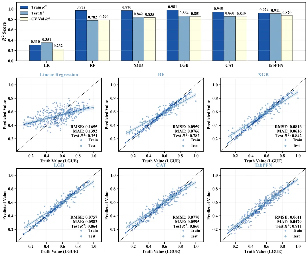
多种配色 



库的导入以及字体设置 

设置颜色库 

绘图函数:配色方案提取,创建画布,网格布局设置 

绘图函数:绘制顶部评估柱状图 

绘图函数:设置柱状图的标题、刻度、图例、网格线 

绘图函数:绘制下方的模型评估结果回归拟合图 

绘图函数:拟合图标题设置、刻度设置、图例添加 

执行部分:数据读取、划分及基础设置 

执行部分:模型拟合及结果评估 

执行部分:绘图函数调用 



期刊图片复现|Python绘制二维偏依赖PDP图 期刊复现|python绘制基于SHAP分析和GAM模型拟合的单特征依赖图 期刊图片复现|python绘制带有渐变颜色shap特征重要性组合图(条形图+蜂巢图) 期刊复现|用Python绘制SHAP特征重要性总览图、依赖图、双特征交互效应SHAP图,解锁XGBoost模型的终极奥秘 期刊图片复现|Python绘制shap重要性蜂巢图+单特征依赖图+交互效应强度气泡图+交互效应依赖图(回归+二分类+分类) 

公众号中的所有所有的免费代码都已经下架了,都并入到付费部分里了,付费合集代码和数据的购买通道已经开通,全部合集100元,后续将会持续更新,决定购买请后台私信我,注意只会分享练习数据和代码文件,不会提供答疑服务,代码文件中已经包含了每行代码的完整注释,购买前请确保真的需要!!!
代码绘制成果展示
代码解释
第一部分
# =========================================================================================# ====================================== 1. 环境设置 =======================================# =========================================================================================import matplotlib.pyplot as pltimport matplotlib.gridspec as gridspecimport seaborn as snsimport numpy as npimport pandas as pd
第二部分
# =========================================================================================# ======================================2.颜色库=======================================# =========================================================================================COLOR_SCHEMES = {1: ['#4a90e2', '#f35b5b', '#42b983'],}
第三部分
# =========================================================================================# ======================================3.绘图函数=======================================# =========================================================================================def plot_advanced_forest_chart(results_dict, scheme_id):colors = COLOR_SCHEMES[scheme_id] # 获取配色方案# 创建画布fig = plt.figure(figsize=(14, 12))gs = gridspec.GridSpec(3, # 3行3, # 列height_ratios=[1.2, 1.5, 1.5], # 高度比例hspace=0.25, # 垂直间距
第四部分
ax_bar = fig.add_subplot(gs[0, :]) # 柱状图子图rects2 = ax_bar.bar(x, # xtest_r2, # ywidth, # 宽label='Test $R^2$', # 图例标签color=colors[1], # 配色edgecolor='black', # 边框色alpha=0.9) # 透明度rects3 = ax_bar.bar(x + width, # xcv_r2, # ywidth, # 宽label='CV Val $R^2$', # 图例标签color=colors[2], # 配色edgecolor='black', # 边框色alpha=0.9) # 透明度
第五部分
# 柱状图的Y轴标题ax_bar.set_ylabel('$R^2$ Score', # 文本fontsize=16, # 字号weight='bold') # 加粗ax_bar.set_xticks(x) # X轴刻度位置# 网格线ax_bar.grid(axis='y', # 轴linestyle='-', # 实线alpha=0.3) # 透明度
第六部分
positions = [gs[1, 0], gs[1, 1], gs[1, 2], gs[2, 0], gs[2, 1], gs[2, 2]] # 回归拟合图位置titles = ['Linear Regression', 'RF', 'XGB', 'LGB', 'CAT', 'TabPFN'] # 子图标题# 遍历绘制拟合图for i, name in enumerate(model_names):min_lim = min(res['y_test'].min(), res['test_pred'].min()) - 0.1 # 下限max_lim = max(res['y_test'].max(), res['test_pred'].max()) + 0.1 # 上限# 绘制1:1参考线ax.plot([min_lim, max_lim], # x[min_lim, max_lim], # ylinestyle=':', # 样式color='black', # 颜色linewidth=1.5, # 粗细zorder=1) # 层
第七部分
# 子图标题ax.set_title(titles[i], # 文本color=colors[1], # 配色fontsize=16, # 字号weight='bold') # 加粗ax.set_xlim(min_lim, max_lim) # X轴范围ax.set_ylim(min_lim, max_lim) # Y轴范围# 图例ax.legend(loc='lower right', # 位置frameon=False, # 边框fontsize=13, # 字号markerscale=1.5) # 标记大小
第八部分
# =========================================================================================# ======================================4.执行部分=======================================# =========================================================================================if __name__ == '__main__':excel_path = r'data.xlsx'df = pd.read_excel(excel_path) # 读取X = df.drop(columns=['LGUE']) # x# 超参数param_grids = {'LR': {},'RF': {'n_estimators': [50, 100, 200],'max_depth': [5, 10]},'XGB': {'n_estimators': [50, 100, 200],'max_depth': [3, 5, 7],'learning_rate': [0.05, 0.1]},'LGB': {'n_estimators': [50, 100, 200],'max_depth': [3, 5, 7],'learning_rate': [0.05, 0.1]},'CAT': {'iterations': [50, 100, 200],'depth': [4, 6],'learning_rate': [0.05, 0.1]},'TabPFN': {}}
第九部分
results_dict = {} # 存储模型结果# 遍历定义好的模型for name, model in models_dict.items():# 保存分析结果results_dict[name] = {'r2_tr': r2_tr, 'r2_te': r2_te, 'cv_r2': cv_r2,'rmse_te': rmse_te, 'mae_te': mae_te,'y_train': y_train, 'train_pred': train_pred,'y_test': y_test, 'test_pred': test_pred}print(f"模型{name}| Best Params: {grid_search.best_params_} | CV Val R2: {cv_r2:.3f} | Test R2: {r2_te:.3f}")
第十部分
scheme_id = 1selected_hex_colors = COLOR_SCHEMES[scheme_id]print('正在绘制并保存方案:', scheme_id)plot_advanced_forest_chart(results_dict, scheme_id)
如何应用到你自己的数据
1.设置原始数据的保存路径,执行部分:
df = pd.read_excel(r'data.xlsx') # 读取2.读取特征数据及目标数据,执行部分:
X = df.drop(columns=['LGUE']) # xy = df['LGUE'] # y
3.划分数据集,执行部分:
X_train, X_test, y_train, y_test = train_test_split(X, y, test_size=0.2, random_state=42) # 划分数据集4.定义要使用的模型及超参数,执行部分:
models_dict = {'LR': LinearRegression(),'RF': RandomForestRegressor(random_state=42),'XGB': xgb.XGBRegressor(random_state=42),'LGB': lgb.LGBMRegressor(random_state=42, verbose=-1),'CAT': cb.CatBoostRegressor(random_state=42, verbose=0),'TabPFN': tabpfn_model}# 超参数param_grids = {'LR': {},'RF': {'n_estimators': [50, 100, 200],'max_depth': [5, 10]},'XGB': {'n_estimators': [50, 100, 200],'max_depth': [3, 5, 7],'learning_rate': [0.05, 0.1]},'LGB': {'n_estimators': [50, 100, 200],'max_depth': [3, 5, 7],'learning_rate': [0.05, 0.1]},'CAT': {'iterations': [50, 100, 200],'depth': [4, 6],'learning_rate': [0.05, 0.1]},'TabPFN': {}}
5.实例化网格搜索对象,执行部分:
grid_search = GridSearchCV(estimator=pipe, param_grid=pipe_param_grid, cv=5, scoring='r2', n_jobs=current_n_jobs) 6.设置是否要进行批量绘图,执行部分:
plot_all = True7.设置绘图结果的保存地址,绘图函数部分:
plt.savefig(fr'scheme_{scheme_id}.png', dpi=300, bbox_inches='tight')推荐
获取方式
本文来自网友投稿或网络内容,如有侵犯您的权益请联系我们删除,联系邮箱:596563534@qq.com 。
