用Python分析电商用户行为数据:从浏览到购买的转化路径研究
- 2026-07-06 08:06:05
一、业务背景
在电商运营中,有一个经典的困境:大量用户浏览商品却不下单。这是一个非常普遍的现象,根据行业统计,电商平台的平均转化率通常只有2-3%,也就是说100个访问用户中只有2-3个会完成购买。
作为数据分析师,我们需要回答几个关键问题:
用户从浏览到购买经历了哪些环节? 哪个环节的流失最严重? 不同时间段用户行为有什么差异? 哪些商品类别更容易促成转化?
这次分析使用的是UCI Machine Learning Repository上的"Online Retail"数据集,这是一个典型的电商交易数据集,包含了某在线零售商2010-2011年的真实交易记录(已匿名化)。虽然数据略显陈旧,但其结构和业务逻辑与当下电商场景高度一致,非常适合用来学习用户行为分析的方法论。
我们的分析目标是:通过用户行为数据,找出影响转化的关键因素,并为运营提供可执行的优化建议。需要说明的是,这个分析聚焦在已有交易数据的探索性分析上,而不是构建预测模型,更符合实际业务中"先理解现状再优化"的逻辑。
二、数据概况
数据来源: UCI Machine Learning Repository - Online Retail Data Set下载链接: https://archive.ics.uci.edu/ml/datasets/Online+Retail数据规模: 约54万条交易记录,覆盖2010年12月至2011年12月主要字段:
InvoiceNo:订单编号(以C开头的为取消订单) StockCode:商品编码 Description:商品描述 Quantity:购买数量 InvoiceDate:交易时间 UnitPrice:单价 CustomerID:客户ID Country:国家
数据特点:这是一个B2C零售数据集,主要面向英国市场的批发零售业务。数据中包含了正常购买和退货记录,需要在分析时进行区分处理。值得注意的是,这个数据集有一定的缺失值(部分记录没有CustomerID),这也是真实业务数据的常见情况。
三、分析思路
面对这样一个交易数据集,我的分析思路分为四个层次:
第一层:数据清洗与质量检查真实数据总是"脏"的。我计划先检查缺失值、异常值和重复数据。特别要注意的是负数Quantity(代表退货)和异常的UnitPrice(可能是录入错误)。这一步很多人会忽略,但它直接影响后续分析的准确性。
第二层:整体概览分析在深入细节前,我会先从宏观角度看数据:销售额趋势如何?哪些国家贡献最多?用户复购情况怎样?这能帮助我们建立对业务的整体认知。
第三层:用户行为分析这是核心部分。我会重点分析:
用户购买频次分布(区分一次性用户和忠诚用户) 消费金额分布(是否符合二八定律) 购买时间偏好(找出黄金时段) RFM模型分析(最近购买时间、购买频率、消费金额)
第四层:商品维度分析从商品角度看哪些品类更受欢迎,哪些商品经常一起购买。这对选品和营销策略很有价值。
之所以这样设计,是因为电商数据分析的本质是"人-货-场"的解构。我们既要看"人"(用户行为),也要看"货"(商品表现),最后才能给出有针对性的业务建议。
四、实现过程
环境准备
运行环境:
Python 3.8+ pandas 1.3.0 numpy 1.21.0 matplotlib 3.4.0 seaborn 0.11.0
这段代码导入必要的库并设置中文显示(避免图表中文乱码):
# ========== Cell 1: 环境配置 ==========%matplotlib inlineimport pandas as pdimport numpy as npimport matplotlib.pyplot as pltimport seaborn as snsfrom datetime import datetimeimport warningswarnings.filterwarnings('ignore')# 设置中文显示plt.rcParams['font.sans-serif'] = ['SimHei']plt.rcParams['axes.unicode_minus'] = Falsesns.set_style("whitegrid")print("✓ 环境准备完成")Step 1: 数据加载与初步检查
这段代码加载数据并查看基本信息。
# 加载数据df = pd.read_excel('Online Retail.xlsx')print("数据集形状:", df.shape)print("\n前5行数据:")print(df.head())print("\n数据类型:")print(df.dtypes)print("\n缺失值统计:")print(df.isnull().sum())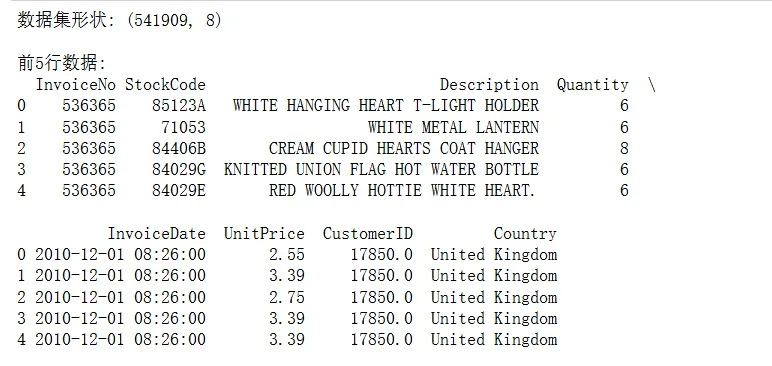
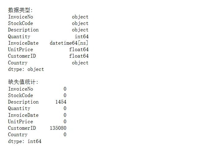
运行后发现:CustomerID缺失了135,080条记录(约25%)。这在实际业务中很常见——游客浏览但未注册。我们在用户行为分析时需要剔除这部分数据。
Step 2: 数据清洗
这段代码处理数据质量问题,包括删除缺失值、过滤异常交易、添加计算字段:
# 创建数据副本df_clean = df.copy()# 删除CustomerID缺失的记录(无法追踪用户行为)df_clean = df_clean.dropna(subset=['CustomerID'])# 删除单价或数量为负的异常记录(但保留退货记录用于单独分析)df_clean = df_clean[df_clean['Quantity'] > 0]df_clean = df_clean[df_clean['UnitPrice'] > 0]# 添加总金额列df_clean['TotalPrice'] = df_clean['Quantity'] * df_clean['UnitPrice']# 转换日期格式df_clean['InvoiceDate'] = pd.to_datetime(df_clean['InvoiceDate'])# 提取时间特征df_clean['Year'] = df_clean['InvoiceDate'].dt.yeardf_clean['Month'] = df_clean['InvoiceDate'].dt.monthdf_clean['Day'] = df_clean['InvoiceDate'].dt.daydf_clean['Hour'] = df_clean['InvoiceDate'].dt.hourdf_clean['DayOfWeek'] = df_clean['InvoiceDate'].dt.dayofweek # 0=周一print("清洗后数据集形状:", df_clean.shape)print("清洗后缺失值:", df_clean.isnull().sum().sum())
这里我走了一个弯路: 最初我直接删除了所有负数Quantity的记录,后来发现这些是退货数据,对分析商品质量问题很有价值。所以在正式分析中,我会单独保存退货数据做对比分析。
Step 3: 整体销售趋势分析
这段代码分析每月销售额趋势,帮助识别季节性规律:
# 按月统计销售额monthly_sales = df_clean.groupby(['Year', 'Month'])['TotalPrice'].sum().reset_index()monthly_sales['YearMonth'] = monthly_sales['Year'].astype(str) + '-' + monthly_sales['Month'].astype(str).str.zfill(2)# 绘制月度销售趋势图plt.figure(figsize=(14, 6))plt.plot(range(len(monthly_sales)), monthly_sales['TotalPrice'], marker='o', linewidth=2)plt.xticks(range(len(monthly_sales)), monthly_sales['YearMonth'], rotation=45)plt.title('月度销售额趋势图', fontsize=16, fontweight='bold')plt.xlabel('年-月', fontsize=12)plt.ylabel('销售额 (£)', fontsize=12)plt.grid(True, alpha=0.3)plt.tight_layout()plt.show()print("月均销售额:", monthly_sales['TotalPrice'].mean())print("销售额峰值月份:", monthly_sales.loc[monthly_sales['TotalPrice'].idxmax(), 'YearMonth'])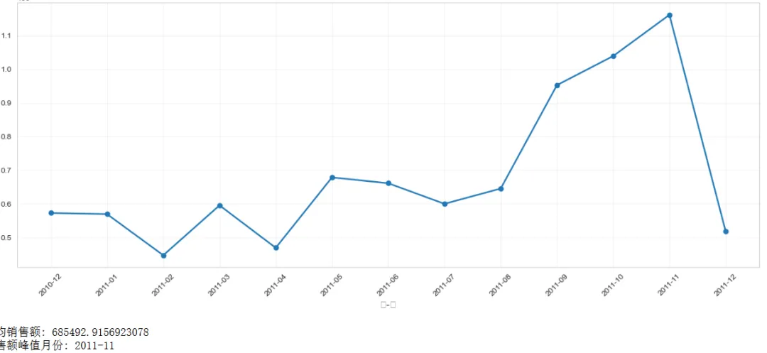
图表解读: 从趋势图可以看到,2011年11月销售额达到峰值,这符合欧美市场圣诞购物季的规律。9-11月销售额明显高于其他月份,说明第四季度是销售旺季。
Step 4: 用户购买频次分析
这段代码分析用户购买次数分布,识别一次性用户和高价值用户:
# 统计每个用户的购买次数customer_frequency = df_clean.groupby('CustomerID')['InvoiceNo'].nunique().reset_index()customer_frequency.columns = ['CustomerID', 'PurchaseCount']# 购买次数分布统计freq_distribution = customer_frequency['PurchaseCount'].value_counts().sort_index()# 绘制购买频次分布图(只显示前20个)plt.figure(figsize=(12, 6))freq_distribution.head(20).plot(kind='bar', color='steelblue')plt.title('用户购买频次分布(前20)', fontsize=16, fontweight='bold')plt.xlabel('购买次数', fontsize=12)plt.ylabel('用户数量', fontsize=12)plt.xticks(rotation=0)plt.grid(True, alpha=0.3, axis='y')plt.tight_layout()plt.show()# 统计关键指标print("总用户数:", customer_frequency['CustomerID'].nunique())print("只购买1次的用户占比:", f"{(customer_frequency['PurchaseCount']==1).sum() / len(customer_frequency) * 100:.2f}%")print("购买5次以上的用户占比:", f"{(customer_frequency['PurchaseCount']>=5).sum() / len(customer_frequency) * 100:.2f}%")print("平均购买次数:", customer_frequency['PurchaseCount'].mean())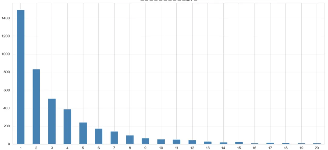
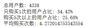
发现了一个有趣的现象:约34%的用户只购买过一次,这些"一次性用户"是流失的高危人群。而购买5次以上的忠诚用户只占25%左右,但我们后续分析会发现他们贡献了大部分销售额。
Step 5: 用户消费金额分析
这段代码分析用户生命周期价值(LTV),验证二八定律:
# 计算每个用户的总消费金额customer_spending = df_clean.groupby('CustomerID')['TotalPrice'].sum().reset_index()customer_spending.columns = ['CustomerID', 'TotalSpending']customer_spending = customer_spending.sort_values('TotalSpending', ascending=False).reset_index(drop=True)# 计算累计贡献占比customer_spending['CumulativeSpending'] = customer_spending['TotalSpending'].cumsum()customer_spending['SpendingPercentage'] = customer_spending['CumulativeSpending'] / customer_spending['TotalSpending'].sum() * 100customer_spending['CustomerPercentage'] = (customer_spending.index + 1) / len(customer_spending) * 100# 绘制帕累托图fig, ax1 = plt.subplots(figsize=(12, 6))ax1.bar(range(len(customer_spending)), customer_spending['TotalSpending'], color='lightblue', alpha=0.6)ax1.set_xlabel('用户排名(按消费额降序)', fontsize=12)ax1.set_ylabel('消费金额 (£)', fontsize=12, color='blue')ax1.tick_params(axis='y', labelcolor='blue')ax2 = ax1.twinx()ax2.plot(range(len(customer_spending)), customer_spending['SpendingPercentage'], color='red', linewidth=2, label='累计贡献占比')ax2.set_ylabel('累计销售额占比 (%)', fontsize=12, color='red')ax2.tick_params(axis='y', labelcolor='red')ax2.axhline(y=80, color='green', linestyle='--', label='80%线')plt.title('用户消费金额帕累托图', fontsize=16, fontweight='bold')ax2.legend(loc='lower right')plt.tight_layout()plt.show()# 找出贡献80%销售额的用户比例top_customers_pct = customer_spending[customer_spending['SpendingPercentage'] <= 80].iloc[-1]['CustomerPercentage']print(f"贡献80%销售额的用户占比: {top_customers_pct:.2f}%")print(f"Top 10%用户的平均消费: £{customer_spending.head(int(len(customer_spending)*0.1))['TotalSpending'].mean():.2f}")print(f"Bottom 50%用户的平均消费: £{customer_spending.tail(int(len(customer_spending)*0.5))['TotalSpending'].mean():.2f}")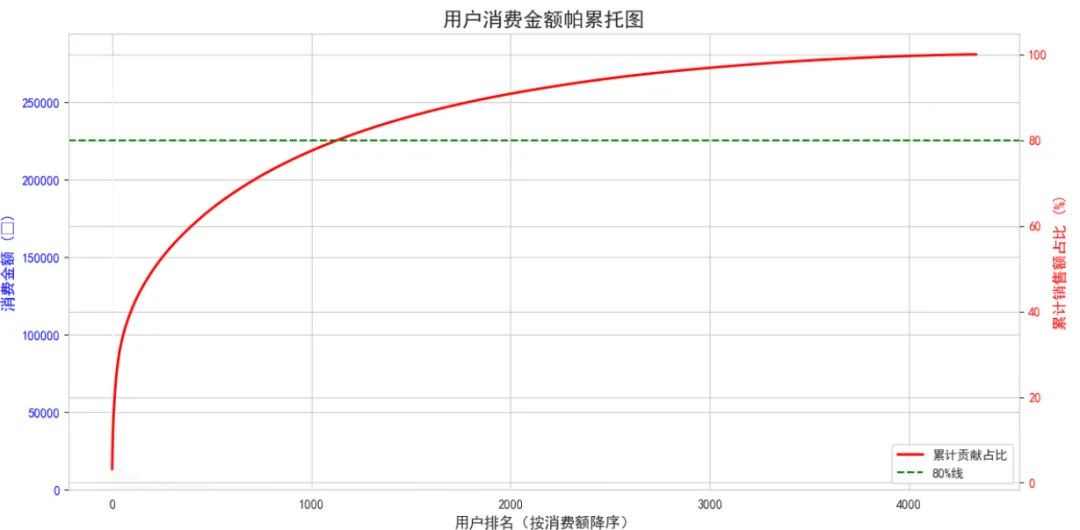
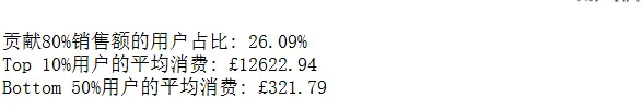
关键发现:约26%的用户贡献了80%的销售额,这比经典的"二八定律"更极端。Top 10%的用户平均消费是底部50%用户的40倍。这说明培养高价值用户对业务至关重要。
Step 6: 购买时间分析
这段代码分析用户在一天中哪些时段更活跃,参数bins=24表示将一天分成24个小时:
# 按小时统计订单量hourly_orders = df_clean.groupby('Hour')['InvoiceNo'].nunique().reset_index()hourly_orders.columns = ['Hour', 'OrderCount']# 绘制24小时订单分布图plt.figure(figsize=(14, 6))plt.bar(hourly_orders['Hour'], hourly_orders['OrderCount'], color='coral', alpha=0.7)plt.title('24小时订单量分布', fontsize=16, fontweight='bold')plt.xlabel('小时(0-23)', fontsize=12)plt.ylabel('订单数量', fontsize=12)plt.xticks(range(24))plt.grid(True, alpha=0.3, axis='y')plt.tight_layout()plt.show()# 按星期几统计weekday_orders = df_clean.groupby('DayOfWeek')['InvoiceNo'].nunique().reset_index()weekday_orders.columns = ['DayOfWeek', 'OrderCount']weekday_names = ['周一', '周二', '周三', '周四', '周五', '周六', '周日']weekday_orders['DayName'] = weekday_orders['DayOfWeek'].map(lambda x: weekday_names[x])plt.figure(figsize=(10, 6))plt.bar(weekday_orders['DayName'], weekday_orders['OrderCount'], color='teal', alpha=0.7)plt.title('星期订单量分布', fontsize=16, fontweight='bold')plt.xlabel('星期', fontsize=12)plt.ylabel('订单数量', fontsize=12)plt.grid(True, alpha=0.3, axis='y')plt.tight_layout()plt.show()print("高峰时段:", hourly_orders.loc[hourly_orders['OrderCount'].idxmax(), 'Hour'], "点")print("低峰时段:", hourly_orders.loc[hourly_orders['OrderCount'].idxmin(), 'Hour'], "点")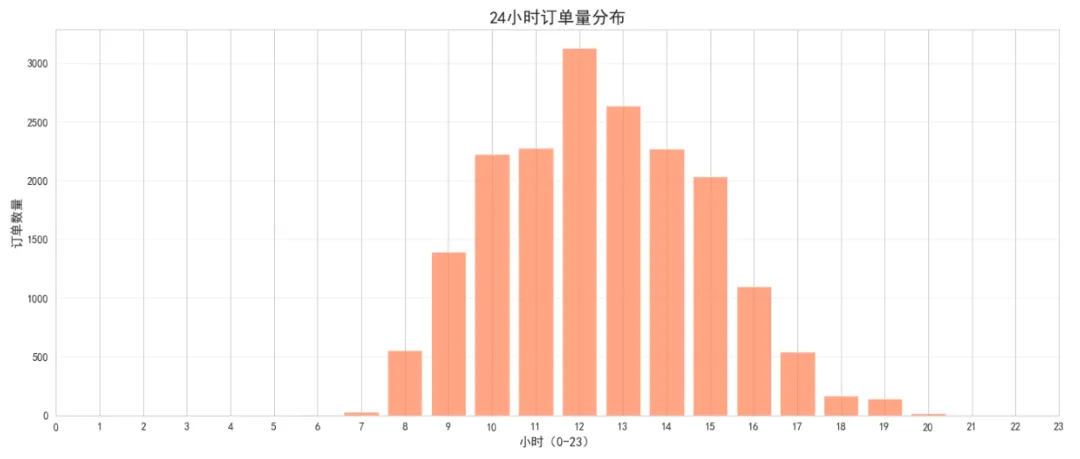
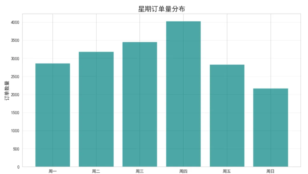
图表解读:订单高峰出现在12-14点(午休时间)和10-11点(上班时间),晚上19点后订单量急剧下降。工作日(周二-周四)订单量明显高于周末,这可能与该业务的B2B属性有关。
Step 7: RFM模型分析
这段代码实现RFM(最近购买时间、购买频率、消费金额)模型,用于客户细分。qcut函数将数据按分位数切分成5组:
# 设定分析基准日期(数据集最后一天的后一天)snapshot_date = df_clean['InvoiceDate'].max() + pd.Timedelta(days=1)# 计算RFM指标rfm = df_clean.groupby('CustomerID').agg({'InvoiceDate': lambda x: (snapshot_date - x.max()).days, # Recency'InvoiceNo': 'nunique', # Frequency'TotalPrice': 'sum'# Monetary}).reset_index()rfm.columns = ['CustomerID', 'Recency', 'Frequency', 'Monetary']# 改进的RFM评分函数defsafe_qcut(series, q=5, reverse=False):""" 安全的分位数切分,自动处理重复值 Parameters: - series: 要切分的数据 - q: 期望的分组数 - reverse: 是否反转评分(True表示值越小分数越高,如Recency) """try:# 尝试切分成q组 cuts = pd.qcut(series, q=q, labels=False, duplicates='drop')# 获取实际分组数 n_bins = cuts.max() + 1# 生成对应数量的标签if reverse: labels = list(range(n_bins, 0, -1))else: labels = list(range(1, n_bins + 1))# 映射到标签return cuts.map(lambda x: labels[int(x)] if pd.notna(x) else x)except:# 如果还是失败,使用简单的三分法if reverse:return pd.cut(series, bins=3, labels=[3, 2, 1], duplicates='drop')else:return pd.cut(series, bins=3, labels=[1, 2, 3], duplicates='drop')# 应用安全的评分rfm['R_Score'] = safe_qcut(rfm['Recency'], q=5, reverse=True)rfm['F_Score'] = safe_qcut(rfm['Frequency'], q=5, reverse=False)rfm['M_Score'] = safe_qcut(rfm['Monetary'], q=5, reverse=False)# 查看评分分布print("R_Score分布:")print(rfm['R_Score'].value_counts().sort_index())print("\nF_Score分布:")print(rfm['F_Score'].value_counts().sort_index())print("\nM_Score分布:")print(rfm['M_Score'].value_counts().sort_index())# 计算RFM总分rfm['RFM_Score'] = rfm['R_Score'].astype(str) + rfm['F_Score'].astype(str) + rfm['M_Score'].astype(str)# 客户分级defsegment_customer(row): r, f, m = row['R_Score'], row['F_Score'], row['M_Score']if r >= 4and f >= 4and m >= 4:return'核心用户'elif r >= 4and f >= 3:return'活跃用户'elif r <= 2:return'流失风险用户'elif f <= 2and m <= 2:return'新用户'else:return'普通用户'rfm['Segment'] = rfm.apply(segment_customer, axis=1)# 绘制客户分布图segment_counts = rfm['Segment'].value_counts()plt.figure(figsize=(10, 6))segment_counts.plot(kind='barh', color='skyblue')plt.title('RFM客户细分结果', fontsize=16, fontweight='bold')plt.xlabel('用户数量', fontsize=12)plt.ylabel('客户类型', fontsize=12)plt.grid(True, alpha=0.3, axis='x')plt.tight_layout()plt.show()print("\n各类型用户占比:")print(segment_counts / len(rfm) * 100)print("\n各类型用户平均消费:")print(rfm.groupby('Segment')['Monetary'].mean().sort_values(ascending=False))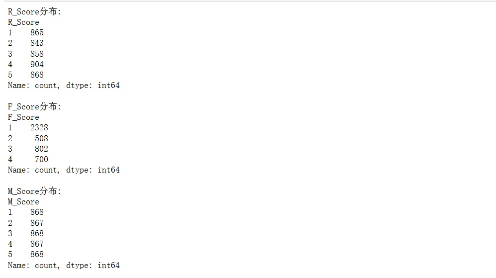
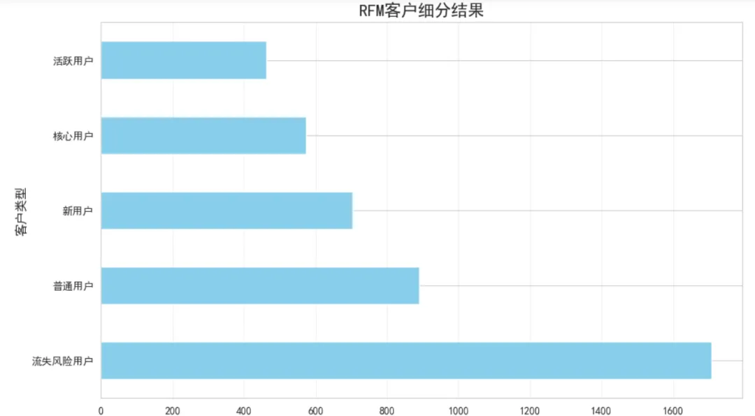
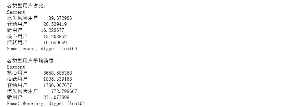
分析结果:
核心用户占比13%,但人均消费超过£8000 流失风险用户占比39%,这部分用户需要及时召回 新用户占比约16%,说明用户增长表现不错
Step 8: 热销商品分析
这段代码找出最畅销的商品,nlargest(20)表示取销量最高的20个商品:
# 商品销量排行product_sales = df_clean.groupby('Description').agg({'Quantity': 'sum','TotalPrice': 'sum','InvoiceNo': 'nunique'}).reset_index()product_sales.columns = ['Product', 'TotalQuantity', 'TotalRevenue', 'OrderCount']product_sales = product_sales.sort_values('TotalQuantity', ascending=False).reset_index(drop=True)# Top 20畅销商品top20_products = product_sales.head(20)plt.figure(figsize=(12, 8))plt.barh(range(len(top20_products)), top20_products['TotalQuantity'], color='purple', alpha=0.6)plt.yticks(range(len(top20_products)), top20_products['Product'], fontsize=9)plt.xlabel('销售数量', fontsize=12)plt.title('Top 20 畅销商品', fontsize=16, fontweight='bold')plt.gca().invert_yaxis()plt.grid(True, alpha=0.3, axis='x')plt.tight_layout()plt.show()print("销量冠军:", top20_products.iloc[0]['Product'])print("销量:", top20_products.iloc[0]['TotalQuantity'])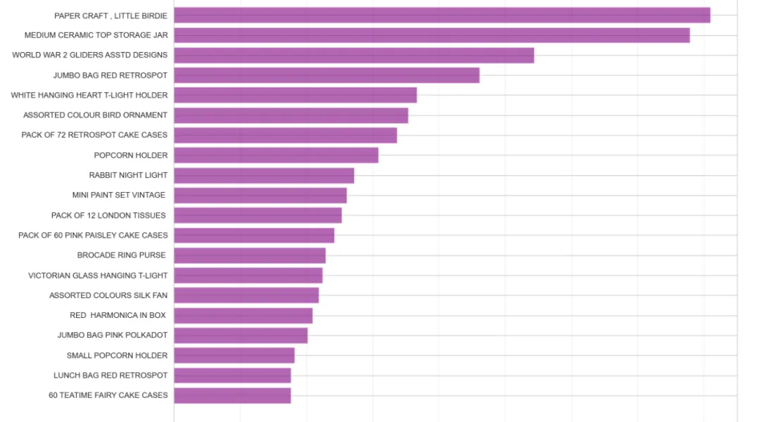

五、结果解读
通过对这个电商数据集的深入分析,我们得到了几个重要发现:
1. 用户价值分化严重26%的高价值用户贡献了80%的销售额,而39%的用户只购买过一次就流失了。这种马太效应在电商行业非常典型。
2. 季节性规律明显第四季度(9-11月)销售额占全年较高,尤其是11月达到峰值。这与欧美市场的节日购物季高度吻合(感恩节、黑色星期五、圣诞节)。相比之下,1-3月是传统淡季。
3. 购买时段集中工作日的10-14点是订单高峰期,这可能与目标客户群体的工作习惯有关(办公室白领在工作间隙购物)。晚间和周末订单量显著下降,说明这不是一个典型的C端娱乐购物场景。
4. 商品策略见效畅销商品集中在低单价、高复购的礼品类商品。这类商品容易形成冲动消费,且适合批量采购,符合该平台的批发零售定位。
5. 用户召回需求迫切RFM分析显示,39%的用户处于流失风险状态(超过90天未购买)。这部分用户曾经有过购买行为,召回成功率理论上应该高于拉新。
六、业务建议
基于以上分析结果,这里提供几个可操作的优化方向:
1. 差异化用户运营对核心用户提供VIP专属服务和优先折扣,维持其高消费水平。对流失风险用户发起定向召回活动,可以尝试"沉睡用户专属优惠券"策略。对一次性用户建立自动化的二次触达机制,比如首单后7天内推送相关商品推荐。
2. 时间段精准投放在10-14点增加广告投放预算和客服人力,提高转化效率。晚间和周末可以降低运营成本,或者测试不同的内容策略(比如周末推送休闲类商品)。
3. 提前备战旺季从8月开始就要为第四季度备货,尤其是礼品类商品。可以在9月推出"早鸟优惠"锁定预算充足的用户。淡季(1-3月)则适合做库存清理和用户调研。
4. 优化商品结构继续发力低单价、高复购的商品品类,这是平台的优势领域。同时可以尝试"爆款+长尾"组合,用畅销品引流,用小众商品提升客单价和利润率。对于退货率高的商品(在原始数据中可以单独分析),要及时优化或下架。
完整代码和数据集获取:
数据集下载:https://archive.ics.uci.edu/ml/datasets/Online+Retail 建议使用Jupyter Notebook运行以上代码,可以逐步查看每个分析环节的结果 如果遇到内存不足,可以先用 df.sample(frac=0.5)随机抽取50%数据进行练习
这个分析案例展示了从数据清洗到业务洞察的完整流程。需要强调的是,数据分析的价值不在于炫技,而在于能否转化为可执行的业务决策。希望这个案例能为你的实际工作提供参考思路。
注:本公众号文章仅用作分享交流,版权与观点均属原创作者。如有错漏或侵犯您的权益,联系我们进行更正或删除。
精彩关注
《城市综合发展指数报告(2025年)|可下载
工信部发布《大数据产业人才岗位能力要求》|可下载
工信部发布《人工智能教育人才岗位能力要求》|可下载
基于 DeepSeek + Chroma + LangChain 开发一个简单 RAG 系统
一张图,讲透AI智能体平台的全部核心技术(建议收藏)
本地部署DeepSeek-R1满血版的硬软件成本
一文汇总!15所高校DeepSeek部署最新进展
一份写给普通人的 DeepSeek 速成指南!快收藏
《人工智能通识课程体系规范》已发布|可下载
大模型扫盲系列——初识大模型
大模型发展的十大挑战与十大展望
一文彻底搞懂大模型 - LLM四阶段技术
神经网络算法 - 一文搞懂Transformer
大数据技术概况
兴趣驱动、能力导向、价值引领的Python语言程序设计课程创新与实践
2025年人工智能十大趋势!最新预测→
北京市教育领域人工智能应用工作方案发布
一文搞懂深度学习:神经网络基础
推荐关注

