在算法时代创作,我用一句话概括底层原理:
强钩子 + 强背书 + 强省事 + 知识获取欲望。
再落到“注意力原理”,就是两条硬规则:
- 收藏代表未来价值(越可复用、越系统化,越值得收藏)
- 干货越多、越难、越复杂,收藏越多(不是炫技,是在给读者省未来的时间)
所以这篇文章我不讲“效果不错”这种空话,我把我自己跑通的生图工作流拆成一份可以直接抄的工程化方案,并把关键产物(prompts.md、plan.json)完整贴在文末,你复制就能复跑、二改、做成自己的版本。
先给你一个“抄就能跑”的结果(强背书 + 强省事)
我现在在任意目录打开终端,直接输入就能出图:

并且整个过程不是黑盒:
[3/3] 批量出图(带进度条 x/N + 每张耗时)
输出文件也不会堆成垃圾堆,强制按日期/主题归档:
outputs/ concept-diagrams/ YYYY-MM-DD/ 主题/ *.plan.json *.prompts.md *.png posters/ YYYY-MM-DD/ 主题/ *.plan.json *.prompts.md *.png
这套系统的“知识密度”在哪里?(知识获取欲望)
很多人用 AI 生图的方式是:
现场写一句 prompt → 祈祷模型懂你 → 出一张图
这类方式最大的问题是:不可复用。你下一次要同风格、同结构、同质量的图,还得重新写 prompt、重新赌一次。
我这次做的不是“出图”,而是把生图拆成可复用资产链:
输入(名词/一句话需求) → plan(结构化拆解) → prompts(可审稿的提示词资产) → images(可交付结果)
这条链路为什么“值得收藏”:
plan.json 是结构化“拆解结果”(以后做系列内容,它就是你的拆解模板)prompts.md 是可复跑的“提示词资产”(它本身就是素材库)
一句话:图片不值钱,prompt 资产 + 结构化拆解才值钱。
我现在只用两套生图 Skill(不依赖任何 vendor)
只包含我自己这套:Skill(规范)+ Python(执行器)+ 模板/规则(prompt 资产)。
1)概念配图 Skill:生图
用途:输入一个名词(比如心理学概念)或一段话,自动生成 简约逻辑图/概念图(白底黑线、手绘质感、16:9、文字极少)。
它的关键不是“画得多花”,而是稳定满足知识类插图的 4 个约束:
- 先拆解再生成(plan/prompts 可审稿、可复跑)
最常用命令:
生图 -n 3 锚定效应生图 -t "写作时先给结论,再用3个要点支撑,最后给行动清单。"
2)海报生图 Skill:海报(万能生图的海报 MVP)
用途:你只说一句话需求,自动生成插画/设计海报。
它的关键是“模板化 prompt”:
最常用命令:
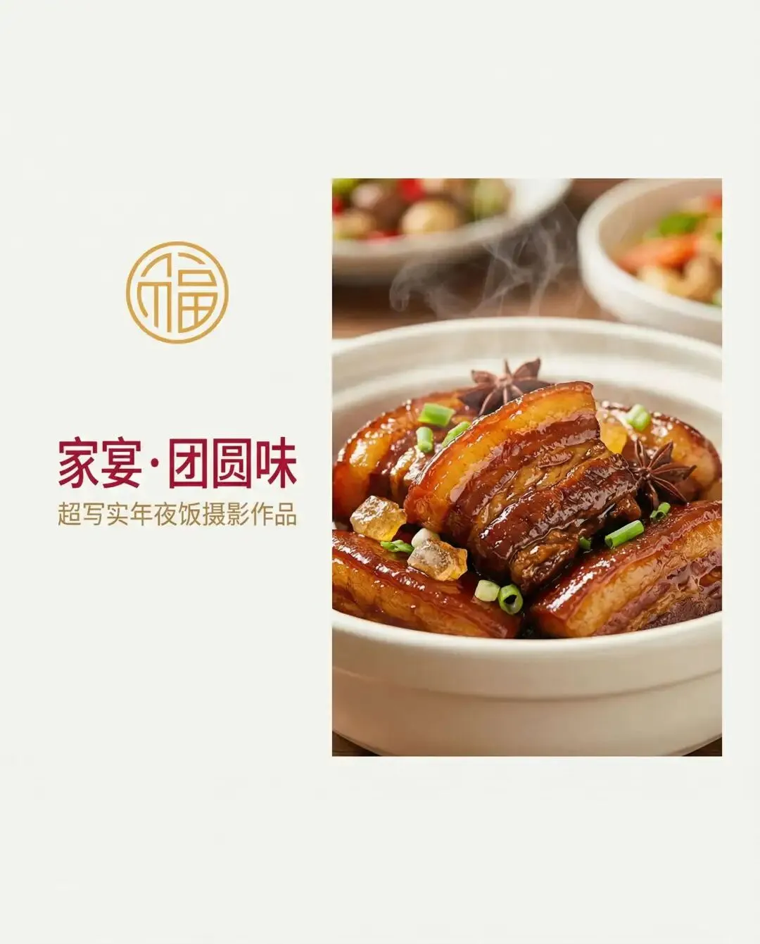
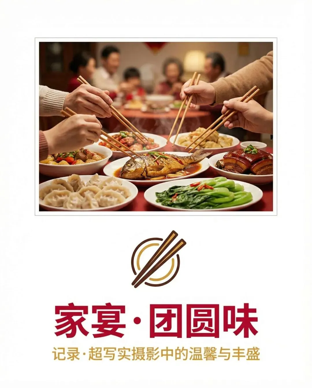
海报 -n 3 年夜饭海报 -n 3 -s 水彩 年夜饭
支持 4 个风格模板(可自动推荐,也可强制指定):
ercolor:水彩插画(温暖治愈)
你怎么把它写成“更容易收藏”的公众号文章?(注意力原理落地)
同样一套能力,写法不同,收藏差 10 倍:
- 开头 10 秒给“可验证结果”:终端命令 + 输出目录结构(让读者立刻判断“我需要”)
- 中段给“可复用资产链”:plan/prompts/images(让读者知道收藏价值在哪里)
- 文末给“速查表 + 排错表 + 附录”:这才是最容易被收藏的部分
- 把 prompts 当素材库:读者收藏的是“未来省事”,不是今天看热闹
一页速查(强收藏版)
概念图:生图
生图 -n 3 锚定效应:分析→prompts→出 3 张图生图 --simple 锚定效应:不分析,直接出 1 张(最快)生图 --prompts-only 锚定效应:只生成 prompts,不出图(先审稿省钱)
海报:海报
海报 -n 3 -s 水彩 年夜饭:强制风格(也支持 剪贴/故障/极简)海报 -r 16:9 -n 2 一句话需求:指定比例(如 16:9、9:16、4:5)海报 --prompts-only --save-plan 一句话需求:只生成 prompts + 保存 plan(先审稿)
海报:冬日咖啡


常见问题(排错清单)
1)模型 503 / 高峰期怎么办?
高峰期出现 high demand 或 503 很常见。
推荐策略:
- 先跑
--prompts-only 把 prompts 审好
2)为什么会出现“无法解析域名 / no network”?
有些运行环境会限制外网访问(沙箱/公司网络/代理)。如果你在本机终端运行通常没问题;受限环境需要换网络环境或配置代理。
3)为什么图里文字太多、像 PPT?
把 3 条规则写进需求/模板:
- 先
--prompts-only 审 prompts,文字密度不对就重跑
附录(强干货:把关键文件完整贴出来)
这部分就是“收藏价值”的本体:你可以直接复制这些结构,改成自己的版本。
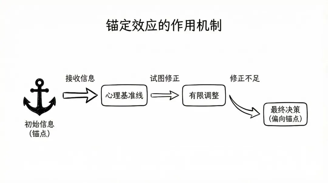
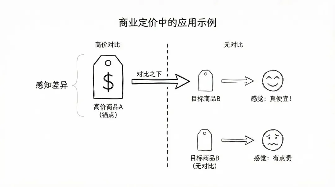
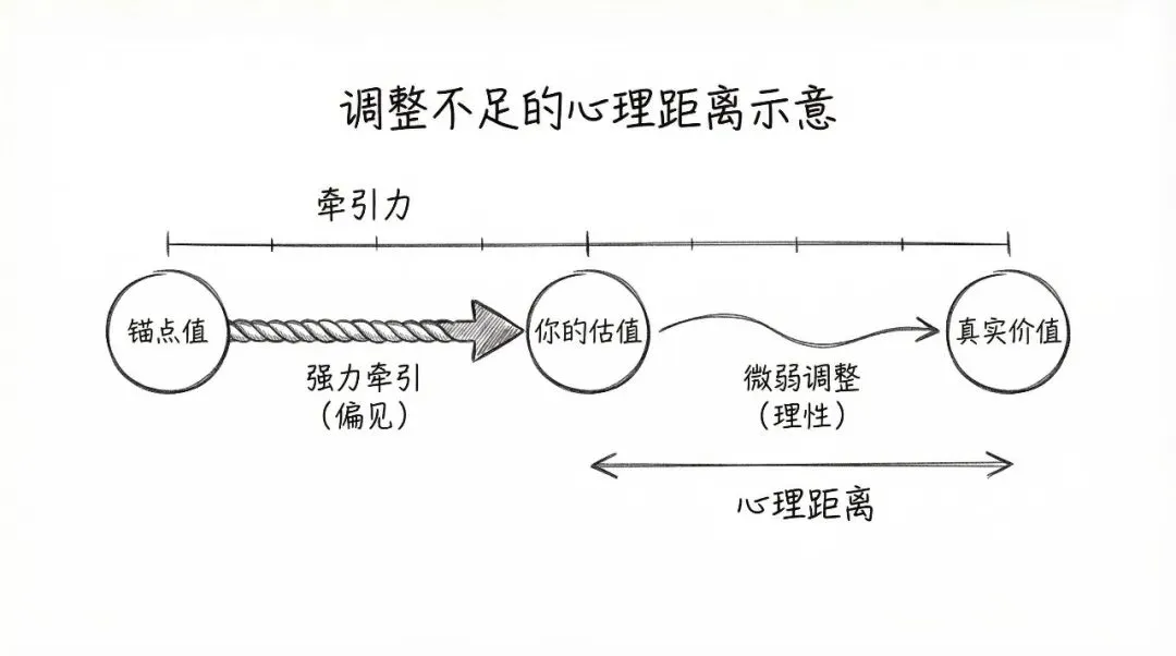
附录 A:概念图(锚定效应)plan.json(完整)
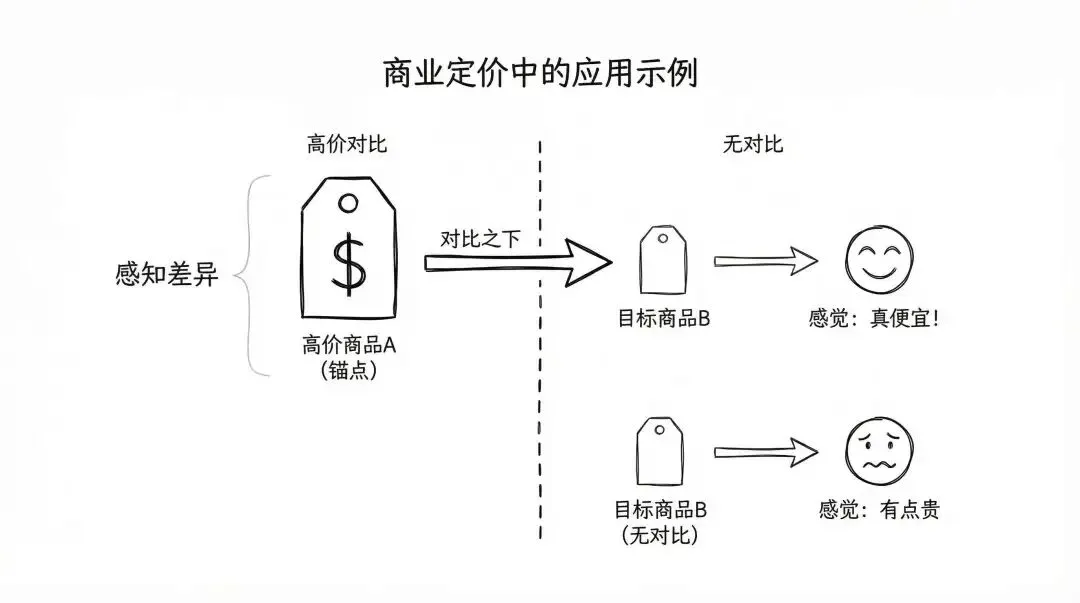
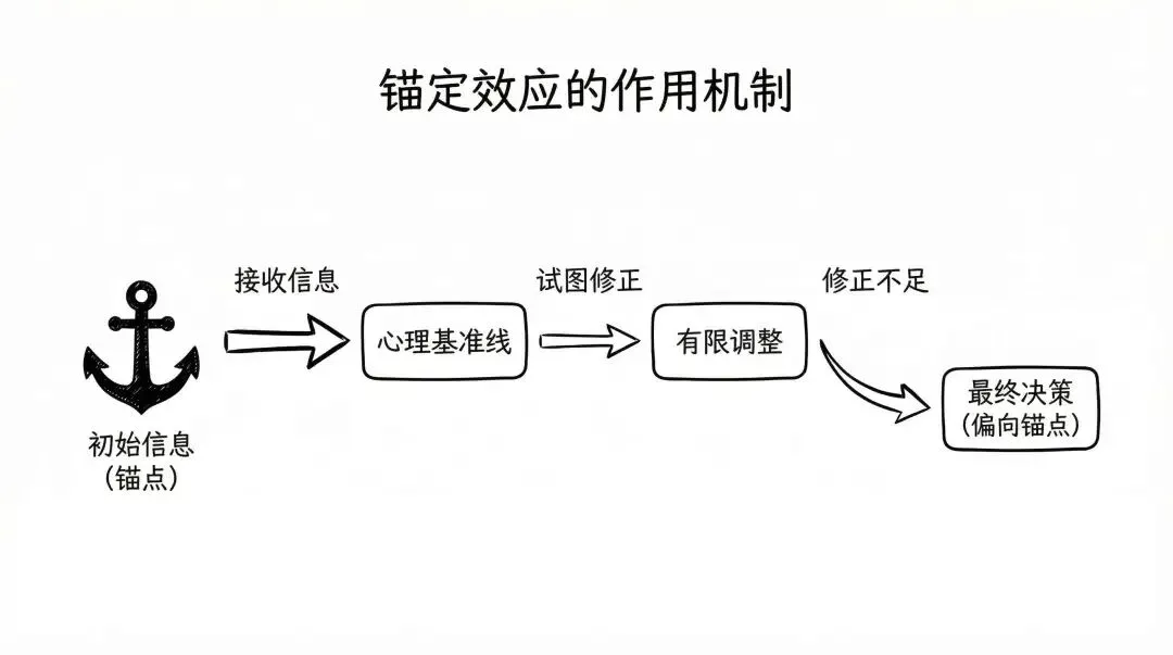
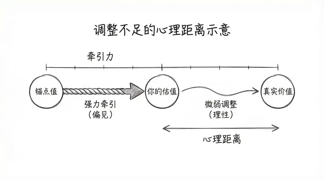
{ "input_type": "term", "title_cn": "锚定效应 (Anchoring Effect)", "explanation_cn": "锚定效应是一种认知偏差。人们在做决策或判断时,会过度依赖最先接收到的信息(即“锚点”)。随后的判断往往会以这个锚点为基准进行调整,但这种调整通常不充分,导致最终结果不知不觉地偏向了初始锚点。", "key_points_cn": [ "初始信息形成心理“锚点”", "后续判断受锚点严重影响", "以锚点为基准的调整往往不足", "常见于价格判断和商业谈判", "属于非理性的认知偏差" ], "diagrams": [ { "index": 1, "title_cn": "锚定效应的作用机制", "diagram_type": "flow", "labels_cn": [ "接收信息", "形成基准", "影响最终判断" ], "nodes_cn": [ "初始信息 (锚点)", "心理基准线", "有限调整", "最终决策 (偏向锚点)" ], "edges": [ { "from": "初始信息 (锚点)", "to": "心理基准线" }, { "from": "心理基准线", "to": "有限调整", "label_cn": "试图修正" }, { "from": "有限调整", "to": "最终决策 (偏向锚点)", "label_cn": "修正不足" } ], "notes_en": "Draw a heavy, literal ship's anchor icon for the first node. The path shows a decision process starting from the anchor, trying to move away, but ending up still close to the anchor's position." }, { "index": 2, "title_cn": "商业定价中的应用示例", "diagram_type": "comparison", "labels_cn": [ "高价对比", "感知差异" ], "nodes_cn": [ "高价商品A (锚点)", "目标商品B", "感觉: 真便宜!", "目标商品B (无对比)", "感觉: 有点贵" ], "edges": [ { "from": "高价商品A (锚点)", "to": "目标商品B", "label_cn": "对比之下" }, { "from": "目标商品B", "to": "感觉: 真便宜!" } ], "notes_en": "Minimalist comparison. Top part shows a large price tag (anchor) next to a smaller one, leading to a happy face icon. Bottom part shows the isolated smaller price tag leading to a hesitant face icon." }, { "index": 3, "title_cn": "调整不足的心理距离示意", "diagram_type": "relationship", "labels_cn": [ "心理距离", "牵引力" ], "nodes_cn": [ "锚点值", "真实价值", "你的估值" ], "edges": [ { "from": "锚点值", "to": "你的估值", "label_cn": "强力牵引 (偏见)" }, { "from": "你的估值", "to": "真实价值", "label_cn": "微弱调整 (理性)" } ], "notes_en": "Visualize on a horizontal scale. The 'Anchor Value' is far from 'True Value'. 'Your Estimate' is stuck in between, connected to the Anchor by a thick, strong rope/arrow, and to the True Value by a thin, weak string/arrow." } ]}
附录 B:概念图(锚定效应)prompts.md(完整)
# Prompts - 2026-02-18 - 锚定效应 (Anchoring Effect)Input: 锚定效应# 简述锚定效应是一种认知偏差。人们在做决策或判断时,会过度依赖最先接收到的信息(即“锚点”)。随后的判断往往会以这个锚点为基准进行调整,但这种调整通常不充分,导致最终结果不知不觉地偏向了初始锚点。## 要点- 初始信息形成心理“锚点”- 后续判断受锚点严重影响- 以锚点为基准的调整往往不足- 常见于价格判断和商业谈判- 属于非理性的认知偏差## 图 1: 锚定效应的作用机制```textCreate ONE minimalist hand-drawn flow diagram / concept map.SUBJECT:锚定效应DIAGRAM TITLE (Chinese, short):锚定效应的作用机制CONTENT BLUEPRINT:- Prefer this diagram type: flow- Use these Chinese keywords as labels (keep VERY few): 接收信息, 形成基准, 影响最终判断- Nodes (Chinese): 初始信息 (锚点), 心理基准线, 有限调整, 最终决策 (偏向锚点)- Relationships/arrows: 初始信息 (锚点) -> 心理基准线; 心理基准线 -> 有限调整 (label "试图修正"); 有限调整 -> 最终决策 (偏向锚点) (label "修正不足")- Notes: Draw a heavy, literal ship's anchor icon for the first node. The path shows a decision process starting from the anchor, trying to move away, but ending up still close to the anchor's position.STYLE INSTRUCTIONS:- Background: pure white.- Lines: black, hand-drawn sketch texture, clean and minimal.- Layout: 16:9 landscape.- Use shapes + arrows to express the core logic.- Use very little text: keep ONLY keywords (1–6 short labels total).- No photography. No realistic objects. No complex gradients. No dense paragraphs.- Leave generous whitespace. Keep stroke width consistent.TEXT RULE (MUST FOLLOW):ALL text, labels, and annotations in the image MUST be primarily in Chinese (Simplified Chinese, 中文).Technical terms and abbreviations (e.g. AI, API, LLM, RAG) may remain in English.```## 图 2: 商业定价中的应用示例```textCreate ONE minimalist hand-drawn comparison diagram / concept map.SUBJECT:锚定效应DIAGRAM TITLE (Chinese, short):商业定价中的应用示例CONTENT BLUEPRINT:- Prefer this diagram type: comparison- Use these Chinese keywords as labels (keep VERY few): 高价对比, 感知差异- Nodes (Chinese): 高价商品A (锚点), 目标商品B, 感觉: 真便宜!, 目标商品B (无对比), 感觉: 有点贵- Relationships/arrows: 高价商品A (锚点) -> 目标商品B (label "对比之下"); 目标商品B -> 感觉: 真便宜!- Notes: Minimalist comparison. Top part shows a large price tag (anchor) next to a smaller one, leading to a happy face icon. Bottom part shows the isolated smaller price tag leading to a hesitant face icon.STYLE INSTRUCTIONS:- Background: pure white.- Lines: black, hand-drawn sketch texture, clean and minimal.- Layout: 16:9 landscape.- Use shapes + arrows to express the core logic.- Use very little text: keep ONLY keywords (1–6 short labels total).- No photography. No realistic objects. No complex gradients. No dense paragraphs.- Leave generous whitespace. Keep stroke width consistent.TEXT RULE (MUST FOLLOW):ALL text, labels, and annotations in the image MUST be primarily in Chinese (Simplified Chinese, 中文).Technical terms and abbreviations (e.g. AI, API, LLM, RAG) may remain in English.```## 图 3: 调整不足的心理距离示意```textCreate ONE minimalist hand-drawn relationship diagram / concept map.SUBJECT:锚定效应DIAGRAM TITLE (Chinese, short):调整不足的心理距离示意CONTENT BLUEPRINT:- Prefer this diagram type: relationship- Use these Chinese keywords as labels (keep VERY few): 心理距离, 牵引力- Nodes (Chinese): 锚点值, 真实价值, 你的估值- Relationships/arrows: 锚点值 -> 你的估值 (label "强力牵引 (偏见)"); 你的估值 -> 真实价值 (label "微弱调整 (理性)")- Notes: Visualize on a horizontal scale. The 'Anchor Value' is far from 'True Value'. 'Your Estimate' is stuck in between, connected to the Anchor by a thick, strong rope/arrow, and to the True Value by a thin, weak string/arrow.STYLE INSTRUCTIONS:- Background: pure white.- Lines: black, hand-drawn sketch texture, clean and minimal.- Layout: 16:9 landscape.- Use shapes + arrows to express the core logic.- Use very little text: keep ONLY keywords (1–6 short labels total).- No photography. No realistic objects. No complex gradients. No dense paragraphs.- Leave generous whitespace. Keep stroke width consistent.TEXT RULE (MUST FOLLOW):ALL text, labels, and annotations in the image MUST be primarily in Chinese (Simplified Chinese, 中文).Technical terms and abbreviations (e.g. AI, API, LLM, RAG) may remain in English.```
附录 C:海报(冬日咖啡)plan.json(完整)
{"scene": "poster","topic_cn": "冬日咖啡主题插画","suggested_style": "watercolor","style_reason_cn": "水彩的柔和晕染质感能极好地营造出冬日里咖啡带来的温暖、舒适和治愈的氛围,适合表现热气和霜冻的对比。","mood_cn": "温暖,治愈,惬意,静谧","elements_en": ["steaming coffee mugs","latte art","knitted sweaters","frosty windows","falling snow","pine branches","cinnamon sticks","warm lamp light" ],"palette_en": ["warm brown","creamy beige","deep forest green","muted red","frosty blue","soft gold" ],"copy_text": "冬日暖饮,咖啡时光","aspect_ratio": "4:5","num_images": 2,"variants": [ {"index": 1,"title_cn": "窗边暖意","variant_notes": "Indoor scene. Close-up focus on hands in a knitted sweater holding a steaming ceramic mug by a heavily frosted window looking out at a snowy landscape. Warm interior lighting contrasts with blue exterior light. Text placed at the top." }, {"index": 2,"title_cn": "雪地静物","variant_notes": "Outdoor still life composition. A thermos and a cup of coffee placed directly on fresh, fluffy snow, surrounded by scattered pinecones, scarf, and dried oranges. Magical, soft light. Text placed at the bottom." } ]}
附录 D:海报(冬日咖啡)prompts.md(完整)
# Poster Prompts - 2026-02-18 - 冬日咖啡主题插画Request: 帮我生成一套冬日咖啡主题的插画海报- Style: watercolor- Style reason: 水彩画的柔和、透明和流动感非常适合表现冬日的寒冷与咖啡的温暖蒸汽之间的对比,能营造出一种舒适、梦幻且治愈的氛围。## 1. 窗边的暖意```textDesign an illustrated poster in warm watercolor style.Theme: 冬日咖啡主题插画Mood keywords (Chinese): 温暖、舒适、治愈、静谧Key objects: steaming coffee mugs, knitted sweaters, snow falling outside window, coffee beans, warm blankets, books, soft lightColor palette: warm browns, creamy beige, muted blues, burnt orange, deep forest greenComposition notes: Close-up composition. Focus on hands holding a steaming ceramic mug, wearing chunky knitted sweater cuffs. A blurred snowy landscape through a window forms the background. Warm color dominance.Typography:- Integrate short headline text into the poster: "温暖,慢煮时光"- Keep text minimal and tasteful.STYLE:- Hand-painted watercolor illustration, cozy, healing.- Soft paper texture, gentle gradients allowed (watercolor wash only).- No photorealism, no 3D render.LAYOUT:- Aspect ratio: 4:5- Clear focal point, generous whitespace, balanced composition.TEXT RULE:All text should be primarily in Chinese (Simplified Chinese). Short English slogans are allowed if requested.```## 2. 雪夜咖啡馆```textDesign an illustrated poster in warm watercolor style.Theme: 冬日咖啡主题插画Mood keywords (Chinese): 温暖、舒适、治愈、静谧Key objects: steaming coffee mugs, knitted sweaters, snow falling outside window, coffee beans, warm blankets, books, soft lightColor palette: warm browns, creamy beige, muted blues, burnt orange, deep forest greenComposition notes: Medium shot composition. Interior view of a cozy cafe looking out a large window at a snowy street evening. Patrons relax inside with warm yellow lighting, contrasting the blue tones outside.Typography:- Integrate short headline text into the poster: "温暖,慢煮时光"- Keep text minimal and tasteful.STYLE:- Hand-painted watercolor illustration, cozy, healing.- Soft paper texture, gentle gradients allowed (watercolor wash only).- No photorealism, no 3D render.LAYOUT:- Aspect ratio: 4:5- Clear focal point, generous whitespace, balanced composition.TEXT RULE:All text should be primarily in Chinese (Simplified Chinese). Short English slogans are allowed if requested.```