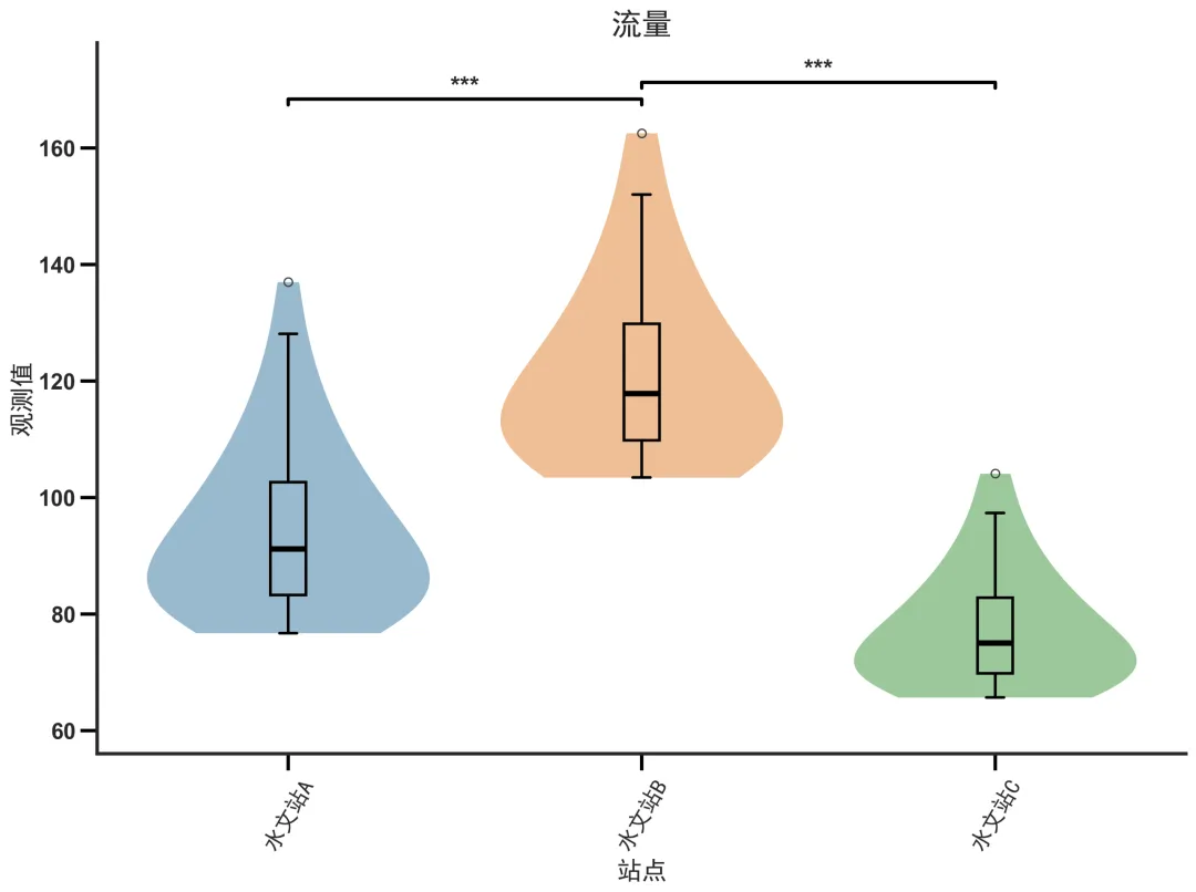
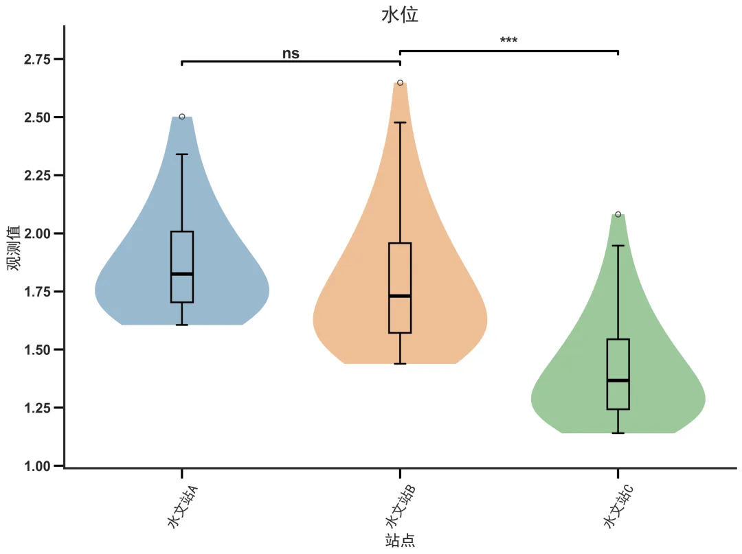
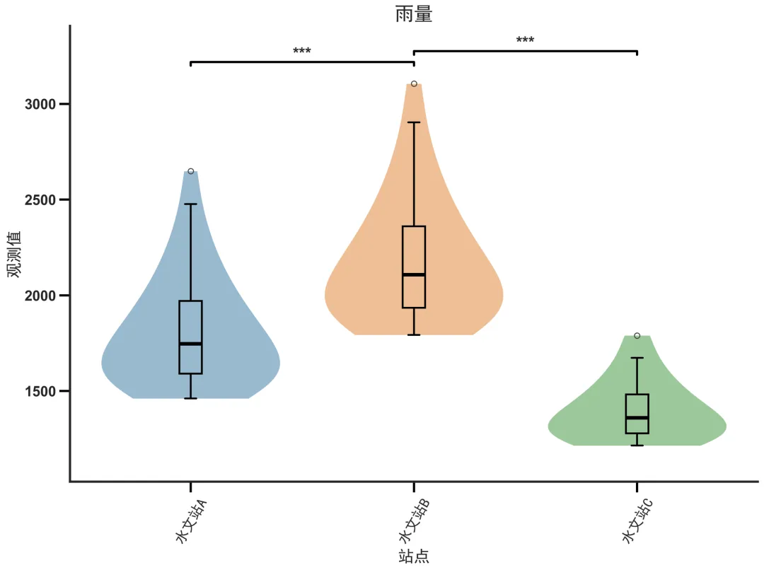
import pandas as pdimport numpy as npimport matplotlib.pyplot as pltimport seaborn as snsfrom scipy import statsimport osfrom matplotlib.font_manager import FontPropertiesfont_path = 'C:/Windows/Fonts/simhei.ttf'if os.path.exists(font_path): font = FontProperties(fname=font_path, size=22, weight='bold')else: font = FontProperties(family=['SimHei', 'Microsoft YaHei', 'SimSun', 'Arial Unicode MS'], size=22, weight='bold')plt.rcParams['axes.unicode_minus'] = Falseplt.rcParams['xtick.bottom'] = Trueplt.rcParams['ytick.left'] = Truesns.set_style("white", {'xtick.bottom': True, 'ytick.left': True})file_path = 'data(小提琴箱线图).xlsx'if os.path.exists(file_path): df = pd.read_excel(file_path)else: sites = ['水文站A', '水文站B', '水文站C'] factors = ['水位', '雨量', '蒸发', '流量'] np.random.seed(42) data = [] for site in sites: for factor in factors: n = np.random.randint(20, 50) if factor == '水位': vals = np.random.normal(25, 2, n) elif factor == '雨量': vals = np.random.normal(50, 10, n) elif factor == '蒸发': vals = np.random.normal(10, 2, n) else: vals = np.random.normal(30, 5, n) data.extend([{ '站点': site, '水文要素': factor, '观测值': v } for v in vals]) df = pd.DataFrame(data) df.to_excel(file_path, index=False) print(f"已生成并保存随机数据至: {file_path}")site_order = ['水文站A', '水文站B', '水文站C']site_color_map = { "水文站A": "#1f77b4", "水文站B": "#ff7f0e", "水文站C": "#2ca02c"}group_order = ["水位", "雨量", "蒸发", "流量"]site_pairs = [ ("水文站A", "水文站B"), ("水文站B", "水文站C")]for factor in group_order: subset = df[df['水文要素'] == factor] plt.figure(figsize=(12, 9)) ax = plt.gca() sns.violinplot( data=subset, x='站点', y='观测值', hue='站点', order=site_order, palette=site_color_map, alpha=0.5, inner=None, linewidth=0, legend=False, bw_method='scott', gridsize=1024, cut=0, ax=ax ) sns.boxplot( data=subset, x='站点', y='观测值', hue='站点', order=site_order, palette=site_color_map, width=0.1, showcaps=True, boxprops={'zorder': 3, 'facecolor': 'none', 'edgecolor': 'black', 'linewidth': 2}, medianprops={'color': 'black', 'linewidth': 4, 'zorder': 4}, whiskerprops={'linewidth': 2, 'color': 'black'}, capprops={'linewidth': 2, 'color': 'black'}, showfliers=True, legend=False, ax=ax ) y_min, y_max = subset['观测值'].min(), subset['观测值'].max() y_range = y_max - y_min current_y = y_max + 0.05 * y_range for (s1, s2) in site_pairs: d1 = subset[subset['站点'] == s1]['观测值'] d2 = subset[subset['站点'] == s2]['观测值'] t_stat, p_val = stats.ttest_ind(d1, d2, nan_policy='omit') if p_val < 0.001: sig = '***' elif p_val < 0.01: sig = '**' elif p_val < 0.05: sig = '*' else: sig = 'ns' x1 = site_order.index(s1) x2 = site_order.index(s2) tip_len = 0.01 * y_range plt.plot([x1, x1, x2, x2], [current_y, current_y + tip_len, current_y + tip_len, current_y], color='black', linewidth=2.5) plt.text((x1 + x2) / 2, current_y + tip_len, sig, ha='center', va='bottom', fontsize=18, fontweight='bold') current_y += 0.02 * y_range + tip_len plt.ylim(y_min - 0.1 * y_range, current_y + 0.05 * y_range) plt.title(factor, fontsize=24, fontweight='bold', ha='center', fontproperties=font) plt.xlabel('站点', fontsize=18, fontweight='bold', fontproperties=font) plt.ylabel('观测值', fontsize=18, fontweight='bold', fontproperties=font) for label in ax.get_xticklabels(): label.set_fontproperties(font) label.set_fontsize(16) label.set_fontweight('bold') label.set_rotation(60) label.set_ha('center') label.set_va('top') for label in ax.get_yticklabels(): label.set_fontsize(16) label.set_fontweight('bold') ax.tick_params(axis='x', which='major', length=12, width=2.5, direction='out', color='black', top=False, right=False) ax.tick_params(axis='y', which='major', length=12, width=2.5, direction='out', color='black', top=False, right=False) for spine in ax.spines.values(): spine.set_linewidth(2.5) plt.legend([], [], frameon=False) sns.despine(top=True, right=True, left=False, bottom=False) plt.tight_layout() output_name = f"{factor}.png" plt.savefig(output_name, dpi=300, bbox_inches='tight') plt.close() print(f"已保存图片: {output_name}")print("所有图片处理完成。")
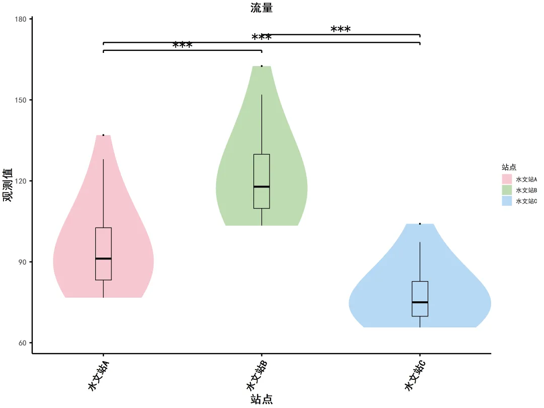
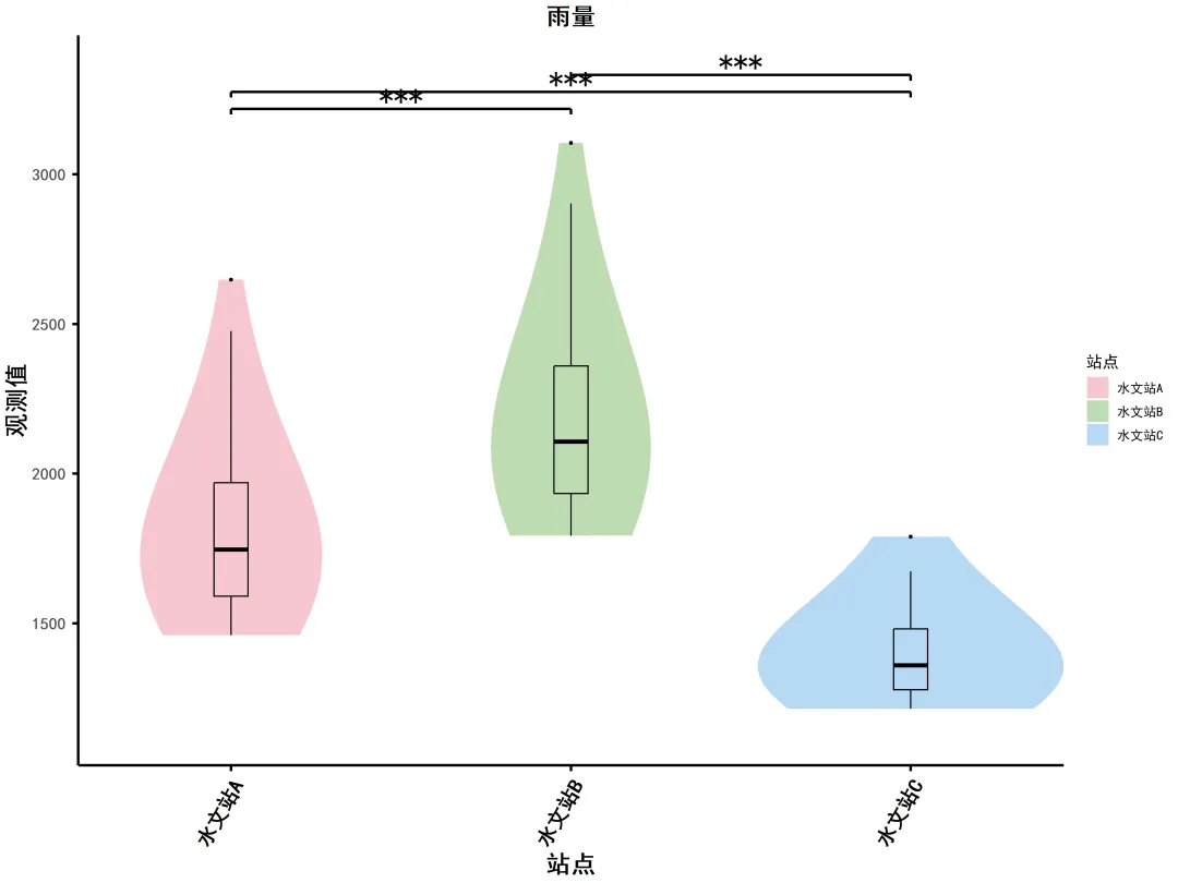
if (requireNamespace("rstudioapi", quietly = TRUE) && rstudioapi::isAvailable()) { script_path <- rstudioapi::getActiveDocumentContext()$path setwd(dirname(script_path))}library(readxl)library(ggplot2)library(dplyr)if (Sys.info()['sysname'] == "Windows") { windowsFonts(SimHei = windowsFont("SimHei"))} else { warning("当前系统非 Windows,中文字体可能显示异常,请手动设置。")}file_path <- "data(小提琴箱线图).xlsx"if (!file.exists(file_path)) { stop("文件不存在:", file_path)}df <- read_excel(file_path)df$站点 <- factor(df$站点, levels = unique(df$站点))site_names <- unique(df$站点)colors <- hcl.colors(length(site_names), palette = "Set2")color_map <- setNames(colors, site_names)group_order <- c("水位", "雨量", "蒸发", "流量")for (element in unique(df$水文要素)) { subset <- df[df$水文要素 == element, ] y_min <- min(subset$观测值, na.rm = TRUE) y_max <- max(subset$观测值, na.rm = TRUE) y_range <- y_max - y_min current_y <- y_max + 0.05 * y_range site_levels <- levels(subset$站点) if (length(site_levels) < 2) { comparisons <- list() } else { pairs <- combn(site_levels, 2, simplify = FALSE) comparisons <- pairs } sig_layers <- list() for (comp in comparisons) { g1 <- comp[1] g2 <- comp[2] d1 <- subset$观测值[subset$站点 == g1] d2 <- subset$观测值[subset$站点 == g2] t_test <- t.test(d1, d2) p_val <- t_test$p.value sig <- ifelse(p_val < 0.001, "***", ifelse(p_val < 0.01, "**", ifelse(p_val < 0.05, "*", "ns"))) x1 <- match(g1, site_levels) x2 <- match(g2, site_levels) tip_len <- 0.01 * y_range start_y <- current_y left_seg <- annotate("segment", x = x1, xend = x1, y = start_y, yend = start_y + tip_len, color = "black", linewidth = 1) horiz_seg <- annotate("segment", x = x1, xend = x2, y = start_y + tip_len, yend = start_y + tip_len, color = "black", linewidth = 1) right_seg <- annotate("segment", x = x2, xend = x2, y = start_y, yend = start_y + tip_len, color = "black", linewidth = 1) text_ann <- annotate("text", x = (x1 + x2) / 2, y = start_y + tip_len, label = sig, hjust = 0.5, vjust = 0, size = 7.5, family = "SimHei") sig_layers <- append(sig_layers, list(left_seg, horiz_seg, right_seg, text_ann)) current_y <- current_y + 0.02 * y_range + tip_len } ylim_upper <- current_y + 0.05 * y_range p <- ggplot(subset, aes(x = 站点, y = 观测值, fill = 站点)) + geom_violin(alpha = 0.5, color = NA, trim = TRUE, scale = "area", bw = "nrd", adjust = 2, kernel = "gaussian") + geom_boxplot(width = 0.1, fill = NA, color = "black", outlier.color = "black", outlier.size = 1, median.color = "black", median.linewidth = 1.5, linewidth = 0.5) + scale_fill_manual(values = color_map) + guides(fill = guide_legend(title = "站点")) + labs(title = element, x = "站点", y = "观测值") + coord_cartesian(ylim = c(y_min - 0.1 * y_range, ylim_upper), expand = FALSE) + theme_minimal() + theme( text = element_text(family = "SimHei", size = 12), plot.title = element_text(hjust = 0.5, size = 18, face = "bold"), axis.title.x = element_text(size = 18, face = "bold"), axis.title.y = element_text(size = 18, face = "bold"), axis.text.x = element_text(size = 15, angle = 60, hjust = 1, vjust = 1, face = "bold", color = "black"), axis.text.y = element_text(size = 12, face = "bold"), axis.ticks = element_line(color = "black", linewidth = 1), axis.ticks.length = unit(0.15, "cm"), panel.grid = element_blank(), panel.border = element_blank(), axis.line = element_line(color = "black", linewidth = 1) ) for (layer in sig_layers) { p <- p + layer } output_file <- paste0(element, ".png") ggsave(output_file, plot = p, dpi = 300, width = 12, height = 9, units = "in") cat("已保存图片:", output_file, "\n")}cat("所有图片处理完成。\n")



 10个月宝宝每天需要喝多少奶粉?