当前位置:首页>python>Python 可视化进阶:手撸 SHAP 蜂巢图 + 混合相关性热图组合面板

Python 可视化进阶:手撸 SHAP 蜂巢图 + 混合相关性热图组合面板

  • 2026-09-22 09:35:20
Python 可视化进阶:手撸 SHAP 蜂巢图 + 混合相关性热图组合面板

!

参考文章

📜 论文标题:Analysis of spatiotemporal variations and driving mechanisms of ecosystem health in arid oasis urban agglomerations using machine learning

📆 发表时间:2026 年

🔗 DOI:10.1016/j.ecolind.2025.114504

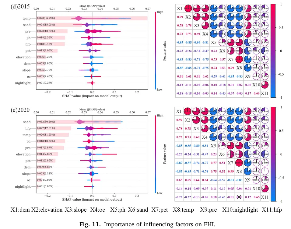
上图主要由两部分组成,分别用于展示影响因子的重要性和相互关系,绘图思路和核心元素如下:

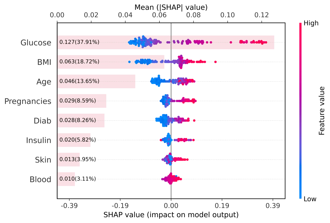
1. 左侧:SHAP 重要性条形图与蜂巢图结合

  • 绘图目的:展示各因子对因变量的重要性及影响方向。

  • 核心元素:

  • Y 轴:列出所有影响因子(如 temp、sand、pre 等)。

  • X 轴:SHAP 值,代表该因子对模型输出的影响程度。

  • 条形长度:表示平均 SHAP 值(Mean |SHAP| value),条形越长,因子越重要。

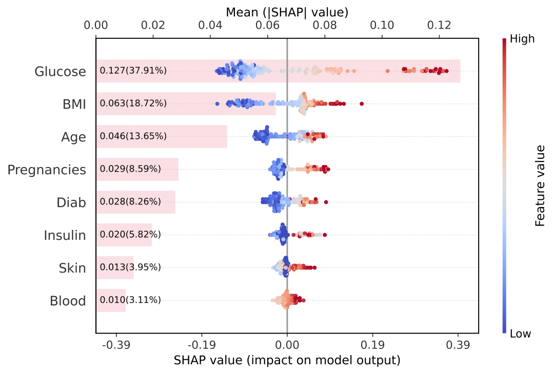
  • 颜色渐变:从蓝色(低特征值)到红色(高特征值),展示不同特征水平下的 SHAP 值分布。

  • 百分比标注:每个因子后标注了其贡献度(如 36.79%),量化其相对重要性。

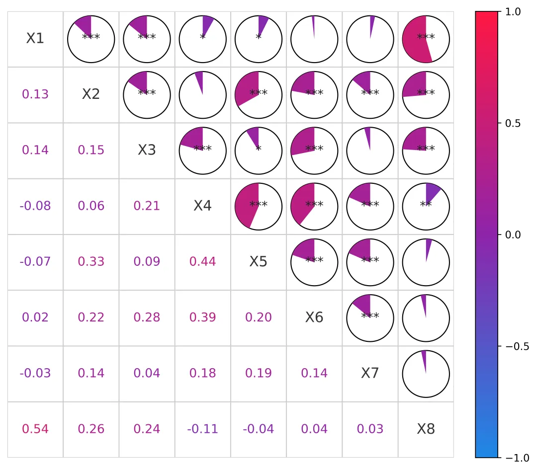
2. 右侧:相关性热力图(Correlation Heatmap)

  • 绘图目的:展示各影响因子之间的线性相关关系。

  • 核心元素:

  • 红色:正相关(相关系数 > 0),颜色越深,正相关越强。

  • 蓝色:负相关(相关系数 < 0),颜色越深,负相关越强。

  • 白色:相关系数接近 0。

  • 矩阵结构:行和列均为相同的影响因子,形成对称矩阵。

  • 颜色编码:

  • 数值标注:每个单元格内标注了相关系数(如 0.99、-0.85),精确量化相关性强度。

  • 对角线:均为 1,表示因子与自身完全相关。

01

!

左侧:SHAP 重要性条形图与蜂巢图结合

在机器学习模型解释性分析中, SHAP (SHapley Additive exPlanations) 无疑是目前的黄金标准。

通常我们在使用 shap.summary_plot 时,面临一个选择困难:

- Dot plot(蜂巢图) :虽然能展示特征值高低对预测结果的正负影响分布,但很难一眼看出特征重要性的具体数值差异。

- Bar plot(条形图) :能清晰地按重要性排序并显示数值,但丢掉了样本分布的细节信息。

- 双轴设计 :底部 X 轴展示具体的 SHAP 值分布(正负影响),顶部 X 轴展示平均绝对 SHAP 值(整体重要性)。

- 图层叠加 :利用 twiny() 共享 Y 轴。粉色的重要性条形图作为 半透明背景 显示,既不喧宾夺主,又能清晰展示长度差异;蜂巢散点图覆盖在上层,保留交互感。

- 数据可视化增强 :在每个条形图的起始位置,自动计算并标注了具体的 重要性数值 和 百分比贡献 ,让图表的信息密度直接拉满。

- 对称美学 :底部 X 轴自动以 0 为中心对称,方便观察正负向影响的平衡性。

-使用小提琴图代替蜂巢图,小提琴图和蜂巢图的区别如下:

  • 小提琴图:在同一坐标系下,所有特征的分布、重要性和影响方向都能同时展示,便于快速对比。

  • 蜂巢图:当特征数量较多时,布局会变得复杂,难以在同一视图下高效对比多个特征的 SHAP 行为。

import numpy as npfrom matplotlib.ticker import FormatStrFormatter# 创建主图(用来画蜂巢图)fig, ax1 = plt.subplots(figsize=(10.5, 4.8), dpi=1200)max_display = min(20, len(columns))# 先画蜂巢图(底部 x 轴:SHAP value)plt.sca(ax1)shap.summary_plot(    shap_values_test,    X_test,    feature_names=columns,    plot_type="violin",    max_display=max_display,    show=False,    color_bar=True,)ax1 = plt.gca()ax1.set_position([0.24, 0.18, 0.60, 0.72])_xmin, _xmax = ax1.get_xlim()_m_data = max(abs(_xmin), abs(_xmax))if np.isfinite(_m_data) and _m_data > 0:    _m_tick = _m_data    _m_lim = _m_tick * 1.12    ax1.set_xlim(-_m_lim, _m_lim)    ax1.set_xticks([-_m_tick, -_m_tick / 2.0, 0.0, _m_tick / 2.0, _m_tick])    ax1.xaxis.set_major_formatter(FormatStrFormatter("%.2f"))_bee_y_ticks = ax1.get_yticks()_bee_y_labels = [t.get_text() for t in ax1.get_yticklabels()]# 顶部 x 轴:Mean(|SHAP|) 的条形图(与蜂巢图共享 y 轴)ax2 = ax1.twiny()ax2.set_position(ax1.get_position())plt.sca(ax2)shap.summary_plot(    shap_values_test,    X_test,    feature_names=columns,    plot_type="bar",    max_display=max_display,    show=False,    color_bar=False,)# 让条形图作为背景显示,蜂巢图盖在上面ax2.set_ylim(ax1.get_ylim())ax2.set_yticks([])ax2.set_ylabel("")for bar in ax2.patches:    bar.set_facecolor("#f2a7b5")    bar.set_alpha(0.35)    bar.set_edgecolor("none")    bar.set_linewidth(0)ax2.set_zorder(0)ax1.set_zorder(1)ax1.patch.set_visible(False)# 在每个条形起点标注 mean(|SHAP|) 和百分比if hasattr(shap_values_test, "values"):    _sv = np.asarray(shap_values_test.values)else:    _sv = np.asarray(shap_values_test)_mean_abs_all = np.mean(np.abs(_sv), axis=0)_total = float(np.sum(_mean_abs_all)) if np.isfinite(np.sum(_mean_abs_all)) else 0.0_order = np.argsort(_mean_abs_all)[::-1][:max_display]_mean_abs_top = _mean_abs_all[_order]_total_top = float(np.sum(_mean_abs_top)) if np.isfinite(np.sum(_mean_abs_top)) else 0.0if len(_bee_y_labels) > 0:    ax1.set_yticks(_bee_y_ticks)    ax1.set_yticklabels(_bee_y_labels)_x_min, _x_max = ax2.get_xlim()_x0 = 0.0 if (_x_min <= 0.0 <= _x_max) else _x_min_x_text = _x0 + 0.01 * (_x_max - _x_min)_bars_sorted = sorted(    ax2.patches,    key=lambda b: (b.get_y() + b.get_height() / 2.0),    reverse=True,)_n = min(len(_bars_sorted), len(_mean_abs_top))for i in range(_n):    bar = _bars_sorted[i]    _y = bar.get_y() + bar.get_height() / 2.0    _v = float(_mean_abs_top[i])    _pct = (100.0 * _v / _total_top) if _total_top > 0 else 0.0    ax2.text(        _x_text,        _y,        f"{_v:.3f}({_pct:.2f}%)",        va="center",        ha="left",        fontsize=9,        color="black",        zorder=3,    )# 四边框与左侧刻度线(让特征名称更像示例图)for spine in ["top", "right", "bottom", "left"]:    ax1.spines[spine].set_visible(True)    ax1.spines[spine].set_linewidth(1.0)ax1.tick_params(axis="y", which="major", length=6, direction="out")ax1.yaxis.grid(True, linestyle=":", linewidth=0.6, alpha=0.4)ax1.set_axisbelow(True)# 轴标签与刻度位置(尽量贴近示例图)ax1.set_xlabel("SHAP value (impact on model output)", fontsize=12)ax1.set_ylabel("")ax2.set_xlabel("Mean (|SHAP| value)", fontsize=12)ax2.xaxis.set_label_position("top")ax2.xaxis.tick_top()plt.savefig("SHAP蜂巢图加重要性.png", dpi=800, bbox_inches="tight")plt.show()

当然也可以换成蜂巢图或者更换颜色分布,分别通过

plot_type和cmap两个参数进行设置。

import numpy as npfrom matplotlib.ticker import FormatStrFormatter# 创建主图(用来画蜂巢图)fig, ax1 = plt.subplots(figsize=(10.5, 4.8), dpi=1200)max_display = min(20, len(columns))# 先画蜂巢图(底部 x 轴:SHAP value)plt.sca(ax1)shap.summary_plot(    shap_values_test,    X_test,    feature_names=columns,    plot_type="dot",    max_display=max_display,    show=False,    color_bar=True,)ax1 = plt.gca()ax1.set_position([0.24, 0.18, 0.60, 0.72])_xmin, _xmax = ax1.get_xlim()_m_data = max(abs(_xmin), abs(_xmax))if np.isfinite(_m_data) and _m_data > 0:    _m_tick = _m_data    _m_lim = _m_tick * 1.12    ax1.set_xlim(-_m_lim, _m_lim)    ax1.set_xticks([-_m_tick, -_m_tick / 2.0, 0.0, _m_tick / 2.0, _m_tick])    ax1.xaxis.set_major_formatter(FormatStrFormatter("%.2f"))_bee_y_ticks = ax1.get_yticks()_bee_y_labels = [t.get_text() for t in ax1.get_yticklabels()]# 顶部 x 轴:Mean(|SHAP|) 的条形图(与蜂巢图共享 y 轴)ax2 = ax1.twiny()ax2.set_position(ax1.get_position())plt.sca(ax2)shap.summary_plot(    shap_values_test,    X_test,    feature_names=columns,    plot_type="bar",    max_display=max_display,    show=False,    color_bar=False,)# 让条形图作为背景显示,蜂巢图盖在上面ax2.set_ylim(ax1.get_ylim())ax2.set_yticks([])ax2.set_ylabel("")for bar in ax2.patches:    bar.set_facecolor("#f2a7b5")    bar.set_alpha(0.35)    bar.set_edgecolor("none")    bar.set_linewidth(0)ax2.set_zorder(0)ax1.set_zorder(1)ax1.patch.set_visible(False)# 在每个条形起点标注 mean(|SHAP|) 和百分比if hasattr(shap_values_test, "values"):    _sv = np.asarray(shap_values_test.values)else:    _sv = np.asarray(shap_values_test)_mean_abs_all = np.mean(np.abs(_sv), axis=0)_total = float(np.sum(_mean_abs_all)) if np.isfinite(np.sum(_mean_abs_all)) else 0.0_order = np.argsort(_mean_abs_all)[::-1][:max_display]_mean_abs_top = _mean_abs_all[_order]_total_top = float(np.sum(_mean_abs_top)) if np.isfinite(np.sum(_mean_abs_top)) else 0.0if len(_bee_y_labels) > 0:    ax1.set_yticks(_bee_y_ticks)    ax1.set_yticklabels(_bee_y_labels)_x_min, _x_max = ax2.get_xlim()_x0 = 0.0 if (_x_min <= 0.0 <= _x_max) else _x_min_x_text = _x0 + 0.01 * (_x_max - _x_min)_bars_sorted = sorted(    ax2.patches,    key=lambda b: (b.get_y() + b.get_height() / 2.0),    reverse=True,)_n = min(len(_bars_sorted), len(_mean_abs_top))for i in range(_n):    bar = _bars_sorted[i]    _y = bar.get_y() + bar.get_height() / 2.0    _v = float(_mean_abs_top[i])    _pct = (100.0 * _v / _total_top) if _total_top > 0 else 0.0    ax2.text(        _x_text,        _y,        f"{_v:.3f}({_pct:.2f}%)",        va="center",        ha="left",        fontsize=9,        color="black",        zorder=3,    )# 四边框与左侧刻度线(让特征名称更像示例图)for spine in ["top", "right", "bottom", "left"]:    ax1.spines[spine].set_visible(True)    ax1.spines[spine].set_linewidth(1.0)ax1.tick_params(axis="y", which="major", length=6, direction="out")ax1.yaxis.grid(True, linestyle=":", linewidth=0.6, alpha=0.4)ax1.set_axisbelow(True)# 轴标签与刻度位置(尽量贴近示例图)ax1.set_xlabel("SHAP value (impact on model output)", fontsize=12)ax1.set_ylabel("")ax2.set_xlabel("Mean (|SHAP| value)", fontsize=12)ax2.xaxis.set_label_position("top")ax2.xaxis.tick_top()plt.savefig("SHAP蜂巢图加重要性1.png", dpi=800, bbox_inches="tight")plt.show()

02

!

2. 右侧:相关性热力图(Correlation Heatmap)

- 左下角 :直接展示 相关系数数值 。不再只是冷冰冰的数字,数字颜色会随着相关性的强弱和正负发生渐变(红正蓝负),与右侧图例完美呼应。

- 右上角 :这是最精彩的部分—— 动态扇形(Pie Chart)可视化 。

1. 填充面积 = 相关性强度

   - ∣ r ∣ ≈ 1 :强相关。扇形几乎填满整个圆,视觉冲击力最强。

   - ∣ r ∣ ≈ 0 :无相关。扇形面积极小甚至消失,留白更多。

   - 一眼看去 :圆越满,关系越铁;圆越空,关系越淡。

2. 填充方向 = 相关性正负

   - 所有的扇形都以 12点钟方向 (正上方)为同一起跑线。

   - 正相关 (  r > 0 ) :扇形向 右 (顺时针)展开,寓意“正向增长”。

   - 负相关 (  r < 0 ) :扇形向 左 (逆时针)展开,寓意“反向背离”。

这种设计利用了人类对几何图形的直觉敏感度,比单纯比对颜色深浅要快得多,也能瞬间分清正负关系。

3. 显著性标记

   - 图表中还贴心地叠加了星号(***),直接标出 p 值显著性水平,做学术汇报必备!

import pandas as pdimport numpy as npimport shapimport matplotlib.pyplot as pltfrom matplotlib.colors import Normalize, LinearSegmentedColormapfrom sklearn.model_selection import train_test_split, GridSearchCVfrom sklearn.neural_network import MLPClassifierfrom sklearn.svm import SVCfrom sklearn.linear_model import LogisticRegressionfrom sklearn.neighbors import KNeighborsClassifierfrom sklearn.tree import DecisionTreeClassifierfrom sklearn.ensemble import RandomForestClassifierdata=pd.read_csv('diabetes.csv')X=data.iloc[:,:-1].valuescolumns=data.columns[:-1].valuesy=data.iloc[:,-1].valuesfrom matplotlib.cm import ScalarMappablefrom matplotlib.patches import Circle, Wedgetry:    from scipy.stats import pearsonrexcept Exception:    pearsonr = Nonedef pearson_corr_heatmap_mixed(x, feature_names, save_path=None, dpi=300):    df = pd.DataFrame(x, columns=feature_names)    corr = df.corr(method="pearson").values    n = corr.shape[0]    pvals = None    if pearsonr is not None:        pvals = np.ones((n, n), dtype=float)        for i in range(n):            for j in range(n):                if i == j:                    pvals[i, j] = 0.0                else:                    _, pvals[i, j] = pearsonr(df.iloc[:, i].values, df.iloc[:, j].values)    norm = Normalize(vmin=-1, vmax=1)    cmap = LinearSegmentedColormap.from_list(        "red_purple_blue",        ["#1e88e5", "#8e24aa", "#ff1744"],        N=256,    )    fig, ax = plt.subplots(figsize=(8.0, 6.5), dpi=dpi)    ax.set_xlim(-0.5, n - 0.5)    ax.set_ylim(n - 0.5, -0.5)    ax.set_aspect("equal")    for k in range(n + 1):        ax.plot([-0.5, n - 0.5], [k - 0.5, k - 0.5], color="#cfcfcf", lw=1)        ax.plot([k - 0.5, k - 0.5], [-0.5, n - 0.5], color="#cfcfcf", lw=1)    r_cell = 0.42    for i in range(n):        for j in range(n):            r = float(corr[i, j])            x0, y0 = j, i            if i == j:                ax.text(                    x0,                    y0,                    feature_names[i],                    ha="center",                    va="center",                    fontsize=14,                    color="#333333",                )                continue            if i > j:                ax.text(                    x0,                    y0,                    f"{r:.2f}",                    ha="center",                    va="center",                    fontsize=12,                    color=cmap(norm(r)),                    fontweight="bold",                )                continue            circ = Circle((x0, y0), r_cell, facecolor="white", edgecolor="black", lw=1)            ax.add_patch(circ)            theta = 360.0 * abs(r)            if theta > 0:                start = -90.0                if r >= 0:                    theta1, theta2 = start - theta, start                else:                    theta1, theta2 = start, start + theta                wedge = Wedge(                    (x0, y0),                    r_cell,                    theta1=theta1,                    theta2=theta2,                    facecolor=cmap(norm(r)),                    edgecolor="none",                )                ax.add_patch(wedge)            if pvals is not None:                p = float(pvals[i, j])                stars = ""                if p < 0.001:                    stars = "***"                elif p < 0.01:                    stars = "**"                elif p < 0.05:                    stars = "*"                if stars:                    ax.text(                        x0,                        y0,                        stars,                        ha="center",                        va="center",                        fontsize=12,                        color="#222222",                    )    ax.set_xticks([])    ax.set_yticks([])    for spine in ["top", "right", "bottom", "left"]:        ax.spines[spine].set_visible(False)    sm = ScalarMappable(norm=norm, cmap=cmap)    sm.set_array([])    cbar = fig.colorbar(sm, ax=ax, fraction=0.046, pad=0.04)    cbar.set_ticks([-1, -0.5, 0, 0.5, 1])    fig.tight_layout()    if save_path:        fig.savefig(save_path, dpi=dpi, bbox_inches="tight")    return fig, axfeature_names = [f"X{i + 1}" for i in range(X.shape[1])]pearson_corr_heatmap_mixed(X, feature_names, save_path="Pearson相关性热图.png", dpi=600)plt.show()

3

!

组合图

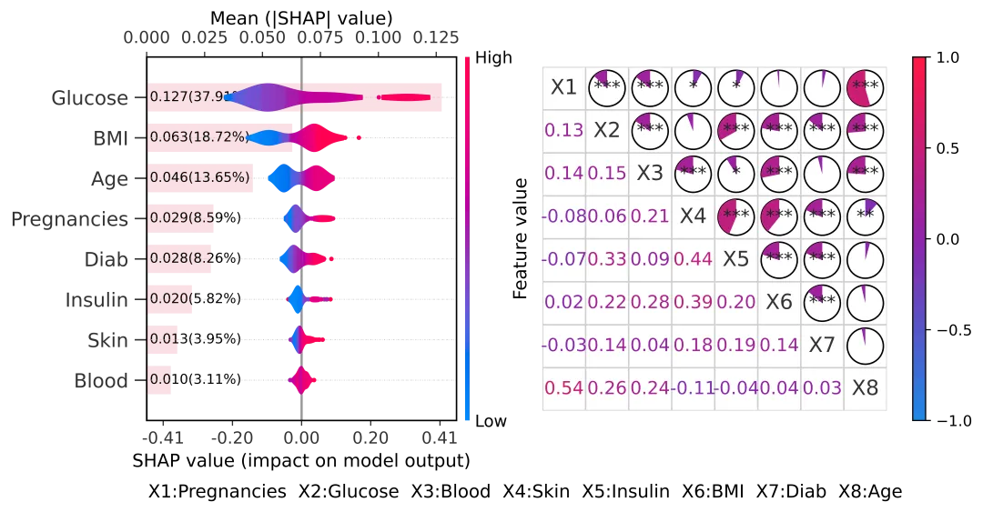
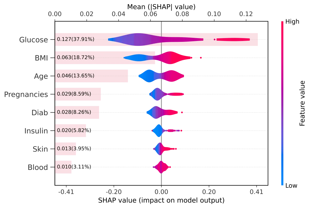
这张图采用了 横向双面板布局 ,信息量极大但逻辑清晰:

左侧面板:SHAP 蜂巢图 + 重要性条形图

这是对模型预测逻辑的深度解剖:

- 特征排序 :自上而下,特征重要性递减,一眼锁定关键因子。

- 红蓝蜂巢 :展示特征值(红高蓝低)对模型输出的正负影响。

- 粉色背景条 :量化展示平均绝对 SHAP 值 (Mean |SHAP|),并直接标注了 具体的贡献数值和百分比 ,让定性分析瞬间变成定量分析。 

右侧面板:混合型 Pearson 相关性热图

这是对特征内部关系的全面体检:

- 数值+几何双显 :左下角直接看相关系数数值(颜色渐变),右上角看扇形面积(大小代表强度,方向代表正负)。

- 特征映射 :为了保持图表整洁,右图使用 X 1 , X 2... 代号,并在底部贴心地附上了与原始特征名的对照表。

import numpy as npimport pandas as pdimport shapimport matplotlib.pyplot as pltfrom matplotlib.cm import ScalarMappablefrom matplotlib.colors import Normalize, LinearSegmentedColormapfrom matplotlib.patches import Circle, Wedgefrom matplotlib.ticker import FormatStrFormattertry:    from scipy.stats import pearsonrexcept Exception:    pearsonr = Nonecolumns=['Pregnancies', 'Glucose', 'Blood', 'Skin',       'Insulin', 'BMI', 'Diab', 'Age']def pearson_corr_heatmap_mixed(ax, fig, x, feature_names, cmap, norm, cbar_pos, start_angle=-90.0):    df = pd.DataFrame(x, columns=feature_names)    corr = df.corr(method="pearson").to_numpy()    n = corr.shape[0]    pvals = None    if pearsonr is not None:        pvals = np.ones((n, n), dtype=float)        for i in range(n):            xi = df.iloc[:, i].to_numpy()            for j in range(n):                if i == j:                    pvals[i, j] = 0.0                else:                    _, pvals[i, j] = pearsonr(xi, df.iloc[:, j].to_numpy())    ax.set_xlim(-0.5, n - 0.5)    ax.set_ylim(n - 0.5, -0.5)    ax.set_aspect("equal")    for k in range(n + 1):        ax.plot([-0.5, n - 0.5], [k - 0.5, k - 0.5], color="#cfcfcf", lw=1)        ax.plot([k - 0.5, k - 0.5], [-0.5, n - 0.5], color="#cfcfcf", lw=1)    r_cell = 0.42    for i in range(n):        for j in range(n):            r = float(corr[i, j])            x0, y0 = j, i            if i == j:                ax.text(x0, y0, feature_names[i], ha="center", va="center", fontsize=14, color="#333333")                continue            if i > j:                ax.text(x0, y0, f"{r:.2f}", ha="center", va="center", fontsize=12, color=cmap(norm(r)), fontweight="bold")                continue            ax.add_patch(Circle((x0, y0), r_cell, facecolor="white", edgecolor="black", lw=1))            theta = 360.0 * abs(r)            if theta > 0:                start = float(start_angle)                if r >= 0:                    theta1, theta2 = start - theta, start                else:                    theta1, theta2 = start, start + theta                ax.add_patch(Wedge((x0, y0), r_cell, theta1=theta1, theta2=theta2, facecolor=cmap(norm(r)), edgecolor="none"))            if pvals is not None:                p = float(pvals[i, j])                stars = "***" if p < 0.001 else "**" if p < 0.01 else "*" if p < 0.05 else ""                if stars:                    ax.text(x0, y0, stars, ha="center", va="center", fontsize=12, color="#222222")    ax.set_xticks([])    ax.set_yticks([])    for spine in ["top", "right", "bottom", "left"]:        ax.spines[spine].set_visible(False)    cax = fig.add_axes(cbar_pos)    sm = ScalarMappable(norm=norm, cmap=cmap)    sm.set_array([])    cbar = fig.colorbar(sm, cax=cax)    cbar.set_ticks([-1, -0.5, 0, 0.5, 1])fig = plt.figure(figsize=(18, 5), dpi=1200)max_display = min(20, len(columns))_left_bee = [0.06, 0.18, 0.36, 0.72]_left_cb = [0.43, 0.18, 0.012, 0.72]_right_corr = [0.52, 0.18, 0.4, 0.72]_right_cb = [0.95, 0.18, 0.015, 0.72]ax1 = fig.add_axes(_left_bee)# 先画蜂巢图(底部 x 轴:SHAP value)plt.sca(ax1)shap.summary_plot(    shap_values_test,    X_test,    feature_names=columns,    plot_type="violin",    max_display=max_display,    show=False,    color_bar=True,)ax1 = plt.gca()ax1.set_position(_left_bee)fig.canvas.draw()_cb_ax = Nonefor _a in fig.axes:    if _a is not ax1 and _a.get_ylabel() == "Feature value":        _cb_ax = _a        breakif _cb_ax is not None:    _cb_ax.set_position(_left_cb)_xmin, _xmax = ax1.get_xlim()_m_data = max(abs(_xmin), abs(_xmax))if np.isfinite(_m_data) and _m_data > 0:    _m_tick = _m_data    _m_lim = _m_tick * 1.12    ax1.set_xlim(-_m_lim, _m_lim)    ax1.set_xticks([-_m_tick, -_m_tick / 2.0, 0.0, _m_tick / 2.0, _m_tick])    ax1.xaxis.set_major_formatter(FormatStrFormatter("%.2f"))_bee_y_ticks = ax1.get_yticks()_bee_y_labels = [t.get_text() for t in ax1.get_yticklabels()]if not any(_bee_y_labels):    fig.canvas.draw()    _bee_y_ticks = ax1.get_yticks()    _bee_y_labels = [t.get_text() for t in ax1.get_yticklabels()]# 顶部 x 轴:Mean(|SHAP|) 的条形图(与蜂巢图共享 y 轴)ax2 = ax1.twiny()ax2.set_position(ax1.get_position())plt.sca(ax2)shap.summary_plot(    shap_values_test,    X_test,    feature_names=columns,    plot_type="bar",    max_display=max_display,    show=False,    color_bar=False,)# 让条形图作为背景显示,蜂巢图盖在上面ax2.set_ylim(ax1.get_ylim())ax2.set_yticks([])ax2.set_ylabel("")for bar in ax2.patches:    bar.set_facecolor("#f2a7b5")    bar.set_alpha(0.35)    bar.set_edgecolor("none")    bar.set_linewidth(0)ax2.set_zorder(0)ax1.set_zorder(1)ax1.patch.set_visible(False)# 在每个条形起点标注 mean(|SHAP|) 和百分比if hasattr(shap_values_test, "values"):    _sv = np.asarray(shap_values_test.values)else:    _sv = np.asarray(shap_values_test)_mean_abs_all = np.mean(np.abs(_sv), axis=0)_total = float(np.sum(_mean_abs_all)) if np.isfinite(np.sum(_mean_abs_all)) else 0.0_order = np.argsort(_mean_abs_all)[::-1][:max_display]_mean_abs_top = _mean_abs_all[_order]_total_top = float(np.sum(_mean_abs_top)) if np.isfinite(np.sum(_mean_abs_top)) else 0.0if len(_bee_y_labels) > 0:    ax1.set_yticks(_bee_y_ticks)    ax1.set_yticklabels(_bee_y_labels)_x_min, _x_max = ax2.get_xlim()_x0 = 0.0 if (_x_min <= 0.0 <= _x_max) else _x_min_x_text = _x0 + 0.01 * (_x_max - _x_min)_bars_sorted = sorted(    ax2.patches,    key=lambda b: (b.get_y() + b.get_height() / 2.0),    reverse=True,)_n = min(len(_bars_sorted), len(_mean_abs_top))for i in range(_n):    bar = _bars_sorted[i]    _y = bar.get_y() + bar.get_height() / 2.0    _v = float(_mean_abs_top[i])    _pct = (100.0 * _v / _total_top) if _total_top > 0 else 0.0    ax2.text(        _x_text,        _y,        f"{_v:.3f}({_pct:.2f}%)",        va="center",        ha="left",        fontsize=9,        color="black",        zorder=3,    )# 四边框与左侧刻度线(让特征名称更像示例图)for spine in ["top", "right", "bottom", "left"]:    ax1.spines[spine].set_visible(True)    ax1.spines[spine].set_linewidth(1.0)ax1.tick_params(    axis="y",    which="major",    left=True,    labelleft=True,    length=8,    width=1.0,    direction="out",    pad=4,)ax1.yaxis.grid(True, linestyle=":", linewidth=0.6, alpha=0.4)ax1.set_axisbelow(True)# 轴标签与刻度位置(尽量贴近示例图)ax1.set_xlabel("SHAP value (impact on model output)", fontsize=12)ax1.set_ylabel("")ax2.set_xlabel("Mean (|SHAP| value)", fontsize=12)ax2.xaxis.set_label_position("top")ax2.xaxis.tick_top()ax_corr = fig.add_axes(_right_corr)try:    _X_corr = Xexcept NameError:    _X_corr = X_test_feature_names = [f"X{i + 1}" for i in range(_X_corr.shape[1])]_norm = Normalize(vmin=-1, vmax=1)_cmap = LinearSegmentedColormap.from_list(    "red_purple_blue",    ["#1e88e5", "#8e24aa", "#ff1744"],    N=256,)pearson_corr_heatmap_mixed(ax_corr, fig, _X_corr, _feature_names, _cmap, _norm, _right_cb, start_angle=-90.0)_x_map = "  ".join([f"X{i + 1}:{columns[i]}" for i in range(min(len(columns), len(_feature_names)))])fig.text(0.5, 0.02, _x_map, ha="center", va="bottom", fontsize=12)plt.savefig("SHAP_与_Pearson_组合.png", dpi=800, bbox_inches="tight")plt.show()
总结

这张组合图通过横向双面板布局,将 SHAP 可视化与混合型相关性热力图有机结合:左侧以 “重要性条形图 + 蜂巢 / 小提琴图” 的双轴设计,同时量化特征重要性并展示其对模型输出的正负影响分布;右侧则用 “数值 + 动态扇形” 的混合型热力图,直观呈现因子间相关性的强度、方向与显著性,既深度解析了模型预测逻辑,又清晰揭示了驱动因子的内部关联,实现了信息密度与可读性的平衡,为机器学习模型解释提供了高效可视化方案。

!

点击蓝字 关注我们

最新文章

随机文章