在学习Python的数据可视化时,matplotlib和seaborn是两个非常强大的库。它们可以帮助我们轻松地创建各种类型的图表,如折线图、柱状图等。今天我们将重点介绍如何使用这两个库来绘制学生成绩分布的示例。
🔍准备工作
首先,你需要确保安装了matplotlib和seaborn。如果尚未安装,可以通过以下命令进行安装:
pip install seaborn matplotlib pandas
🛠️绘制折线图与柱状图
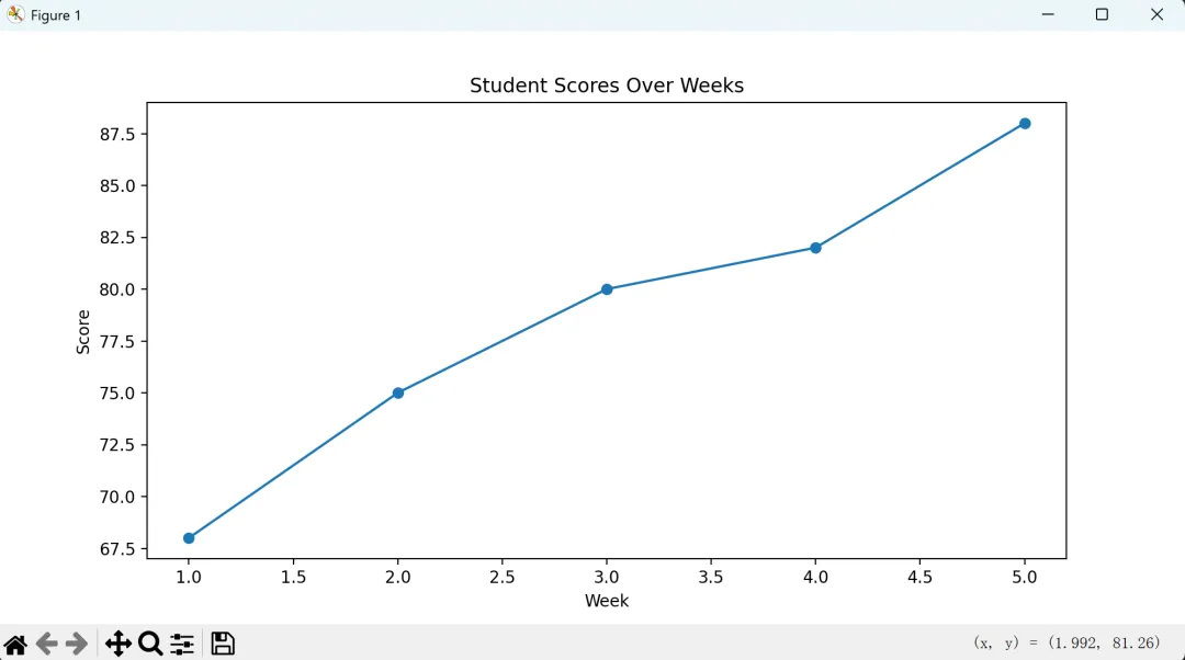
使用Matplotlib绘制折线图
下面是一个简单的例子,展示如何使用matplotlib绘制学生成绩随时间的变化情况(折线图)。
import matplotlib.pyplot as plt# 学生成绩数据(模拟)weeks = [1, 2, 3, 4, 5]scores = [68, 75, 80, 82, 88]# 创建折线图plt.figure(figsize=(10, 5))plt.plot(weeks, scores, marker='o')# 添加标题和坐标轴标签plt.title('Student Scores Over Weeks')plt.xlabel('Week')plt.ylabel('Score')# 显示图表plt.show()
使用Matplotlib绘制柱状图
接下来,我们用matplotlib来绘制一个班级中不同学生的成绩分布(柱状图)。
import matplotlib.pyplot as plt# 学生成绩数据(模拟)student_names = ['Alice', 'Bob', 'Charlie', 'David']scores = [90, 85, 88, 92]# 创建柱状图plt.figure(figsize=(10, 6))plt.bar(student_names, scores, color='skyblue')# 添加标题和坐标轴标签plt.title('Student Scores Distribution')plt.xlabel('Students')plt.ylabel('Scores')# 显示图表plt.show()
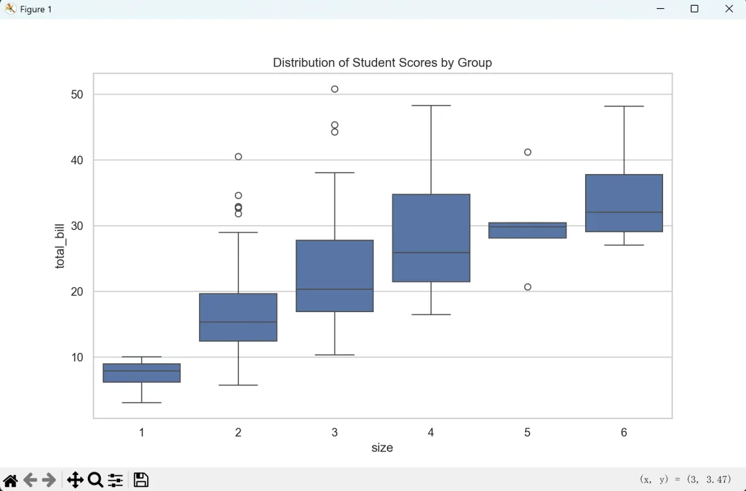
使用Seaborn美化图表
虽然matplotlib已经足够强大,但结合seaborn可以让你的图表看起来更加专业和美观。这里以绘制箱型图为例,展示学生分数的分布情况。
import seaborn as snsimport matplotlib.pyplot as pltimport pandas as pd# 设置 seaborn 风格sns.set(style="whitegrid")# 从本地 CSV 文件加载数据data = pd.read_csv("tips.csv") # 确保 tips.csv 位于当前工作目录中# 创建箱型图plt.figure(figsize=(10, 6))sns.boxplot(x="size", y="total_bill", data=data)# 添加标题plt.title('Distribution of Student Scores by Group')# 显示图表plt.show()
请注意,最后一个示例使用了seaborn中的内置数据集"tips.csv"作为一个本地数据集。在实际应用中,你应该替换为你自己的学生成绩数据。
通过上述例子,我们可以看到matplotlib和seaborn的强大之处。无论是绘制简单明了的折线图或柱状图,还是更加复杂的统计图形,这些工具都能帮助我们更好地理解和展示数据。希望这个教程能够激发你的灵感,并为你的数据分析之旅增添色彩!🎉