在Python中,将分级着色专题地图(Choropleth)与直方图结合,既能通过地图展示地理维度的数值分布,又能通过直方图呈现数据的整体分布特征,是可视化美国各州平均薪资的绝佳方式。本文将基于matplotlib一步步实现该组合可视化效果。
一、专题地图介绍
分级着色专题地图是一种将地理区域按数值大小赋予对应颜色的可视化地图,区域颜色深浅/色调与数值大小成比例,能直观体现地理空间上的数值差异。
二、所需库加载
首先加载实现可视化所需的Python库,分别用于绘图、地理数据处理、数据处理、字体加载和配色方案加载:
# 导入绘图库import matplotlib.pyplot as plt# 导入地理数据处理库import geopandas as gpd# 导入数据处理库import pandas as pd# 从pyfonts导入谷歌字体加载函数from pyfonts import load_google_font# 从pypalettes导入配色方案加载函数from pypalettes import load_cmap
三、数据集加载与预处理
本次可视化需要两个核心数据集:美国各州的地理轮廓数据(shp/geojson格式)、美国各州的薪资数据,加载后需将二者合并,同时做数据过滤和地理信息补充。
3.1 数据加载与合并
# 加载美国各州薪资数据salary_path = "https://raw.githubusercontent.com/holtzy/The-Python-Graph-Gallery/refs/heads/master/static/data/usa-salary.csv"df_salary = pd.read_csv(salary_path)# 加载美国各州地理轮廓数据并与薪资数据按州名合并geo_path = "https://raw.githubusercontent.com/holtzy/The-Python-Graph-Gallery/refs/heads/master/static/data/us.geojson"gdf = gpd.read_file(geo_path).merge(df_salary, on="state")
3.2 数据过滤
剔除哥伦比亚特区、阿拉斯加州和夏威夷州,仅保留美国本土各州数据,避免地理展示偏差:
# 剔除薪资超100的哥伦比亚特区gdf = gdf[gdf["salary"] < 100]# 剔除阿拉斯加州gdf = gdf[gdf["state"] != "Alaska"]# 剔除夏威夷州gdf = gdf[gdf["state"] != "Hawaii"]# 查看前5行数据gdf.head()
处理后的数据结构如下:
| | |
|---|
| | MULTIPOLYGON (((-87.41958 30.4796, -87.42683 3... |
| | POLYGON ((-111.00627 31.32718, -111.06712 31.3... |
| | POLYGON ((-90.30422 35.00008, -90.30124 34.995... |
| | MULTIPOLYGON (((-114.72428 32.71284, -114.7645... |
| | POLYGON ((-109.04633 40.99983, -108.88932 40.9... |
3.3 补充州中心坐标
计算每个州的质心坐标,用于后续在地图上添加州名和薪资标签,先投影再计算质心,保证坐标准确性:
# 将地理数据投影到epsg=3035坐标系,便于准确计算质心gdf_projected = gdf.to_crs(epsg=3035)# 计算投影后数据的质心,添加为新列gdf_projected["centroid"] = gdf_projected.geometry.centroid# 将质心坐标转换回原坐标系,添加到原始地理数据中gdf["centroid"] = gdf_projected["centroid"].to_crs(gdf.crs)# 查看添加质心后的前5行数据gdf.head()
补充后的数据新增centroid列,结构如下:
| | | |
|---|
| | MULTIPOLYGON (((-87.41958 30.4796, -87.42683 3... | |
| | POLYGON ((-111.00627 31.32718, -111.06712 31.3... | |
| | POLYGON ((-90.30422 35.00008, -90.30124 34.995... | |
| | MULTIPOLYGON (((-114.72428 32.71284, -114.7645... | |
| | POLYGON ((-109.04633 40.99983, -108.88932 40.9... | |
四、绘制基础专题地图
核心步骤为加载配色方案、创建绘图画布、绘制专题地图,通过颜色区分各州薪资高低:
# 加载连续型配色方案enara,反转颜色顺序让高值对应深色cmap = load_cmap("enara", cmap_type="continuous", reverse=True)# 设置地理区域边界颜色为白色edgecolor = "white"# 设置边界线宽度为0,隐藏边界linewidth = 0# 创建画布,设置尺寸8*8,分辨率300fig, ax = plt.subplots(figsize=(8, 8), dpi=300)# 设置地图x轴范围,适配美国本土经度ax.set_xlim(-130, -65)# 设置地图y轴范围,适配美国本土纬度ax.set_ylim(20, 50)# 绘制专题地图,按salary列赋值颜色gdf.plot(ax=ax, column="salary", cmap=cmap, edgecolor=edgecolor, linewidth=linewidth)# 自动调整子图布局,避免元素重叠fig.tight_layout()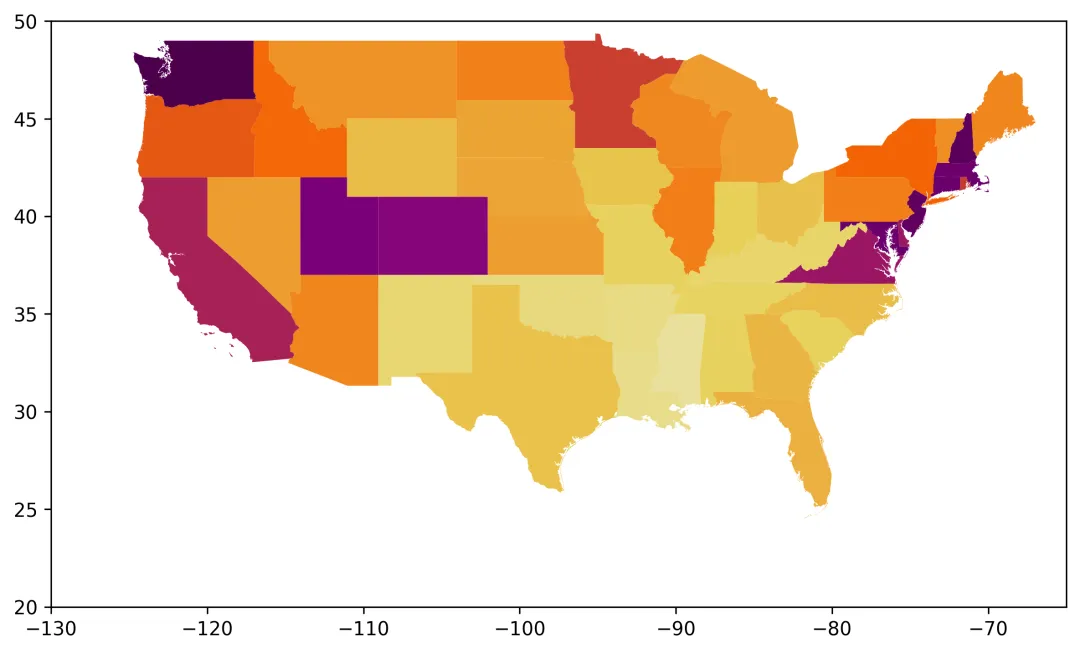
五、添加直方图子图
通过ax.inset_axes()创建内嵌子图,绘制薪资数据的直方图,并让直方图配色与专题地图保持一致,实现视觉统一:
# 加载配色方案,与专题地图保持一致cmap = load_cmap("enara", cmap_type="continuous", reverse=True)edgecolor = "white"linewidth = 0# 创建画布fig, ax = plt.subplots(figsize=(8, 8), dpi=300)# 绘制基础专题地图gdf.plot(ax=ax, column="salary", cmap=cmap, edgecolor=edgecolor, linewidth=linewidth)# 设置地图经纬度范围ax.set_xlim(-130, -65)ax.set_ylim(20, 50)# 创建内嵌子图,设置位置[左, 下, 宽, 高],层级置后避免遮挡地图bar_ax = ax.inset_axes(bounds=[0.05, -0.05, 0.5, 0.4], zorder=-1)# 绘制透明直方图,仅获取统计数据(频数、区间、柱子对象)n, bins, _ = bar_ax.hist(gdf["salary"], bins=15, alpha=0)# 根据薪资区间计算对应配色,与专题地图配色统一colors = [cmap((val - min(bins)) / (max(bins) - min(bins))) for val in bins]# 绘制带配色的直方图,设置柱子宽度和边界bar_ax.bar( bins[:-1], n, color=colors, width=2, edgecolor=edgecolor, linewidth=linewidth)# 自动调整布局fig.tight_layout()
六、美化地图与直方图
移除地图和直方图的多余边框、刻度,简化视觉元素,让可视化更简洁美观,重点优化直方图的刻度标签:
# 加载统一配色方案cmap = load_cmap("enara", cmap_type="continuous", reverse=True)edgecolor = "white"linewidth = 0# 创建画布并绘制专题地图fig, ax = plt.subplots(figsize=(8, 8), dpi=300)gdf.plot(ax=ax, column="salary", cmap=cmap, edgecolor=edgecolor, linewidth=linewidth)ax.set_xlim(-130, -65)ax.set_ylim(20, 50)# 隐藏地图的所有坐标轴和边框ax.axis("off")# 创建直方图内嵌子图bar_ax = ax.inset_axes(bounds=[0.05, -0.05, 0.5, 0.4], zorder=-1)n, bins, _ = bar_ax.hist(gdf["salary"], bins=15, alpha=0)colors = [cmap((val - min(bins)) / (max(bins) - min(bins))) for val in bins]bar_ax.bar( bins[:-1], n, color=colors, width=2, edgecolor=edgecolor, linewidth=linewidth)# 隐藏直方图的上、左、右边框bar_ax.spines[["top", "left", "right"]].set_visible(False)# 隐藏直方图的y轴刻度bar_ax.set_yticks([])# 设置x轴刻度为50-80,步长10x_ticks = list(range(50, 90, 10))# 将刻度标签设置为带k的格式(表示千)x_tick_labels = [f"{val}k"for val in x_ticks]# 赋值x轴刻度和标签,设置字体大小bar_ax.set_xticks(x_ticks, labels=x_tick_labels, size=8)# 隐藏x轴刻度线,设置标签与轴线的间距bar_ax.tick_params(axis="x", length=0, pad=5)fig.tight_layout()
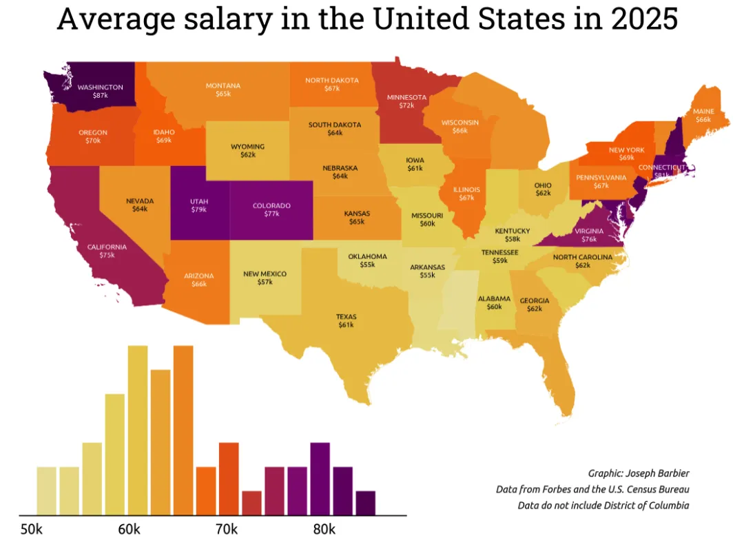
七、添加各州标签标注
利用之前计算的质心坐标,在地图上添加州名和薪资标注,同时优化标注位置、字体和颜色,让标注清晰且不遮挡地图:
# 加载谷歌字体Ubuntu,用于标注文字font2 = load_google_font("Ubuntu")# 统一配色和边界设置cmap = load_cmap("enara", cmap_type="continuous", reverse=True)edgecolor = "white"linewidth = 0# 高值区域标注文字颜色设为白色text_color = "white"# 创建画布并绘制专题地图,隐藏地图坐标轴fig, ax = plt.subplots(figsize=(8, 8), dpi=300)gdf.plot(ax=ax, column="salary", cmap=cmap, edgecolor=edgecolor, linewidth=linewidth)ax.set_xlim(-130, -65)ax.set_ylim(20, 50)ax.axis("off")# 绘制并美化直方图bar_ax = ax.inset_axes(bounds=[0.05, -0.05, 0.5, 0.4], zorder=-1)n, bins, _ = bar_ax.hist(gdf["salary"], bins=15, alpha=0)colors = [cmap((val - min(bins)) / (max(bins) - min(bins))) for val in bins]bar_ax.bar( bins[:-1], n, color=colors, width=2, edgecolor=edgecolor, linewidth=linewidth)bar_ax.spines[["top", "left", "right"]].set_visible(False)bar_ax.set_yticks([])x_ticks = list(range(50, 90, 10))x_tick_labels = [f"{val}k"for val in x_ticks]# 直方图刻度标签使用加载的Ubuntu字体bar_ax.set_xticks(x_ticks, labels=x_tick_labels, size=8, font=font2)bar_ax.tick_params(axis="x", length=0, pad=5)# 定义需要排除标注的州(小州/密集州,避免标注重叠)exclude = {"Indiana", "Michigan", "Mississippi", "Florida", "New Jersey","West Virginia", "South Carolina", "Louisiana", "Massachusetts","Vermont", "Connecticut", "Maryland", "Delaware", "Rhode Island","New Hampshire"}# 筛选出需要标注的州states_to_annotate = [state for state in gdf.state.to_list() if state notin exclude]# 定义标注位置调整字典,修正质心坐标的标注偏差adjustments = {"California": (0, -1),"Kentucky": (0, -0.2),"Washington": (0.5, -0.4),"Virginia": (0, -0.2),"Idaho": (0, -0.4),"New York": (0, -0.2),}# 遍历需要标注的州,添加州名和薪资标注for state in states_to_annotate:# 获取该州的质心坐标 centroid = gdf.loc[gdf["state"] == state, "centroid"].values[0] x_val, y_val = centroid.coords[0]# 根据调整字典修正标注位置try: x_val += adjustments[state][0] y_val += adjustments[state][1]except KeyError:pass# 获取该州的薪资数值 value = gdf.loc[gdf["state"] == state, "salary"].values[0]# 薪资≤65k时标注文字为黑色,否则为白色,保证对比度if value <= 65: color_text = "black"else: color_text = text_color# 添加文字标注,州名大写+薪资(取整),居中对齐 ax.text( x=x_val, y=y_val, s=f"{state.upper()}\n${value:.0f}k", fontsize=5, font=font2, color=color_text, ha="center", va="center", )fig.tight_layout()
八、添加标题与说明文字
最后添加可视化标题、制图者、数据来源等说明文字,完善可视化的信息完整性,让图表更专业:
# 加载斜体Ubuntu字体(用于说明文字)和常规Ubuntu字体(用于标注/刻度)font1 = load_google_font("Ubuntu", italic=True)font2 = load_google_font("Ubuntu")# 统一配色和样式设置cmap = load_cmap("enara", cmap_type="continuous", reverse=True)edgecolor = "white"linewidth = 0text_color = "white"# 绘制专题地图并隐藏坐标轴fig, ax = plt.subplots(figsize=(8, 8), dpi=300)gdf.plot(ax=ax, column="salary", cmap=cmap, edgecolor=edgecolor, linewidth=linewidth)ax.set_xlim(-130, -65)ax.set_ylim(20, 50)ax.axis("off")# 绘制并美化直方图bar_ax = ax.inset_axes(bounds=[0.05, -0.05, 0.5, 0.4], zorder=-1)n, bins, _ = bar_ax.hist(gdf["salary"], bins=15, alpha=0)colors = [cmap((val - min(bins)) / (max(bins) - min(bins))) for val in bins]bar_ax.bar( bins[:-1], n, color=colors, width=2, edgecolor=edgecolor, linewidth=linewidth)bar_ax.spines[["top", "left", "right"]].set_visible(False)bar_ax.set_yticks([])x_ticks = list(range(50, 90, 10))x_tick_labels = [f"{val}k"for val in x_ticks]bar_ax.set_xticks(x_ticks, labels=x_tick_labels, size=8, font=font2)bar_ax.tick_params(axis="x", length=0, pad=5)# 定义排除标注的州和位置调整字典exclude = {"Indiana", "Michigan", "Mississippi", "Florida", "New Jersey","West Virginia", "South Carolina", "Louisiana", "Massachusetts","Vermont", "Connecticut", "Maryland", "Delaware", "Rhode Island","New Hampshire"}states_to_annotate = [state for state in gdf.state.to_list() if state notin exclude]adjustments = {"California": (0, -1),"Kentucky": (0, -0.2),"Washington": (0.5, -0.4),"Virginia": (0, -0.2),"Idaho": (0, -0.4),"New York": (0, -0.2),}# 遍历添加各州标注for state in states_to_annotate: centroid = gdf.loc[gdf["state"] == state, "centroid"].values[0] x_val, y_val = centroid.coords[0]try: x_val += adjustments[state][0] y_val += adjustments[state][1]except KeyError:pass value = gdf.loc[gdf["state"] == state, "salary"].values[0]if value <= 65: color_text = "black"else: color_text = text_color ax.text( x=x_val, y=y_val, s=f"{state.upper()}\n${value:.0f}k", fontsize=5, font=font2, color=color_text, ha="center", va="center", )# 添加主标题,使用Roboto Slab字体,居中对齐,字号22fig.text( x=0.5, y=0.8, s="Average salary in the United States in 2025", ha="center", size=22, font=load_google_font("Roboto Slab"),)# 定义说明文字的公共参数:右对齐、字号7、斜体、底部对齐credit_params = dict(x=0.9, ha="right", size=7, font=font1, va="bottom")# 添加制图者说明fig.text(y=0.24, s="Graphic: Joseph Barbier", **credit_params)# 添加数据来源说明fig.text(y=0.22, s="Data from Forbes and the U.S. Census Bureau", **credit_params)# 添加数据说明(剔除哥伦比亚特区)fig.text(y=0.2, s="Data do not include District of Columbia", **credit_params)# 自动调整布局fig.tight_layout()# 保存可视化图片,设置分辨率300,自动裁剪空白区域fig.savefig("web-choropleth-map-with-histogram.png", dpi=300, bbox_inches="tight",)
本文可视化实现核心思路:通过geopandas处理地理数据,matplotlib实现基础绘图和内嵌子图,统一配色方案让地图与直方图视觉联动,通过坐标修正、文字配色优化标注效果,最终添加完善的说明文字让可视化更专业、信息更完整。