我爱Python, 可是不如R科研绘图好看简洁
- 2026-07-02 02:01:02
我爱Python, 可是不如R科研绘图好看简洁点击上方“科研代码”,关注我的公众号。 添加微信:smartcode2023 备注:R模板,免费领取50个R语言绘图代码


最近建了一个9.9/年费,会员交流群,每周更新R、Python教程PPT,实用代码,AI提示词 


感兴趣的朋友请扫描,备注:9.9进群,Michael来加你入群 
感谢关注,你的支持是我不懈的动力!
前言:我用Python画图都画沉默了
因为我经常需要同时用R和Python做数据可视化,我越来越感觉,Python不够简洁。
比如同样画一张PCA散点图加置信椭圆,R语言可能10行搞定,Python却要写50行,而且还没R的好看。
但我感觉,这本来就是Python的一个劣势,因为R语言具有的ggplot2 的图层语法、stats 包的内置函数,都非常适合科研绘图。但是,Python是一门通用编程语言,matplotlib 更像是一套绘图”零件库”,你需要自己组装每一颗螺丝钉。灵活度极高,但代价是啰嗦。
但我一向认为在机器学习或者建模领域,深度的应用,还是Python更好用,因此今天用Python来展示下,如何绘制PCA的可视化科研图表。
2. 数据集
今天用的依然是Iris数据集(150样本 × 4特征)
2.1 环境准备与数据加载
import numpy as npimport pandas as pdimport matplotlib.pyplot as pltfrom matplotlib.patches import Ellipsefrom sklearn.datasets import load_irisfrom sklearn.preprocessing import StandardScalerfrom sklearn.decomposition import PCAnp.random.seed(42)iris = load_iris()X = iris.datay = iris.targetlabels = iris.target_namesfeat = iris.feature_names# 标准化:PCA对尺度敏感,必须先标准化scaler = StandardScaler()X_std = scaler.fit_transform(X)pca2d = PCA(n_components=2, random_state=42)X_2d = pca2d.fit_transform(X_std)pca3d = PCA(n_components=3, random_state=42)X_3d = pca3d.fit_transform(X_std)pca_full = PCA(random_state=42)pca_full.fit(X_std)loadings = pd.DataFrame( pca2d.components_.T, index=feat, columns=["PC1", "PC2"])COLORS = ["#7F77DD", "#1D9E75", "#D85A30"]MARKERS = ["o", "s", "^"]2.2 置信椭圆 & Bootstrap
这两个函数是后续所有图表的基础,写一次全程复用。
defconfidence_ellipse(x, y, ax, n_std=1.96, facecolor="none", **kwargs):""" 基于协方差矩阵绘制2D置信椭圆。 n_std=1.96 → 双变量正态假设下的95% CI 原理:对2×2协方差矩阵做特征分解, 特征向量决定椭圆方向,特征值决定半轴长度。 """if len(x) < 3:return cov = np.cov(x, y) vals, vecs = np.linalg.eigh(cov) order = vals.argsort()[::-1] vals, vecs = vals[order], vecs[:, order] theta = np.degrees(np.arctan2(*vecs[:, 0][::-1])) w, h = 2 * n_std * np.sqrt(vals) ellipse = Ellipse( xy=(np.mean(x), np.mean(y)), width=w, height=h, angle=theta, facecolor=facecolor, **kwargs ) ax.add_patch(ellipse)return ellipsedefbootstrap_cov(X, n_bootstrap=500):"""Bootstrap重采样估计协方差矩阵每个元素的95% CI""" n = X.shape[0] covs = np.zeros((n_bootstrap, X.shape[1], X.shape[1]))for i in range(n_bootstrap): idx = np.random.choice(n, size=n, replace=True) covs[i] = np.cov(X[idx].T)return (np.percentile(covs, 2.5, axis=0), np.percentile(covs, 97.5, axis=0))3. 可视化图表
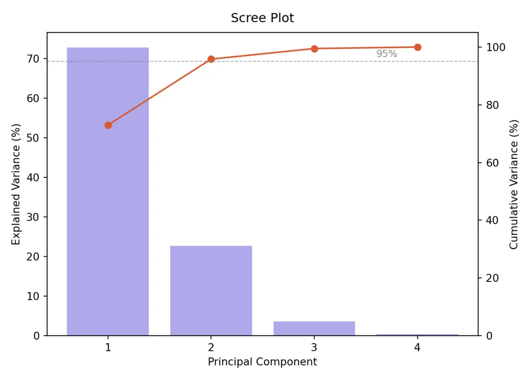
3.1 :碎石图(Scree Plot)
判断”保留几个主成分”的标准工具,双轴设计同时展示单个贡献与累积贡献。
fig, ax1 = plt.subplots(figsize=(7, 5), facecolor="white")ax1.bar( range(1, 5), pca_full.explained_variance_ratio_ * 100, color="#AFA9EC", edgecolor="white", linewidth=0.8)ax1_twin = ax1.twinx()ax1_twin.plot( range(1, 5), np.cumsum(pca_full.explained_variance_ratio_) * 100,"o-", color="#D85A30", linewidth=1.5, markersize=6)ax1_twin.axhline(y=95, color="#888780", linestyle="--", linewidth=0.8, alpha=0.7)ax1_twin.text(3.6, 96.5, "95%", fontsize=9, color="#888780")ax1_twin.set_ylim(0, 105)## (0.0, 105.0)ax1_twin.set_ylabel("Cumulative Variance (%)", fontsize=10)ax1.set_xlabel("Principal Component", fontsize=10)ax1.set_ylabel("Explained Variance (%)", fontsize=10)ax1.set_title("Scree Plot", fontsize=12, fontweight="500", pad=10)ax1.set_xticks(range(1, 5))plt.tight_layout()plt.savefig("pca_01_scree.png", dpi=300, bbox_inches="tight", facecolor="white")plt.show()3.2 2D投影散点图 + 95%置信椭圆
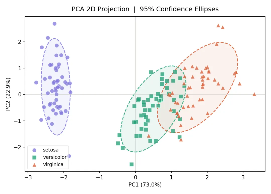
PCA最经典的可视化形式。每个类别画两次椭圆:虚线边框 + 半透明填充,兼顾清晰度与美观。
fig, ax2 = plt.subplots(figsize=(7, 5), facecolor="white")for i, (name, c, m) in enumerate(zip(labels, COLORS, MARKERS)): mask = y == i ax2.scatter( X_2d[mask, 0], X_2d[mask, 1], c=c, marker=m, s=55, alpha=0.75, edgecolors="white", linewidths=0.4, label=name, zorder=3 )# 虚线椭圆边框 confidence_ellipse( X_2d[mask, 0], X_2d[mask, 1], ax2, n_std=1.96, edgecolor=c, linewidth=1.5, linestyle="--", alpha=0.85, zorder=2 )# 半透明填充 confidence_ellipse( X_2d[mask, 0], X_2d[mask, 1], ax2, n_std=1.96, facecolor=c, alpha=0.08, zorder=1 )ax2.set_xlabel(f"PC1 ({pca2d.explained_variance_ratio_[0]:.1%})", fontsize=10)ax2.set_ylabel(f"PC2 ({pca2d.explained_variance_ratio_[1]:.1%})", fontsize=10)ax2.set_title("PCA 2D Projection | 95% Confidence Ellipses", fontsize=12, fontweight="500", pad=10)ax2.legend(fontsize=9, framealpha=0.5)ax2.axhline(0, color="#D3D1C7", linewidth=0.6)ax2.axvline(0, color="#D3D1C7", linewidth=0.6)plt.tight_layout()plt.savefig("pca_02_2d.png", dpi=300, bbox_inches="tight", facecolor="white")plt.show()3.3:Biplot(得分图 + 载荷图)
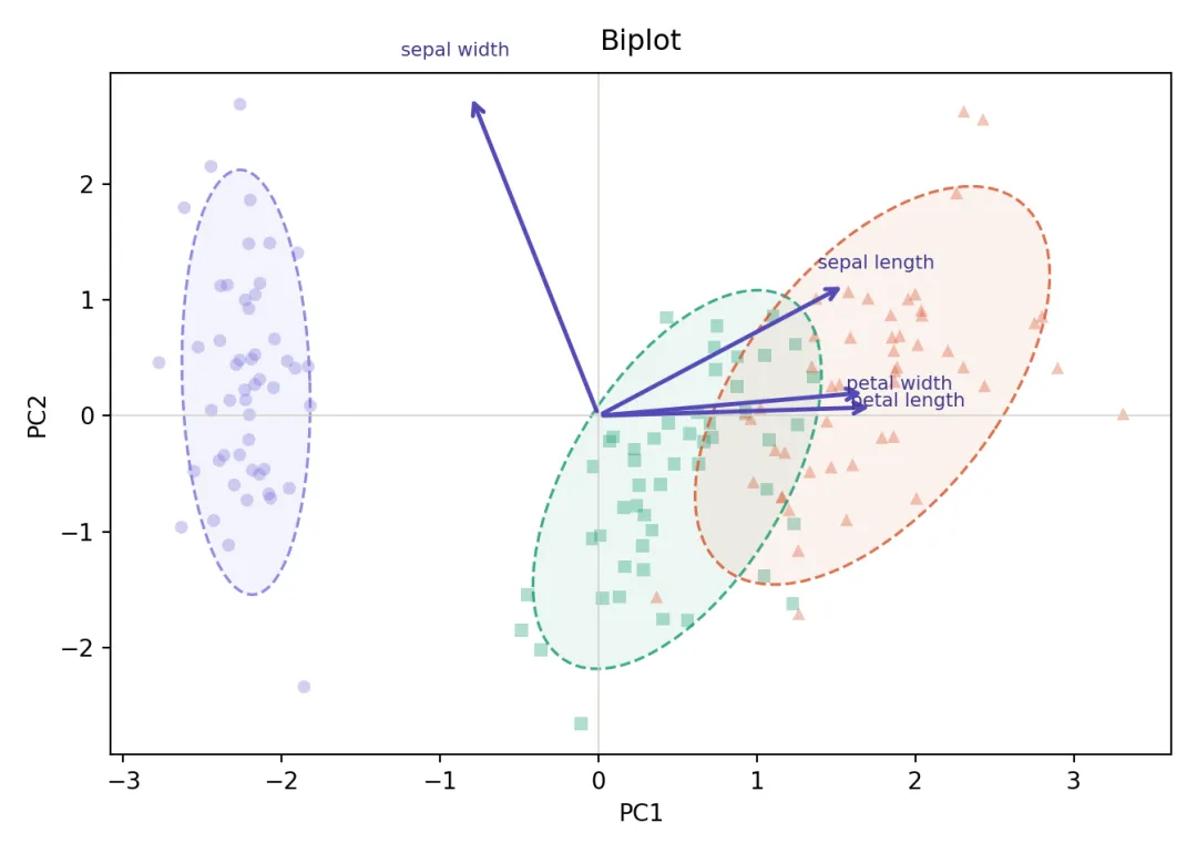
Biplot是PCA可视化的”信息密度之王”,同时展示样本分布(散点)和特征贡献(箭头)。箭头方向代表特征对主成分的贡献方向,箭头长度代表贡献强度。
fig, ax4 = plt.subplots(figsize=(7, 5), facecolor="white")for i, (name, c, m) in enumerate(zip(labels, COLORS, MARKERS)): mask = y == i# 散点透明度降低,让箭头更突出 ax4.scatter( X_2d[mask, 0], X_2d[mask, 1], c=c, marker=m, s=30, alpha=0.35, edgecolors="none" ) confidence_ellipse( X_2d[mask, 0], X_2d[mask, 1], ax4, n_std=1.96, edgecolor=c, linewidth=1.2, linestyle="--", alpha=0.85, zorder=2 ) confidence_ellipse( X_2d[mask, 0], X_2d[mask, 1], ax4, n_std=1.96, facecolor=c, alpha=0.08, zorder=1 )# 特征载荷箭头(scale=3.0将载荷放大到数据空间)scale = 3.0for feat_name, row in loadings.iterrows(): px, py = row["PC1"] * scale, row["PC2"] * scale ax4.annotate("", xy=(px, py), xytext=(0, 0), arrowprops=dict(arrowstyle="->", color="#534AB7", lw=1.8, mutation_scale=12), zorder=3 ) ax4.text(px * 1.12, py * 1.12, feat_name.replace(" (cm)", ""), fontsize=8, color="#3C3489", ha="center")ax4.axhline(0, color="#D3D1C7", linewidth=0.6)ax4.axvline(0, color="#D3D1C7", linewidth=0.6)ax4.set_xlabel("PC1", fontsize=10)ax4.set_ylabel("PC2", fontsize=10)ax4.set_title("Biplot", fontsize=12, fontweight="500", pad=10)plt.tight_layout()plt.savefig("pca_04_biplot.png", dpi=300, bbox_inches="tight", facecolor="white")plt.show()小结
R出图快,Python控制细。最好的方案是两者都会,场景决定工具,而不是工具决定场景。希望今天的代码起到抛砖引玉的作用,欢迎对Python感兴趣的朋友尝试!
群聊交流
本文来自网友投稿或网络内容,如有侵犯您的权益请联系我们删除,联系邮箱:wyl860211@qq.com 。
随机文章
-
 10个月宝宝每天需要喝多少奶粉?
- 【已复现】Linux内核提权漏洞 Dirty Frag
- 高危预警!Linux 内核"Dirty Frag"本地提权漏洞来袭,全主流发行版暂无补丁,附一键缓解命令
- 如果我想靠Python做副业!开局应该要怎么做呢!!……
- 【漏洞通告】Linux内核权限提升漏洞(Dirty Frag)
- 【风险提示】天融信关于Linux Kernel本地权限提升漏洞Dirty Frag的风险提示
- 111个Python核心语法知识点,从入门到上手,一篇够用!
- 【已复现】Linux Kernel Dirty Frag 本地权限提升漏洞
- Python的10个高频脚本:上班摸鱼,效率拉满!
- tsfresh:告别特征工程!这个Python神器让你效率翻倍
- Linux提权——dirtyfrag
