Python气象绘图 选取colormap中部分颜色,以中国东部dem为例
- 2026-06-30 03:42:53
Python气象绘图 选取colormap中部分颜色,以中国东部dem为例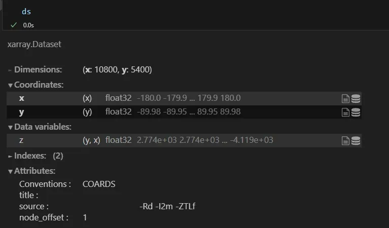
图1 海拔高度数据 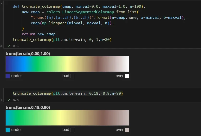
图2 选取的colormap 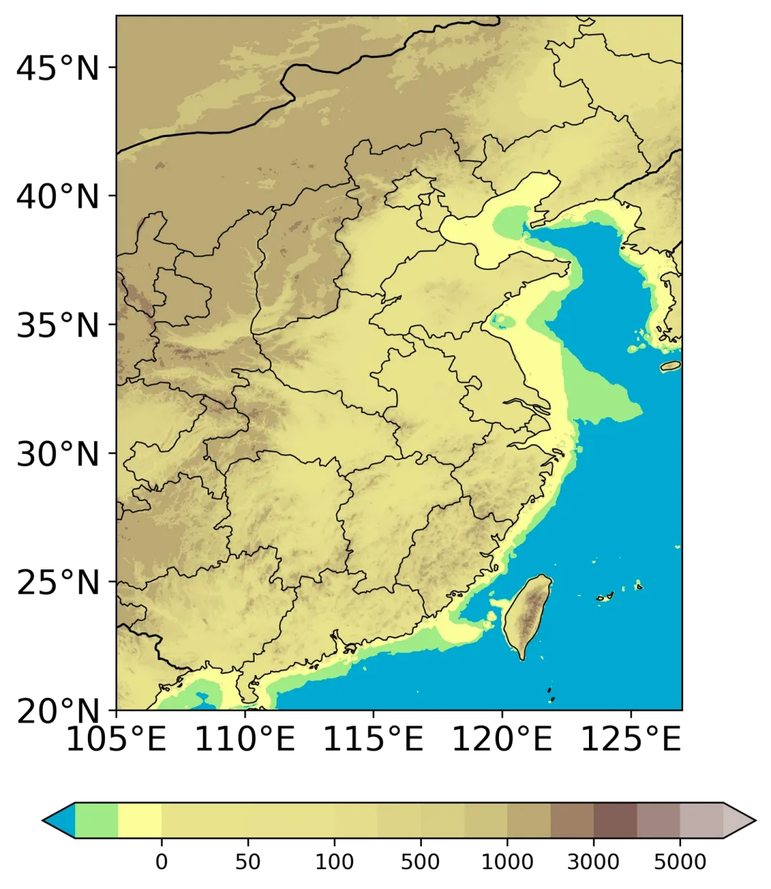
图3 绘图结果1 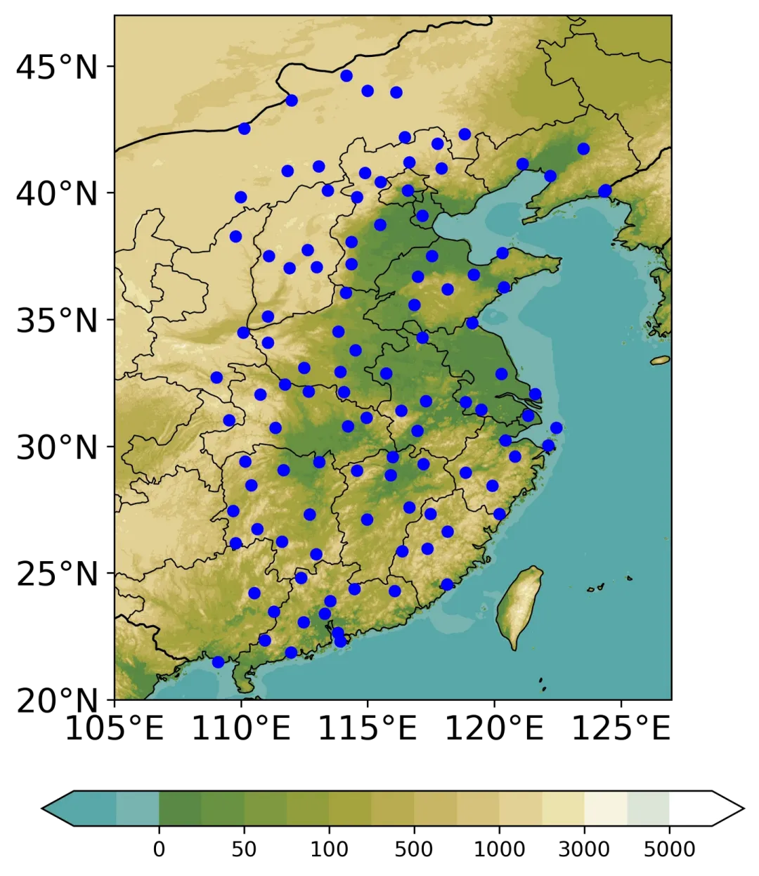
图4 绘图结果2
import matplotlib.colors as colors
def truncate_colormap(cmap, minval=0.0, maxval=1.0, n=100):
new_cmap = colors.LinearSegmentedColormap.from_list(
"trunc({n},{a:.2f},{b:.2f})".format(n=cmap.name, a=minval, b=maxval),
cmap(np.linspace(minval, maxval, n)),
)
return new_cmap
注:该函数源自网络,具体哪个来源忘了,作者看到可联系
通过使用上述函数可截取colormap的部分片段段,注意范围为0-1,以绘制中国东部地区海拔高度分布为例:
1.数据读取
海拔数据:ETOPO2数据,nc文件具体下载目前没搞懂
import numpy as np
import pandas as pd
import matplotlib.pyplot as plt
importcartopy.crs as ccrs
import cartopy.feature as cfeature
import matplotlib.colors as mcolors
from cartopy.mpl.ticker import LongitudeFormatter, LatitudeFormatter
importxarrayas xr
import matplotlib.colors as colors
# 读取全球地形数据
ds = xr.open_dataset('ETOPO2v2c_f4.nc')
dem = ds.z.values
lon = ds.x.values
lat = ds.y.values
2.colormap截取
第一个为完整的colormap,第二个为要选取的colormap
truncate_colormap(plt.cm.terrain, 0.18, 0.9,n=80)
3.绘图部分
# 绘图
fig, ax = plt.subplots(1, 1, figsize=(6,8), dpi=300, subplot_kw={'projection': ccrs.PlateCarree()})
extent = [105, 127, 20, 47]
proj = ccrs.PlateCarree(central_longitude=0)
##填色
lev = [-50,-25, 0, 25, 50, 75, 100, 300, 500, 700, 1000,2000, 3000,4000, 5000,6000]
tick = [0, 50, 100, 500, 1000, 3000, 5000]
C = ax.contourf(lon, lat, dem, transform= proj, cmap=truncate_colormap(plt.cm.terrain, 0.18, 0.9,n=80), extend='both', zorder=1,
norm = mcolors.TwoSlopeNorm(vmin=-100, vmax = 6000, vcenter=0),
levels= lev)
fig.colorbar(C, ax=ax, location='bottom', shrink=1, extend= 'both',ticks= tick,pad=0.1)
# 设置地图属性
ax.set_extent(extent, crs=ccrs.PlateCarree())
states_provinces = cfeature.NaturalEarthFeature(
category='cultural',
name='admin_1_states_provinces_lines',
scale='50m',
facecolor='none')
ax.add_feature(states_provinces, edgecolor='k',linewidth= 0.6, zorder= 2)
ax.add_feature(cfeature.COASTLINE.with_scale('50m'), linewidth= 0.6, zorder= 2)
ax.add_feature(cfeature.BORDERS, linestyle='-',linewidth= 1,zorder= 2)
##设置网格属性
ax.set_xticks([105,110,115,120,125])
ax.set_yticks(np.arange(20,50,5))
ax.tick_params(labelsize= 16)
ax.xaxis.set_major_formatter(LongitudeFormatter(zero_direction_label= True))
ax.yaxis.set_major_formatter(LatitudeFormatter())
结果相较于NCL色阶还是丑了一些,不怕繁琐的同学也可尝试cv NCL的色阶,这里加上了要研究的站点,可忽略,颜色看起来舒服多咯:
lev = [-50,-25, 0, 25, 50, 75, 100, 300, 500, 700, 1000,2000, 3000,4000, 5000,6000]
color = ['#58A8A9','#78B4B0','#598944','#6A9142','#7F9840','#929E3D','#A5A43F',
'#B8AC50','#C8B665','#D7C27C','#E2D194','#EDE2AE','#F7F4DF','#DDE5D7','#FFFFFF']
tick = [0, 50, 100, 500, 1000, 3000, 5000]
C = ax.contourf(lon, lat, dem, transform= proj, colors=color, extend='both', zorder=1,
norm = mcolors.TwoSlopeNorm(vmin=-100, vmax = 6000, vcenter=0),
levels= lev)
————————————————
版权声明:本文为知乎博主「momo」的原创文章,转载请附上原文出处链接及本声明。
原文链接:https://zhuanlan.zhihu.com/p/699465671
本文来自网友投稿或网络内容,如有侵犯您的权益请联系我们删除,联系邮箱:wyl860211@qq.com 。

