Python绘制高颜值森林图
- 2026-07-01 11:28:44
Python绘制高颜值森林图

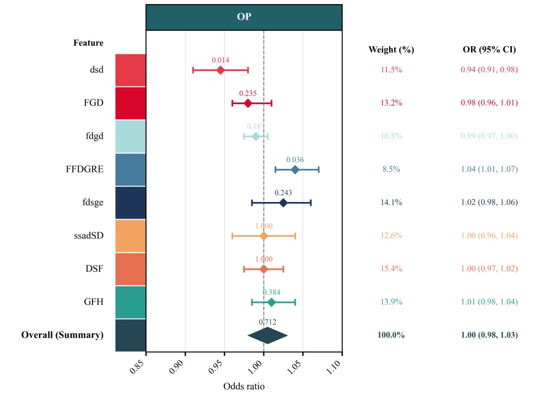
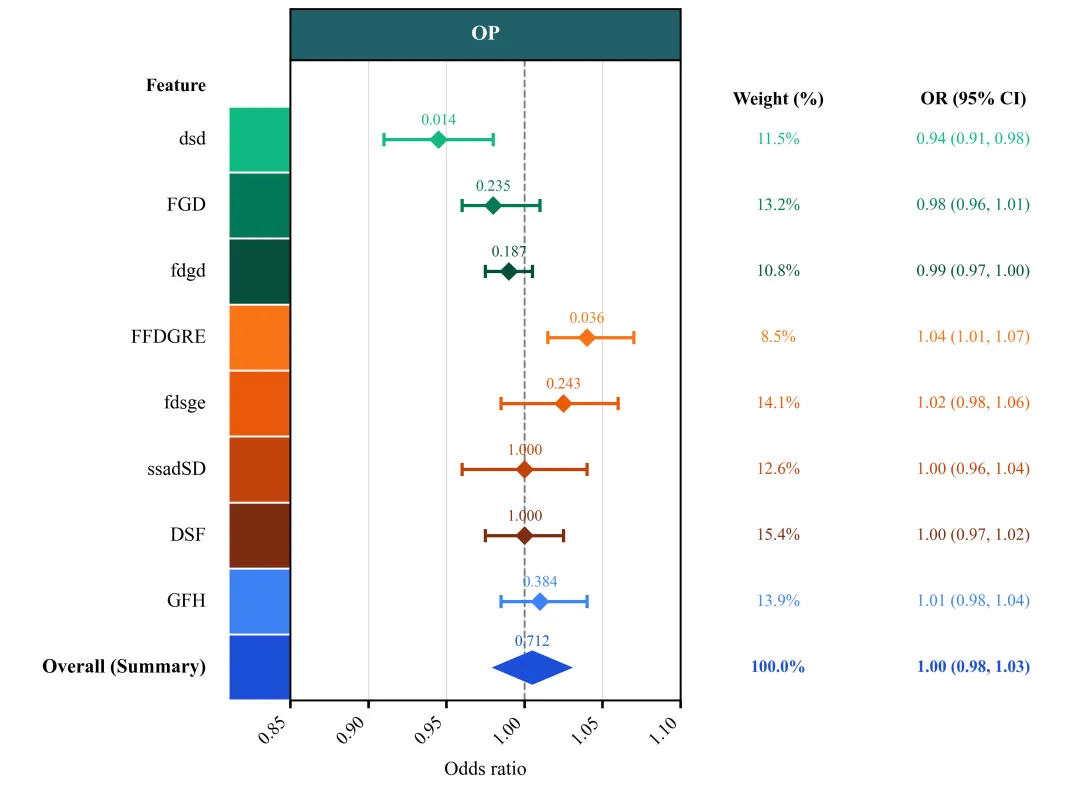
绘图结果 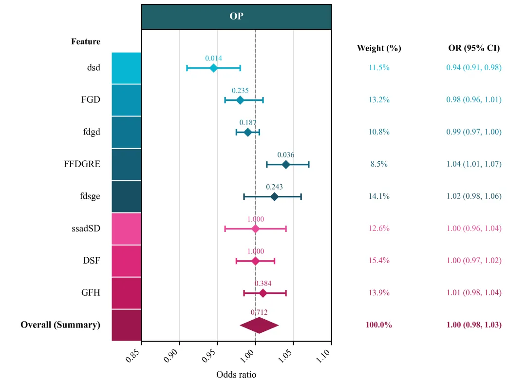
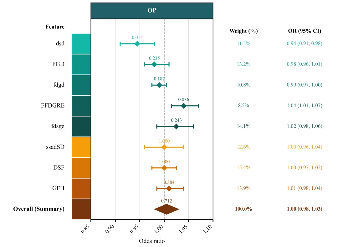
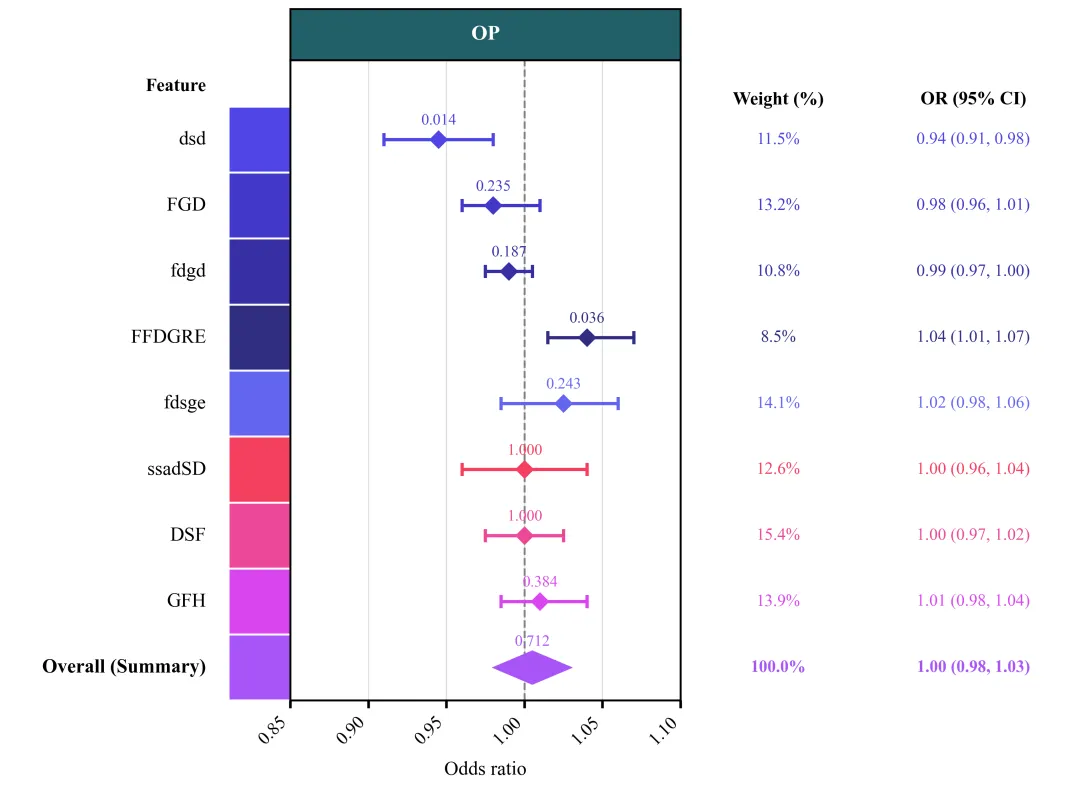
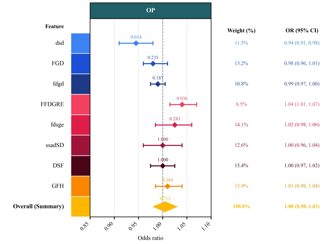
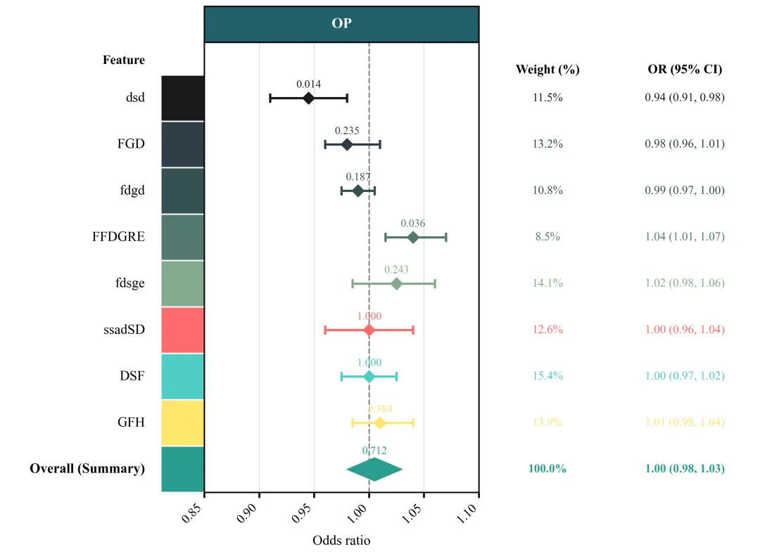
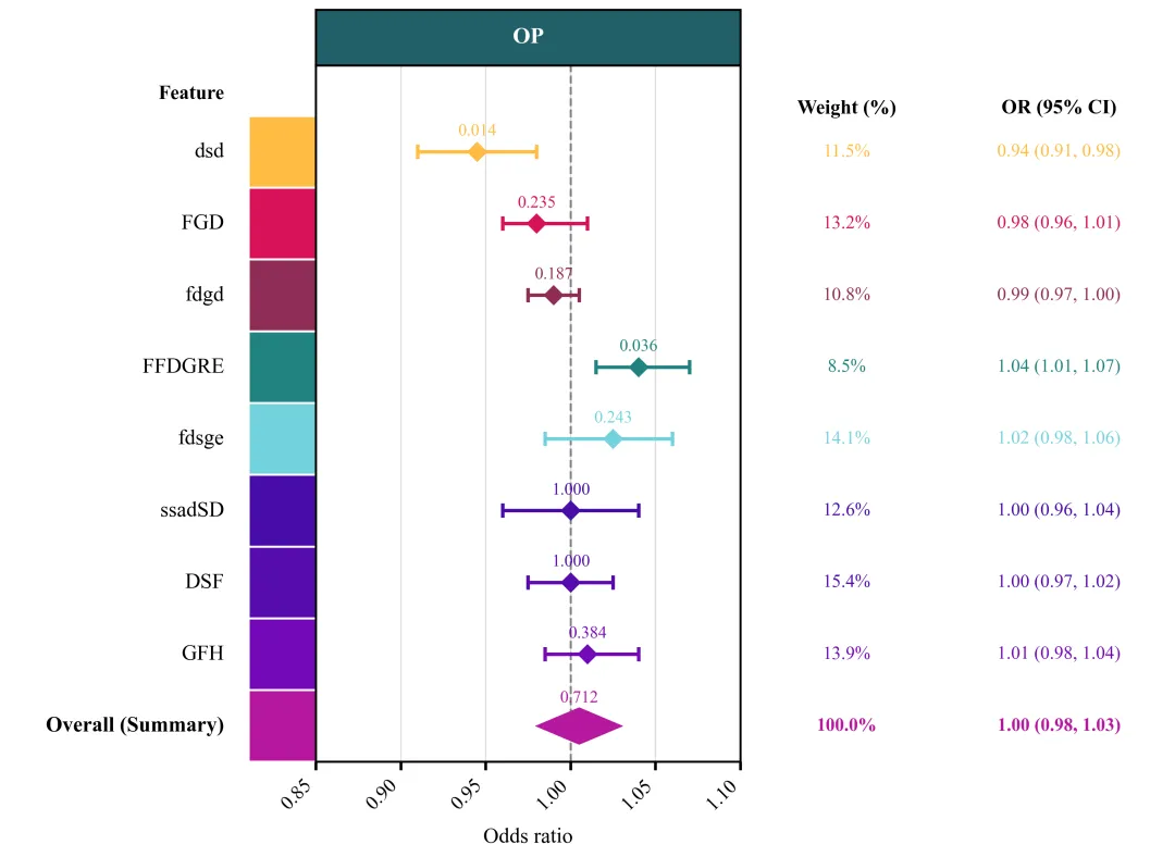
多种配色 


库的导入以及字体设置 

设置颜色库 

绘图函数:创建画布,子图布局设计 

绘图函数:绘制中间森林图主体 

绘图函数:主图坐标轴、网格线、表头、边框等细节设置 

绘图函数:主图左侧的名称标注设置,色块绘制 

绘图函数:绘制主图右侧的数据子图 

执行部分 


期刊图片复现|Python绘制二维偏依赖PDP图 期刊复现|python绘制基于SHAP分析和GAM模型拟合的单特征依赖图 期刊图片复现|python绘制带有渐变颜色shap特征重要性组合图(条形图+蜂巢图) 期刊复现|用Python绘制SHAP特征重要性总览图、依赖图、双特征交互效应SHAP图,解锁XGBoost模型的终极奥秘 期刊图片复现|Python绘制shap重要性蜂巢图+单特征依赖图+交互效应强度气泡图+交互效应依赖图(回归+二分类+分类) 

公众号中的所有所有的免费代码都已经下架了,都并入到付费部分里了,付费合集代码和数据的购买通道已经开通,全部合集100元,后续将会持续更新,决定购买请后台私信我,注意只会分享练习数据和代码文件,不会提供答疑服务,代码文件中已经包含了每行代码的完整注释,购买前请确保真的需要!!!
代码绘制成果展示
代码解释
第一部分
# =========================================================================================# ====================================== 1. 环境设置 =======================================# =========================================================================================import matplotlibimport matplotlib.pyplot as pltimport numpy as npimport pandas as pdimport matplotlib.patches as patchesplt.rcParams['font.family'] = 'serif'plt.rcParams['font.serif'] = ['Times New Roman']plt.rcParams['axes.unicode_minus'] = Falsematplotlib.rcParams['pdf.fonttype'] = 42matplotlib.rcParams['ps.fonttype'] = 42
第二部分
# =========================================================================================# ======================================2.颜色库=======================================# =========================================================================================COLOR_SCHEMES = {1: ['#f05c6a', '#e27d60', '#f49692', '#cc5c76', '#7b3e55', '#287884', '#f5b067', '#f77c5c', '#4682B4'],}
第三部分
# =========================================================================================# ======================================3.绘图函数=======================================# =========================================================================================def plot_advanced_forest_chart(df, scheme_id):selected_colors = COLOR_SCHEMES[scheme_id]#提取配色方案num_rows = len(df) #获取行y_pos = np.arange(num_rows, 0, -1) #创建y轴坐标#创建画布fig = plt.figure(figsize=(11.5, 8.5))#配置画布的网格布局gs = fig.add_gridspec(1, #行3, #列# 设置3个子图的宽度比例:左侧特征名列宽比为1.8width_ratios=[1.8,2.5,2.5],wspace=0) #横向间距ax_label = fig.add_subplot(gs[0]) #创建左侧子图ax_forest = fig.add_subplot(gs[1]) #创建中间子图ax_text = fig.add_subplot(gs[2]) #创建右侧子图ylim_min, ylim_max = 0.5, num_rows + 1.2 #y轴范围#遍历子图for ax in [ax_label, ax_forest, ax_text]:ax.set_ylim(ylim_min, ylim_max) #设置y轴范围
第四部分
#绘制森林图垂直线ax_forest.axvline(x=1.00, #xcolor='gray', #颜色linestyle='--', #线型linewidth=1.5, #线宽zorder=1) #层val_text = str(df['P_Value'].iloc[i]) #P值is_summary = df.get('Is_Summary', pd.Series([0] * num_rows)).iloc[i] #汇总行标识color = selected_colors[i % len(selected_colors)] #循环取出对应的颜色#汇总数据#其他数据else:xerr = [[or_v - lower], [upper - or_v]] #OR值与置信区间上下限的负向和正向误差距离ax_forest.errorbar(x=or_v, #xy=y, #yxerr=xerr, #横向误差区间fmt='D', #中心点形状color=color, #误差线颜色capsize=5, #误差线两端帽线长度elinewidth=2.5, #误差线粗细capthick=2.5, #误差线两端帽线粗细markersize=9, #中心标记大小zorder=3) #层
第五部分
ax_forest.set_xlim(0.85, 1.10) #x轴范围xticks = [0.85, 0.90, 0.95, 1.00, 1.05, 1.10] #x轴刻度标注ax_forest.set_xticks(xticks) #设置标注ax_forest.set_xticklabels([f"{val:.2f}" for val in xticks], #格式化文本rotation=45, #旋转ha='right', #水平fontsize=14) #大小#网格线ax_forest.grid(True, #开启axis='both', #x、ycolor='#e0e0e0', #颜色linestyle='-', #线型linewidth=1, #粗细zorder=0) #层#表头ax_forest.text(0.5, #x1.04, #y'OP', #文本transform=ax_forest.transAxes, #坐标系ha='center', #水平va='center', #垂直color='white', #文本颜色fontsize=16, #大小fontweight='bold') #加粗#设置边框粗细for spine in ax_forest.spines.values():spine.set_linewidth(1.5)
第六部分
ax_label.set_xlim(0, 1) #x轴范围ax_label.axis('off') #去掉左侧坐标轴线、刻度以及背景框ax_label.text(0.70, #xnum_rows + 0.8, #y'Feature', #文本ha='right', #水平va='center', #垂直fontweight='bold', #加粗fontsize=14) #字体大小ax_label.text(0.70, #xy, label, #yha='right', #水平va='center', #垂直居fontsize=15, #大小fontweight=fw) #样式 #填充色edgecolor='white', #边框线色linewidth=1.5) #边框线粗细ax_label.add_patch(rect) #添加到图上
第七部分
ax_text.set_xlim(0, 1) #设置右侧子图的x轴范围ax_text.axis('off') #去掉坐标轴线、刻度以及背景框#文本标题ax_text.text(0.25, #xnum_rows + 0.6, #y'Weight (%)', #文本ha='center', #水平va='center', #垂直fontweight='bold', #加粗fontsize=14) #大小ax_text.text(0.75, #xnum_rows + 0.6, #y'OR (95% CI)', #文本ha='center', #水平va='center', #垂直fontweight='bold', #加粗fontsize=14) #大小#权重文本ax_text.text(0.25, #xy, #yweight, #文本ha='center', #水平va='center', #垂直fontsize=13, #字体大小fontweight=fw, #样式color=color) #颜色#OR值及置信区间文本ax_text.text(0.75, #xy, #yci_text, #文本ha='center', #水平va='center', #垂直fontsize=13, #字体大小fontweight=fw, # 样式color=color) #颜色
第八部分
# =========================================================================================# ======================================4.执行部分=======================================# =========================================================================================if __name__ == "__main__":excel_path = r'data.xlsx' #原始数据df_real = pd.read_excel(excel_path, dtype={'P_Value': str, 'Weight': str}) #读取数据else:scheme_id = 1print('正在绘制并保存方案:', scheme_id)plot_advanced_forest_chart(df_real, scheme_id)
如何应用到你自己的数据
1.设置原始数据的保存路径,执行部分:
excel_path = r'data.xlsx' #原始数据2.设置是否要进行批量绘图,执行部分:
plot_all = True3.设置绘图结果的保存地址,绘图函数部分:
plt.savefig(fr'scheme_{scheme_id}.png', dpi=300, bbox_inches='tight')推荐
获取方式
本文来自网友投稿或网络内容,如有侵犯您的权益请联系我们删除,联系邮箱:wyl860211@qq.com 。
随机文章
-
 10个月宝宝每天需要喝多少奶粉?
- Linux内核再曝Fragnesia提权漏洞CVE-2026-46300:一行命令即可提权Root
- 一图详解顶级Python模块
- Python实现XGBoost回归+SHAP,科研首选算法
- sumy,一个轻巧的 Python 库
- 总听Linux内核更新升级,Windows怎么闷声不响!
- Python-12-Numpy
- Python全栈课程资源整理分享:免费下载、网盘获取,零基础也能入门到实战
- Java/Python/Node.js 等应用进程内存与线程管理
- 过来人建议,学Python可以自学,但不能乱学
- 资源分享:Python全课栈程【自用整理】从入门到全栈开发全套教程免费获取
