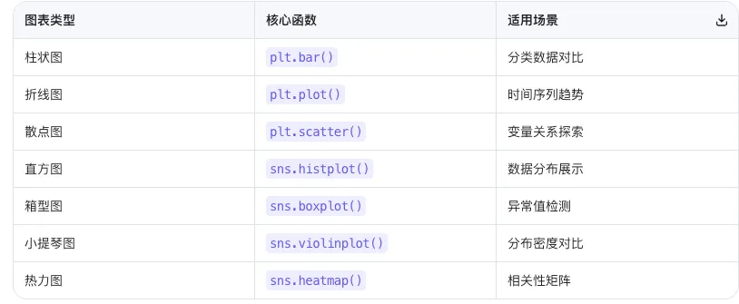
今天我们迎来数据分析的"颜值担当"——数据可视化!掌握 Matplotlib 和 Seaborn,你就能将枯燥的数字转化为直观的图表,让数据趋势、分布和关系一目了然,真正让数据"开口说话"!Matplotlib 基础绘图:可视化的"瑞士军刀"
Matplotlib 是 Python 最基础的绘图库,功能强大、灵活可控,是数据可视化的基石。
环境配置(避免中文乱码)
import matplotlibmatplotlib.use('TkAgg') # 或 'Qt5Agg',根据系统选择import matplotlib.pyplot as pltimport pandas as pdimport numpy as np# 🎯 关键设置:支持中文显示plt.rcParams['font.sans-serif'] = ['SimHei', 'Arial Unicode MS', 'DejaVu Sans'] # 中文字体plt.rcParams['axes.unicode_minus'] = False # 解决负号显示问题
💡 字体选择:Windows 用 'SimHei',Mac 用 'Arial Unicode MS',Linux 用 'DejaVu Sans' 柱状图:对比分类数据
# 创建示例数据df = pd.DataFrame({ 'Year': [2017, 2018, 2019, 2020, 2021], 'Sales': [150, 200, 250, 300, 350]})# 绘制柱状图plt.figure(figsize=(10, 5)) # 设置画布大小(英寸)plt.bar(df['Year'], df['Sales'], color='skyblue', # 柱子颜色 edgecolor='navy', # 边框颜色 alpha=0.8) # 透明度plt.title('年度销售额趋势', fontsize=16, fontweight='bold')plt.xlabel('年份', fontsize=12)plt.ylabel('销售额(万元)', fontsize=12)plt.xticks(rotation=45) # 旋转x轴标签plt.grid(axis='y', alpha=0.3) # 仅显示y轴网格plt.tight_layout() # 自动调整布局plt.show()
美化技巧:
figsize=(宽, 高) 控制图形大小alpha 控制透明度(0-1)edgecolor 添加边框增强立体感tight_layout() 防止标签被裁剪
折线图:展示时间序列趋势
# 创建月度气温数据df_line = pd.DataFrame({ 'Month': ['1月', '2月', '3月', '4月', '5月', '6月'], 'Temperature': [30, 32, 35, 28, 25, 30]})plt.figure(figsize=(10, 5))plt.plot(df_line['Month'], df_line['Temperature'], marker='o', # 数据点标记 markersize=8, # 标记大小 linestyle='-', # 线型 linewidth=2, # 线宽 color='orange', label='月均气温')plt.title('月度气温变化趋势', fontsize=16, fontweight='bold')plt.xlabel('月份', fontsize=12)plt.ylabel('温度(°C)', fontsize=12)plt.grid(True, alpha=0.3) # 显示网格plt.legend(fontsize=12) # 显示图例plt.tight_layout()plt.show()
📌 常用标记样式:'o'(圆点), 's'(方块), '^'(三角), '*'(星号)散点图:探索变量关系
# 创建销售与广告投入数据df_scatter = pd.DataFrame({ 'Ad_Spend': [10, 15, 20, 25, 30, 35, 40], 'Sales': [150, 200, 250, 300, 350, 380, 420]})plt.figure(figsize=(10, 6))plt.scatter(df_scatter['Ad_Spend'], df_scatter['Sales'], s=100, # 点大小 c='green', # 点颜色 alpha=0.6, edgecolors='darkgreen', label='销售数据')# 添加趋势线z = np.polyfit(df_scatter['Ad_Spend'], df_scatter['Sales'], 1)p = np.poly1d(z)plt.plot(df_scatter['Ad_Spend'], p(df_scatter['Ad_Spend']), "r--", linewidth=2, label='趋势线')plt.title('广告投入与销售额关系', fontsize=16, fontweight='bold')plt.xlabel('广告投入(万元)', fontsize=12)plt.ylabel('销售额(万元)', fontsize=12)plt.legend()plt.grid(True, alpha=0.3)plt.tight_layout()plt.show()
💡 趋势线解读:红色虚线显示正相关关系,广告投入增加,销售额同步增长。Seaborn 高级绘图:统计可视化的"利器"
Seaborn 基于 Matplotlib 构建,提供更简洁的接口和更美观的默认样式,特别适合统计图表。分布图:理解数据分布特征
import seaborn as sns# 生成正态分布数据np.random.seed(42)data_normal = np.random.normal(loc=0, scale=1, size=1000)# 设置Seaborn样式sns.set_style("whitegrid") # 白色网格背景sns.set_palette("husl") # 调色板plt.figure(figsize=(10, 6))sns.histplot(data_normal, bins=30, # 柱子数量 kde=True, # 显示核密度估计曲线 color='blue', alpha=0.6)plt.title('正态分布数据直方图', fontsize=16, fontweight='bold')plt.xlabel('数值', fontsize=12)plt.ylabel('频数', fontsize=12)plt.tight_layout()plt.show()
📊 KDE曲线作用:平滑显示数据分布密度,比直方图更直观反映整体分布形态。箱型图:识别异常值与分布
# 创建分类数据df_box = pd.DataFrame({ 'Category': ['A组'] * 50 + ['B组'] * 50 + ['C组'] * 50, 'Value': np.concatenate([ np.random.normal(10, 2, 50), np.random.normal(15, 3, 50), np.random.normal(12, 1.5, 50) ])})plt.figure(figsize=(10, 6))sns.boxplot(x='Category', y='Value', data=df_box, palette='Set2', # 配色方案 width=0.5, # 箱子宽度 showfliers=True) # 显示异常值plt.title('不同类别数据分布对比(箱型图)', fontsize=16, fontweight='bold')plt.xlabel('类别', fontsize=12)plt.ylabel('数值', fontsize=12)plt.grid(True, alpha=0.3)plt.tight_layout()plt.show()
🔍 箱型图解读:
- 箱体:中间50%数据范围(25%-75%分位数)
- 中线:中位数
- 须线:最小/最大值(排除异常值)
- 圆点:异常值(超出1.5倍四分位距)
🔹 小提琴图:分布密度的"艺术呈现
plt.figure(figsize=(10, 6))sns.violinplot(x='Category', y='Value', data=df_box, palette='pastel', inner='box') # 内部显示箱型图plt.title('不同类别数据分布对比(小提琴图)', fontsize=16, fontweight='bold')plt.xlabel('类别', fontsize=12)plt.ylabel('数值', fontsize=12)plt.grid(True, alpha=0.3)plt.tight_layout()plt.show()
🎻 优势:结合箱型图和密度图,既显示统计量又展示完整分布形态。🔹 热力图:相关性矩阵可视化
# 创建多变量数据df_corr = pd.DataFrame({ '销售额': [100, 150, 200, 250, 300], '广告投入': [10, 15, 20, 25, 30], '客户数': [50, 70, 90, 110, 130], '利润': [30, 45, 60, 75, 90]})# 计算相关系数矩阵corr_matrix = df_corr.corr()plt.figure(figsize=(8, 6))sns.heatmap(corr_matrix, annot=True, # 显示数值 cmap='RdYlGn', # 红黄绿配色 center=0, # 中心值 square=True, # 正方形格子 linewidths=0.5, # 格子间距 cbar_kws={"shrink": .8}) # 颜色条缩放plt.title('变量相关性热力图', fontsize=16, fontweight='bold')plt.tight_layout()plt.show()
🌈 颜色解读:红色=正相关,绿色=负相关,黄色=无相关,数值越接近±1相关性越强。多图布局:专业报告的"标配"
实际分析中,经常需要在一张图中展示多个子图,提升信息密度和对比效果。# 创建示例数据np.random.seed(42)dates = pd.date_range('2024-01-01', periods=30, freq='D')df_multi = pd.DataFrame({ 'Date': dates, 'Sales': np.random.randint(100, 300, 30) + np.sin(np.arange(30)/5)*50, 'Profit': np.random.randint(30, 100, 30), 'Customers': np.random.randint(20, 80, 30)})# 创建 2x2 子图布局fig, axes = plt.subplots(2, 2, figsize=(12, 10))fig.suptitle('销售数据综合分析', fontsize=20, fontweight='bold')# 子图1:销售额趋势(折线图)axes[0, 0].plot(df_multi['Date'], df_multi['Sales'], color='blue', linewidth=2)axes[0, 0].set_title('销售额趋势', fontsize=14)axes[0, 0].tick_params(axis='x', rotation=45)# 子图2:利润分布(直方图)axes[0, 1].hist(df_multi['Profit'], bins=10, color='green', alpha=0.7, edgecolor='black')axes[0, 1].set_title('利润分布', fontsize=14)# 子图3:销售额vs客户数(散点图)axes[1, 0].scatter(df_multi['Customers'], df_multi['Sales'], alpha=0.6, color='orange')axes[1, 0].set_xlabel('客户数', fontsize=12)axes[1, 0].set_ylabel('销售额', fontsize=12)axes[1, 0].set_title('客户数与销售额关系', fontsize=14)# 子图4:三类数据箱型图data_box = [df_multi['Sales'], df_multi['Profit'], df_multi['Customers']]axes[1, 1].boxplot(data_box, labels=['销售额', '利润', '客户数'])axes[1, 1].set_title('数据分布对比', fontsize=14)plt.tight_layout()plt.show()
📐 布局技巧:
plt.subplots(n行, n列) 创建网格布局fig.suptitle() 设置总标题axes[i, j] 访问第i行第j列的子图tight_layout() 自动调整间距
⚠️ 核心避坑指南
综合实战:销售数据可视化仪表盘
将今日知识点串联,模拟真实业务场景:
import matplotlibmatplotlib.use('TkAgg')import matplotlib.pyplot as pltimport pandas as pdimport numpy as npimport seaborn as sns# 1. 构造业务数据np.random.seed(42)n_days = 60dates = pd.date_range('2024-01-01', periods=n_days, freq='D')df_viz = pd.DataFrame({ 'Date': dates, 'Region': np.random.choice(['华东', '华南', '华北', '华西'], n_days), 'Product': np.random.choice(['产品A', '产品B', '产品C'], n_days), 'Sales': np.random.randint(100, 500, n_days) + np.sin(np.arange(n_days)/10)*100, 'Profit': np.random.randint(30, 150, n_days), 'Customers': np.random.randint(20, 100, n_days)})# 2. 设置样式sns.set_style("whitegrid")plt.rcParams['font.sans-serif'] = ['SimHei']plt.rcParams['axes.unicode_minus'] = False# 3. 创建综合仪表盘fig = plt.figure(figsize=(14, 10))fig.suptitle('📊 销售数据可视化仪表盘', fontsize=20, fontweight='bold', y=0.98)# 子图1:销售趋势(折线图)ax1 = plt.subplot(2, 3, 1)df_daily = df_viz.groupby('Date')['Sales'].sum().reset_index()plt.plot(df_daily['Date'], df_daily['Sales'], color='#1f77b4', linewidth=2)plt.title('日销售额趋势', fontsize=14, fontweight='bold')plt.xticks(rotation=45)plt.ylabel('销售额(元)')# 子图2:区域销售占比(饼图)ax2 = plt.subplot(2, 3, 2)region_sales = df_viz.groupby('Region')['Sales'].sum()colors = plt.cm.Set3(np.linspace(0, 1, len(region_sales)))plt.pie(region_sales, labels=region_sales.index, autopct='%1.1f%%', colors=colors, startangle=90)plt.title('区域销售占比', fontsize=14, fontweight='bold')# 子图3:产品销售分布(柱状图)ax3 = plt.subplot(2, 3, 3)product_sales = df_viz.groupby('Product')['Sales'].mean()plt.bar(product_sales.index, product_sales.values, color=['#ff7f0e', '#2ca02c', '#d62728'], alpha=0.8)plt.title('产品平均销售额', fontsize=14, fontweight='bold')plt.ylabel('平均销售额(元)')# 子图4:销售额分布(直方图+KDE)ax4 = plt.subplot(2, 3, 4)sns.histplot(df_viz['Sales'], bins=15, kde=True, color='#9467bd')plt.title('销售额分布', fontsize=14, fontweight='bold')plt.xlabel('销售额(元)')# 子图5:利润vs客户数(散点图)ax5 = plt.subplot(2, 3, 5)plt.scatter(df_viz['Customers'], df_viz['Profit'], alpha=0.6, c='#17becf', s=50)plt.title('客户数与利润关系', fontsize=14, fontweight='bold')plt.xlabel('客户数')plt.ylabel('利润(元)')# 子图6:区域×产品热力图ax6 = plt.subplot(2, 3, 6)pivot_data = df_viz.pivot_table(values='Sales', index='Region', columns='Product', aggfunc='sum')sns.heatmap(pivot_data, annot=True, fmt='.0f', cmap='YlOrRd', linewidths=0.5, cbar_kws={'label': '销售额(元)'})plt.title('区域×产品销售额', fontsize=14, fontweight='bold')plt.tight_layout(rect=[0, 0, 1, 0.96]) # 为总标题留空间plt.show()# 4. 输出关键指标print("=" * 50)print("📈 销售数据关键指标")print("=" * 50)print(f"总销售额:¥{df_viz['Sales'].sum():,.0f}")print(f"平均日销售额:¥{df_viz['Sales'].mean():,.0f}")print(f"最高单日销售:¥{df_viz['Sales'].max():,.0f}")print(f"平均利润率:{(df_viz['Profit'].sum() / df_viz['Sales'].sum() * 100):.1f}%")print(f"总客户数:{df_viz['Customers'].sum():,}")print("=" * 50)print(f"\n🏆 最佳销售区域:{region_sales.idxmax()}")print(f"🏆 最受欢迎产品:{product_sales.idxmax()}")
🖥️ 预期输出:
- 6个子图的综合仪表盘,包含趋势、占比、分布、关系等多维度可视化
- 控制台输出关键业务指标,辅助决策
今日知识点
✅ 核心心法:
- Matplotlib 灵活可控,适合定制复杂图表
- Seaborn 简洁美观,适合快速统计可视化
- 多图布局 用
plt.subplots(),专业报告必备 - 中文显示 必须设置字体,否则全是方框□
- 配色方案 用
sns.color_palette() 或 cmap 参数,避免"彩虹色灾难"
【一起学Python】每天进步一点点,365天后遇见更优秀的自己!
🎯 今日金句:"一图胜千言,数据可视化让洞察触手可及;一码绘万象,图表之美在于简洁与深刻。"