期刊图片复现|Python绘制SHAP交互作用与依赖趋势图
- 2026-06-28 03:22:49
期刊图片复现|Python绘制SHAP交互作用与依赖趋势图

论文:Urban-rural differences in the nonlinear individual and interactive effects of blue-green space landscape patterns on carbon sequestration 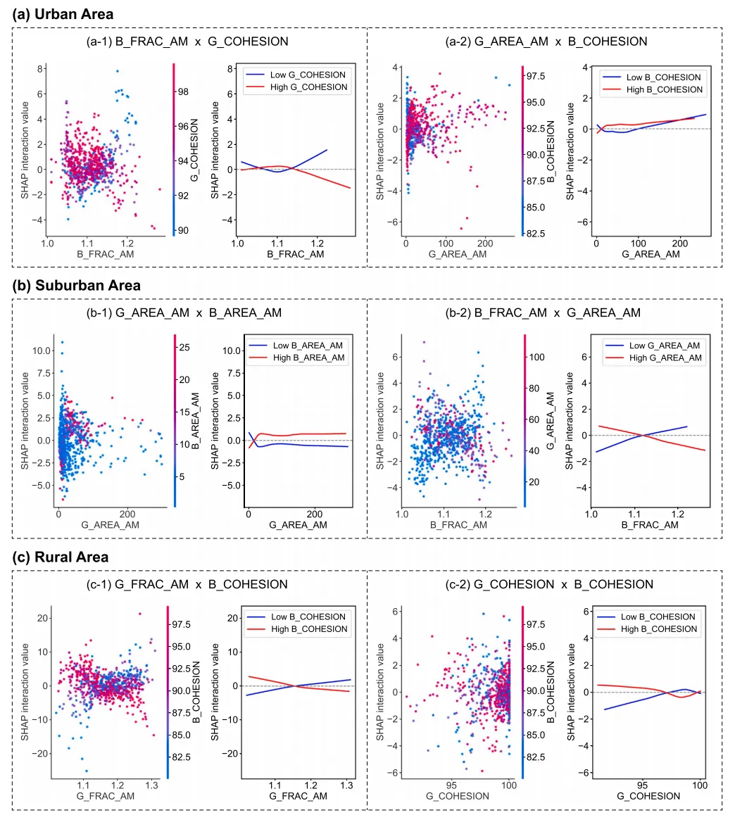
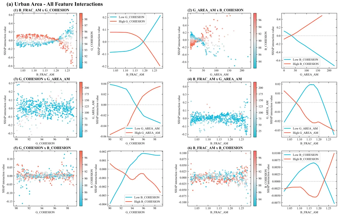
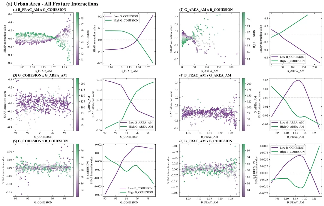
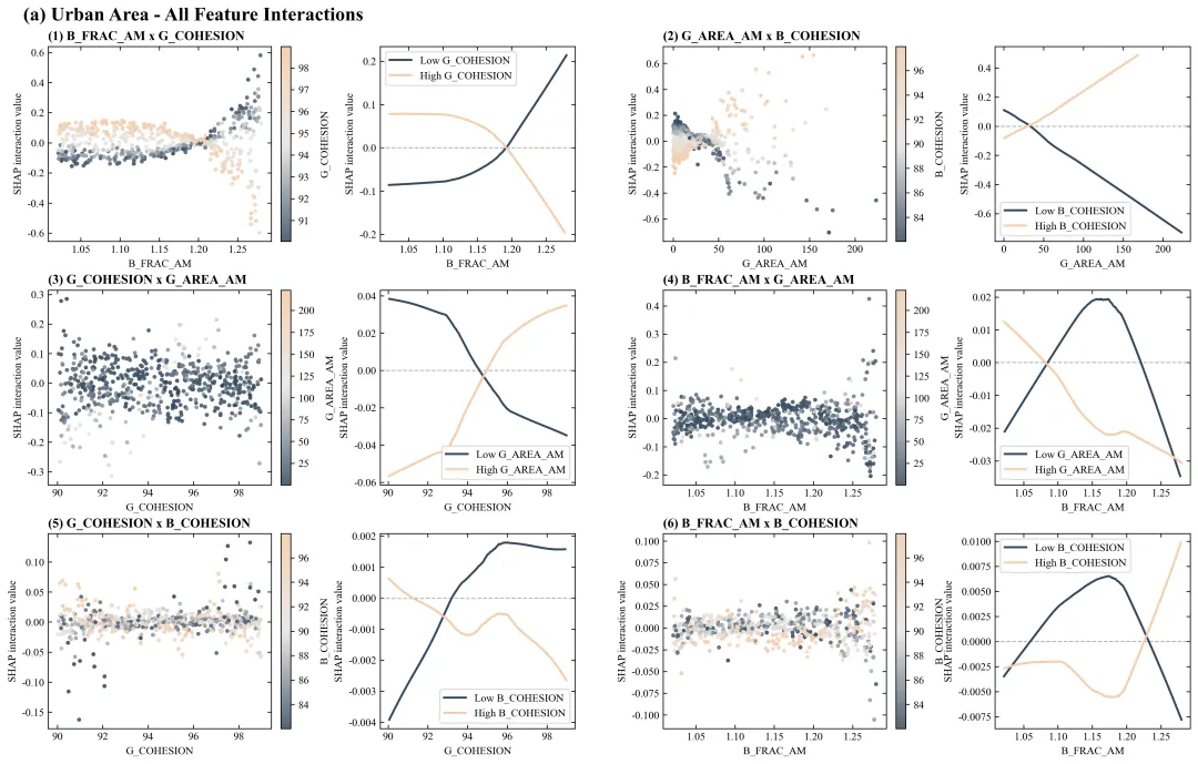
论文原图 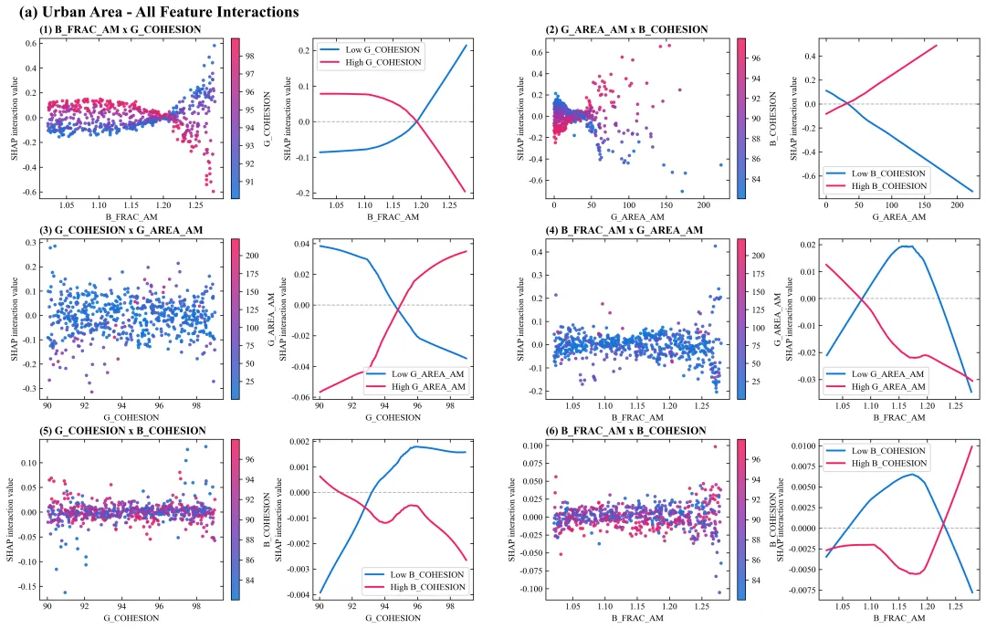
仿图 此图展示了不同变量两两组合时的非线性SHAP交互效应。图中每个子图内部均由左右两部分构成:左侧为散点图,其横轴代表某一主特征的具体数值,纵轴代表SHAP交互值,图中数据点的颜色映射了与之交互的另一个副特征的数值大小,颜色代表数值由低到高;右侧为对应的局部平滑拟合曲线图,分别绘制了代表副特征处于高值和低值两类不同群体状态下的交互作用变化趋势曲线。整张图表将散点分布的微观离散状态与高低分组曲线的宏观演变趋势相结合,直观地揭示了多种特征在协同作用于预测目标时所产生的复杂依赖关系与交叉反转特征。 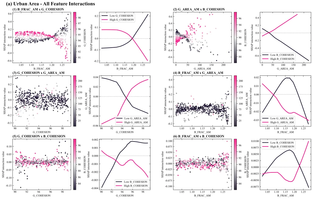
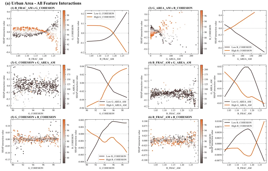
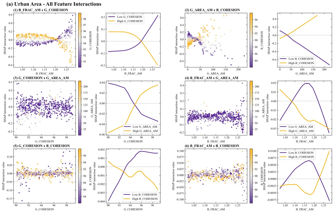
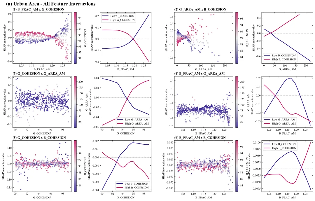
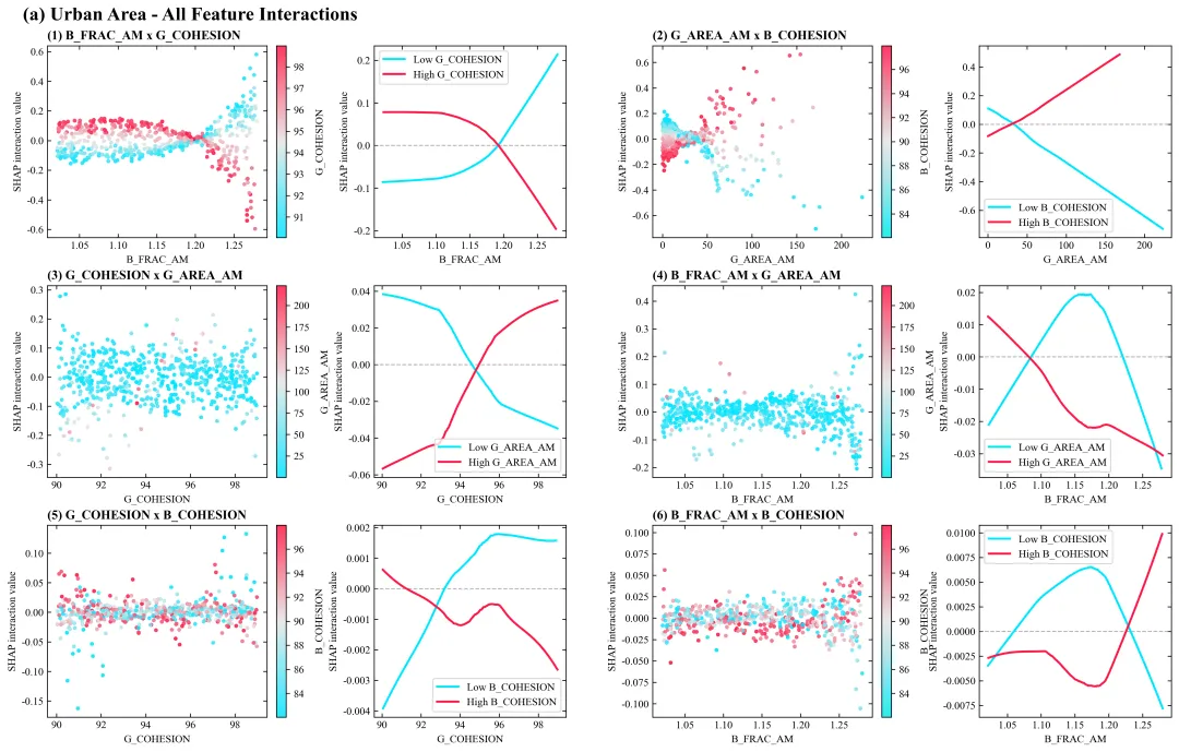
多种配色 


库的导入以及字体设置 

设置颜色库 

绘图函数:初始化画布与布局设置 

绘图函数:绘制散点图 

绘图函数:绘制拟合线图 

绘图函数:图框设置、刻度线设置、布局调整、绘图结果保存 

执行部分:数据读取与模型拟合 

执行部分:计算SHAP值并提取重要交互特征 

执行部分:绘图 


期刊图片复现|Python绘制二维偏依赖PDP图 期刊复现|python绘制基于SHAP分析和GAM模型拟合的单特征依赖图 期刊图片复现|python绘制带有渐变颜色shap特征重要性组合图(条形图+蜂巢图) 期刊复现|用Python绘制SHAP特征重要性总览图、依赖图、双特征交互效应SHAP图,解锁XGBoost模型的终极奥秘 期刊图片复现|Python绘制shap重要性蜂巢图+单特征依赖图+交互效应强度气泡图+交互效应依赖图(回归+二分类+分类) 

公众号中的所有所有的免费代码都已经下架了,都并入到付费部分里了,付费合集代码和数据的购买通道已经开通,全部合集100元,后续将会持续更新,决定购买请后台私信我,注意只会分享练习数据和代码文件,不会提供答疑服务,代码文件中已经包含了每行代码的完整注释,购买前请确保真的需要!!!
代码绘制成果展示
代码解释
第一部分
# =========================================================================================# ====================================== 1. 环境设置 =======================================# =========================================================================================import numpy as npimport pandas as pdimport matplotlib.pyplot as pltimport matplotlib.gridspec as gridspecfrom matplotlib.colors import LinearSegmentedColormap
第二部分
# =========================================================================================# ======================================2.颜色库============================================# =========================================================================================COLOR_SCHEMES = {1: ['#1075d9', '#8c3cb4', '#f61c5d'],}
第三部分
# =========================================================================================# ======================================3.绘图函数============================================# =========================================================================================def plot_advanced_forest_chart(df_real, combos, scheme_id):selected_hex_colors = COLOR_SCHEMES[scheme_id] #提取配色方案#创建画布fig = plt.figure(figsize=(16, 10))#生成渐变色cmap_custom = LinearSegmentedColormap.from_list(f"shap_cmap_{scheme_id}", selected_hex_colors, N=256)lowess = sm.nonparametric.lowess #LOWESS局部加权回归函数
第四部分
#遍历特征对for idx, (f1, f2) inenumerate(combos):row = idx // 2 #当前特征对应该画在第几行col_offset = (idx % 2) * 2 #列ax_scatter.set_xlabel(f1) #散点图x轴标题ax_scatter.set_ylabel("SHAP interaction value") #散点图y轴标题#添加颜色条cbar = fig.colorbar(sc, #基于散点图生成颜色条ax=ax_scatter, #轴fraction=0.046, #颜色条占图空间的比例pad=0.04) #与主图间距#颜色条标题cbar.set_label(f2, #文本rotation=90, #旋转labelpad=10) #间隔
第五部分
#折线图0值参考线ax_line.axhline(0, #ycolor="gray", #颜色linestyle="--", #样式linewidth=1, #线宽alpha=0.6) #透明度ax_line.plot(high_curve[:, 0], #xhigh_curve[:, 1], #ycolor=selected_hex_colors[2], #颜色linewidth=2, #线宽label=f"High {f2}") #图例标签ax_line.set_xlabel(f1) #折线图x轴标题ax_line.set_ylabel("SHAP interaction value") #折线图y轴标题ax_line.legend(loc="best", frameon=True, fontsize=10) #图例
第六部分
#遍历子图for ax in [ax_scatter, ax_line]:#边框设置#主标题fig.text(0.02, #x0.99, #y"(a) Urban Area - All Feature Interactions", #文本fontsize=18, #大小fontweight="bold", #加粗va="top",#垂直ha="left")#水平
第七部分
# =================================================================================================# ======================================4.执行部分=====================================================# =================================================================================================if __name__ == '__main__':file_path = r'data.xlsx' #原始数据df = pd.read_excel(file_path) #读取target_col = 'NPP_Target' #目标变量y_target = df[target_col] #取出目标变量df_features = df.drop(columns=[target_col]) #特征数据print(f"R2: {r2:.2f}")print(f"RMSE: {rmse:.2f}")print(f"MAE: {mae:.2f}")print(f"MSE: {mse:.2f}")
第八部分
explainer = shap.TreeExplainer(rf_model) #实例化SHAP树解释器shap_interaction = explainer.shap_interaction_values(df_features) #SHAP交互值df_real = df_features.copy() #复制features = list(df_features.columns) #提取所有特征列名all_combos = list(itertools.combinations(features, 2)) #生成所有两两特征的排列组合interaction_metrics.sort(key=lambda x: x['importance'], reverse=True) #重要性强度排序sorted_combos = [(item['f1'], item['f2']) for item in interaction_metrics] #提取排序后特征组合top_combos = sorted_combos[:6] #重要性排名前6的特征组合
第九部分
#是否批量绘图plot_all = Trueif plot_all:for scheme_id in COLOR_SCHEMES.keys():print(f"正在绘制并保存方案: {scheme_id}")plot_advanced_forest_chart(df_real, top_combos, scheme_id)else:scheme_id = 1print(f"正在绘制并保存方案: {scheme_id}")plot_advanced_forest_chart(df_real, top_combos, scheme_id)
如何应用到你自己的数据
1.设置原始数据的保存路径,执行部分:
file_path = r'\data.xlsx' #原始数据2.定义目标变量,执行部分:
target_col = 'NPP_Target' #目标变量3.设置超参数,执行部分:
param_grid = { 'n_estimators': [50, 100, 150], 'max_depth': [4, 6, 8]}4.设置要绘制前多少组合,执行部分:
top_combos = sorted_combos[:6] #重要性排名前6的特征组合5.设置是否进行批量绘图,执行部分:
plot_all = True6.设置绘图结果的保存地址,绘图函数部分:
plt.savefig(fr'shap_interaction_scheme_{scheme_id}.pdf', bbox_inches='tight')推荐
获取方式
本文来自网友投稿或网络内容,如有侵犯您的权益请联系我们删除,联系邮箱:wyl860211@qq.com 。
随机文章
-
 10个月宝宝每天需要喝多少奶粉?
- linux.do取消小作文审核,满足github时长直接通过
- Python超全电子书合集 | 16本python书籍,看完少走一半弯路
- Python编程学动量自习化:通李信真正波段王底指标源代码
- Python自动化办公|11个实用脚本,告别重复工作
- 掌握Python函数看这篇就够了,从基础到进阶
- 想不到我在python也能用起设计模式
- 用Python+RPA自动完成银行对账:从2小时到8分钟的完整方案
- 会计转行真心发问:SQL和Python值不值得学?
- Python办公自动化连载10:综合实战项目——全自动员工考勤报表系统
- 微软终于低头了!75个Linux命令原生跑在Windows上
