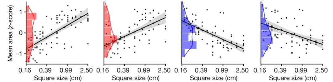
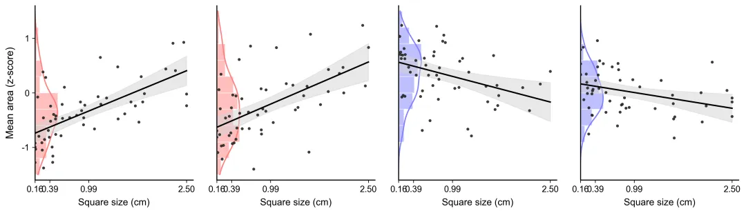
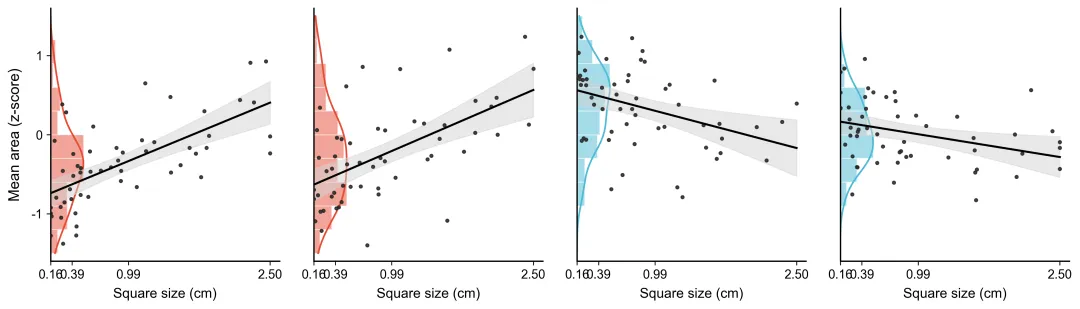
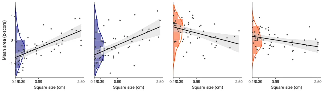
color_schemes = { 1: {"colors": ["#ff7f7f", "#807fff"], "desc": "指定高饱和红蓝方案,适用于强对比度实验对照组"}, 2: {"colors": ["#E64B35", "#4DBBD5"], "desc": "Nature Publishing Group (NPG) 经典红蓝,学术期刊常用高对比色"}, 3: {"colors": ["#BC3C29", "#0072B5"], "desc": "The Journal of American Medical Association (JAMA) 经典深红深蓝"}, 4: {"colors": ["#3C5488", "#F39B7F"], "desc": "Lancet (柳叶刀) 经典蓝橙配色,对色盲群体友好且印刷清晰"}, 5: {"colors": ["#00A087", "#3C5488"], "desc": "Nature Communication 常用深绿与深蓝组合,观感严谨且稳重"}, 6: {"colors": ["#42B540", "#91D1C2"], "desc": "Bioinformatics 常用绿色与淡青色,多用于生物信息学及基因表达"}, 7: {"colors": ["#111E6C", "#990000"], "desc": "Science 杂志风格海军蓝与暗红,适合传统物理与化学领域"}, 8: {"colors": ["#002060", "#EDB120"], "desc": "Cell 杂志高频深蓝与金黄,对比极其强烈,重点突出"}, 9: {"colors": ["#4A6984", "#B8860B"], "desc": "New England Journal of Medicine (NEJM) 经典石板蓝与暗金"}, 10: {"colors": ["#20B2AA", "#FF8C00"], "desc": "IEEE Transactions 常用轻质浅绿与深橙,适合工程与计算机图表"}, 11: {"colors": ["#2F4F4F", "#FF6347"], "desc": "AGU (美国地球物理学会) 暗石板灰与番茄红,兼顾自然和人文感"}, 12: {"colors": ["#1F77B4", "#FF7F0E"], "desc": "Matplotlib (Tab10) 官方推荐经典科技蓝橙,泛用性及高区分度"}, 13: {"colors": ["#2CA02C", "#D62728"], "desc": "传统生物学突变体与野生型对比色,高饱和绿与红"}, 14: {"colors": ["#9467BD", "#8C564B"], "desc": "多因素分析常用柔和紫与棕色,用于区分次要实验组"}, 15: {"colors": ["#17BECF", "#BCBD22"], "desc": "环境科学与生态学常用青色与橄榄绿,色彩贴近自然物象"}, 16: {"colors": ["#4B0082", "#FFD700"], "desc": "高能物理及天文学高对比度靛紫与纯金,印制灰度识别度高"}, 17: {"colors": ["#555555", "#E31A1C"], "desc": "工程力学及材料学常用暗灰与正红,突出单组异常数据"}, 18: {"colors": ["#008080", "#CD5C5C"], "desc": "临床医学对照试验常用深青色与印第安红,温和且容易分辨"}, 19: {"colors": ["#708090", "#FFA07A"], "desc": "统计学及大数据图表常用板岩灰与浅鲑红,现代感强且不刺眼"}, 20: {"colors": ["#000080", "#FF4500"], "desc": "高清晰度纯黑底印刷专用的纯深蓝与橙红,适合高分辨大图"}}
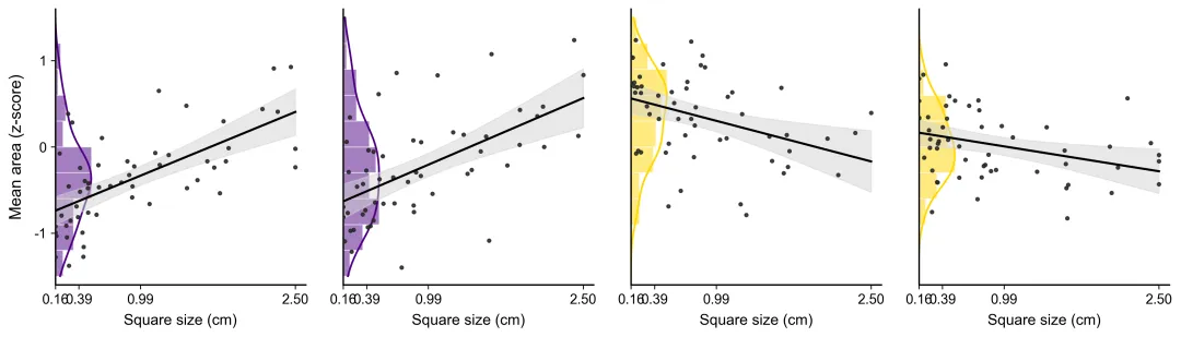
import osimport numpy as npimport pandas as pdimport matplotlib.pyplot as pltfrom scipy.stats import linregress, gaussian_kde# =========================================================================# 1. 初始化路径与文件夹检查# =========================================================================script_dir = os.path.dirname(os.path.abspath(__file__)) if '__file__' in locals() else os.getcwd()excel_file = os.path.join(script_dir, "data.xlsx")output_dir = os.path.join(script_dir, "图表")if not os.path.exists(output_dir): os.makedirs(output_dir) print(f"已创建文件夹: {output_dir}")if not os.path.exists(excel_file): print(f"错误: 找不到文件 {excel_file}。请确保 data.xlsx 与本脚本在同一目录下。") exit()# =========================================================================# 2. 专业科研期刊配色方案# =========================================================================color_schemes = { 1: {"colors": ["#ff7f7f", "#807fff"], "desc": "指定高饱和红蓝方案,适用于强对比度实验对照组"},}# 默认选择方案1selected_scheme = color_schemes[1]["colors"]red_color = selected_scheme[0]blue_color = selected_scheme[1]# =========================================================================# 3. 数据读取与验证# =========================================================================print("正在读取 Excel 并准备绘图...")data_sheets = pd.read_excel(excel_file, sheet_name=None)sheet_names = ["Condition1_A", "Condition2_B", "Condition3_C", "Condition4_D"]for sheet in sheet_names: if sheet not in data_sheets: print(f"错误: Excel 文件中缺少名为 '{sheet}' 的工作表。") exit()# =========================================================================# 4. 绘图配置与高精度渲染# =========================================================================colors = [red_color, red_color, blue_color, blue_color]plt.rcParams['font.sans-serif'] = ['Arial', 'SimHei']plt.rcParams['axes.unicode_minus'] = Falsefig, axes = plt.subplots(1, 4, figsize=(16, 4), sharey=True)fig.subplots_adjust(wspace=0.15)axes[0].set_ylabel("Mean area (z-score)", fontsize=13, labelpad=8)for i, sheet_name in enumerate(sheet_names): ax = axes[i] df = data_sheets[sheet_name].dropna() x = pd.to_numeric(df["Square size (cm)"], errors='coerce').dropna().values y = pd.to_numeric(df["Mean area (z-score)"], errors='coerce').dropna().values min_len = min(len(x), len(y)) x, y = x[:min_len], y[:min_len] if min_len < 3: print(f"警告: 工作表 '{sheet_name}' 中的有效数据点不足,已跳过拟合。") continue color = colors[i] # ------------------ A. 左侧直方图和边际核密度曲线 (KDE) ------------------ y_bins = np.linspace(-1.5, 1.5, 11) counts, edges, patches = ax.hist(y, bins=y_bins, orientation='horizontal', color=color, alpha=0.5, edgecolor='white', linewidth=0.8, zorder=1) kde = gaussian_kde(y) y_eval = np.linspace(-1.5, 1.5, 100) x_eval = kde(y_eval) max_count = np.max(counts) if np.max(counts) > 0 else 1 scale_factor = 0.35 for count, patch in zip(counts, patches): patch.set_width((count / max_count) * scale_factor) patch.set_xy((0.16, patch.get_xy()[1])) ax.plot(0.16 + (x_eval / np.max(x_eval)) * scale_factor, y_eval, color=color, linewidth=1.5, zorder=1.5) # ------------------ B. 散点图 ------------------ ax.scatter(x, y, color='#262626', s=7, alpha=0.85, zorder=3) # ------------------ C. 95% 置信区间阴影与回归线 ------------------ slope, intercept, r_val, p_val, std_err = linregress(x, y) x_line = np.linspace(0.16, 2.50, 100) y_line = slope * x_line + intercept n = len(x) x_mean = np.mean(x) y_fitted = slope * x + intercept residual_std = np.sqrt(np.sum((y - y_fitted) ** 2) / (n - 2)) t_value = 2.0 se_line = residual_std * np.sqrt(1 / n + (x_line - x_mean) ** 2 / np.sum((x - x_mean) ** 2)) ax.fill_between(x_line, y_line - t_value * se_line, y_line + t_value * se_line, color='#D4D4D4', alpha=0.5, zorder=2) ax.plot(x_line, y_line, color='black', linewidth=1.8, zorder=4) # ------------------ D. 还原视觉轴线样式 ------------------ ax.set_xlim(0.16, 2.60) ax.set_ylim(-1.6, 1.6) ax.set_xticks([0.16, 0.39, 0.99, 2.50]) ax.set_xticklabels(["0.16", "0.39", "0.99", "2.50"], fontsize=11) ax.set_xlabel("Square size (cm)", fontsize=12, labelpad=6) if i == 0: ax.set_yticks([-1, 0, 1]) ax.set_yticklabels(["-1", "0", "1"], fontsize=11) else: ax.yaxis.set_ticks_position('none') ax.spines['top'].set_visible(False) ax.spines['right'].set_visible(False) ax.spines['left'].set_linewidth(1.2) ax.spines['bottom'].set_linewidth(1.2)# =========================================================================# 5. 保存输出# =========================================================================output_path = os.path.join(output_dir, "recreated_plot.png")plt.savefig(output_path, dpi=300, bbox_inches='tight')plt.close()print(f"绘图成功!高清图片已保存至: {output_path}")