期刊图片复现|Python绘制SHAP重要性蜂巢图+条形图+相对贡献饼图组图
- 2026-06-28 01:26:47
期刊图片复现|Python绘制SHAP重要性蜂巢图+条形图+相对贡献饼图组图

论文:As cities sprawl: Unraveling the nonlinear impacts of urban spatial evolution on outdoor crime patterns through machine learning and causal inference 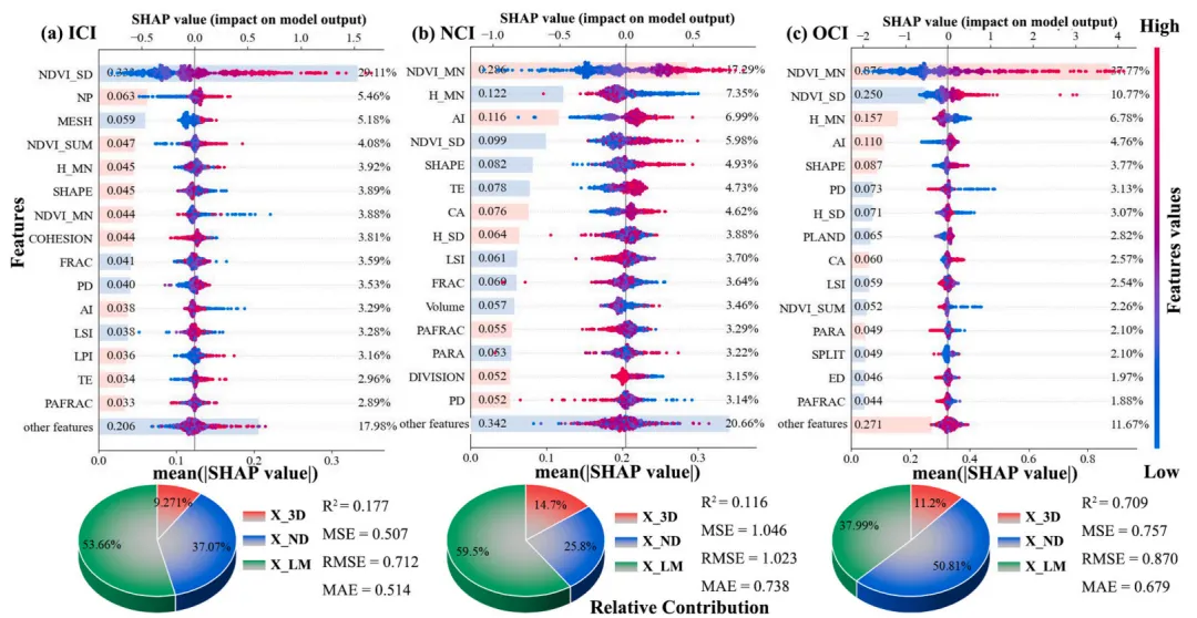
论文原图 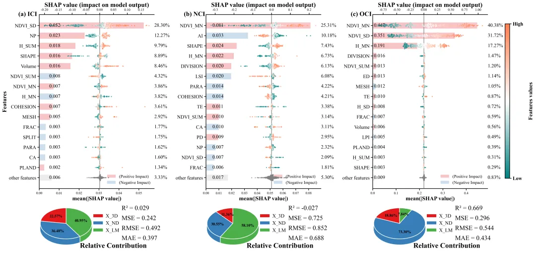
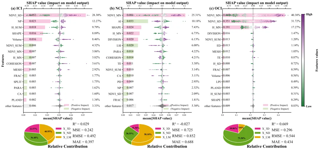
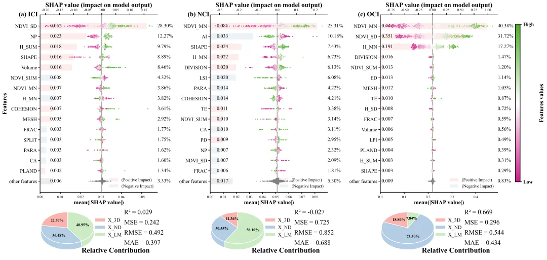
仿图 此图展示了一个针对三个不同目标变量的模型可解释性与性能评估的综合组图,整幅图分为三列。图上半部分,左侧的Y轴自上而下按照重要性排序,列出了对模型预测贡献最大的前15个核心特征,并将剩余特征汇总为底部的other features;下方的X轴衡量特征的全局重要性,对应的水平条形图直观反映了该重要性的大小,条柱左侧内嵌了具体的平均绝对SHAP数值,右侧则标注了该特征重要性占总体的百分比占比,同时条形的颜色区分了该特征对模型整体而言是倾向于正向影响还是负向影响,采用相关性分析(特征数据和shap值)得到,而其他特征汇总项则固定为灰色;上方的X轴衡量样本的边际贡献大小,中间的一条穿过X=0的灰色垂直实线作为零基准线区分正负反馈,叠加其上的蜂群散点图代表了测试集中的每一个样本,散点的颜色代表原始特征数值高低。下半部分,左侧放置了相对贡献的3D饼图,通过三种不同颜色的扇区及其表面标注的百分比,宏观总结了这三大类别特征对于当前目标变量模型的总贡献权重;右侧的文本区域则直观列出了当前最佳模型在测试集上的四大核心回归评估指标,包含R2、MSE、RMSE以及MAE,精准量化了模型对该目标变量的预测精度与整体拟合性能。 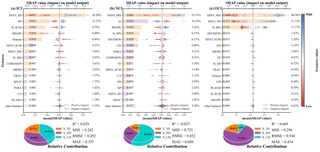
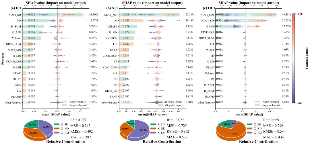
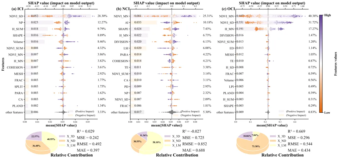
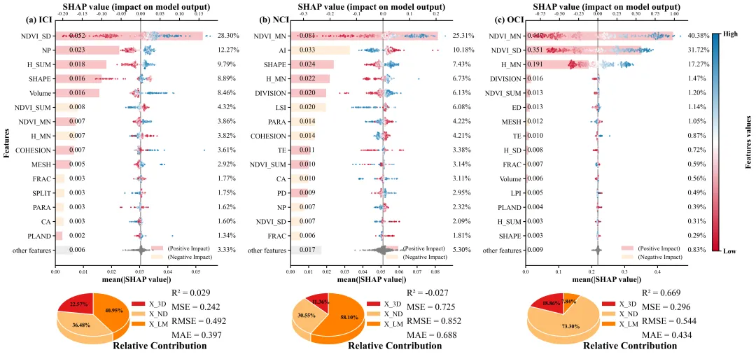
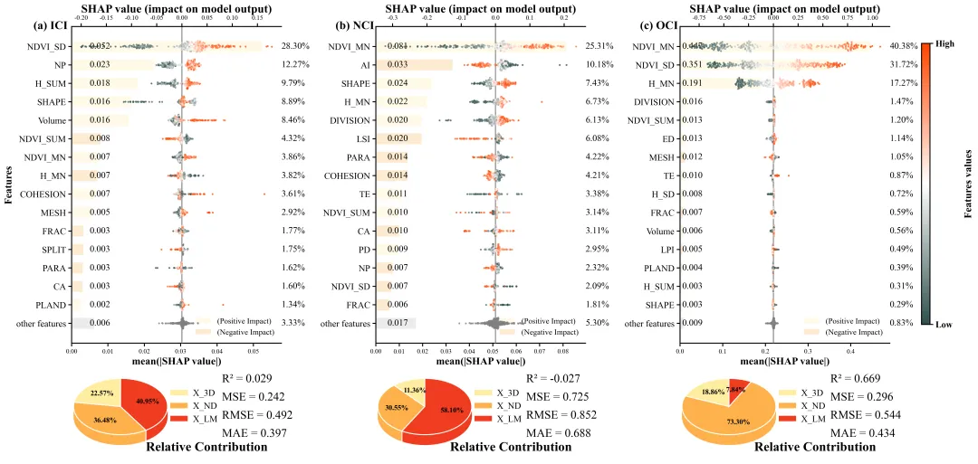
多种配色 


库的导入以及字体设置 

设置颜色库 

蜂巢图辅助函数,主要是为了避免SHAP值散点在同一X坐标堆叠重合导致无法看出数据密度,通过在Y轴添加受控制的随机抖动量,实现类似蜂巢图的视觉效果。 


期刊图片复现|Python绘制二维偏依赖PDP图 期刊复现|python绘制基于SHAP分析和GAM模型拟合的单特征依赖图 期刊图片复现|python绘制带有渐变颜色shap特征重要性组合图(条形图+蜂巢图) 期刊复现|用Python绘制SHAP特征重要性总览图、依赖图、双特征交互效应SHAP图,解锁XGBoost模型的终极奥秘 期刊图片复现|Python绘制shap重要性蜂巢图+单特征依赖图+交互效应强度气泡图+交互效应依赖图(回归+二分类+分类) 

公众号中的所有所有的免费代码都已经下架了,都并入到付费部分里了,付费合集代码和数据的购买通道已经开通,全部合集100元,后续将会持续更新,决定购买请后台私信我,注意只会分享练习数据和代码文件,不会提供答疑服务,代码文件中已经包含了每行代码的完整注释,购买前请确保真的需要!!!
代码绘制成果展示
代码解释
第一部分
# =========================================================================================# ====================================== 1. 库的导入 =========================================# =========================================================================================import numpy as npimport pandas as pdimport matplotlib.pyplot as pltimport matplotlib.gridspec as gridspecimport matplotlibimport xgboost as xgbimport shap
第二部分
# =========================================================================================# ====================================== 2.颜色库 =========================================# =========================================================================================COLOR_SCHEMES = {1: (['#e41a1c', '#377eb8', '#4daf4a'], LinearSegmentedColormap.from_list('c1', ['#008080', '#FFFFFF', '#FF7F50'])),}
第三部分
# =========================================================================================# ======================================3.蜂群图辅助函数=======================================# =========================================================================================def simple_beeswarm(x_values, nbins=40, width=0.1):np.random.seed(42)hist_range = (np.min(x_values), np.max(x_values)) #数据的最小值和最大值范围if hist_range[0] == hist_range[1]: # 如果最大值等于最小值hist_range = (hist_range[0] - 0.1, hist_range[1] + 0.1) #手动扩展范围current_width = (counts[i] / max_count) * width # 根据当前箱子的密度计算抖动宽度ys = np.linspace(-current_width, current_width, len(idxs)) # 在宽度范围内生成均匀分布的Y值np.random.shuffle(ys) # 打乱Y值顺序y_values[idxs] = ys # 将计算好的Y值赋给对应的数据点return y_values # 返回计算好的Y轴抖动坐标
第四部分
3D饼图绘制函数,通过在Y轴上从下至上密集堆叠数十个扁平的二维饼图,构造出具有厚度的3D圆柱体效果。
# =========================================================================================# ====================================== 4.3D饼图 =========================================# =========================================================================================def draw_3d_pie_chart_on_ax(ax, sizes, colors, labels, tilt_angle=0.4, depth_layers=80,total_thickness=0.5):step = total_thickness / depth_layers #计算每一层的厚度# 循环按层绘制实现堆叠的3D效果for i in range(depth_layers):#绘制表层饼图wedges, texts, autotexts = ax.pie(sizes, #数据colors=colors, #颜色startangle=90, #角度radius=1.2, #半径autopct='%1.2f%%', #文本pctdistance=0.6, #文本距圆心的相对距离shadow=False #关闭默认的阴影效果)#文本样式for autotext in autotexts:autotext.set_fontsize(11) #字体大小autotext.set_fontweight('bold') #加粗autotext.set_color('black') #颜色autotext.set_zorder(depth_layers + 3) #层ax.set_aspect(tilt_angle) #角度#加图例ax.legend(wedges,#图例对象labels, #标签loc="center left", #位置bbox_to_anchor=(0.92, 0.5), #坐标frameon=False, #边框fontsize=14, #字体大小handletextpad=0.5) #间距
第五部分
SHAP 重要性组图,将SHAP全局重要性与散点分布组合在同一子图中,展示哪个特征最重要,又展示了该特征数值大小对预测结果的具体影响。
# =========================================================================================# ======================================5.shap重要性散点组图=========================================# =========================================================================================def plot_custom_shap_dual_axis(ax_bar, ax_scatter, shap_values, X_df, scheme_colors, cmap,max_features=15):mean_abs_shap = np.abs(shap_values.values).mean(axis=0) #每个特征SHAP绝对值的平均数order = np.argsort(mean_abs_shap)[::-1] #排序top_indices = order[:max_features] #前15个最重要的特征other_indices = order[max_features:] #其它特征#拼接名字top_features = [X_df.columns[i] for i in top_indices] + ["other features"]top_features.reverse() #倒序y_pos = np.arange(len(top_features)) #每个特征的y坐标total_mean = sum(mean_abs_shap) #所有特征的总重要性,用来求百分比bar_color_pos = matplotlib.colors.to_rgba(scheme_colors[0], alpha=0.25) #正向色bar_color_neg = matplotlib.colors.to_rgba(scheme_colors[1], alpha=0.25) #负向色bar_color_neutral = matplotlib.colors.to_rgba('grey', alpha=0.15) #其它特征颜色if feature == "other features":bar_color = bar_color_neutral #使用灰色else:bar_color = bar_color_pos if corr >= 0 else bar_color_neg #大于0用正向色,小于0用负向色#百分比ax_bar.text(max(plot_mean_abs) * 1.1, #xidx, #yf"{pct:.2f}%", #文本va='center', #垂直ha='left', #水平fontsize=14) #大小ax_bar.set_yticks(y_pos) #左侧y轴刻度位置ax_bar.set_yticklabels(top_features, fontsize=14) #y轴刻度标注特征文本ax_bar.set_xlabel('mean(|SHAP value|)', fontsize=16, fontweight='bold') #x轴标题#边框ax_scatter.spines['bottom'].set_visible(False)ax_scatter.spines['right'].set_visible(False)
第六部分
主绘图函数,绘制出最后的结果图
# =========================================================================================# ======================================6.组图绘制函数=========================================# =========================================================================================def plot_advanced_forest_chart(analysis_results, scheme_id, selected_colors_tuple, grid_cols=3):scheme_colors = selected_colors_tuple[0] #饼图配色cmap_name = selected_colors_tuple[1] #蜂巢图配色hr = [3, 1] * grid_rows #每行高度比例,主图:饼图#创建画布gs = gridspec.GridSpec(grid_rows * 2, #行grid_cols, #列height_ratios=hr, #高度比hspace=0.05, #上下间距wspace=0.45) #左右间距titles = [f'({chr(97 + i)}) {target_name}' for i, target_name in enumerate(targets_keys)] #标题cmap = plt.get_cmap(cmap_name) if isinstance(cmap_name, str) else cmap_name #获取对应的Colormap对象ax_pie = fig.add_subplot(gs_bottom[0]) #饼图轴#饼图绘制draw_3d_pie_chart_on_ax(ax_pie, #轴res['pie_sizes'], #数据scheme_colors, #颜色['X_3D', 'X_ND', 'X_LM'],#图例标签tilt_angle=0.6, #角度total_thickness=0.45, #厚度depth_layers=60) #层数#饼图标题ax_pie.set_title('Relative Contribution', #文本x=1.38,#xy=-0.32, #yfontsize=20, #字体大小fontweight='bold') #加粗ax_txt = fig.add_subplot(gs_bottom[1]) #右侧评估结果部分ax_txt.axis('off') #清空text_content = f"R² = {res['R2']:.3f}\n\nMSE = {res['MSE']:.3f}\n\nRMSE = {res['RMSE']:.3f}\n\nMAE = {res['MAE']:.3f}" #拼接文本
第七部分
执行部分,加载Excel数据、将特征按分组归类、模型训练及参数调优,评估精度,调用 SHAP模型解释,绘图
# =========================================================================================# ======================================7.执行部分 =========================================# =========================================================================================if __name__ == '__main__':#类别划分features_3d = ['H_MN', 'H_SD', 'Volume', 'H_SUM']features_nd = ['NDVI_MN', 'NDVI_SD', 'NDVI_SUM']features_lm = ['NP', 'MESH', 'SHAPE', 'COHESION', 'FRAC', 'PD', 'AI', 'LSI', 'LPI', 'TE', 'PAFRAC', 'CA','DIVISION', 'PARA', 'PLAND', 'SPLIT', 'ED']excel_data_path = r"data.xlsx" #原始数据excel_file = pd.ExcelFile(excel_data_path) #读取target_names = excel_file.sheet_names #读取表名就是目标名#遍历每个目标for target_name in target_names:df_sheet = pd.read_excel(excel_data_path, sheet_name=target_name) #读取当前表#提取特征数据和目标数据if target_name in df_sheet.columns:y = df_sheet[target_name]X = df_sheet.drop(columns=[target_name])else:y = df_sheet.iloc[:, -1]X = df_sheet.iloc[:, :-1]#划分数据X_train, X_test, y_train, y_test = train_test_split(X, y, test_size=0.2, random_state=42)model = xgb.XGBRegressor(random_state=42) #初始化XGBoost回归模型#初始化网格搜索grid = GridSearchCV(model, param_grid, cv=3, scoring='neg_mean_squared_error')grid.fit(X_train, y_train) #拟合best_model = grid.best_estimator_ #最佳模型print("-" * 50)target_columns = 3 #组合图每一行的子图数plot_advanced_forest_chart(df_real, scheme_id, selected_colors_tuple, grid_cols=target_columns)
如何应用到你自己的数据
1.设置特征数据的分类,执行部分:
features_3d = ['H_MN', 'H_SD', 'Volume', 'H_SUM']features_nd = ['NDVI_MN', 'NDVI_SD', 'NDVI_SUM']features_lm = ['NP', 'MESH', 'SHAPE', 'COHESION', 'FRAC', 'PD', 'AI', 'LSI', 'LPI', 'TE', 'PAFRAC', 'CA','DIVISION', 'PARA', 'PLAND', 'SPLIT', 'ED']
2.设置原始数据的保存地址,执行部分:
excel_data_path = r"data.xlsx" #原始数据3.设置超参数,执行部分:
param_grid = {'max_depth': [3, 4],'n_estimators': [50, 100],'learning_rate': [0.05, 0.1]}
4.设置是否要进行批量绘图,执行部分:
plot_all = True5.设置绘图结果的保存地址,主绘图函数部分:
plt.savefig(fr"advanced_shap_scheme_{scheme_id}.png", dpi=300, bbox_inches='tight')推荐
获取方式
本文来自网友投稿或网络内容,如有侵犯您的权益请联系我们删除,联系邮箱:wyl860211@qq.com 。
随机文章
-
 10个月宝宝每天需要喝多少奶粉?
- 【建议收藏】Python等级考试1-4级总规划及每节课的教学目标
- python期末常考的20道题
- Python运用在智能家居(二)
- Python学习指南
- 【Linux系统】网卡驱动:瑞昱r8127.ko & 马威尔atlantic.ko
- 【漏洞通告】Linux Kernel net_sched act_pedit本地提权漏洞(CVE-2026-46331)
- Apple官方做容器:Swift写的Linux容器工具
- 【高危漏洞预警】Linux Kernel net/sched act_pedit本地权限提升漏洞CVE-2026-46331
- 做 Linux 运维,一定要拿下红帽认证
- 建议大家都去看,我愿称之为Python入门最伟大的网站,没有之一!!!
