一天一个科研小技巧——Python复刻《Nature》柱状图
- 2026-06-28 12:39:44
今天就用一段 Python 代码,复刻一张Nature的多子图柱状图——包含两组对比实验、多个物种,每个柱子又细分为Unique和Both两类,同时左右两个大子图(a 和 b)分别对应不同的基因集。最终效果极具“顶刊味”,让你的数据展示瞬间提升档次!🚀
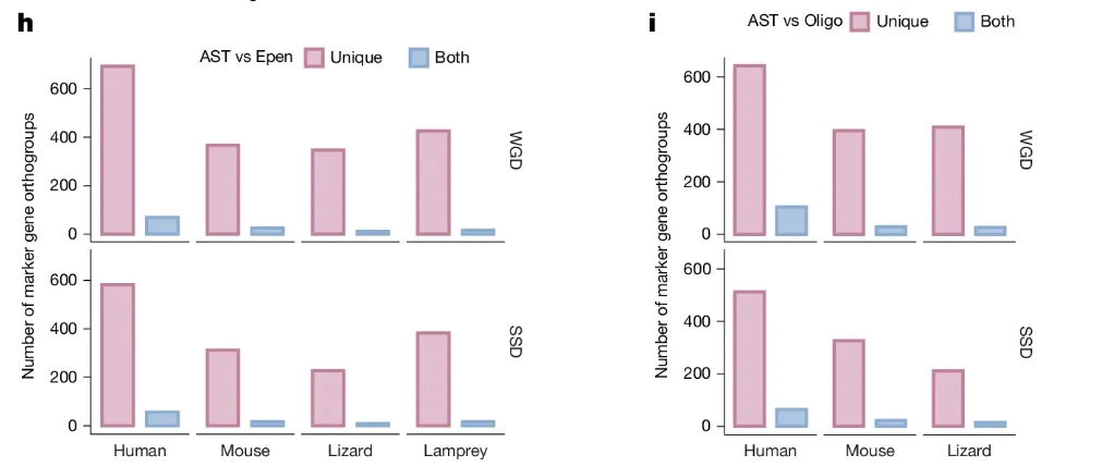
论文名称:Whole-genome duplication shaped cell-type evolution in the vertebrate brain
🎯 目标图预览
我们要复刻的是一张2×2 布局的柱状图:
左列(图 h):比较 AST vs Epen,包含 4 个物种,上下分别显示 WGD 和 SSD 的结果。
右列(图 i):比较 AST vs Oligo,包含 3 个物种,同样分 WGD 和 SSD。
每个柱子的颜色编码:Unique:浅粉紫(#E1B6CE),深色边框Both:浅蓝色(#A9C4E2),深色边框
这种设计能同时展示数量级差异(Unique 远大于 Both)和物种间趋势,信息密度极高。
🧱 第一步:模拟数据
为便于演示,我们用 numpy 生成与目标趋势一致的数据(实际使用时替换为自己的真实数据即可)。
import numpy as npnp.random.seed(42)h_wgd_unique = np.array([680, 370, 350, 430])h_wgd_both = np.random.randint(15, 75, size=4)h_ssd_unique = np.array([580, 310, 230, 380])h_ssd_both = np.random.randint(15, 65, size=4)i_wgd_unique = np.array([640, 400, 410])i_wgd_both = np.array([105, 30, 28])i_ssd_unique = np.array([520, 330, 210])i_ssd_both = np.random.randint(15, 65, size=3)species_h = ["Human", "Mouse", "Lizard", "Lamprey"]species_i = ["Human", "Mouse", "Lizard"]
🎨 第二步:全局样式与配色
顶刊图形通常采用无衬线字体、简洁坐标轴(去掉上、右 spine)和柔和的配色方案。我们一次性设置好:
import matplotlib.pyplot as pltplt.rcParams["font.family"] = "sans-serif"plt.rcParams["axes.unicode_minus"] = False# 定义颜色 (浅色填充 + 深色边框)color_unique = "#E1B6CE"edge_unique = "#B97A9E"color_both = "#A9C4E2"edge_both = "#759CC4"bar_width = 0.35 # 每根柱子的宽度
📐 第三步:核心绘图函数
为了避免重复代码,我们把绘制单组柱状图的逻辑封装成函数,它接受坐标轴、两个数组(Unique 和 Both)、物种名称,以及是否显示 x 轴标签。
def draw_sub_plot(ax, unique_data, both_data, species, show_x=False):x = np.arange(len(species))# 绘制柱子:left 偏移量 -bar_width/1.5,right 偏移量 +bar_width/1.5rects1 = ax.bar(x - bar_width/1.5, unique_data, bar_width,color=color_unique, edgecolor=edge_unique, linewidth=2)rects2 = ax.bar(x + bar_width/1.5, both_data, bar_width,color=color_both, edgecolor=edge_both, linewidth=2)# 隐藏上、右 spine,加粗左、下 spineax.spines["top"].set_visible(False)ax.spines["right"].set_visible(False)ax.spines["left"].set_linewidth(0.8)ax.spines["bottom"].set_linewidth(0.8)ax.set_ylim(-20, 720)if show_x:ax.set_xticks(x)ax.set_xticklabels(species, fontsize=11)else:ax.set_xticks([])
🗺️ 第四步:使用 GridSpec 精细布局
我们需要两列(左、右),每列上下两个子图(WGD 和 SSD)。用 GridSpec 可以精准控制子图间距,尤其是左右两列之间的间距(通过 wspace 参数)。
fig = plt.figure(figsize=(15, 6))# 主 GridSpec:2 行 2 列,宽度比例 4:3,左右间距 wspace=0.6gs = fig.add_gridspec(2, 2, width_ratios=[4, 3], wspace=0.6, hspace=0.1)
💡 小技巧:若觉得左右图靠得太近,加大
wspace即可(如 0.6→0.8)。若整体被压缩,可同步增大figsize宽度。
🖼️ 第五步:绘制左列(图 a)
我们为左列(索引 0)创建一个2 行 1 列的子 GridSpec,并添加两个子图。
# 左列的子网格gs_h = gs[:, 0].subgridspec(2, 1, hspace=0.1)ax_h_top = fig.add_subplot(gs_h[0, 0])ax_h_bottom = fig.add_subplot(gs_h[1, 0], sharex=ax_h_top)# 顶部 (WGD)draw_sub_plot(ax_h_top, h_wgd_unique, h_wgd_both, species_h, show_x=False)ax_h_top.text(1.03, 0.5, "WGD", transform=ax_h_top.transAxes,rotation=-90, va="center", fontsize=12)# 底部 (SSD)draw_sub_plot(ax_h_bottom, h_ssd_unique, h_ssd_both, species_h, show_x=True)ax_h_bottom.text(1.03, 0.5, "SSD", transform=ax_h_bottom.transAxes,rotation=-90, va="center", fontsize=12)# 左列图例 (放在顶部子图的上方)ax_h_top.legend([plt.Rectangle((0,0),1,1, facecolor=color_unique, edgecolor=edge_unique, lw=2),plt.Rectangle((0,0),1,1, facecolor=color_both, edgecolor=edge_both, lw=2)],["Unique", "Both"],title="AST vs Epen",ncol=2,bbox_to_anchor=(0.85, 1.15),frameon=False,title_fontsize=11,fontsize=11)# 公共 Y 轴标签(左列)fig.text(0.07, 0.5, "Number of marker gene orthogroups",va="center", rotation="vertical", fontsize=12)# 子图编号 afig.text(0.05, 0.92, "a", fontsize=18, fontweight="bold", va="top", ha="left")
🖼️ 第六步:绘制右列(图 b)
同理绘制右列,注意物种列表只有 3 个。
gs_i = gs[:, 1].subgridspec(2, 1, hspace=0.1)ax_i_top = fig.add_subplot(gs_i[0, 0])ax_i_bottom = fig.add_subplot(gs_i[1, 0], sharex=ax_i_top)# 顶部 (WGD)draw_sub_plot(ax_i_top, i_wgd_unique, i_wgd_both, species_i, show_x=False)ax_i_top.text(1.04, 0.5, "WGD", transform=ax_i_top.transAxes,rotation=-90, va="center", fontsize=12)# 底部 (SSD)draw_sub_plot(ax_i_bottom, i_ssd_unique, i_ssd_both, species_i, show_x=True)ax_i_bottom.text(1.04, 0.5, "SSD", transform=ax_i_bottom.transAxes,rotation=-90, va="center", fontsize=12)# 右列图例ax_i_top.legend([plt.Rectangle((0,0),1,1, facecolor=color_unique, edgecolor=edge_unique, lw=2),plt.Rectangle((0,0),1,1, facecolor=color_both, edgecolor=edge_both, lw=2)],["Unique", "Both"],title="AST vs Oligo",ncol=2,bbox_to_anchor=(0.85, 1.15),frameon=False,title_fontsize=11,fontsize=11)# 公共 Y 轴标签(右列)fig.text(0.53, 0.5, "Number of marker gene orthogroups",va="center", rotation="vertical", fontsize=12)# 子图编号 bfig.text(0.51, 0.92, "b", fontsize=18, fontweight="bold", va="top", ha="left")plt.tight_layout()plt.show()
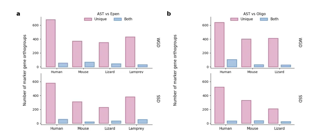
✨ 最终效果
📦 完整代码一键运行
把以上所有片段按顺序拼接,即可直接运行。你也可以替换数据为自己的 Excel/CSV 文件,只需调整数组内容即可。
import matplotlib.pyplot as pltimport numpy as np# 设置随机种子np.random.seed(42)# ==========================================# 1. 模拟生成与原图趋势相近的数据# ==========================================# 格式: [Human, Mouse, Lizard, Lamprey]h_wgd_unique = np.array([680, 370, 350, 430])h_wgd_both = np.random.randint(15, 75, size=4)h_ssd_unique = np.array([580, 310, 230, 380])h_ssd_both = np.random.randint(15, 65, size=4)i_wgd_unique = np.array([640, 400, 410])i_wgd_both = np.array([105, 30, 28])i_ssd_unique = np.array([520, 330, 210])i_ssd_both = np.random.randint(15, 65, size=3)species_h = ["Human", "Mouse", "Lizard", "Lamprey"]species_i = ["Human", "Mouse", "Lizard"]# ==========================================# 2. 画图设置# ==========================================# 设置全局字体为无衬线,更接近 Nature/Science 风格plt.rcParams["font.family"] = "sans-serif"plt.rcParams["axes.unicode_minus"] = False# 创建画布,包含左右两个大区域 (h 和 i)fig = plt.figure(figsize=(14, 6))# 使用 Subplots 布局:左边 2x4 (图h),右边 2x3 (图i)gs = fig.add_gridspec(2, 2, width_ratios=[4, 3], wspace=0.6, hspace=0.1)# 配色方案 (原图的浅粉紫和浅蓝,带有深色边框)color_unique = "#E1B6CE"edge_unique = "#B97A9E"color_both = "#A9C4E2"edge_both = "#759CC4"bar_width = 0.35# 绘图核心函数def draw_sub_plot(ax, unique_data, both_data, species, show_x=False):x = np.arange(len(species))# 画柱状图rects1 = ax.bar(x - bar_width / 1.5,unique_data,bar_width,color=color_unique,edgecolor=edge_unique,linewidth=2,)rects2 = ax.bar(x + bar_width / 1.5,both_data,bar_width,color=color_both,edgecolor=edge_both,linewidth=2,)# 样式微调ax.spines["top"].set_visible(False)ax.spines["right"].set_visible(False)ax.spines["left"].set_linewidth(0.8)ax.spines["bottom"].set_linewidth(0.8)ax.set_ylim(-20, 720)if show_x:ax.set_xticks(x)ax.set_xticklabels(species, fontsize=11)else:ax.set_xticks([])# ==========================================# 3. 图 a (左侧)# ==========================================gs_h = gs[:, 0].subgridspec(2, 1, hspace=0.1)ax_h_top = fig.add_subplot(gs_h[0, 0])ax_h_bottom = fig.add_subplot(gs_h[1, 0], sharex=ax_h_top)# 顶部 WGDdraw_sub_plot(ax_h_top, h_wgd_unique, h_wgd_both, species_h, show_x=False)ax_h_top.text(1.03,0.5,"WGD",transform=ax_h_top.transAxes,rotation=-90,va="center",fontsize=12,)# 顶部的图例ax_h_top.legend([plt.Rectangle((0, 0), 1, 1, facecolor=color_unique, edgecolor=edge_unique, lw=2),plt.Rectangle((0, 0), 1, 1, facecolor=color_both, edgecolor=edge_both, lw=2),],["Unique", "Both"],title="AST vs Epen",ncol=2,bbox_to_anchor=(0.85, 1.15),frameon=False,title_fontsize=11,fontsize=11,)# 底部 SSDdraw_sub_plot(ax_h_bottom, h_ssd_unique, h_ssd_both, species_h, show_x=True)ax_h_bottom.text(1.03,0.5,"SSD",transform=ax_h_bottom.transAxes,rotation=-90,va="center",fontsize=12,)# 公共 Y 轴标签 (图a)fig.text(0.07,0.5,"Number of marker gene orthogroups",va="center",rotation="vertical",fontsize=12,)fig.text(0.05, 0.92, "a", fontsize=18, fontweight="bold", va="top", ha="left")# ==========================================# 4.图 b (右侧)# ==========================================gs_i = gs[:, 1].subgridspec(2, 1, hspace=0.1)ax_i_top = fig.add_subplot(gs_i[0, 0])ax_i_bottom = fig.add_subplot(gs_i[1, 0], sharex=ax_i_top)# 顶部 WGDdraw_sub_plot(ax_i_top, i_wgd_unique, i_wgd_both, species_i, show_x=False)ax_i_top.text(1.04,0.5,"WGD",transform=ax_i_top.transAxes,rotation=-90,va="center",fontsize=12,)# 顶部的图例ax_i_top.legend([plt.Rectangle((0, 0), 1, 1, facecolor=color_unique, edgecolor=edge_unique, lw=2),plt.Rectangle((0, 0), 1, 1, facecolor=color_both, edgecolor=edge_both, lw=2),],["Unique", "Both"],title="AST vs Oligo",ncol=2,bbox_to_anchor=(0.85, 1.15),frameon=False,title_fontsize=11,fontsize=11,)# 底部 SSDdraw_sub_plot(ax_i_bottom, i_ssd_unique, i_ssd_both, species_i, show_x=True)ax_i_bottom.text(1.04,0.5,"SSD",transform=ax_i_bottom.transAxes,rotation=-90,va="center",fontsize=12,)# 公共 Y 轴标签 (图b)fig.text(0.53,0.5,"Number of marker gene orthogroups",va="center",rotation="vertical",fontsize=12,)fig.text(0.51, 0.92, "b", fontsize=18, fontweight="bold", va="top", ha="left")# 展示图像plt.show()
💬 思考:如果需要添加显著性标记(星号或线段),可以在
draw_sub_plot内额外用ax.plot()和ax.text()添加,原理与云雨图类似。
🔮 写在最后
柱状图虽基础,但细节决定格局。通过精细控制子图间距、颜色、边框和图例位置,就能让数据开口说话,让审稿人眼前一亮。👀
如果你觉得有用,点个「在看」或转发给实验室的小伙伴,一起卷出顶刊范儿!我们下一个小技巧见~ 🚀
随机文章
-
 10个月宝宝每天需要喝多少奶粉?
- sqlite_utils,一个攒劲的python项目!
- Mimesis,一个效率翻倍的python项目!
- 量化系列(七十八) Python 三分钟抓取同花顺板块实时数据|附可直接运行完整源码
- 8个实用Python脚本:让工作自动化起来!
- 我愿称之为Python最全的背记手册 没有之一!
- 【量化交易实践】Python 实现股票箱体突破选股策略(完整代码 + 结果验证)
- 当了六年程序员,劝告那些打算去学Python的人…
- 一张图吃透Python!纯中英文Python速查表~
- 我拿Python给桌面"养"了个AI生命体 它会自主成长,有自己的性格和记忆
- 一个神奇的 Python 库:Streamlit,把脚本秒变 Web 应用
