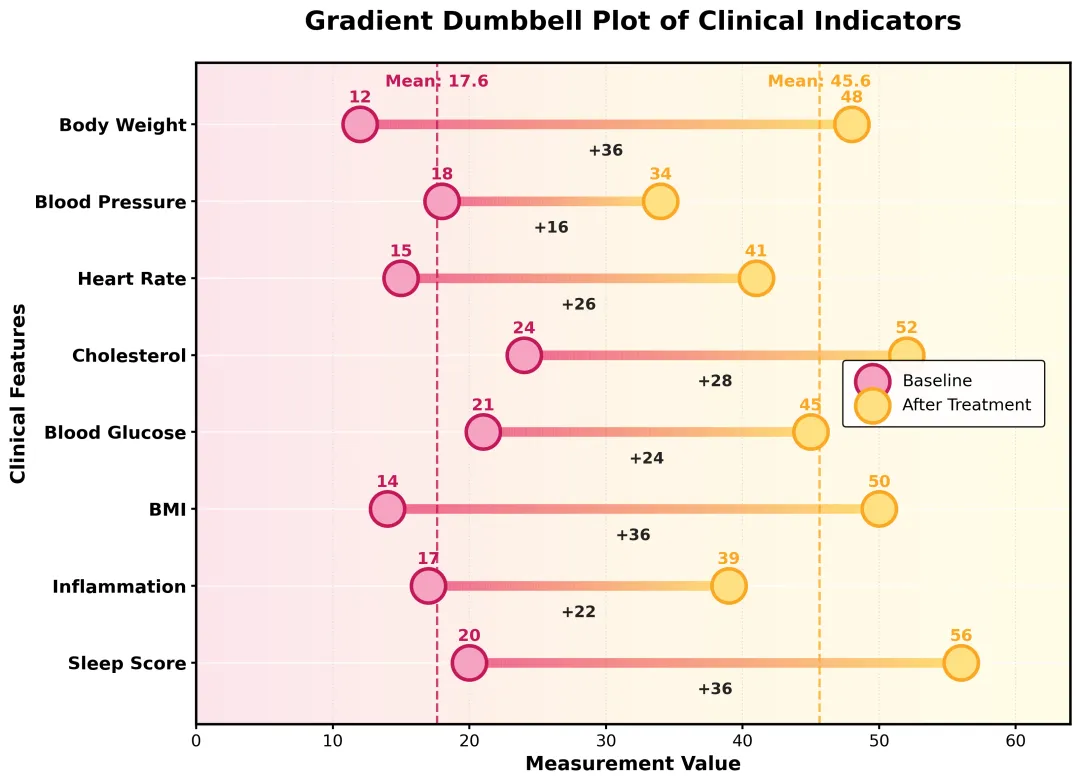
渐变色哑铃图 Python版
- 2026-10-11 07:22:03
importos
importnumpyasnp
importpandasaspd
importmatplotlib.pyplotasplt
frommatplotlib.collectionsimportLineCollection
frommatplotlib.colorsimportLinearSegmentedColormap,Normalize
# 1. 虚构数据 ------------------------------------------------------
df=pd.DataFrame({
"Feature":[
"Body Weight",
"Blood Pressure",
"Heart Rate",
"Cholesterol",
"Blood Glucose",
"BMI",
"Inflammation",
"Sleep Score"
],
"Baseline":[12,18,15,24,21,14,17,20],
"After_Treatment":[48,34,41,52,45,50,39,56]
})
df["Diff"]=df["After_Treatment"]-df["Baseline"]
# 2. 配色方案 ------------------------------------------------------
COLOR={
"left_fill":"#F6A3C2",
"left_edge":"#C2185B",
"right_fill":"#FFE082",
"right_edge":"#F9A825",
"bg_left":"#FCE4EC",
"bg_mid":"#FFF7E6",
"bg_right":"#FFFDE7",
"line_left":"#EC407A",
"line_right":"#FFD54F",
"grid":"#DDDDDD"
}
# 3. 绘制渐变线函数 -----------------------------------------------
defdraw_gradient_line(ax,x1,x2,y,color1,color2,lw=7,alpha=0.85):
"""Draw one horizontal gradient line from x1 to x2."""
xs= np.linspace(x1,x2,120)
ys= np.full_like(xs,y)
points= np.array([xs,ys]).T.reshape(-1,1,2)
segments= np.concatenate([points[:-1],points[1:]],axis=1)
cmap=LinearSegmentedColormap.from_list("line_gradient",[color1,color2])
lc=LineCollection(
segments,
cmap=cmap,
norm=Normalize(0,1),
linewidth=lw,
alpha=alpha,
zorder=2
)
lc.set_array(np.linspace(0,1,len(segments)))
ax.add_collection(lc)
# 4. 主绘图函数 ----------------------------------------------------
defdraw_dumbbell_plot(data):
data=data.copy()
data=data.iloc[::-1].reset_index(drop=True)
y_pos= np.arange(len(data))
x_min=0
x_max=max(data["After_Treatment"].max(),data["Baseline"].max())+8
y_min=-0.8
y_max=len(data)-0.2
mean_left=data["Baseline"].mean()
mean_right=data["After_Treatment"].mean()
fig,ax= plt.subplots(figsize=(11,8))
# 渐变背景
bg= np.linspace(0,1,1200).reshape(1,-1)
bg_cmap=LinearSegmentedColormap.from_list(
"soft_background",
[COLOR["bg_left"],COLOR["bg_mid"],COLOR["bg_right"]]
)
ax.imshow(
bg,
extent=[x_min,x_max,y_min,y_max],
aspect="auto",
cmap=bg_cmap,
alpha=0.95,
zorder=0
)
# 水平辅助线
foryiny_pos:
ax.hlines(
y,
x_min,
x_max,
color="white",
linewidth=1.1,
alpha=0.75,
zorder=1
)
# 渐变连接线
fori,rowindata.iterrows():
draw_gradient_line(
ax,
row["Baseline"],
row["After_Treatment"],
y_pos[i],
COLOR["line_left"],
COLOR["line_right"],
lw=7,
alpha=0.78
)
# 两组散点
ax.scatter(
data["Baseline"],
y_pos,
s=620,
facecolor=COLOR["left_fill"],
edgecolor=COLOR["left_edge"],
linewidth=2.6,
zorder=4,
label="Baseline"
)
ax.scatter(
data["After_Treatment"],
y_pos,
s=620,
facecolor=COLOR["right_fill"],
edgecolor=COLOR["right_edge"],
linewidth=2.6,
zorder=4,
label="After Treatment"
)
# 均值虚线
ax.axvline(
mean_left,
color=COLOR["left_edge"],
linestyle="--",
linewidth=1.7,
alpha=0.8,
zorder=2
)
ax.axvline(
mean_right,
color=COLOR["right_edge"],
linestyle="--",
linewidth=1.7,
alpha=0.8,
zorder=2
)
ax.text(
mean_left,
y_max-0.15,
f"Mean: {mean_left:.1f}",
ha="center",
va="top",
fontsize=12,
fontweight="bold",
color=COLOR["left_edge"]
)
ax.text(
mean_right,
y_max-0.15,
f"Mean: {mean_right:.1f}",
ha="center",
va="top",
fontsize=12,
fontweight="bold",
color=COLOR["right_edge"]
)
# 数值与差值标注
fori,rowindata.iterrows():
y=y_pos[i]
x1=row["Baseline"]
x2=row["After_Treatment"]
mid=(x1+x2)/2
ax.text(
x1,
y+0.24,
f"{x1:.0f}",
ha="center",
va="bottom",
fontsize=12,
fontweight="bold",
color=COLOR["left_edge"]
)
ax.text(
x2,
y+0.24,
f"{x2:.0f}",
ha="center",
va="bottom",
fontsize=12,
fontweight="bold",
color=COLOR["right_edge"]
)
ax.text(
mid,
y-0.25,
f"+{row['Diff']:.0f}",
ha="center",
va="top",
fontsize=11.5,
fontweight="bold",
color="#222222"
)
# 坐标轴设置
ax.set_yticks(y_pos)
ax.set_yticklabels(data["Feature"],fontsize=13,fontweight="bold")
ax.set_xlim(x_min,x_max)
ax.set_ylim(y_min,y_max)
ax.set_xlabel(
"Measurement Value",
fontsize=14,
fontweight="bold"
)
ax.set_ylabel(
"Clinical Features",
fontsize=14,
fontweight="bold"
)
ax.set_title(
"Gradient Dumbbell Plot of Clinical Indicators",
fontsize=19,
fontweight="bold",
pad=24
)
# 图例
leg=ax.legend(
loc="center right",
bbox_to_anchor=(0.98,0.50),
frameon=True,
fontsize=12,
borderpad=0.8
)
leg.get_frame().set_edgecolor("black")
leg.get_frame().set_linewidth(1.0)
leg.get_frame().set_alpha(0.92)
# 美化边框和网格
ax.grid(
axis="x",
linestyle=":",
linewidth=0.9,
color=COLOR["grid"],
alpha=0.85
)
forspineinax.spines.values():
spine.set_linewidth(1.8)
spine.set_color("black")
ax.tick_params(axis="x",labelsize=12,width=1.5)
ax.tick_params(axis="y",width=1.5)
plt.tight_layout()
# 保存到桌面
desktop=os.path.join(os.path.expanduser("~"),"Desktop")
png_path=os.path.join(desktop,"gradient_dumbbell_plot.png")
plt.savefig(png_path,dpi=300,bbox_inches="tight",facecolor="white")
draw_dumbbell_plot(df)
随机文章
-
 10个月宝宝每天需要喝多少奶粉?
- Python 三阶第 2 课|字典遍历循环!一键读取全部键、值、键值对,批量处理配对数据
- 带了一个Python实习生,真的好崩溃.....
- 10天学完Python基础语法(6~10天)
- 7月5日周日 | Python热门项目
- Python小白必备:一篇了解Python
- Python代码解析:使用OpenAI兼容接口调用千问大模型
- 用可视化编程工具打开Python学习新姿势
- Python从入门到精通的100个实战项目!(附学习资料)
- Linux运维小技巧-文件防误删
- Linux 最新资讯 20260705——ReactOS“开源Windows”项目重大进展;上4K@60FPS USB视频捕获终于改善