量化系列(八十五): 量化可视化教程:Python 导入股票历史数据生成带成交量 K 线图源码分享
- 2026-10-11 05:44:56
一. 认真学完这一章节,你可以做什么?
上一章节,我们学习了获取股票的历史数据,但历史数据是表格形式的,不太好直观的展示? 那该怎么办呢? 用K线图表示。
学习完这一章节,你就可以使用K线图来展示股票的日K数据信息。
类似于这样:
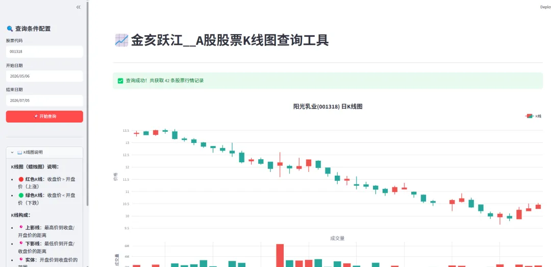
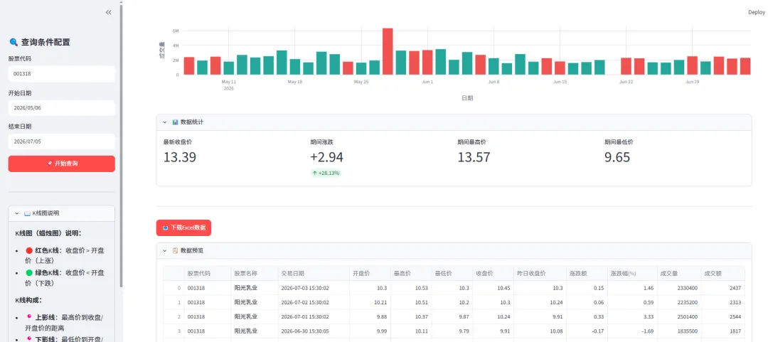
这个功能还是很强大的,大家可以好好学习一下。
本文含系统自动匹配的广告,广告收入用于支持持续创作,感谢理解
二. 数据源和响应信息
数据源仍然使用上一章节的数据接口, 为了避免大家忘记,小亥这儿再写一下。
股票的全量列表, 从
https://www.yueshushu.top/StockApi/stockHistory/history?sign=stock中 获取 POST 请求
请求参数是:
{ "pageNum": 1, "pageSize": 100, "code": "001318", "startDate": "2026-05-01", "endDate": "2026-07-03"}其中 code 是股票编码 (六位的纯数字股票编码)。 pageNum 和 pageSize 是 分页参数, startDate 为开始时间, endDate 为结束时间。
响应体样式是:
{ "code": 20000, "success": true, "message": null, "timestamp": 1783077316779, "traceId": "4a0e4cc5-67df-48cf-8099-221e34e864a1", "timestampStr": "2026-07-03 19:15:16", "exceptionMessage": null, "customInfo": "如果你对我的接口感兴趣,请联系我:+v: yueshushu_top", "data": { "total": 42, "list": [ { "id": 6730591, "code": "001318", "name": "阳光乳业", "currDate": "2026-07-03 15:30:02", "lowestPrice": 10.3000, "openingPrice": 10.3000, "yesClosingPrice": 10.3000, "amplitude": 0.1500, "amplitudeProportion": 1.4600, "tradingVolume": 2330400.0000, "tradingValue": 2437.0000, "closingPrice": 10.4500, "highestPrice": 10.5300, "zt": 0, "lowestTime": null, "highestTime": null, "openPercent": 0.0000, "lowestPercent": 0.0000, "highestPercent": 2.2300, "outDish": 11718, "innerDish": 11586, "changingProportion": 0.8200, "than": 1.0400, "avgPrice": 10.4600, "market": 29.5400, "ltMarket": 29.5400, "staticPriceRatio": 28.2700, "dynamicPriceRatio": 38.7000, "ttmPriceRatio": 29.1000, "buyHand": 364, "sellHand": 1150, "appointThan": "-51.92", "flag": 1, "webUrl": null, "dayWebUrl": null, "aiSendMessage": "2026-07-03 10.3000,10.5300,10.3000,10.4500,2330400.0000", "tradingVolumePercent": null, "currDateStr": "07-03", "tproportion": 2.2300 } ] }}如果想了解 平台相关的数据源, 可以看我之前写的文章:
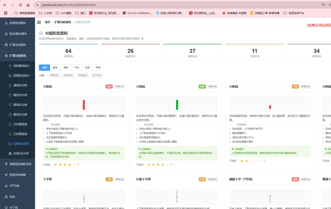
关于 K线图的形态,大家可以看我之前写的文章
Java 量化系列(十五):输入股票代码,1 秒生成专业 K 线图!ECharts 渲染 + 精准数据,新手也能看懂走势
Java 量化系列(十四):输入股票代码,1 秒识别 K 线形态!自动判断涨跌,新手也能精准决策
Java量化系列(十三):42种K线形态“涨跌密码”全揭秘!新手也能精准预判行情
三. Python 实现画K线图
为了方便大家理解和使用, 小亥将采用 streamlit 进行编写相关的脚本, 这样有页面,也方便点击 。
大家可以通过 AI 自行实现, 小亥这儿提供一个简单的版本。
脚本名称为 stock_history_kline.py
安装依赖:
pip install streamlit requests pandas plotly -i https://pypi.tuna.tsinghua.edu.cn/simple直接复制粘贴即可
import streamlit as stimport requestsimport pandas as pdimport plotly.graph_objects as gofrom plotly.subplots import make_subplotsfrom datetime import datetime, timedeltafrom io import BytesIO# ===================== 接口配置 =====================STOCK_HISTORY_URL = "https://www.yueshushu.top/StockApi/stockHistory/history?sign=stock"SERVER_PORT = 9093# ===================== 页面配置 =====================st.set_page_config( page_title="金亥跃江_股票K线图查询工具", layout="wide", page_icon="📈")# ===================== 查询股票历史数据 =====================def query_stock_history(stock_code, start_date, end_date): req_body = { "pageNum": 1, "pageSize": 200, "code": stock_code, "type": 1, "startDate": start_date, "endDate": end_date } try: resp = requests.post(STOCK_HISTORY_URL, json=req_body, timeout=20) res_json = resp.json() if res_json.get("code") == 20000 and res_json.get("success"): data = res_json.get("data", {}) total = data.get("total", 0) data_list = data.get("list", []) df = pd.DataFrame(data_list) return df, total, "success" else: return pd.DataFrame(), 0, f"接口返回异常:{res_json.get('message')}" except Exception as e: return pd.DataFrame(), 0, f"请求异常:{str(e)}"# ===================== K线图组件 =====================def plot_kline(df, stock_name, stock_code): """ 绘制K线图 Args: df: 股票数据DataFrame stock_name: 股票名称 stock_code: 股票代码 """ # 准备数据 df = df.sort_values('currDate') # 按日期排序 # 将日期转换为 datetime 格式(Plotly 自动隐藏周末间隙) from datetime import datetime dates = [] for d in df['currDate'].tolist(): date_str = str(d).split(' ')[0] if ' ' in str(d) else str(d) dates.append(pd.to_datetime(date_str)) opening = df['openingPrice'].astype(float).tolist() closing = df['closingPrice'].astype(float).tolist() highest = df['highestPrice'].astype(float).tolist() lowest = df['lowestPrice'].astype(float).tolist() volumes = df['tradingVolume'].astype(float).tolist() # 判断涨跌 colors = ['#ef5350' if close >= open_ else '#26a69a' for close, open_ in zip(closing, opening)] # 创建子图:K线图在上,成交量在下 fig = make_subplots( rows=2, cols=1, shared_xaxes=True, vertical_spacing=0.08, row_heights=[0.75, 0.25], subplot_titles=('', '成交量') ) # 添加K线图 fig.add_trace( go.Candlestick( x=dates, open=opening, high=highest, low=lowest, close=closing, name='K线', increasing_line_color='#ef5350', # 上涨红色 decreasing_line_color='#26a69a', # 下跌绿色 increasing_fillcolor='#ef5350', decreasing_fillcolor='#26a69a' ), row=1, col=1 ) # 添加成交量柱状图 fig.add_trace( go.Bar( x=dates, y=volumes, name='成交量', marker_color=colors, showlegend=False ), row=2, col=1 ) # 更新布局 - 隐藏周末间隙 fig.update_layout( title={ 'text': f'<b>{stock_name}({stock_code})</b> 日K线图', 'font': {'size': 20}, 'x': 0.5, 'xanchor': 'center' }, template='plotly_white', height=700, showlegend=True, legend=dict( orientation="h", yanchor="bottom", y=1.02, xanchor="right", x=1 ), xaxis_rangeslider_visible=False, # 隐藏默认的range slider hovermode='x unified', # 使用 rangebreaks 隐藏周末 xaxis=dict( rangebreaks=[ dict(bounds=['sat', 'mon']) # 隐藏周六到周一 ] ) ) # 更新Y轴标签 fig.update_yaxes(title_text="价格", row=1, col=1, gridcolor='#E0E0E0') fig.update_yaxes(title_text="成交量", row=2, col=1, gridcolor='#E0E0E0') # 更新X轴 fig.update_xaxes( row=2, col=1, title_text="日期", gridcolor='#E0E0E0', showgrid=True ) return fig# ===================== 页面主程序 =====================def main(): st.title("📈金亥跃江__A股股票K线图查询工具") st.divider() # 侧边栏查询条件 with st.sidebar: st.header("🔍 查询条件配置") # 手动输入股票代码 stock_code_input = st.text_input( label="股票代码", value="", placeholder="请输入6位股票代码,如:001318" ) # 默认日期:今天、往前2个月 today = datetime.now().date() two_month_ago = today - timedelta(days=60) start_date = st.date_input("开始日期", value=two_month_ago) end_date = st.date_input("结束日期", value=today) query_btn = st.button("🚀 开始查询", type="primary", use_container_width=True) st.divider() # K线图说明 with st.expander("📖 K线图说明"): st.markdown(""" **K线图(蜡烛图)说明:** - 🔴 **红色K线**:收盘价 > 开盘价(上涨) - 🟢 **绿色K线**:收盘价 < 开盘价(下跌) **K线构成:** - 📍 **上影线**:最高价到收盘/开盘价的距离 - 📍 **下影线**:最低价到开盘/收盘价的距离 - 📍 **实体**:开盘价到收盘价的范围 **交互功能:** - 🔍 鼠标滚轮缩放 - ✋ 点击拖拽移动 - 📊 悬停查看详情 """) # 执行查询 if query_btn: # 验证股票代码 if not stock_code_input or len(stock_code_input.strip()) == 0: st.warning("请输入股票代码!") return selected_stock_code = stock_code_input.strip() if start_date > end_date: st.warning("开始日期不能晚于结束日期!") return start_str = start_date.strftime("%Y-%m-%d") end_str = end_date.strftime("%Y-%m-%d") with st.spinner("正在请求接口获取股票历史数据,请稍等..."): df, total, msg = query_stock_history(selected_stock_code, start_str, end_str) if msg != "success": st.error(msg) return if df.empty: st.info("当前筛选条件下未查询到任何行情数据") return # 获取股票名称 stock_name = df.iloc[0]['name'] if 'name' in df.columns else selected_stock_code st.success(f"✅ 查询成功!共获取 {total} 条股票行情记录") # 绘制K线图 fig = plot_kline(df, stock_name, selected_stock_code) st.plotly_chart(fig, use_container_width=True) # 显示数据统计信息 with st.expander("📊 数据统计"): col1, col2, col3, col4 = st.columns(4) with col1: latest_close = float(df.iloc[-1]['closingPrice']) st.metric("最新收盘价", f"{latest_close:.2f}") with col2: first_close = float(df.iloc[0]['closingPrice']) change = latest_close - first_close change_pct = (change / first_close) * 100 if first_close != 0 else 0 st.metric("期间涨跌", f"{change:+.2f}", f"{change_pct:+.2f}%") with col3: highest_price = float(df['highestPrice'].max()) st.metric("期间最高价", f"{highest_price:.2f}") with col4: lowest_price = float(df['lowestPrice'].min()) st.metric("期间最低价", f"{lowest_price:.2f}") # 导出数据 st.divider() file_name = f"{selected_stock_code}_{start_str}_{end_str}_股票历史数据.xlsx" # 准备导出数据 COLUMN_MAP = { "code": "股票代码", "name": "股票名称", "currDate": "交易日期", "openingPrice": "开盘价", "highestPrice": "最高价", "lowestPrice": "最低价", "closingPrice": "收盘价", "yesClosingPrice": "昨日收盘价", "amplitude": "涨跌额", "amplitudeProportion": "涨跌幅(%)", "tradingVolume": "成交量", "tradingValue": "成交额" } SHOW_COLUMNS = list(COLUMN_MAP.keys()) export_df = df[SHOW_COLUMNS].copy() export_df.rename(columns=COLUMN_MAP, inplace=True) output = BytesIO() with pd.ExcelWriter(output, engine="openpyxl") as writer: export_df.to_excel(writer, index=False, sheet_name="股票行情数据") excel_data = output.getvalue() st.download_button( label="📥 下载Excel数据", data=excel_data, file_name=file_name, mime="application/vnd.openxmlformats-officedocument.spreadsheetml.sheet", type="primary" ) # 数据预览 with st.expander("📋 数据预览"): st.dataframe(export_df, use_container_width=True, height=300)if __name__ == "__main__": main()运行脚本:
streamlit run stock_history_kline.py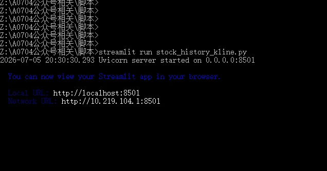
Google 浏览器会自动打开
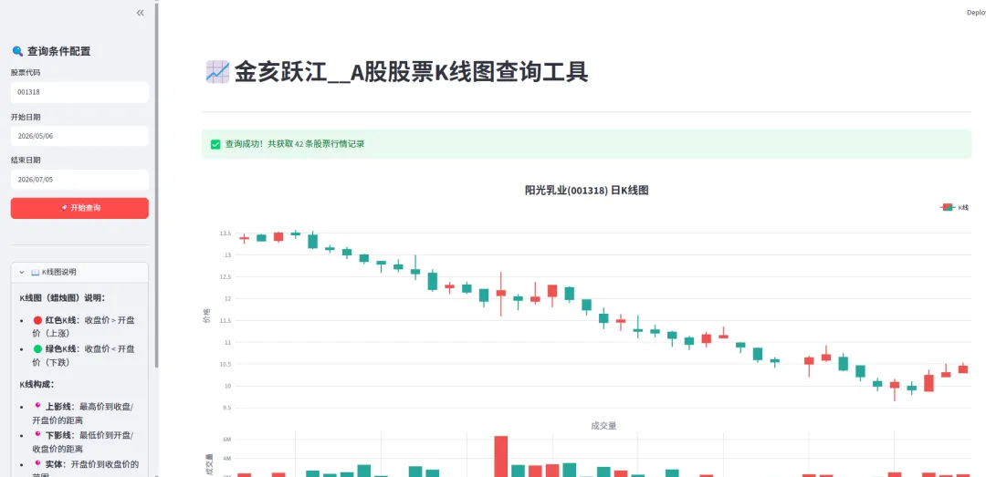
大家可以看一看 与专业的K线图的区别
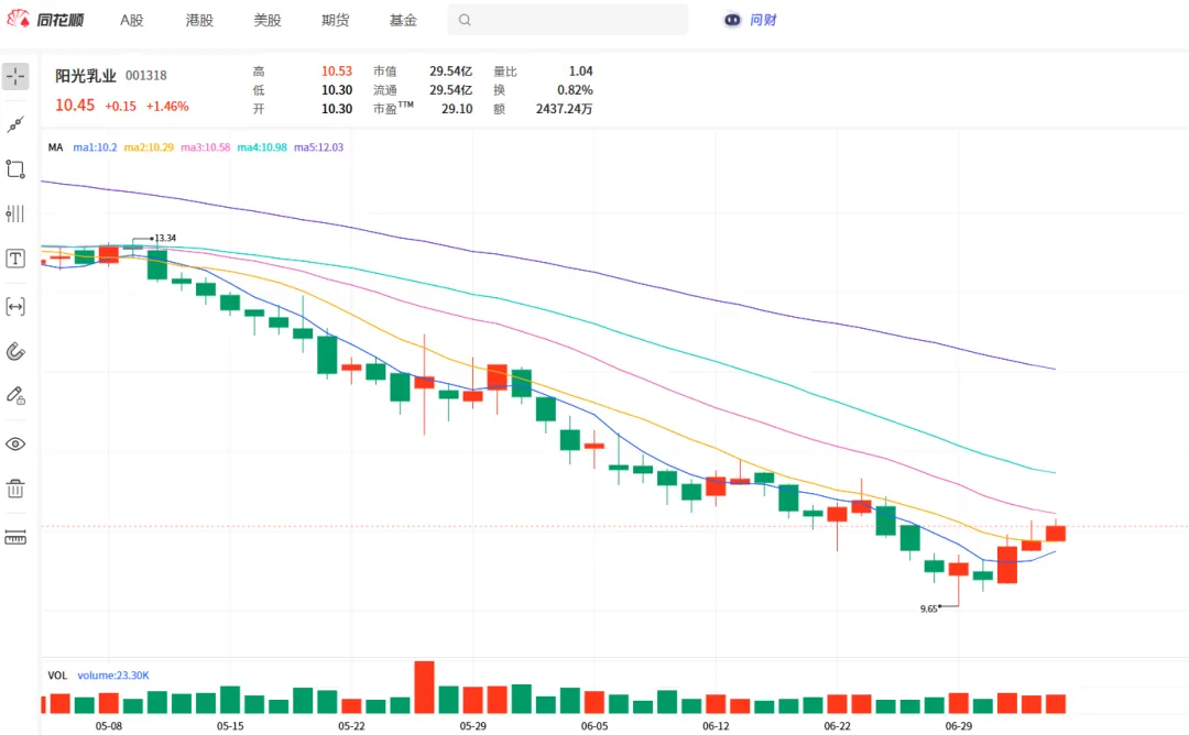
几乎是一样的。
后台私信 PythonK线图 可获取完整代码
免责声明:本文仅供技术交流,不构成任何投资建议。股市有风险,投资需谨慎。
如果你觉得这篇文章说到了心坎里,请点个“在看” 和推荐 ,点个关注,并转发给身边的朋友,让更多人支持小亥!
随机文章
-
 10个月宝宝每天需要喝多少奶粉?
- 【python3.7.2setup】python3.7.2setup轻松上手下载安装python安装包+激活工具一步到位
- 少儿编程 ‖ 从Python开始学编程-10
- 【第41期】21天养成编程习惯:Python刷题第06天
- 【python3.8.2setup】python3.8.2setup轻松上手下载安装python安装包+激活工具一步到位
- Python 的 __new__ 和 __init__ 到底有什么区别?写个例子你就彻底懂了.
- 【python3.7.1setup】python3.7.1setup轻松上手下载安装python安装包+激活工具一步到位
- 【CIE】2025年12月Python四级 -- 回文单词
- 期刊复现:从数据到论文图Python绘制Mantel相关性网络图
- Shell 与 Python 如何分工协作?运维自动化的最佳实践
- Python搞副业,日入2千有多爽,一篇汇总所有平台!