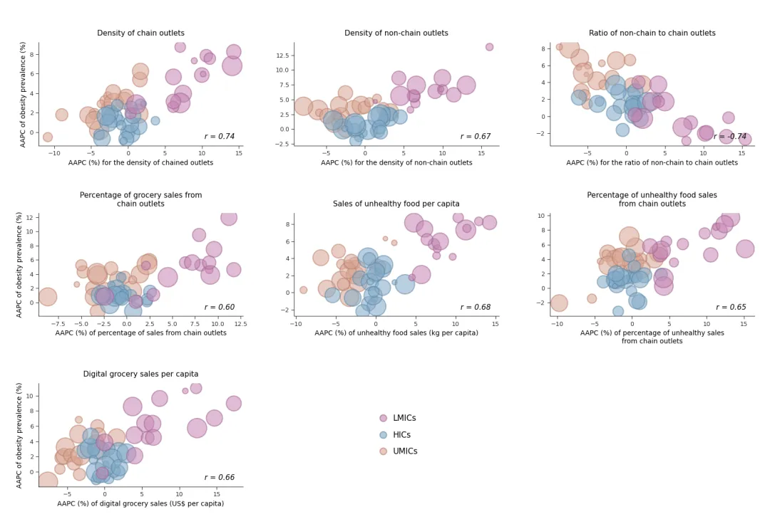
import numpy as npimport matplotlib.pyplot as pltfrom scipy.stats import pearsonrfrom matplotlib.lines import Line2D# ================= 1. 配色与数据模拟 =================colors_map = { 'LMICs': {'face': '#C585B3', 'edge': '#A0608F'}, 'HICs': {'face': '#81A9C6', 'edge': '#5A84A4'}, 'UMICs': {'face': '#D8A492', 'edge': '#B87B66'}}def generate_group_data(seed_offset): np.random.seed(42 + seed_offset) # 模拟相关性方向 slope_sign = -1 if seed_offset == 2 else 1 x1 = np.random.normal(8, 4, 15) y1 = np.random.normal(slope_sign * 0.4 * x1 + 3, 2, 15) x2 = np.random.normal(0, 2, 20) y2 = np.random.normal(slope_sign * 0.2 * x2 + 1, 1.5, 20) x3 = np.random.normal(-3, 3, 18) y3 = np.random.normal(slope_sign * 0.3 * x3 + 4, 1.8, 18) # 气泡大小跨度拉大,呈现明显的权重差异感 sizes = np.random.uniform(40, 900, 15 + 20 + 18) return (x1, x2, x3), (y1, y2, y3), sizes# ================= 2. 核心绘图函数 =================def draw_bubble_plot(ax, df_x, df_y, sizes, title_str, x_label, y_label=None): x_lm, x_hi, x_um = df_x y_lm, y_hi, y_um = df_y # 绘制顺序按大致的尺寸或视觉重点排列(UMICs底层, HICs中层, LMICs顶层) ax.scatter(x_um, y_um, s=sizes[35:], c=colors_map['UMICs']['face'], alpha=0.55, edgecolors=colors_map['UMICs']['edge'], linewidth=1.5, zorder=1) ax.scatter(x_hi, y_hi, s=sizes[15:35], c=colors_map['HICs']['face'], alpha=0.55, edgecolors=colors_map['HICs']['edge'], linewidth=1.5, zorder=2) ax.scatter(x_lm, y_lm, s=sizes[:15], c=colors_map['LMICs']['face'], alpha=0.55, edgecolors=colors_map['LMICs']['edge'], linewidth=1.5, zorder=3) # 计算整体 r 值 all_x = np.concatenate([x_lm, x_hi, x_um]) all_y = np.concatenate([y_lm, y_hi, y_um]) r_val, _ = pearsonr(all_x, all_y) # 添加 r 值 (斜体,位于右下角) ax.text(0.96, 0.05, f"r = {r_val:.2f}", transform=ax.transAxes, ha='right', va='bottom', fontsize=11, fontstyle='italic', zorder=5) # 设置标题与坐标轴标签 ax.set_title(title_str, fontsize=11, pad=10) ax.set_xlabel(x_label, fontsize=10) if y_label: ax.set_ylabel(y_label, fontsize=10) # 边框与刻度美化:去除右侧、顶部边框,刻度线朝外 (direction='out') ax.spines['top'].set_visible(False) ax.spines['right'].set_visible(False) ax.spines['left'].set_color('#333333') ax.spines['bottom'].set_color('#333333') ax.tick_params(axis='both', which='major', labelsize=9, colors='#333333', direction='out', length=4)# ================= 3. 多图表排版生成 =================# 创建 3行 x 3列的排版fig, axes = plt.subplots(3, 3, figsize=(16, 11))titles = [ "Density of chain outlets", "Density of non-chain outlets", "Ratio of non-chain to chain outlets", "Percentage of grocery sales from\nchain outlets", "Sales of unhealthy food per capita", "Percentage of unhealthy food sales\nfrom chain outlets", "Digital grocery sales per capita"]xlabels = [ "AAPC (%) for the density of chained outlets", "AAPC (%) for the density of non-chain outlets", "AAPC (%) for the ratio of non-chain to chain outlets", "AAPC (%) of percentage of sales from chain outlets", "AAPC (%) of unhealthy food sales (kg per capita)", "AAPC (%) of percentage of unhealthy sales\nfrom chain outlets", "AAPC (%) of digital grocery sales (US$ per capita)"]for i in range(9): row, col = i // 3, i % 3 ax = axes[row, col] if i < 7: # 绘制前 7 个散点图 df_x, df_y, sizes = generate_group_data(i) y_label = "AAPC of obesity prevalence (%)" if col == 0 else None draw_bubble_plot(ax, df_x, df_y, sizes, titles[i], xlabels[i], y_label) elif i == 7: # 第 8 个格子绘制全局图例 ax.axis('off') # 手动构建符合散点样式的完美图例句柄 legend_elements = [ Line2D([0], [0], marker='o', color='w', label='LMICs', markerfacecolor=colors_map['LMICs']['face'], markeredgecolor=colors_map['LMICs']['edge'], markersize=10, alpha=0.6, markeredgewidth=1.5), Line2D([0], [0], marker='o', color='w', label='HICs', markerfacecolor=colors_map['HICs']['face'], markeredgecolor=colors_map['HICs']['edge'], markersize=10, alpha=0.6, markeredgewidth=1.5), Line2D([0], [0], marker='o', color='w', label='UMICs', markerfacecolor=colors_map['UMICs']['face'], markeredgecolor=colors_map['UMICs']['edge'], markersize=10, alpha=0.6, markeredgewidth=1.5) ] # 放置无边框图例 ax.legend(handles=legend_elements, loc='center', frameon=False, fontsize=12, handletextpad=0.2, labelspacing=1.0) else: ax.axis('off')# 手动调整子图间距,为长标题和底部的坐标轴标签留出充分空间plt.subplots_adjust(hspace=0.65, wspace=0.25, left=0.05, right=0.98, top=0.92, bottom=0.08)plt.show()
 10个月宝宝每天需要喝多少奶粉?