期刊图片复现|Python绘制带有回归拟合图、相对误差散点图及残差分布直方图的模型性能综合评估图
- 2026-09-08 19:14:55
期刊图片复现|Python绘制带有回归拟合图、相对误差散点图及残差分布直方图的模型性能综合评估图

论文:Matching metaheuristics to machine learning for concrete drying shrinkage prediction toward cost-effective mix design 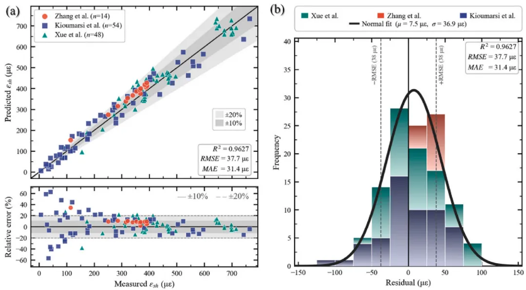
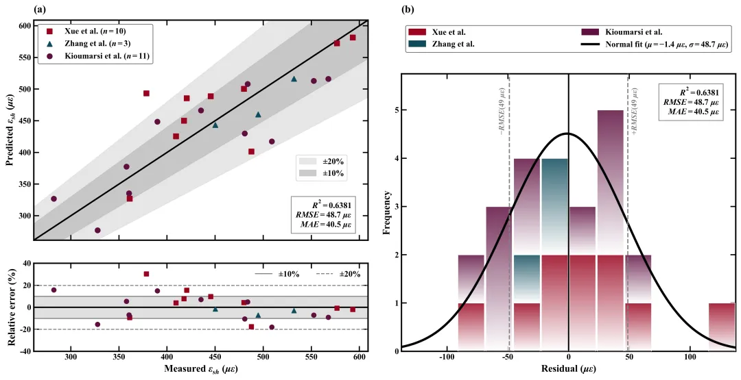
论文原图 此图为模型预测性能的综合评估图。图 (a) 的上半部分为预测值与实测值的散点对比图,横轴表示实测数据,纵轴表示预测值,图中使用不同的形状分别代表三个不同来源的数据,对角线的黑色实线代表 1:1 的完美预测,其周围的深灰色和浅灰色阴影带分别直观地标示出 ±10% 和 ±20% 的相对误差边界,右下角的文本框显示了该模型的R2等评估指标;图 (a) 的下半部分为相对误差分布图,横轴与上图一致,纵轴为相对误差百分比,通过散点展示了各个数据点误差的离散情况,并辅以灰色实线和虚线分别划定 ±10% 和 ±20% 的参考基准线。图 (b) 呈现了模型预测残差的统计分布规律,其主体是一个按数据来源分类着色的堆叠直方图,柱体带有由底端向上的渐变效果,横轴为残差值,纵轴为频数;叠加了一条黑色的正态分布拟合平滑曲线,图中央的一条黑色实线垂直参考线代表零残差位置,两侧的灰色虚线则分别指示了正负RMSE的区间范围。 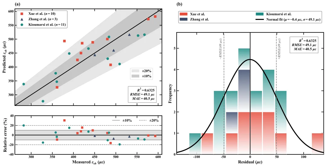
仿图 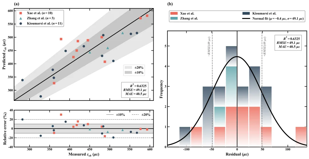
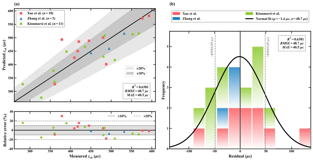
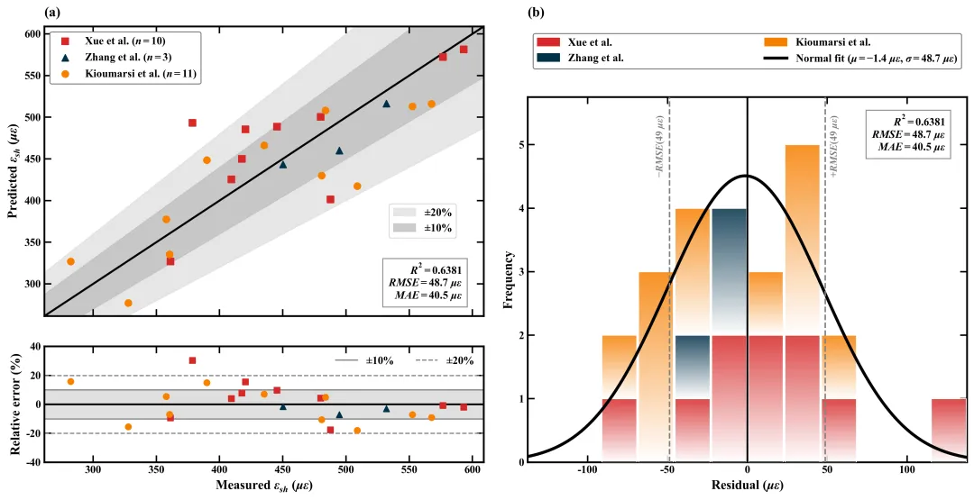
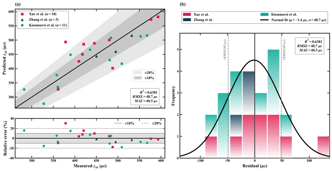
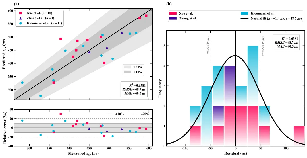
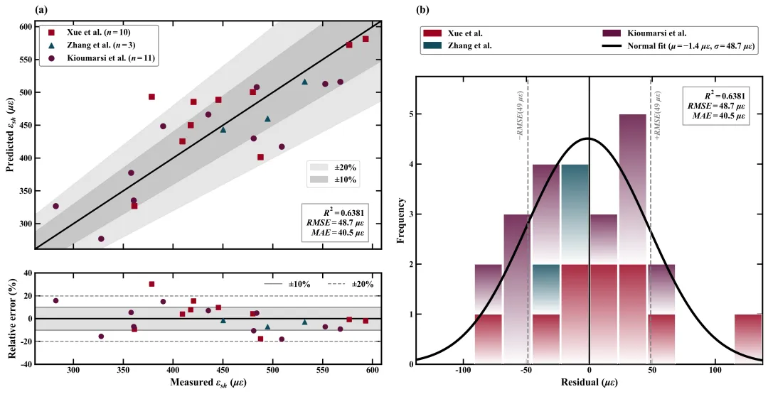
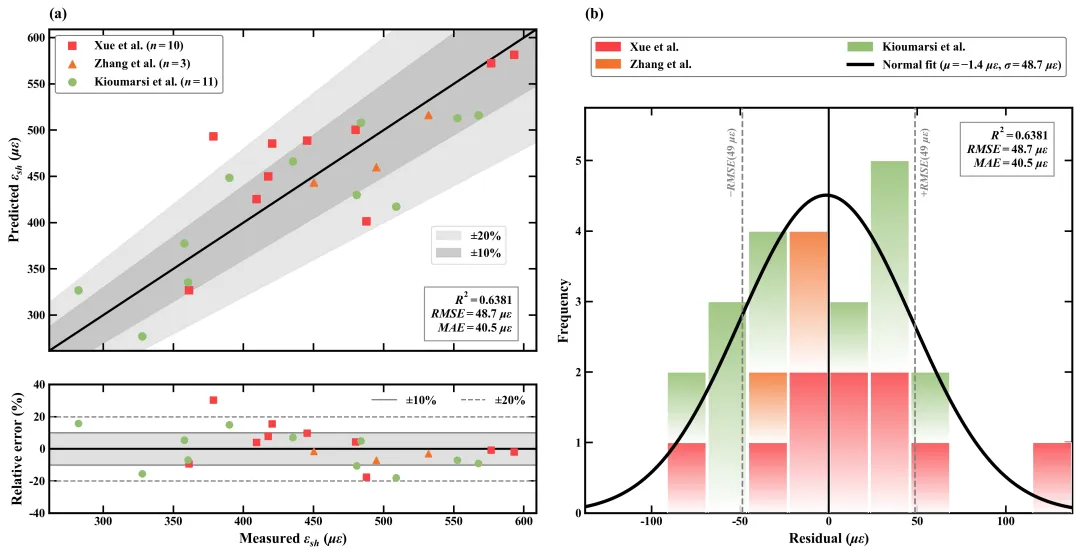
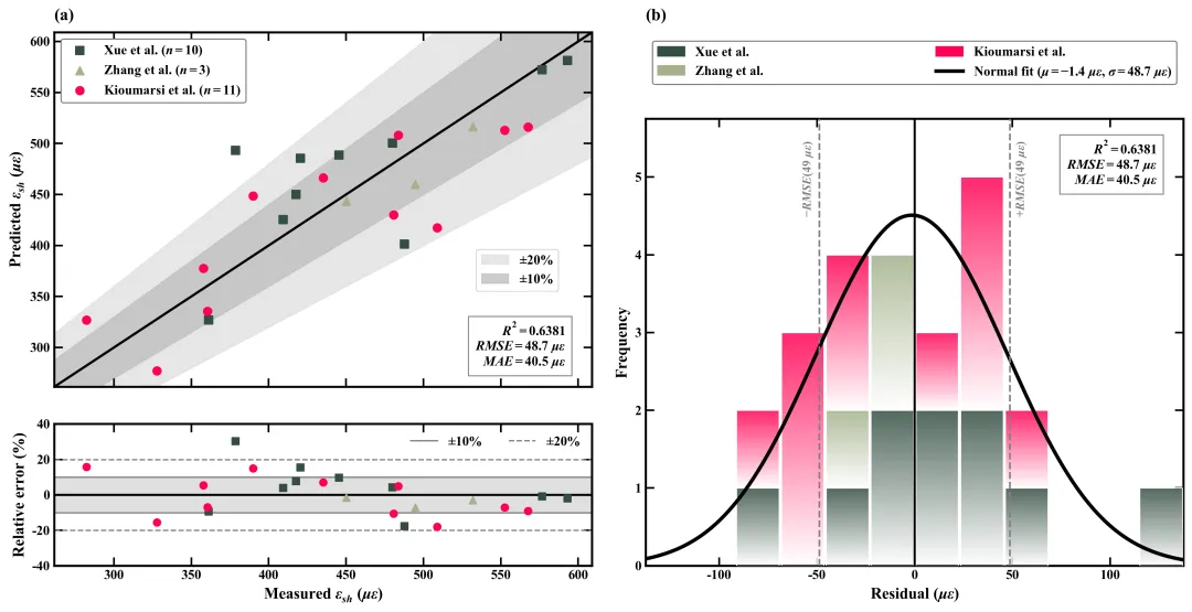
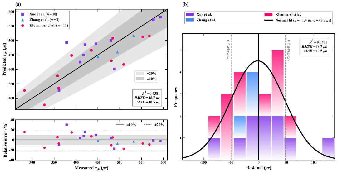
多种配色 



库的导入以及字体设置 

设置颜色库 

绘图函数:坐标轴轴格式化辅助函数与基础计算 

绘图函数:创建画布与基础布局设置 

绘图函数:绘制回归拟合图的部分 

绘图函数:绘制左下角的相对误差散点图 

绘图函数:绘制右上角的图例轴部分 

绘图函数:绘制右下方残差堆叠直方图 

执行部分 



期刊图片复现|Python绘制二维偏依赖PDP图 期刊复现|python绘制基于SHAP分析和GAM模型拟合的单特征依赖图 期刊图片复现|python绘制带有渐变颜色shap特征重要性组合图(条形图+蜂巢图) 期刊复现|用Python绘制SHAP特征重要性总览图、依赖图、双特征交互效应SHAP图,解锁XGBoost模型的终极奥秘 期刊图片复现|Python绘制shap重要性蜂巢图+单特征依赖图+交互效应强度气泡图+交互效应依赖图(回归+二分类+分类) 

公众号中的所有所有的免费代码都已经下架了,都并入到付费部分里了,付费合集代码和数据的购买通道已经开通,全部合集150元,无后续收费,目前包含270+篇代码+数据+参考论文,后续将会持续更新,决定购买请后台私信我,注意只会分享练习数据、参考论文和代码文件,仅提供有关代码的答疑,不会提供其他答疑服务,代码文件中已经包含了每行代码的完整注释,购买前请确保真的需要!!!
代码绘制成果展示
代码解释
第一部分
# =========================================================================================# ====================================== 1. 环境设置 =======================================# =========================================================================================import numpy as npimport pandas as pdimport matplotlib.pyplot as pltimport matplotlib.gridspec as gridspec
第二部分
# =========================================================================================# ======================================2.颜色库=======================================# =========================================================================================COLOR_SCHEMES = {1: ['#E74C3C', '#3B4A6B', '#1C8C85'],}
第三部分
# =========================================================================================# =====================================3.绘图函数=======================================# =========================================================================================def plot_advanced_forest_chart(df_real, scheme_id):# 分组unique_sources = df_real['Source'].unique()selected_hex_colors = COLOR_SCHEMES[scheme_id] # 配色方案#动态分配颜色和标记形状markers = ['s', '^', 'o', 'D', 'v', '<', '>']#用于存储图例样式source_styles = {}
第四部分
# 创建画布fig = plt.figure(figsize=(14, 7))# 创建网格gs_base = gridspec.GridSpec(1, # 行2, # 列width_ratios=[1, 1], # 比例wspace=0.1, # 宽度间距left=0.06, # 左边距right=0.98, # 右边距top=0.95, # 上边距bottom=0.08) # 下边距ax_leg = fig.add_subplot(gs_right[0])ax3 = fig.add_subplot(gs_right[1])
第五部分
min_v = min(y_true_all.min(), y_pred_all.min()) # 全局最小值max_v = max(y_true_all.max(), y_pred_all.max()) # 全局最大值scatter_handles = [] #散点句柄scatter_labels = [] #散点标签# 设置子图编号ax1.set_title('(a)', # 文本fontsize=14, # 字号fontweight='bold', # 加粗loc='left', # 水平pad=10) # 边距ax1.set_xticklabels([]) # 隐藏x轴刻度标签# 标注到图上ax1.text(0.95, # xbbox=dict(boxstyle='square,pad=0.5', # 文本框样式facecolor='white', # 背景色edgecolor='gray', # 边框色alpha=0.9)) # 透明度
第六部分
apply_local_format(ax2) # 格式化残差子图max_err = 0 # 初始最大误差err_bound = max(40, max_err * 1.1) # 设置y轴边界ax2.set_xlim(dynamic_min, dynamic_max) # x轴范围ax2.set_ylim(-err_bound, err_bound) # y轴范围# 设置x轴标题ax2.set_xlabel(r'Measured $\epsilon_{sh}$ ($\mu\epsilon$)', # 文本fontsize=13, # 字号fontweight='bold') # 加粗# 设置y轴标题ax2.set_ylabel('Relative error (%)', # 文本fontsize=13, # 字号fontweight='bold') # 加粗# 图例ax2.legend(loc='upper right', # 位置ncol=2, # 列frameon=False, # 无边框prop={'size': 11}) # 字号属性
第七部分
ax_leg.axis('off') # 关闭图例坐标轴# 添加编号ax_leg.set_title('(b)', # 文本fontsize=14, # 字号fontweight='bold', # 加粗loc='left', # 水平pad=10) # 标题边距# 添加右上角图例ax_leg.legend(handles=[*patch_handles, line_normal], #句柄loc='center', # 位置居中mode="expand", # 展开bbox_to_anchor=(0, 0, 1, 1), ncol=2, # 图例锚点及列布局prop={'size': 11}, # 字号edgecolor='gray', # 边框色framealpha=1) # 透明
第八部分
apply_local_format(ax3) # 格式化子图# 绘制x=0线ax3.axvline(0, # xcolor='black', # 黑色lw=1.8, # 线宽zorder=5) # 层# 绘制负RMSE参考线ax3.axvline(-rmse, # xcolor='gray', # 灰色lw=1.5, # 线宽ls='--', # 虚线zorder=5) # 层# 绘制正RMSE参考线ax3.axvline(rmse, # xcolor='gray', # 灰色lw=1.5, # 线宽ls='--', # 虚线zorder=5) # 层ax3.text(rmse + (res_limit * 0.02), # xylim_top, # yrf'$+RMSE ({rmse:.0f}\ \mu\epsilon)$', # 文本rotation=90, # 旋转color='gray', # 颜色va='top', # 垂直
第九部分
# =========================================================================================# ======================================4.执行部分=======================================# =========================================================================================if __name__ == "__main__":excel_path = r'data.xlsx' # 数据路径df_raw = pd.read_excel(excel_path) # 读取X_train = X_train_full.drop(columns=['Source']) #剔除分组X_test = X_test_full.drop(columns=['Source']) #剔除分组#测试集df_test = df_raw.loc[X_test.index].copy()#定义参数网格param_grid = {'n_estimators': [50, 100, 150],'learning_rate': [0.05, 0.1],'max_depth': [3, 4, 5]}
如何应用到你自己的数据
1.设置原始数据的保存路径,执行部分:
excel_path = r'data.xlsx'2.分离数据,执行部分:
X = df_raw.drop(columns=['Measured', 'Source']) #xy = df_raw['Measured'] #y
3.划分训练数据和测试数据,执行部分:
#划分数据X_train_full, X_test_full, y_train, y_test = train_test_split(df_raw.drop(columns=['Measured']), #xdf_raw['Measured'], #ytest_size=0.2, #比例random_state=42, #种子stratify=df_raw['Source'] #分层)X_train = X_train_full.drop(columns=['Source']) #剔除分组X_test = X_test_full.drop(columns=['Source']) #剔除分组
4.设置参数网格,执行部分:
param_grid = {'n_estimators': [50, 100, 150],'learning_rate': [0.05, 0.1],'max_depth': [3, 4, 5]}
5.设置是否进行批量绘图,执行部分:
plot_all = True6.提取分组信息,绘图函数部分:
# 分组unique_sources = df_real['Source'].unique()
7.设置绘图结果的保存地址,绘图函数部分:
plt.savefig(fr'Scheme_{scheme_id}.svg', bbox_inches='tight')推荐
获取方式
本文来自网友投稿或网络内容,如有侵犯您的权益请联系我们删除,联系邮箱:596563534@qq.com 。
随机文章
-
 10个月宝宝每天需要喝多少奶粉?
- Python自学|分清for与while,啃枯燥的底层语法
- Python实战项目|蜜雪冰城数据可视化完整案例.零基础可复刻!(附完整项目)
- 零基础Python自学方案|亲测3周上手拿实习
- 学Python想追AI,但不知道怎么结合自己专业?这里有个群,专门解决这事
- Python3.8.2|均衡稳定 Python 版本,兼顾学习与项目开发
- python2.7.10|Python2 系列漏洞修复迭代兼容旧项目
- python-3.6.6|修复安全漏洞 Python3.6 迭代稳定版本
- Python 里的条件判断、循环和函数,别再一股脑塞进 main 里
- python3.5.2|早期 Python3 基础版本,入门编程学习专用
- python-3.6.4|经典稳定 Python3 版本,适配老旧项目开发调试