期刊图片复现|Python绘制双变量对角线分割组合三角热图
- 2026-10-11 06:13:23
期刊图片复现|Python绘制双变量对角线分割组合三角热图

论文:Spatially synchronized structures of global hydroclimatic extremes 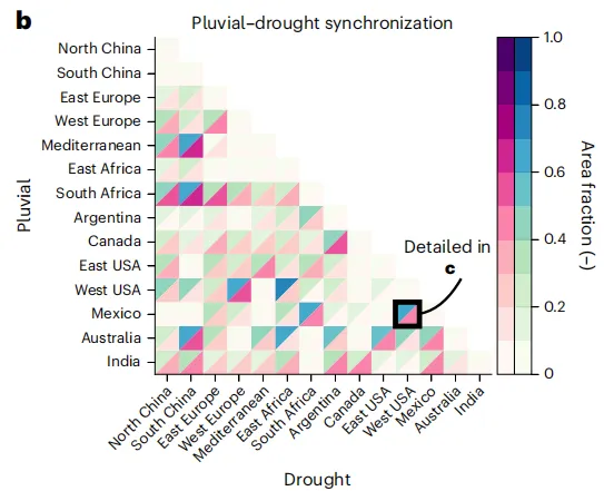
论文原图 此图的横轴代表经历干旱的地区,纵轴代表经历多雨的地区 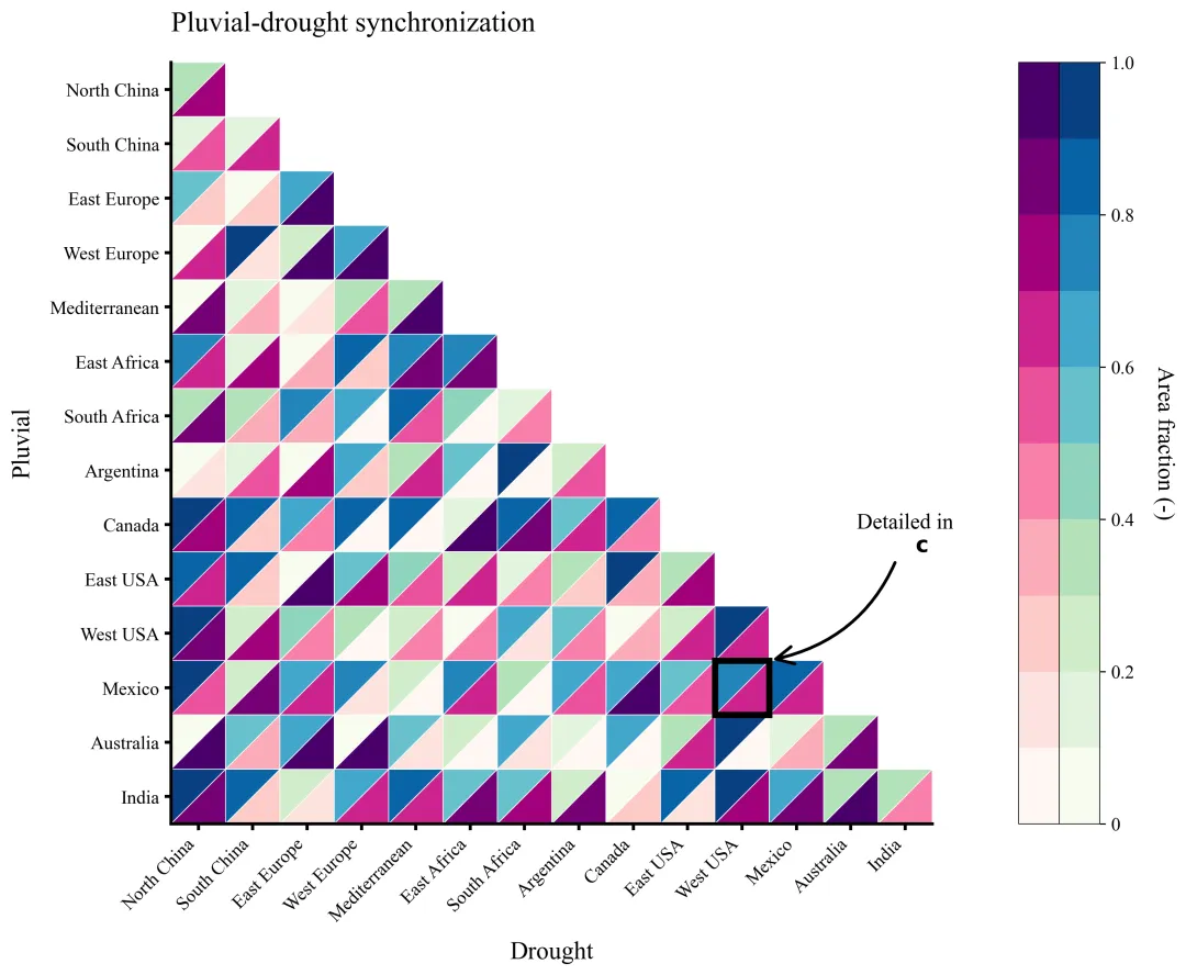
仿图 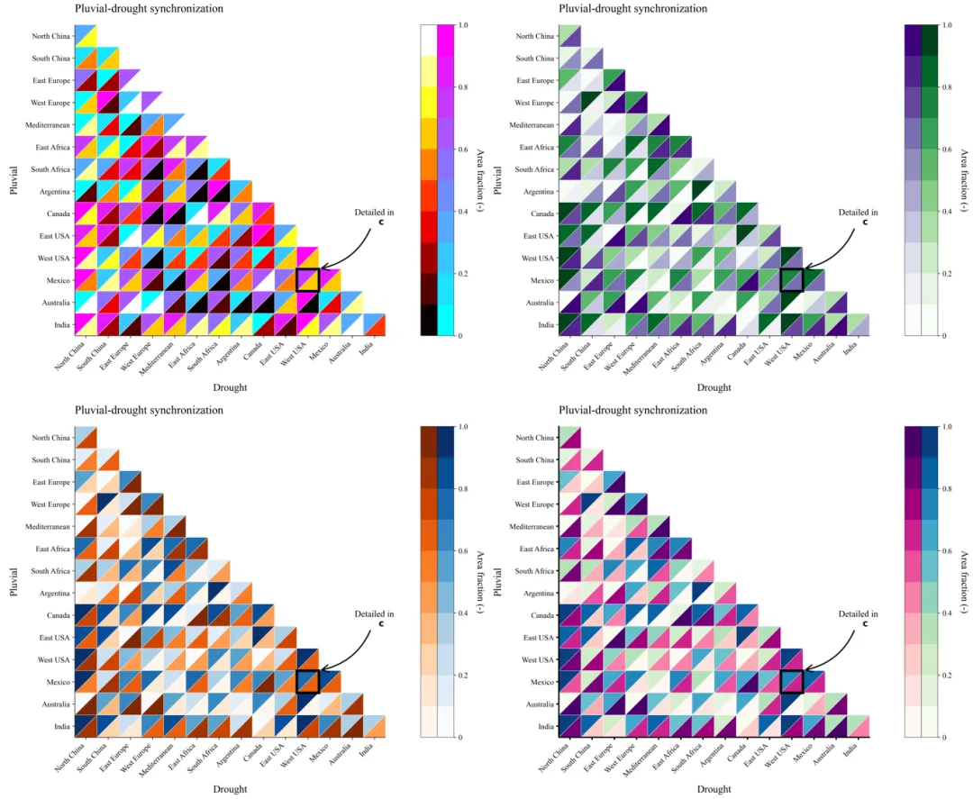
多种配色 



库的导入以及字体设置 

颜色库设置以及配色方案的选择 

绘图函数定义,初始化与坐标轴设置 它首先根据输入的区域列表确定图表尺寸和离散化颜色映射。 创建画布,在画布的特定位置精确放置了主坐标轴。 设置坐标轴的范围。 

热力图绘制循环 通过两层循环遍历矩阵的每个单元格,通过条件限制只绘制对角线及以下的区域。对于每个单元格,绘制了两个三角形:左上三角形和右下三角形分别表示不同的数值。 

图面细节设置 包括坐标轴、刻度线、标题、标记框 

双颜色条绘制 

执行部分 包括读取两个的数据。提取区域名称和数值,查找指定标记区域的索引,调用函数进行绘图 



期刊图片复现|Python绘制二维偏依赖PDP图 期刊复现|python绘制基于SHAP分析和GAM模型拟合的单特征依赖图 期刊图片复现|python绘制带有渐变颜色shap特征重要性组合图(条形图+蜂巢图) 期刊复现|用Python绘制SHAP特征重要性总览图、依赖图、双特征交互效应SHAP图,解锁XGBoost模型的终极奥秘 期刊图片复现|Python绘制shap重要性蜂巢图+单特征依赖图+交互效应强度气泡图+交互效应依赖图(回归+二分类+分类) 

需要的请后台私信我获取详细信息,注意只会分享练习数据和代码文件,不会提供答疑服务,代码文件中已经包含了每行代码的完整注释!!
代码绘制成果展示
代码解释
第一部分
# =========================================================================================# ====================================== 1. 库的导入 =========================================# =========================================================================================import matplotlib.pyplot as pltimport matplotlib.patches as patchesimport matplotlibimport numpy as npimport pandas as pdplt.rcParams['font.family'] = 'serif'plt.rcParams['font.serif'] = ['Times New Roman']plt.rcParams['axes.unicode_minus'] = Falsematplotlib.rcParams['pdf.fonttype'] = 42matplotlib.rcParams['ps.fonttype'] = 42
第二部分
# =========================================================================================# ====================================== 2.颜色库 =========================================# =========================================================================================COLOR_SCHEMES = {1: ('RdPu', 'GnBu'),2: ('Oranges', 'Blues'),3: ('Reds', 'Greens'),4: ('Purples', 'Greens'),5: ('YlOrBr', 'PuBu'),6: ('Reds', 'Blues'),7: ('OrRd', 'PuBuGn'),8: ('PuRd', 'YlGn'),9: ('BuPu', 'YlGnBu'),10: ('YlOrRd', 'BuGn'),11: ('Greys', 'Reds'),12: ('autumn', 'winter'),13: ('pink', 'bone'),14: ('hot', 'cool'),15: ('RdPu', 'PuBu'),16: ('YlOrBr', 'Greens'),17: ('Wistia', 'YlGnBu_r'),18: ('plasma', 'viridis'),19: ('summer', 'copper'),20: ('afmhot', 'ocean'),}SELECTED_SCHEME= 1
第三部分
# =========================================================================================# ====================================== 3.绘图函数=========================================# =========================================================================================def plot_and_save_heatmap(regions, data_pluvial, data_drought,idx_highlight_row, idx_highlight_col,scheme_index=1):# 获取区域数量,用于确定网格大小n = len(regions)#定义颜色的分级数量n_steps = 10#获取配色cmap_d_name, cmap_p_name = COLOR_SCHEMES.get(scheme_index, COLOR_SCHEMES[1])#加载下三角的颜色映射cmap_drought = matplotlib.colormaps[cmap_d_name].resampled(n_steps)#加载上三角的颜色映射cmap_pluvial = matplotlib.colormaps[cmap_p_name].resampled(n_steps)# 创建一个图形fig = plt.figure(figsize=(12, 9))# 定义主图在画布上的位置左,下,宽,高main_x, main_y = 0.12, 0.15main_w, main_h = 0.65, 0.75pos_main = [main_x, main_y, main_w, main_h]#在指定位置添加ax_main = fig.add_axes(pos_main)#X轴范围ax_main.set_xlim(0, n)#Y轴范围ax_main.set_ylim(0, n)#设置纵横比ax_main.set_aspect('equal')#反转Y轴ax_main.invert_yaxis()
第四部分
#绘图for row in range(n):for col in range(n):#只绘制下三角部分if row >= col:#获取对应位置的数据val_tl = data_pluvial[row, col]#根据数值从颜色映射中获取对应的颜色color_tl = cmap_pluvial(val_tl)#上三角形triangle_tl = patches.Polygon([(col, row), (col + 1, row), (col, row + 1)], #顶点坐标closed=True, #闭合图形color=color_tl, #填充颜色ec='white', #边框颜色lw=0.5 #边框宽度)# 将上三角形添加到主坐标轴ax_main.add_patch(triangle_tl)#获取对应位置的数据值val_br = data_drought[row, col]#根据数值从颜色映射中获取对应的颜色color_br = cmap_drought(val_br)#下三角形triangle_br = patches.Polygon([(col + 1, row), (col + 1, row + 1), (col, row + 1)], #顶点坐标closed=True, #闭合图形color=color_br, #填充颜色ec='white', # 框颜色lw=0.5 #边框宽度)#将下三角形添加到主坐标轴ax_main.add_patch(triangle_br)# 判断当前格子是否为指定的标记位置if row == idx_highlight_row and col == idx_highlight_col:# 创建黑色方框rect = patches.Rectangle((col, row), #左下角坐标1, 1, #宽度和高度linewidth=4, #线宽edgecolor='black', #边框颜色facecolor='none', #填充颜色zorder=10 #图层顺序)#添加到主坐标轴ax_main.add_patch(rect)
第五部分
# X轴刻度位置ax_main.set_xticks(np.arange(n) + 0.5)#Y轴刻度位置ax_main.set_yticks(np.arange(n) + 0.5)#X轴刻度标签ax_main.set_xticklabels(regions, rotation=45, ha='right', fontsize=12)#Y轴刻度标签ax_main.set_yticklabels(regions, fontsize=12)#图框ax_main.spines['top'].set_visible(False)ax_main.spines['right'].set_visible(False)ax_main.spines['left'].set_visible(True)ax_main.spines['bottom'].set_visible(True)for spine in ax_main.spines.values():spine.set_linewidth(2)#刻度线ax_main.tick_params(axis='both', which='both', length=4,width=2,)#Y轴标题ax_main.set_ylabel("Pluvial", fontsize=16, labelpad=10)ax_main.set_xlabel("Drought", fontsize=16, labelpad=10)#主标题ax_main.set_title("Pluvial-drought synchronization", fontsize=18, loc='left', pad=20)#标记注释#坐标target_x = idx_highlight_col + 1target_y = idx_highlight_row# 添加注释ax_main.annotate("Detailed in\n " + r"$\bf{c}$", #注释文本xy=(target_x, target_y), #箭头坐标xytext=(target_x + 2.5, target_y - 2), #文本坐标arrowprops=dict(arrowstyle="->, head_width=0.4, head_length=0.8", #箭头样式connectionstyle="arc3,rad=-0.3", #连接线弯曲程度lw=2, color='black'), #线宽和颜色fontsize=14, ha='center')
第六部分
#颜色条cbar_gap = 0.02 # 主图与颜色条之间间隔cbar_width = 0.03 #单个颜色条的宽度cbar_bottom = main_y #颜色条底部位置cbar_height = main_h #颜色条高度#颜色条的起始X坐标cbar_left_x = main_x + main_w + cbar_gap#创建垂直渐变数据gradient = np.linspace(0, 1, n_steps).reshape(-1, 1)#绘制左侧颜色条# 添加子坐标轴用于绘制颜色条ax_cb_left = fig.add_axes([cbar_left_x, cbar_bottom, cbar_width, cbar_height])#绘制图像ax_cb_left.imshow(gradient, aspect='auto', cmap=cmap_drought, origin='lower')#X轴刻度ax_cb_left.set_xticks([])#Y轴刻度ax_cb_left.set_yticks([])#图框for spine in ax_cb_left.spines.values():spine.set_edgecolor('black');spine.set_linewidth(0.5)#绘制右侧颜色条#添加子坐标轴ax_cb_right = fig.add_axes([cbar_left_x + cbar_width, cbar_bottom, cbar_width, cbar_height])#绘制图像ax_cb_right.imshow(gradient, aspect='auto', cmap=cmap_pluvial, origin='lower', extent=[0, 1, 0, 1])#X轴刻度ax_cb_right.set_xticks([])#右侧颜色条的刻度ax_cb_right.yaxis.tick_right()#设置刻度数值位置ax_cb_right.set_yticks([0, 0.2, 0.4, 0.6, 0.8, 1.0])#刻度标签文本ax_cb_right.set_yticklabels(['0', '0.2', '0.4', '0.6', '0.8', '1.0'], fontsize=12)# 为颜色条添加细黑色边框for spine in ax_cb_right.spines.values():spine.set_edgecolor('black');spine.set_linewidth(0.5)#图框ax_cb_right.set_ylabel("Area fraction (-)", rotation=270, labelpad=-60, fontsize=15)
第七部分
# =========================================================================================# ====================================== 4.执行部分=========================================# =========================================================================================if __name__ == "__main__":excel_path = r"data.xlsx"#读取数据df_pluvial = pd.read_excel(excel_path, sheet_name='Pluvial_Data', index_col=0)df_drought = pd.read_excel(excel_path, sheet_name='Drought_Data', index_col=0)#获取索引列表作为区域名称regions = df_pluvial.index.tolist()#读取数值data_pluvial = df_pluvial.valuesdata_drought = df_drought.values#标记行索引idx_mexico = regions.index("Mexico")idx_west_usa = regions.index("West USA")# 调用封装好的绘图函数进行绘制和保存plot_and_save_heatmap(regions, # 区域名称列表data_pluvial, #上三角数据data_drought, #下三角数据idx_highlight_row=idx_mexico, #标记行索引idx_highlight_col=idx_west_usa, #标记行索引scheme_index=SELECTED_SCHEME, #配色方案)
如何应用?
1.选择你想要使用到的配色方案:
SELECTED_SCHEME= 12.设置绘图结果的保存地址:
plt.savefig(fr"heatmap_visualization_{SELECTED_SCHEME}.png", dpi=300, bbox_inches='tight')plt.savefig(fr"heatmap_visualization_{SELECTED_SCHEME}.pdf", bbox_inches='tight')
3.设置原始数据的路径:
excel_path = r"simulation_data.xlsx"4.设置要添加标记框的位置:
idx_mexico = regions.index("Mexico")idx_west_usa = regions.index("West USA")
推荐
获取方式
本文来自网友投稿或网络内容,如有侵犯您的权益请联系我们删除,联系邮箱:596563534@qq.com 。
随机文章
-
 10个月宝宝每天需要喝多少奶粉?
- 这5个Python库一旦掌握就离不开
- 用Python 画出高颜值柱状图 | 数据分析直接封神
- python实现北半球投影绘图-适用于离散型 数据
- 10个常用的python人工智能AI库
- 【python3.7.3setup】python3.7.3setup完整安装激活步骤及python安装包下载
- 实用Python代码1:宽格式表转长格式表
- Python 处理JSON/接口高性能序列化神器:orjson
- Python之实现文本转语音-edge-tts
- Python小白入门必背知识点汇总,背完你就牛
- Python绘制扇形相关性热图-包括pearson, spearman, kendall