【科研绘图系列】python绘制论文图
- 2026-09-02 16:08:43
【科研绘图系列】python绘制论文图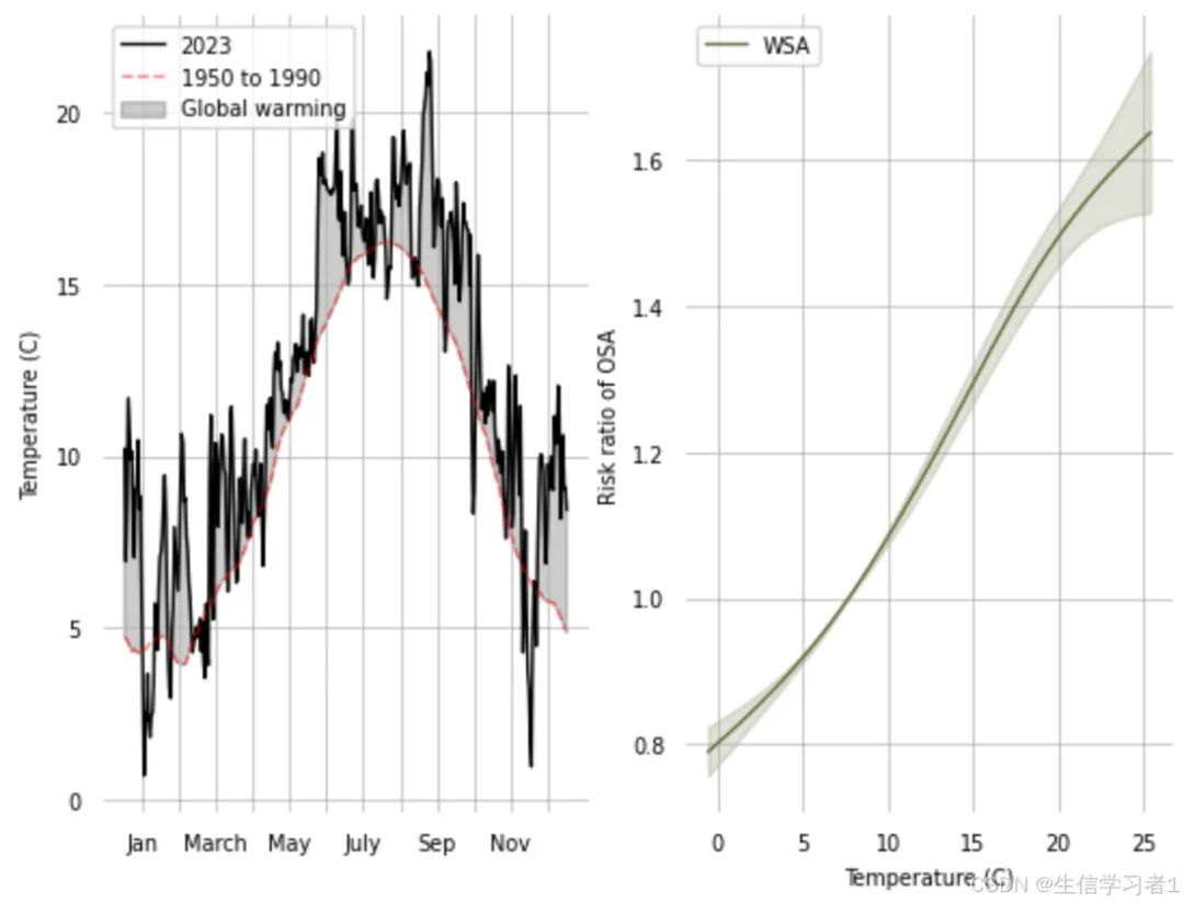
介绍
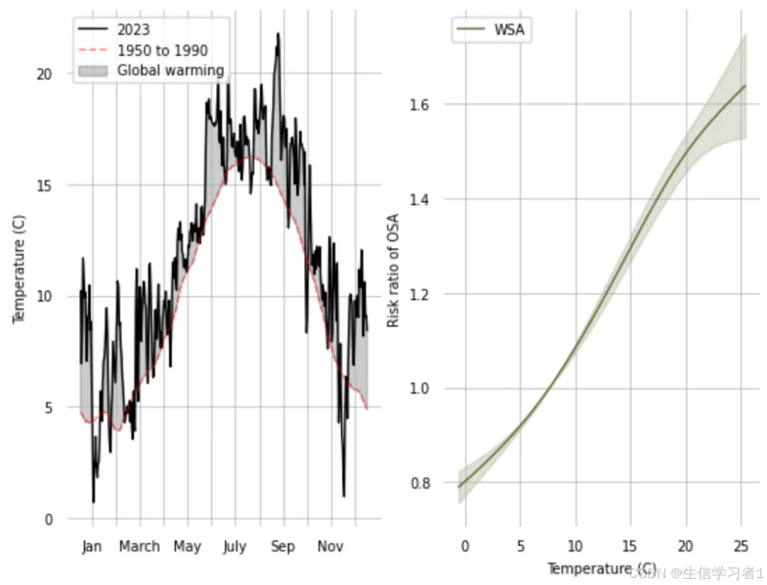
这段代码使用Python的Pandas、Numpy和Matplotlib库,对气温数据和健康风险数据进行了可视化分析。代码的主要目的是通过图表展示全球变暖对气温的影响,以及气温变化对健康风险(特别是睡眠呼吸暂停综合征,OSA)的影响。以下是代码的详细介绍:
数据读取
代码首先从CSV文件中读取了两组数据:
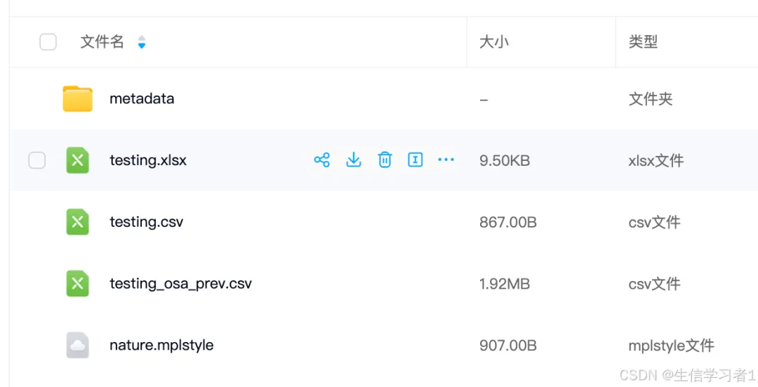
wdatemp:包含2023年的气温数据和1950-1990年的历史气温数据。 wsalogit:包含气温与OSA风险比(Risk Ratio, RR)的关系数据。
设置Matplotlib样式
plt.style.use('nature.mplstyle'):这行代码设置了Matplotlib的绘图样式,使用了nature.mplstyle样式表。这种样式表通常用于科学出版物,能够使图表看起来更加专业和美观。
绘制气温对比图
代码创建了一个包含两个子图的图表:
第一个子图(
ax):绘制了2023年的平均气温( t2m_mean)和1950-1990年的历史气温(t2m_historical)随时间(day_of_year)的变化。使用 ax.plot函数绘制了两条曲线,分别表示2023年的气温和历史气温。使用 ax.fill_between函数填充了两条曲线之间的区域,表示全球变暖的影响。设置了X轴的刻度标签,使其显示月份名称。 隐藏了图表的边框和刻度,使图表更加简洁。 添加了网格线和图例,以便更好地理解图表内容。 第二个子图(
ax2):绘制了气温与OSA风险比(RR)的关系曲线。 使用 ax2.plot函数绘制了气温与RR的关系曲线。使用 ax2.fill_between函数填充了置信区间,表示RR的不确定性范围。隐藏了图表的边框和刻度,使图表更加简洁。 添加了网格线和图例,以便更好地理解图表内容。
图表展示
最后,代码使用plt.show()函数展示了绘制的图表。通过这两个子图,可以直观地看到全球变暖对气温的影响,以及气温变化对OSA风险的影响。
加载python包
import pandas as pdimport numpy as npimport matplotlib.pyplot as pltplt.style.use('nature.mplstyle')导入数据
wdatemp = pd.read_csv('metadata/figure1a.csv')画图
fig,(ax,ax2)= plt.subplots(1,2)ax.plot(wdatemp['day_of_year'].values, wdatemp['t2m_mean'].values-273.15, label='2023', color='k', alpha=1)ax.plot(wdatemp['day_of_year'].values, wdatemp['t2m_historical'].values, label='1950 to 1990', linestyle='--', color='r', alpha=0.5)y2 = wdatemp['t2m_mean'].values-273.15y1 = wdatemp['t2m_historical'].valuesax.fill_between(x=wdatemp['day_of_year'].values, y1 = y1, y2 = y2, where=y2 >= y1, alpha=0.2, color='k', label='Global warming')ax.set_xticks(np.linspace(0,365,13)[:-1]+15,('Jan',' ','March',' ','May',' ','July',' ','Sep',' ','Nov',' '))ax.grid()ax.legend(loc='upper left')ax.spines.right.set_visible(False)ax.spines.top.set_visible(False)ax.spines.bottom.set_visible(False)ax.spines.left.set_visible(False)ax.tick_params(# changes apply to the x-axis which='both',# both major and minor ticks are affected bottom=False,# ticks along the bottom edge are off top=False,# ticks along the top edge are off left=False,)ax.set_ylabel('Temperature (C)')wsalogit = pd.read_csv('metadata/figure1b.csv')ax2.plot(wsalogit['xvar'].values, wsalogit['est'].values, color='#606c38', label='WSA')ax2.fill_between(wsalogit['xvar'].values, y1=wsalogit['lb'].values, y2=wsalogit['hb'].values, color='#606c38', alpha=0.2)ax2.grid()ax2.legend(loc='upper left')ax2.spines.right.set_visible(False)ax2.spines.top.set_visible(False)ax2.spines.bottom.set_visible(False)ax2.spines.left.set_visible(False)ax2.tick_params(# changes apply to the x-axis which='both',# both major and minor ticks are affected bottom=False,# ticks along the bottom edge are off top=False,# ticks along the top edge are off left=False,)ax2.set_xlabel('Temperature (C)')ax2.set_ylabel('Risk ratio of OSA')plt.show()总结
这段代码通过Python的Pandas、Numpy和Matplotlib库,对气温数据和健康风险数据进行了可视化分析。代码的主要目的是通过图表展示全球变暖对气温的影响,以及气温变化对健康风险(特别是睡眠呼吸暂停综合征,OSA)的影响。代码分为以下几个主要部分:
- 数据读取
:从CSV文件中读取了2023年的气温数据、历史气温数据和气温与OSA风险比的关系数据。 - 设置Matplotlib样式
:使用了 nature.mplstyle样式表,使图表看起来更加专业和美观。 - 绘制气温对比图
:创建了一个包含两个子图的图表,分别展示了2023年的气温与历史气温的对比,以及气温与OSA风险比的关系。 - 图表展示
:通过隐藏边框、刻度和添加网格线、图例等操作,使图表更加简洁和易于理解。
整体而言,这段代码提供了一个清晰的框架,用于展示气温变化对健康风险的影响,有助于科学地评估全球变暖对人类健康的潜在影响。
数据下载
通过网盘分享的文件:211.python论文绘图
百度网盘链接:https://pan.baidu.com/s/1HyHLt4TV1RjxH3sFrJOjGw 提取码:psta
本文来自网友投稿或网络内容,如有侵犯您的权益请联系我们删除,联系邮箱:596563534@qq.com 。
随机文章
-
 10个月宝宝每天需要喝多少奶粉?
- 在 Linux 上运行完整 Android 系统
- ChatGPT 杀入 Linux:这次不止聊天,Codex 也进了本地项目
- 第350讲:Python通过win32com调用VBA宏——用Python做调度中心,让存量VBA资产继续发光
- 【第42期】21天养成编程习惯:Python刷题第15天
- 10分钟看懂80%的Python代码,新手只要记住这个万能公式!
- 普通人用Python做副业的邪修平台,周入2000,超简单!!!
- 吃透这张图,你就能搞定整套Linux体系!
- 6python之数据库表数据加到配置文件中及线上bug处理
- 从 0 到 1 打造工业级 Linux 服务器自动巡检系统:Python + psutil 工程化实战
- Linux都冲到7.0了,Linus还在拿“大数字恐惧症”开涮,连接班人的话都顺手聊开了