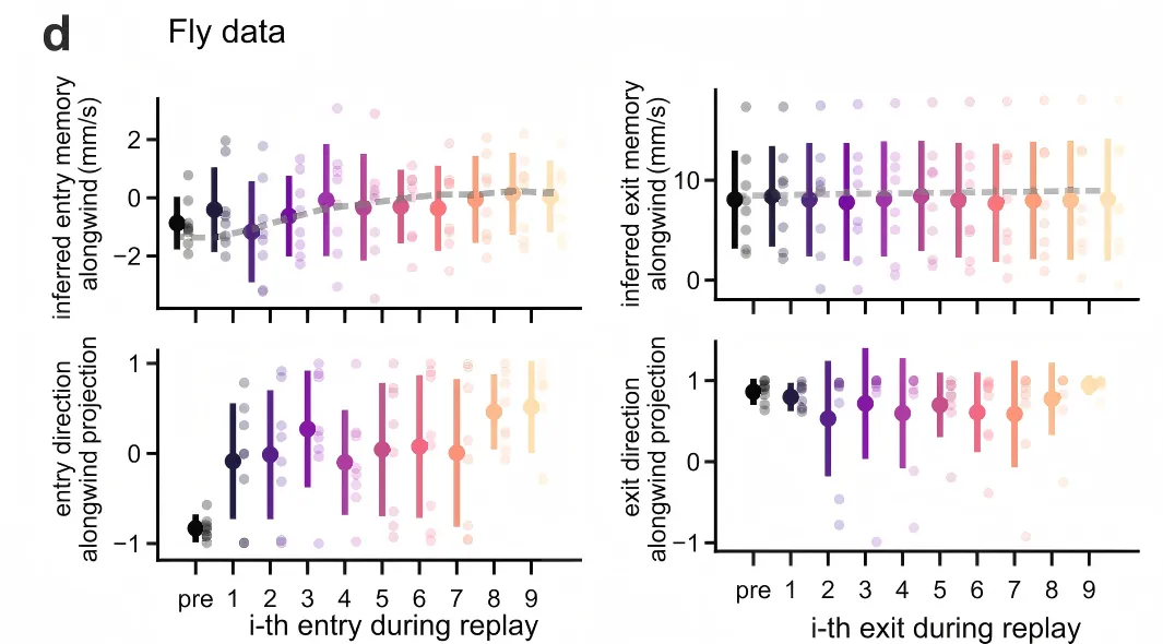
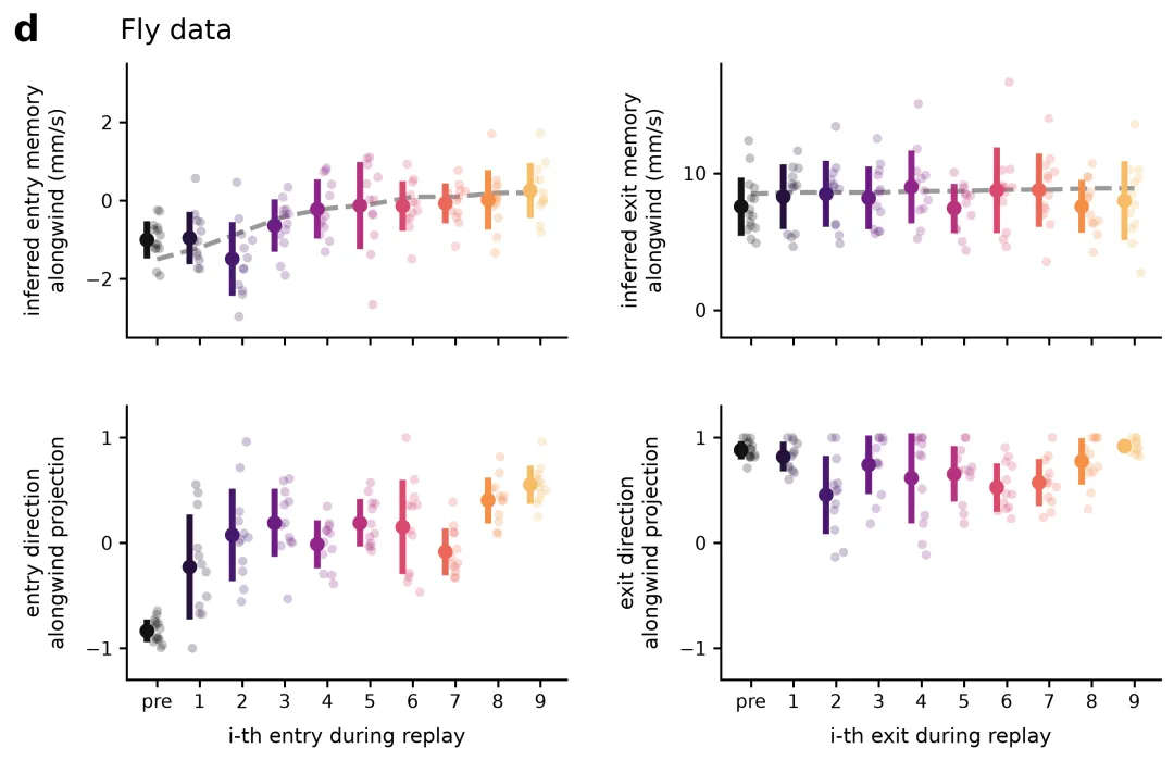
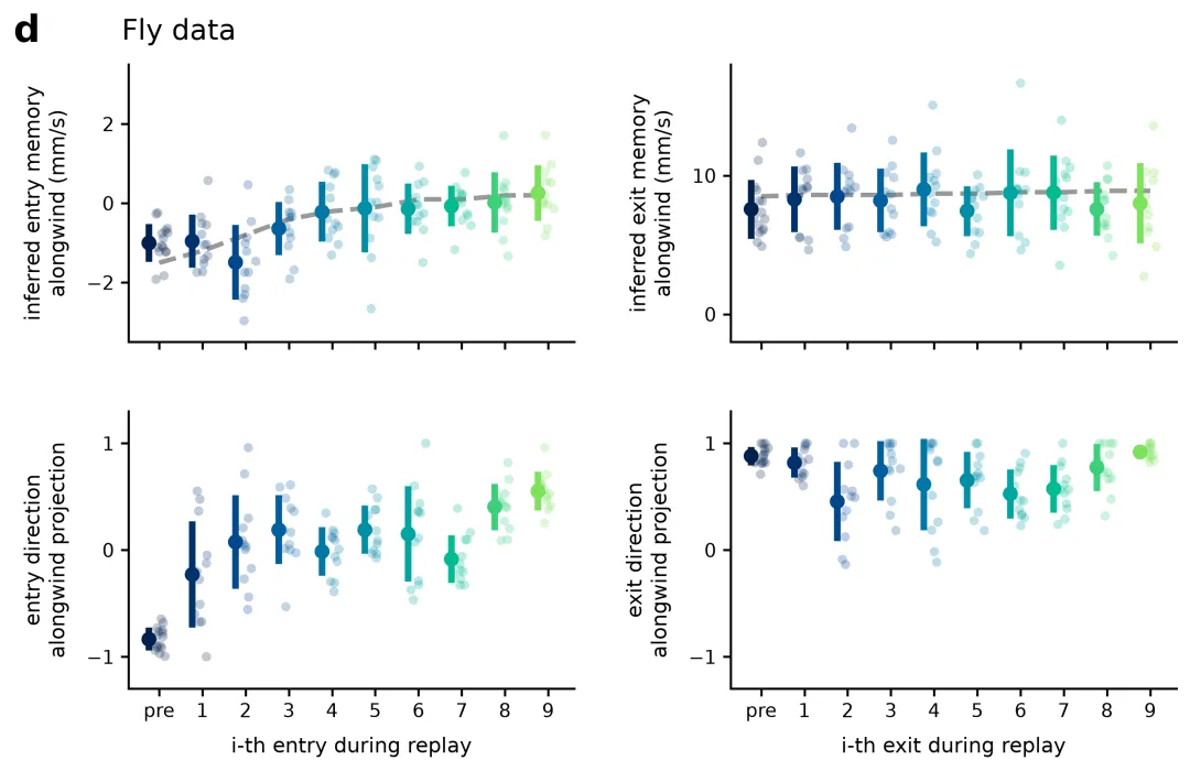
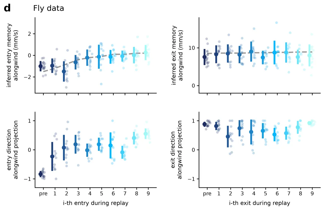
COLOR_SCHEMES = { 1: ["#111111", "#26103c", "#46196e", "#6b1d84", "#90258a", "#b83280", "#da496d", "#ed6858", "#f68f48", "#f7bc67"], # 方案1: Magma(暗紫/黑到黄橙,适合连续渐变) 2: ["#0d0887", "#350498", "#5c01a6", "#8004a2", "#a21d94", "#c03a83", "#d8576b", "#ed7953", "#fb9f3a", "#f0c93d"], # 方案2: Plasma(蓝紫到亮黄,高对比度渐变) 3: ["#00204c", "#00326d", "#00478d", "#005e9d", "#0076a5", "#008ea6", "#00a5a0", "#00bb91", "#3cd07b", "#7ce25b"], # 方案3: Viridis Blue-Green(深蓝到亮绿,色盲友好) 4: ["#1b2c62", "#1f407b", "#215695", "#206daf", "#1b84c9", "#119de3", "#00b6fd", "#3ecffb", "#6ce6f9", "#a1f8f7"], # 方案4: Ocean Blue(深海蓝渐变,适合单色调层级) 5: ["#3b0f70", "#541675", "#6c1d79", "#85247c", "#9e2b7f", "#b7327f", "#d03b7d", "#e74678", "#f95570", "#ff6b6b"], # 方案5: Red-Purple(紫红到珊瑚红,高饱和渐变) 6: ["#2d004b", "#430460", "#5c0970", "#770e7a", "#92137e", "#ad1a7d", "#c62677", "#dc396d", "#eb5260", "#f47055"], # 方案6: Sunset Purple(落日紫红,典雅渐变) 7: ["#103823", "#1a5235", "#246c47", "#2e8759", "#39a36b", "#43bf7c", "#53dc8c", "#6ee89d", "#8cf4b0", "#adffc4"], # 方案7: Emerald Green(深翡翠绿到浅绿,生态与自然科学) 8: ["#40004b", "#5c1d6f", "#763a8e", "#8e57ac", "#a376c6", "#b895dd", "#cb7ebd", "#da619d", "#e44177", "#e71d51"], # 方案8: Berry Gradient(深紫到浆果红,高冷科研风格) 9: ["#003f5c", "#2f4b7c", "#665191", "#a05195", "#d45087", "#f95d6a", "#ff7c43", "#ffa600", "#ffc533", "#ffe169"], # 方案9: Qual-Multi Tier(深蓝到亮黄彩虹级,多组对比) 10: ["#1a2a3a", "#2b3e50", "#3d5366", "#50697f", "#648099", "#7998b3", "#8fb1cd", "#a6cbe8", "#bee5ff", "#d6f0ff"], # 方案10: Cool Steel Gray-Blue(钢蓝冷灰色系,低调严谨) 11: ["#20115b", "#3d1375", "#5a1389", "#780f98", "#9702a1", "#b400a4", "#cf00a2", "#e61a9b", "#f74390", "#ff6b87"], # 方案11: Neon Violet(霓虹紫红,显著分界渐变) 12: ["#004c6d", "#1c6080", "#317493", "#458aab", "#59a0c3", "#6db6dc", "#82cdf5", "#9be3ff", "#b4f0ff", "#cefaff"], # 方案12: Ice Blue(冰蓝渐变,冷色调数据) 13: ["#4a1005", "#671a0c", "#852512", "#a33118", "#c23e1e", "#e14c24", "#fd5c2a", "#ff7343", "#ff8c5e", "#ffa57a"], # 方案13: Warm Amber/Rust(铁锈红到暖橙,暖色调系列) 14: ["#053061", "#1e539b", "#3c76b4", "#6699c7", "#9cc2df", "#c7e0f0", "#ebd2c8", "#f4a582", "#d6604d", "#b2182b"], # 方案14: Blue-Red Diverging(蓝红发散配色,正负值对比) 15: ["#276419", "#4d9221", "#7fbc41", "#b8e186", "#e6f5d0", "#fde0ef", "#f1b6da", "#de77ae", "#c51b7d", "#8e0152"], # 方案15: Green-Pink Diverging(绿粉发散配色,双向数据对比) 16: ["#00441b", "#006d2c", "#238b45", "#41ab5d", "#74c476", "#a1d99b", "#c7e9c0", "#e5f5e0", "#f7fcf5", "#ffffff"], # 方案16: Monochrome Green(单色渐变绿,表达梯度) 17: ["#023858", "#045a8d", "#0570b0", "#3690c0", "#67a9cf", "#bdc9e1", "#f1eef6", "#fff7bc", "#fec44f", "#fe9929"], # 方案17: Deep Blue to Gold(深蓝到黄金色,华丽高对比) 18: ["#313695", "#4575b4", "#74add1", "#abd9e9", "#e0f3f8", "#fee090", "#fdae61", "#f46d43", "#d73027", "#a50026"], # 方案18: Spectral Diverging(经典光谱发散, Nature常用) 19: ["#1b9e77", "#d95f02", "#7570b3", "#e7298a", "#66a61e", "#e6ab02", "#a6761d", "#666666", "#2b83ba", "#abdda4"], # 方案19: Qualitative Mixed(高辨识离散配色,多组类别) 20: ["#000000", "#1a1a1a", "#333333", "#4d4d4d", "#666666", "#808080", "#999999", "#b3b3b3", "#cccccc", "#e6e6e6"] # 方案20: Grayscale Scientific(标准科研黑白灰梯度)}
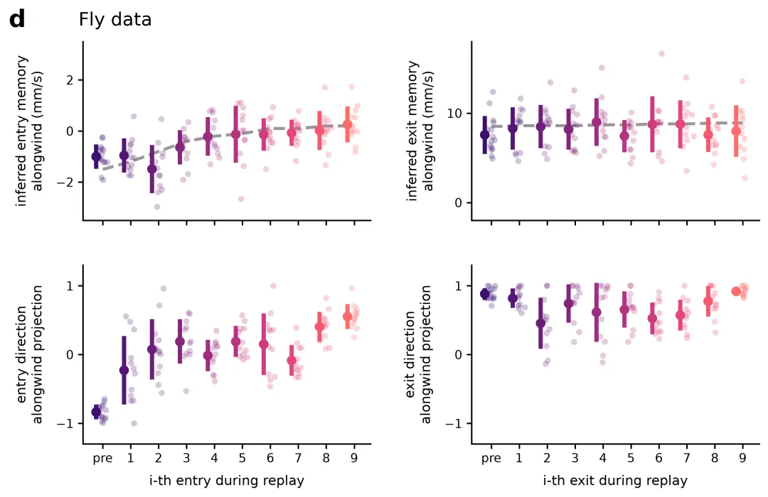
import osimport numpy as npimport pandas as pdimport matplotlib.pyplot as plt# ---------------------------------------------------------# 20种符合主流期刊标准的专业科研配色方案字典 (10色渐变)# ---------------------------------------------------------COLOR_SCHEMES = { 1: ["#111111", "#26103c", "#46196e", "#6b1d84", "#90258a", "#b83280", "#da496d", "#ed6858", "#f68f48", "#f7bc67"], # 方案1: Magma(暗紫/黑到黄橙,适合连续渐变)}# 选择配色方案编号 (1 - 20)SCHEME_INDEX = 5# 1. 自动创建“图表”文件夹os.makedirs("图表", exist_ok=True)# 2. 自动读取同目录下的 Excel 文件excel_path = "data.xlsx"df_raw = pd.read_excel(excel_path, sheet_name="Raw_Data")df_summary = pd.read_excel(excel_path, sheet_name="Summary_Data")# 3. 设置符合主流科研期刊的绘图参数plt.rcParams['font.family'] = 'DejaVu Sans'plt.rcParams['font.size'] = 10plt.rcParams['axes.linewidth'] = 1.2plt.rcParams['xtick.major.width'] = 1.2plt.rcParams['ytick.major.width'] = 1.2plt.rcParams['xtick.major.size'] = 4plt.rcParams['ytick.major.size'] = 4fig, axes = plt.subplots(2, 2, figsize=(10, 6), sharex=True)fig.subplots_adjust(hspace=0.25, wspace=0.35)# X轴阶段顺序stages = ["pre", "1", "2", "3", "4", "5", "6", "7", "8", "9"]# 加载选择的配色方案colors = COLOR_SCHEMES[SCHEME_INDEX]# 子图配置参数plot_configs = [ { "ax": axes[0, 0], "key": "entry_memory", "ylabel": "inferred entry memory\nalongwind (mm/s)", "has_trend": True, "ylim": (-3.5, 3.5), "yticks": [-2, 0, 2] }, { "ax": axes[0, 1], "key": "exit_memory", "ylabel": "inferred exit memory\nalongwind (mm/s)", "has_trend": True, "ylim": (-2, 18), "yticks": [0, 10] }, { "ax": axes[1, 0], "key": "entry_direction", "ylabel": "entry direction\nalongwind projection", "xlabel": "i-th entry during replay", "has_trend": False, "ylim": (-1.3, 1.3), "yticks": [-1, 0, 1] }, { "ax": axes[1, 1], "key": "exit_direction", "ylabel": "exit direction\nalongwind projection", "xlabel": "i-th exit during replay", "has_trend": False, "ylim": (-1.3, 1.3), "yticks": [-1, 0, 1] }]# 均值点与误差条向左偏移的量offset = 0.24# 4. 遍历配置并基于 Excel 数据绘图for cfg in plot_configs: ax = cfg["ax"] key = cfg["key"] # 提取 Excel 中的数据 sub_raw = df_raw[df_raw["Plot_Type"] == key] sub_sum = df_summary[df_summary["Plot_Type"] == key] # 绘制拟合虚线 if cfg["has_trend"]: trend_vals = sub_sum["Trend_Fit"].values if not np.isnan(trend_vals).all(): x_numeric = np.arange(len(stages)) ax.plot(x_numeric, trend_vals, color="grey", linestyle="--", linewidth=2.5, alpha=0.8, zorder=1) # 遍历各个阶段绘制数据 for i, stage in enumerate(stages): color = colors[i] # 1) 原始数据散点(分布在主要刻度 i 及其附近) raw_vals = sub_raw[sub_raw["Stage"] == str(stage)]["Value"].values if len(raw_vals) > 0: jitter = np.random.normal(0, 0.08, size=len(raw_vals)) ax.scatter(np.full_like(raw_vals, i) + jitter, raw_vals, color=color, alpha=0.25, s=25, edgecolors='none', zorder=2) # 2) 均值与误差条(画在点的左侧 x = i - offset 位置) sum_row = sub_sum[sub_sum["Stage"] == str(stage)] if not sum_row.empty: mean_val = sum_row["Mean"].values[0] sd_val = sum_row["SD"].values[0] # 在左侧绘制垂直粗误差棒 ax.vlines(x=i - offset, ymin=mean_val - sd_val, ymax=mean_val + sd_val, color=color, linewidth=3.5, zorder=3) # 在左侧绘制均值圆点 ax.plot(i - offset, mean_val, marker='o', color=color, markersize=7, zorder=4) # 隐藏上方与右侧边框 ax.spines['top'].set_visible(False) ax.spines['right'].set_visible(False) # 设置 Y 轴标签与刻度 ax.set_ylabel(cfg["ylabel"], fontsize=11, labelpad=8) if "ylim" in cfg: ax.set_ylim(cfg["ylim"]) if "yticks" in cfg: ax.set_yticks(cfg["yticks"]) # 设置 X 轴标签与刻度 if "xlabel" in cfg: ax.set_xlabel(cfg["xlabel"], fontsize=11, labelpad=8) ax.set_xticks(range(len(stages))) ax.set_xticklabels(stages, fontsize=10)# 5. 添加最左侧的 "d" 标号和 "Fly data"fig.text(0.04, 0.92, "d", fontsize=20, fontweight='bold', ha='left', va='center')fig.text(0.12, 0.92, "Fly data", fontsize=15, ha='left', va='center')# 6. 保存图片至 图表/ 目录(包含方案序号后缀)output_png = os.path.join("图表", f"fly_data_replay_{SCHEME_INDEX}.png")plt.savefig(output_png, dpi=300, bbox_inches='tight')plt.close()print(f"图表已更新并保存至: {output_png}")