Python绘制高颜值散点图矩阵+相关性分析网络图
- 2026-09-10 21:43:45
Python绘制高颜值散点图矩阵+相关性分析网络图请尊重原创成果,未经允许不得转载,谢谢 

论文:Leaf stomatal configuration and photosynthetic traits jointly affect leaf water use efficiency in forests along climate gradients 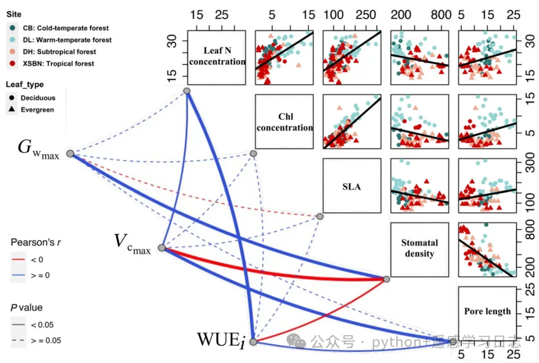
原图 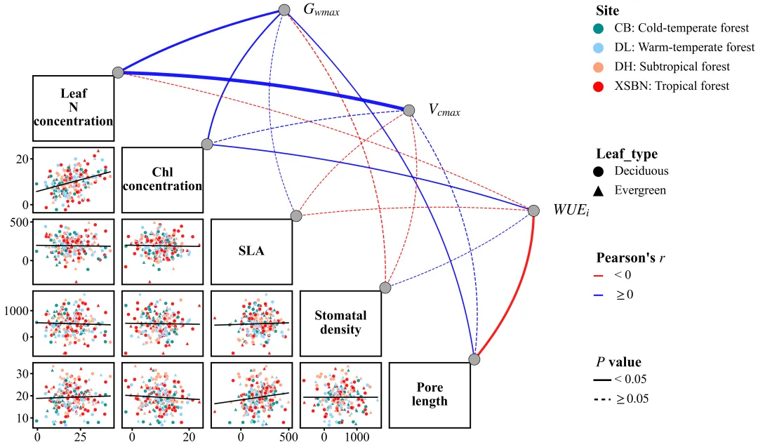
此图的左下角为主体散点图矩阵,对角线上的文本定义了基础变量,对角线下方各子图展示了两两变量之间的散点分布及线性回归拟合趋势;其中散点颜色对应4个生态站点,散点形状则代表不同类型特征;图右上半区构建了半环形拓扑网络,3个端点分别代表不同的目标变量;线条颜色反映皮尔逊相关系数的正负影响,线条粗细表示相关系数绝对值,线型表征统计显著性;右侧则垂直排列了4个清晰独立的图例块。此图适用于生态学、地球科学与自然地理学、植被遥感与定量遥感等众多领域的复杂多源数据分析展示。 仿图 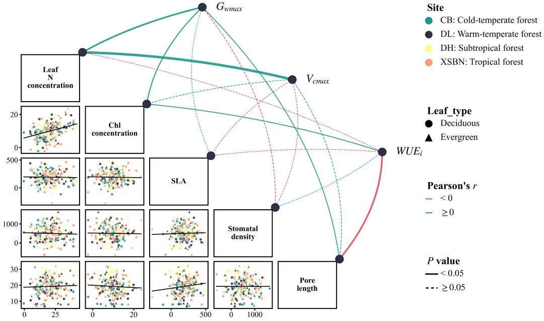
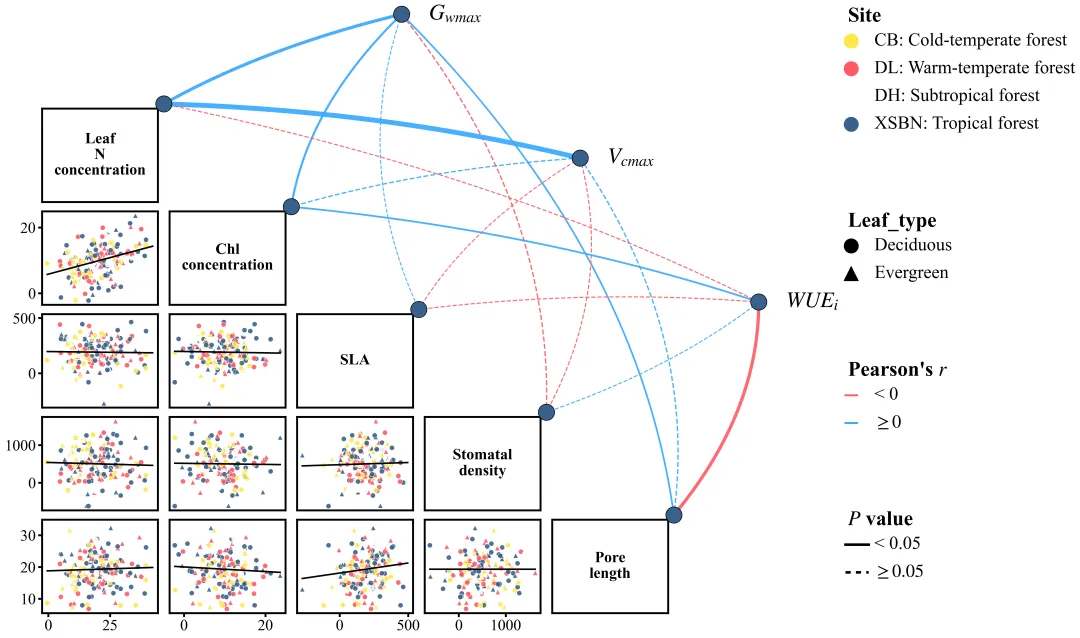
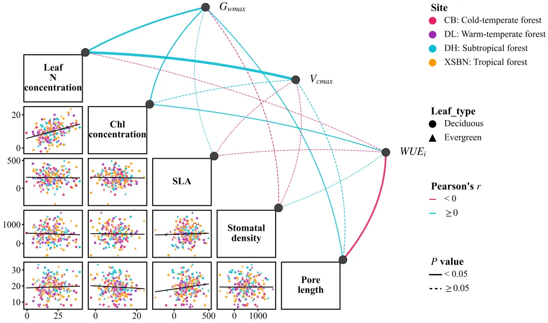
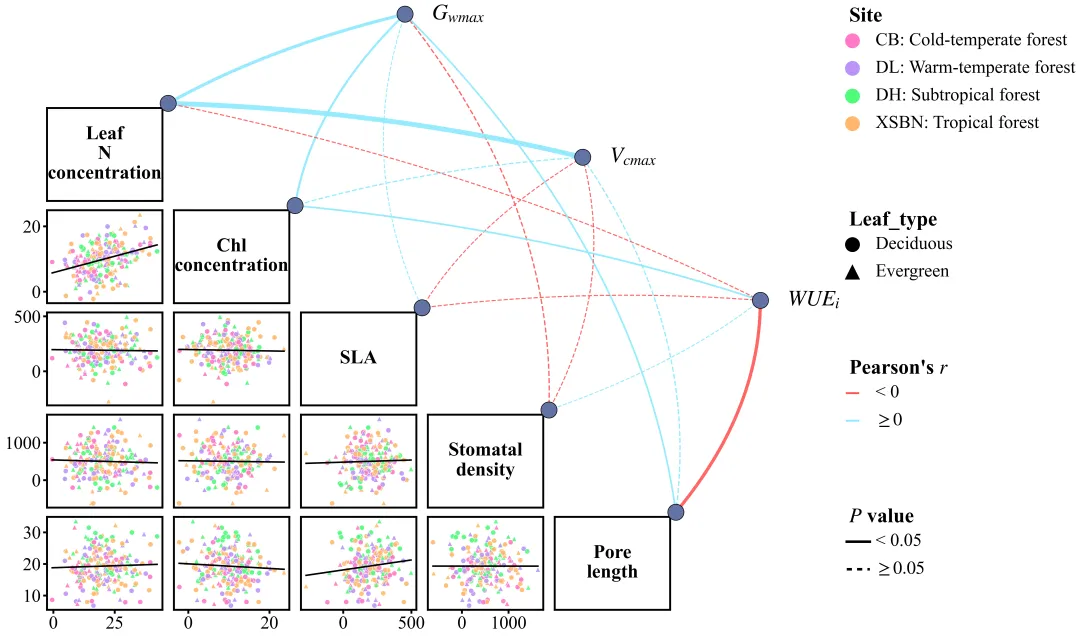
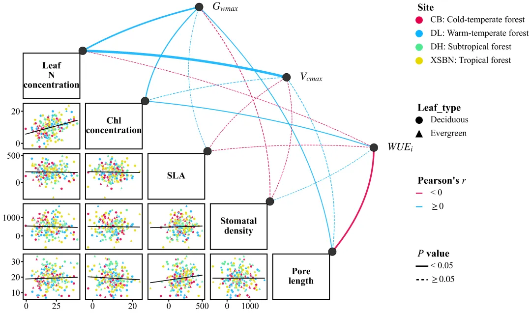
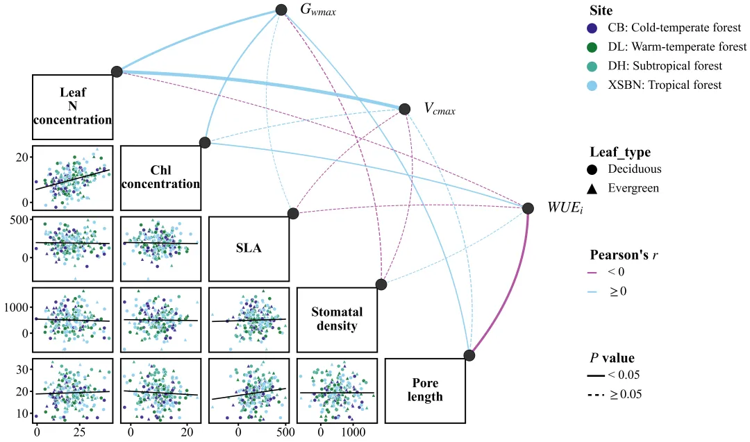
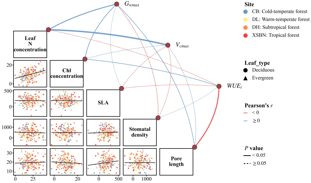
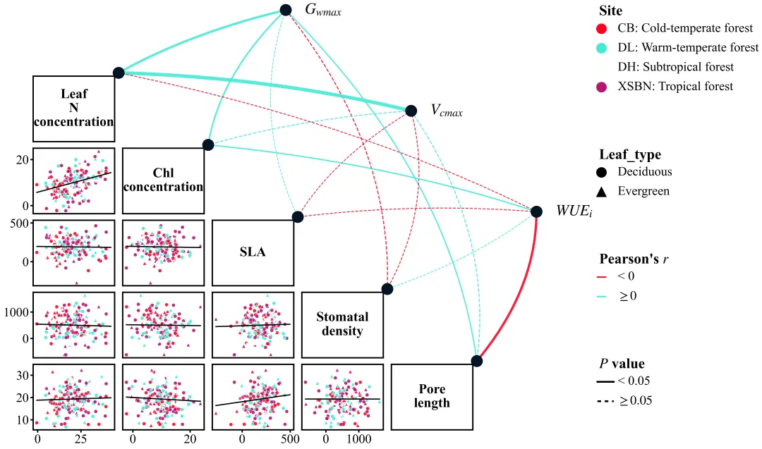
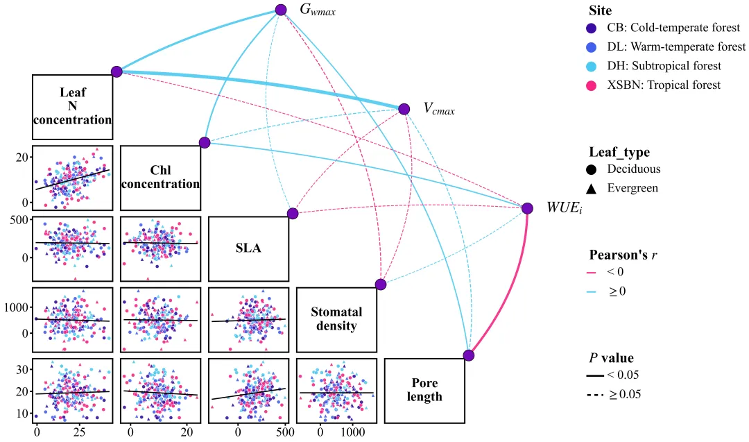
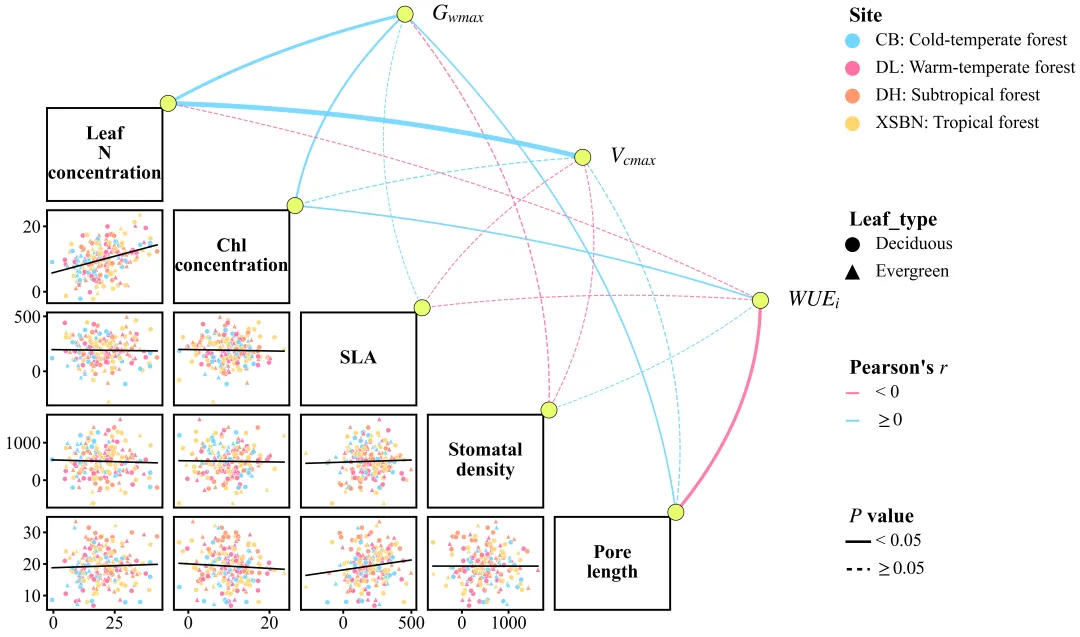
多种配色 



库的导入以及字体设置 

设置颜色库 

画布初始化与下三角散点图矩阵绘制:画布与网格划分,设置网格布局,用于跨子图绘制网络和曲线。绘制回归拟合趋势线和双重映射散点。设置边框与刻度,仅在最左侧和最下面显示。上三角区域设置为空白。对角线区域绘制对应变量名。 

坐标转换计算与网络节点绘制:基于散点对角线两端坐标加上偏移量,插值生成上方3个网络节点的线性排列坐标。在对角线端点及网络节点处绘制圆点。 

统计相关性分析计算与网络连线绘制:循环遍历两两变量,剔除缺失值后计算r和P值。 

图例的绘制以及绘图结果的保存 

执行部分 



期刊图片复现|Python绘制二维偏依赖PDP图 期刊复现|python绘制基于SHAP分析和GAM模型拟合的单特征依赖图 期刊图片复现|python绘制带有渐变颜色shap特征重要性组合图(条形图+蜂巢图) 期刊复现|用Python绘制SHAP特征重要性总览图、依赖图、双特征交互效应SHAP图,解锁XGBoost模型的终极奥秘 期刊图片复现|Python绘制shap重要性蜂巢图+单特征依赖图+交互效应强度气泡图+交互效应依赖图(回归+二分类+分类) 需要请后台私信我,注意只会分享练习数据、参考论文和代码文件,仅提供有关代码的答疑,不会提供其他答疑服务,代码文件中已经包含了每行代码的完整注释!!!
代码绘制成果展示
代码解释
第一部分
# =========================================================================================# ====================================== 1. 环境设置 =======================================# =========================================================================================import pandas as pdimport numpy as npimport seaborn as snsimport matplotlib.pyplot as plt
第二部分
# =========================================================================================# ======================================2.颜色库=======================================# =========================================================================================COLOR_SCHEMES = {1: {'sites': ['#008B8B', '#87CEFA', '#FFA07A', '#FF0000'], 'corr_positive': 'blue',},}
第三部分
# =========================================================================================# ======================================4.绘图函数=======================================# =========================================================================================def create_network_scatterplot_matrix(df, color_scheme, save_path="."):#网格布局gs = fig.add_gridspec(total_rows, # 行8, # 列wspace=0.1, # 宽间距hspace=0.1, # 高间距left=0.05, # 左边距bottom=0.05, # 下边距right=0.95, # 右边距top=0.95) # 上边距#去掉轴标签ax.set_xlabel('')ax.set_ylabel('')# 是否是最后一行if i == n_bottom - 1 and j < n_bottom - 1:ax.xaxis.set_ticks_position('bottom'); # X刻度ax.xaxis.set_label_position('bottom') # X标签#设置刻度样式ax.tick_params(axis='x', # 轴which='major', # 主刻度labelsize=24, # 字号length=TICK_LENGTH, # 长度width=TICK_WIDTH) # 宽度else:ax.set_xticks([])# 是否是最左侧if j == 0 and i > 0:ax.yaxis.set_ticks_position('left'); # Y刻度ax.yaxis.set_label_position('left') # Y标签# 设置刻度样式ax.tick_params(axis='y', # 轴labelsize=24, # 字号length=TICK_LENGTH, # 长度width=TICK_WIDTH) # 宽度else:ax.set_yticks([])# 上三角if i < j:ax.set_visible(False) # 隐藏子
第四部分
bottom_matrix_node_pos = {} # 存放底部矩阵节点位置network_node_pos = {} # 存放网络节点位置ellipse_height_data = 0.024 # 定义节点高ellipse_width_data = ellipse_height_data * (8 / 16) * 1.5 # 定义节点宽# 定义节点样式node_style = {'marker': 'o', # 圆形'markersize': 25, # 大小'color': color_scheme['node'], # 颜色'zorder': 10, # 层'markeredgecolor': 'black', # 边框色'linestyle': 'None', # 无线'clip_on': False # 不裁剪}ax_main.text(label_pos[0], # xlabel_pos[1], # yf'${label}$', # 文本ha='left', # 水平va='center', # 垂直fontsize=34, # 字号fontweight='bold', # 加粗zorder=101, # 层color=color_scheme['legend_text']) # 文本颜色
第五部分
设置相关性影响方向的颜色映射。根据显著性的数值设置线型映射。根据相关系数绝对值设置线的粗细,相关系数绝对值越大线越粗。
arc_radius_base = -0.1 # 定义基础曲率半径# 遍历网络变量起点for var1 in network_vars:features_to_connect = scatter_vars_bottom # 连接散点目标变量dynamic_arc_radius = arc_radius_base # 原弧度control_offset = np.linalg.norm(dist_vec) * dynamic_arc_radius # 控制点偏移control_point = midpoint + perp_vec * control_offset # 控制点坐标verts = [pos1, control_point, pos2] # 控制点列表codes = [Path.MOVETO, Path.CURVE3, Path.CURVE3] # 贝塞尔路径指令path = Path(verts, codes) # 构造路径对象# 创建曲线patch = PathPatch(path, # 路径对象facecolor='none', # 背景色edgecolor=color, # 轮廓颜色lw=linewidth, # 线粗linestyle=linestyle, # 线样式zorder=8, # 层alpha=0.9, # 透明度clip_on=False) # 不裁剪ax_main.add_patch(patch) # 添加到图上
第六部分
ax_legend = fig.add_subplot(gs[:, 6]) # 添加图例轴ax_legend.axis('off') # 隐藏图例边框current_y -= group_spacing # 间距#设置散点形状图例ax_legend.text(0.35, # xcurrent_y, # y'Leaf_type', # 标题fontdict=title_font_props, # 字体va='top') # 垂直current_y -= y_step * 1.2 # 更新ax_legend.plot([x_icon - 0.05, x_icon + 0.05], # x[current_y, current_y], # ycolor=color_scheme['corr_negative'], # 颜色lw=3, # 粗细clip_on=False) # 防裁剪ax_legend.plot([x_icon - 0.05, x_icon + 0.15], # xcurrent_y -= y_step # 更新ax_legend.plot([x_icon - 0.05, x_icon + 0.15], # x[current_y, current_y], # ycolor=color_scheme['legend_text'], # 线色dashes=(2, 2), # 虚线lw=4, # 粗细clip_on=False) # 防裁剪
第七部分
# =========================================================================================# ======================================2.颜色库=======================================# =========================================================================================if __name__ == '__main__': # 读取数据all_vars_to_check = network_vars + scatter_vars_bottom # 拼接列名scheme_id = 20selected_scheme = COLOR_SCHEMES[scheme_id]print('正在绘制并保存方案:', scheme_id)create_network_scatterplot_matrix(main_df, color_scheme=selected_scheme, save_path=output_directory)
如何应用到你自己的数据
1.设置原始数据的保存路径,执行部分:
data_file_path = r"data.xlsx" 2.设置绘图结果的保存路径,执行部分:
output_directory = r"分析网络图" # 输出目录3.设置是否要进行批量绘图,执行部分:
plot_all = True4.设置节点数据,基础变量设置部分:
network_vars = ['G_wmax', 'V_cmax', 'WUE_i'] 5.设置散点图要用到的变量数据,基础变量设置部分:
scatter_vars_bottom = ['Leaf N concentration', 'Chl concentration', 'SLA', 'Stomatal density', 'Pore length'] 6.设置颜色配置要用到的数据,基础变量设置部分:
sites = ['CB: Cold-temperate forest', 'DL: Warm-temperate forest', 'DH: Subtropical forest', 'XSBN: Tropical forest'] 7.设置形状设置要用到的数据,基础变量设置部分:
leaf_types = ['Deciduous', 'Evergreen']往期内容
本文来自网友投稿或网络内容,如有侵犯您的权益请联系我们删除,联系邮箱:596563534@qq.com 。
随机文章
-
 10个月宝宝每天需要喝多少奶粉?
- Linux(32)-GPIO子系统
- AI连劝多次“放弃吧”!Linux祖师爷怒撕模型:经历18次地狱重启,仅改1行代码打脸AI
- 你知道Linux系统是什么和怎么选择吗?
- AI多次直呼“这不可能”!Linux之父硬扛18次重启,1行代码秒杀地狱级Bug
- AI连劝3次“这题无解”!Linux之父通宵狂启18次内核,一行代码干碎幽灵Bug
- AI被逼到崩溃劝退!Linux之父硬核排查地狱级Bug:重启18次,一行代码反手教AI做人
- PHP 3是这样诞生的?2.0耽误作业得高分了
- PHP 和 JavaScript,越看越像的两门语言
- Python 零基础100天—Day87 分类与聚类
- Linux故障排查与修复命令