1小时22分速通Python可视化基础
- 2026-07-12 21:56:58
Introduction
Hello,各位好久不见!经过长达大半年的大鸽后,我回来更新了(实际上如果去掉中间短暂地更新了一次DeepSeek的内容,时长已经超过一年了)。
对于大鸽,其中不乏很多事务繁忙的要素。
比如离开了一个城市,又重新进入了象牙塔开启中断的学业;论文的写作、修改、投稿、拒稿、返修,反复循环;在青藏高原开展了长达小两个月的野外考察,回来又面对着庞大的账目,同时还得应付为数不少的课程等。
但也有另一方面的原因是,已经鸽到心安理得,不愿意打破现状了(比如这篇推文,早在至少两周前就已经构思好了)。
说起来本人算不上什么高能量人群,在新城市出门逛的多,而逛完后又需要进入修复状态恢复能量。
不过,现在总体算是安顿下来,可以慢慢地静下心来开始新的阶段了。
之前我们系统性地介绍了Python基础语法和科学计算中最常用的两个库NumPy和Pandas,那么下一步自然就是使用可视化展示数据的问题了。
Matplotlib是Python中最常用的可视化库,它提供了一系列绘图函数,可以轻松地创建各种图表。诸如Proplot,Plotly,Cartopy这些库,都是基于Matplotlib的扩展。
所以我们今天就从Matplotlib的基础结构出发介绍Python可视化,后续以此推广到更高阶的可视化模块和第三方库。
创建第一个图形
首先,让我们使用Matplotlib库创建一个最基础的图形。
我们需要用到的是matplotlib.pyplot模块,它提供了一系列函数用于创建各种图形。
import matplotlib.pyplot as pltimport numpy as np我们假定某地一天的气温变化符合正弦波,按小时步长创建出温度曲线。
temp = np.sin(np.linspace(-1/2*np.pi, 3/2*np.pi, 24))temparray([-1. , -0.96291729, -0.8544194 , -0.68255314, -0.46006504, -0.20345601, 0.06824241, 0.33487961, 0.57668032, 0.77571129, 0.9172113 , 0.99068595, 0.99068595, 0.9172113 , 0.77571129, 0.57668032, 0.33487961, 0.06824241, -0.20345601, -0.46006504, -0.68255314, -0.8544194 , -0.96291729, -1. ])于是,通过指定x和y数据,即可使用plot()函数绘制出变化曲线。
plt.plot(range(24), temp)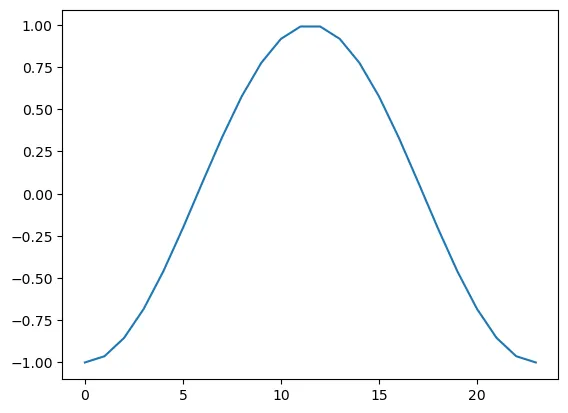
此时,整个图像的大小与横纵比均是由Python自适应调整得到。我们可以通过创建画布,使用figsize参数指定其大小即可自定义。
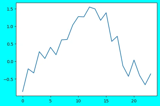
plt.figure(figsize=(10, 6)) # 创建画布并指定横纵长度plt.plot(range(24), temp + np.random.rand(24))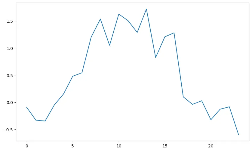
值得注意的是,当我们不创建新的画布,绘图将会在当前画布上继续绘制。
plt.plot(range(24), temp + np.random.rand(24))plt.plot(range(24), temp + np.random.rand(24))plt.plot(range(24), temp + np.random.rand(24))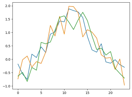
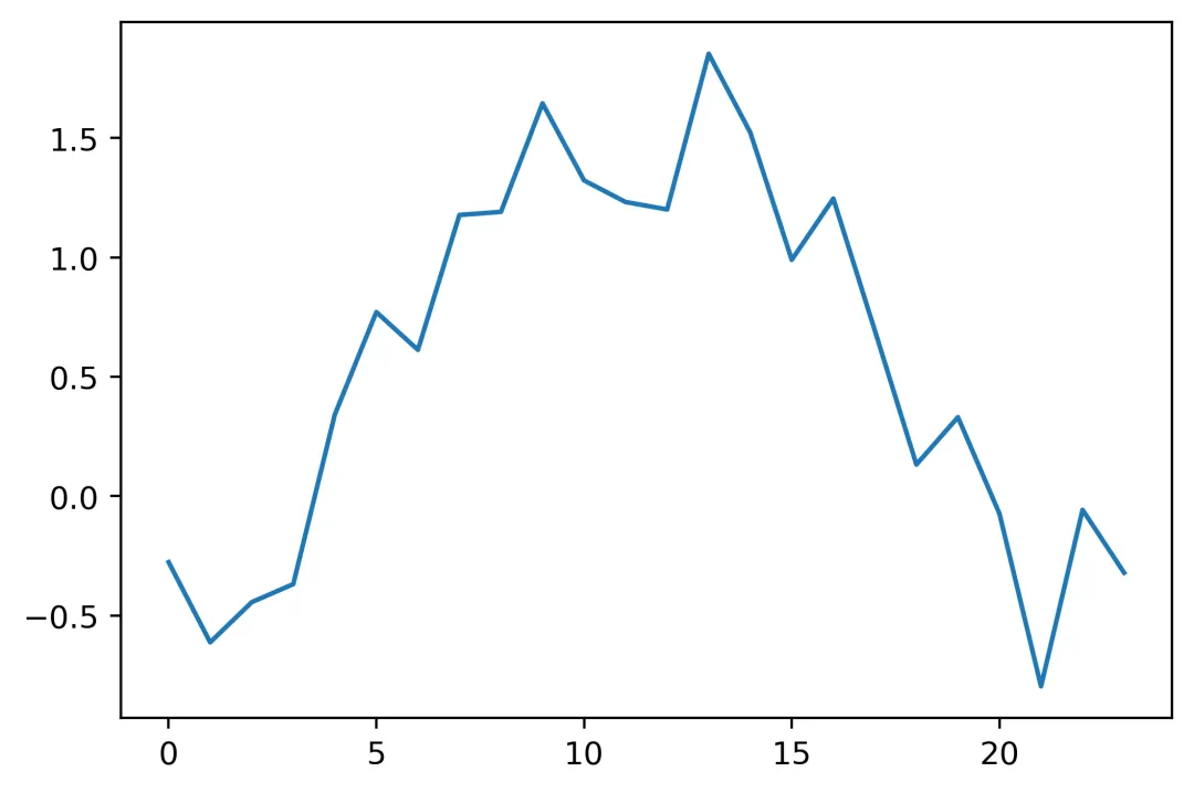
下面,继续看为每张图创建新画布的例子。
同时,我们还可以设置facecolor,dpi等参数设置画布。
plt.figure(figsize=(6, 4))plt.plot(range(24), temp + np.random.rand(24))plt.figure(figsize=(6, 4), facecolor='cyan') # 设置画布底色为青色plt.plot(range(24), temp + np.random.rand(24))plt.figure(figsize=(6, 4), dpi=400) # 设置画布分辨率为400plt.plot(range(24), temp + np.random.rand(24))
调整图形符号
创建图形后,我们可以进一步设置图形符号,如线条、颜色、透明度等,实现更丰富的可视化效果。
首先,我们尝试将正弦曲线修改为红色虚线。分别通过设置参数linestyle和color来实现,二者可以等效缩写为ls和c。后续存在混用,将不再赘述。
plt.plot(range(24), temp, c='r', linestyle='--')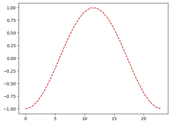
进一步设置alpha参数,调整透明度。
plt.plot(range(24), temp, c='r', linestyle='--', alpha=0.5)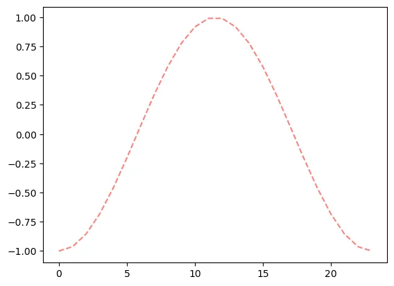
有时候我们需要在数据中突出显示数据点位,我们可以通过设置marker属性来实现。
主要属性包括:
marker:设置数据点的形状,如点、圆圈、正方形、三角形、星形等markersize:设置数据点的大小markeredgewidth:设置数据点的边框宽度markerfacecolor:设置数据点的填充颜色markeredgecolor:设置数据点的边框颜色
plt.plot(range(24), temp, c='r', linestyle='--', marker='o', markersize=8, markerfacecolor='white', markeredgecolor='r', markeredgewidth=1.2)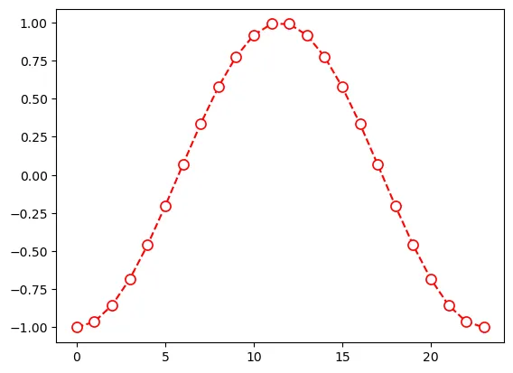
我们可以进一步为图表指定坐标标注和标题。
plt.plot(range(24), temp, c='r', linestyle='--', marker='o', markersize=8, markerfacecolor='white', markeredgecolor='r')plt.xlabel('Hour of the day')plt.ylabel('Temperature (Celsius)')plt.title('Temperature over the day')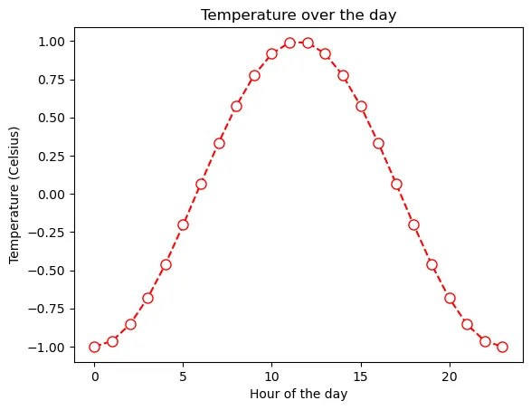
有时候绘图自带的字体类型、字体大小、字体风格等不令人满意,我们也可以通过一系列参数来自定义:
fontname:字体名称fontsize:字体大小,单位为ptfontstyle:字体风格,可以是normal、italic、obliquefontweight:字体粗细,可以是light、normal、regular、bold等
plt.plot(range(24), temp, c='r', linestyle='--', marker='o', markersize=8, markerfacecolor='white', markeredgecolor='r')plt.xlabel('Hour of the day', fontname='Ubuntu Mono', fontsize='14', fontweight='bold', fontstyle='italic')plt.ylabel('Temperature (Celsius)')plt.title('Temperature over the day')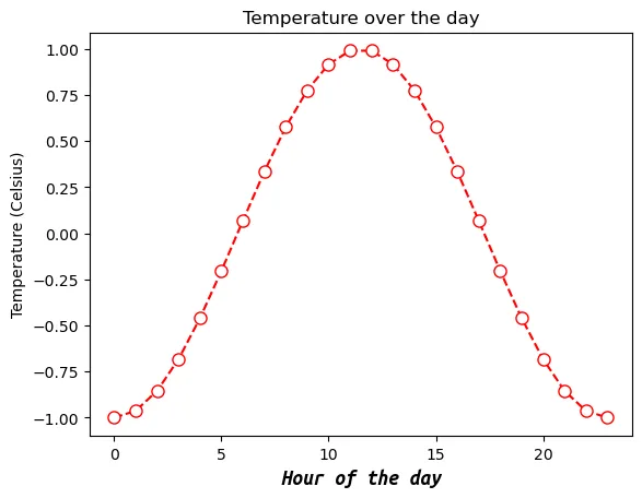
但很多时候这种字体修改在每个涉及字体的位置都自定义显得过于臃肿,我们可以修改全局字体设置,使得当前绘图代码基础字体参数全部修改。
下面我们通过设置font.size和font.family,对全局默认字体类型和字体大小进行修改。
plt.rcParams['font.size'] = 12plt.rcParams['font.family'] = 'Ubuntu Mono'plt.plot(range(24), temp, c='r', linestyle='--', marker='o', markersize=8, markerfacecolor='white', markeredgecolor='r')plt.xlabel('Hour of the day')plt.ylabel('Temperature (Celsius)')plt.title('Temperature over the day')plt.show()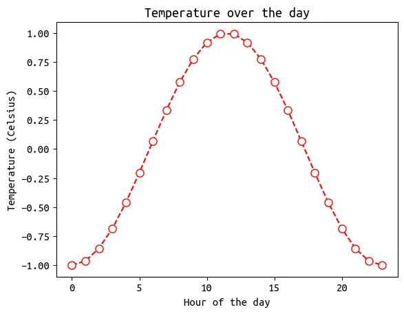
坐标及标注
除去图形本身,对于图表而言,合适地显示坐标也是可视化中重要的一步。
24h的气温变化可能难以看出这一特征,我们创建一个小时尺度的月气温数据作为案例探讨。
import pandas as pdtemp0 = temp.copy()temp = temp0 + np.random.rand(24)df = pd.DataFrame({'Time': pd.date_range('2025-11-01', periods=30*24, freq='1h'),'Beijing': (temp * 10).tolist() * 30,'Shenzhen': (temp * 10 + 10).tolist() * 30})df.set_index('Time', inplace=True)df720 rows × 2 columns
标注
由于时间序列涉及到日期,一旦显示过于密集就会挤成一团。
典型情况如下图所示:
plt.plot(df['Shenzhen'], c='r')plt.xlabel('Hour of the day')plt.ylabel('Temperature (Celsius)')plt.title('Temperature over the day')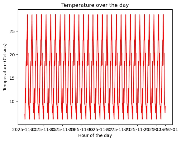
一种可能的解决方式是,我们可以拉长画布。
plt.figure(figsize=(12, 4))plt.plot(df['Shenzhen'], c='r')plt.xlabel('Hour of the day')plt.ylabel('Temperature (Celsius)')plt.title('Temperature over the day')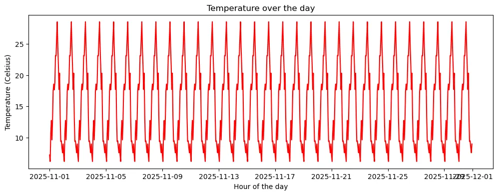
看起来似乎好很多了,但是后面两个日期叠在一起。
更好的方案是自定义坐标轴刻度位置和刻度标签。
主刻度
Python中可以对主刻度和副刻度分别进行调整,这里首先介绍主刻度。
首先,我们可以使用xticks()和yticks()函数来设置主刻度显示位置。
plt.figure(figsize=(12, 4))plt.plot(df['Shenzhen'], c='r')plt.xlabel('Hour of the day')plt.ylabel('Temperature (Celsius)')plt.title('Temperature over the day')plt.xticks(['2025-11-01', '2025-11-08', '2025-11-15', '2025-11-22', '2025-11-29'])plt.yticks([10, 20, 30])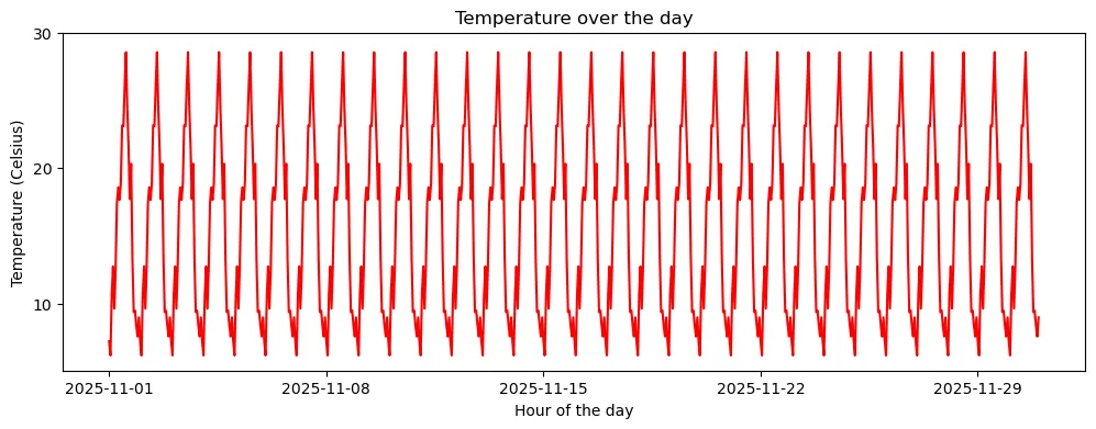
当然,不仅是指定刻度位置那么简单而已。我们可以再传入一个列表,告诉函数我们这几个刻度位置应该显示什么内容。
plt.figure(figsize=(12, 4))plt.plot(df['Shenzhen'], c='r')plt.xlabel('Hour of the day')plt.ylabel('Temperature (Celsius)')plt.title('Temperature over the day')plt.xticks(['2025-11-01', '2025-11-08', '2025-11-15', '2025-11-22', '2025-11-29'], ['Nov.1 25', 'Nov.8 25', 'Nov.15 25', 'Nov.22 25', 'Nov.29 25'])plt.yticks([10, 20, 30], ['10°C', '20°C', '30°C'])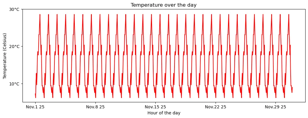
由于是人为指定位置,自然显示位置也不必须是等距的。
plt.figure(figsize=(12, 4))plt.plot(df['Shenzhen'], c='r')plt.xlabel('Hour of the day')plt.ylabel('Temperature (Celsius)')plt.title('Temperature over the day')plt.xticks(['2025-11-01', '2025-11-05', '2025-11-15', '2025-11-20', '2025-11-30'], ['Nov.1 25', 'Nov/5 25', '25 Nov.15', '25-11-20', '25/11~30'])plt.yticks([0, 3.14, 30], ['273.15K', '3.14°C', f'{30 * 9/5 + 32:.1f}°F'])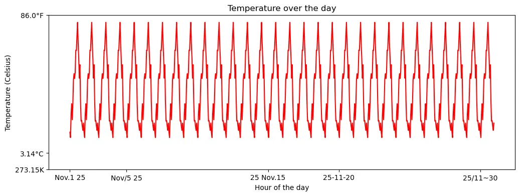
如果我们不传入任何内容,刻度就会消失。
plt.figure(figsize=(12, 4))plt.plot(df['Shenzhen'], c='r')plt.xticks([])plt.yticks([])
也可以使用tick_params()函数进一步调整刻度标注大小、刻度线形状。
plt.figure(figsize=(12, 4))plt.plot(df['Shenzhen'], c='r')plt.xlabel('Hour of the day')plt.ylabel('Temperature (Celsius)')plt.title('Temperature over the day')plt.xticks(['2025-11-01', '2025-11-08', '2025-11-15', '2025-11-22', '2025-11-29'])plt.yticks([10, 20, 30])plt.tick_params(axis='x', which='major', labelsize=5)plt.tick_params(axis='y', which='major', labelsize=15, direction='in', length=5, width=2)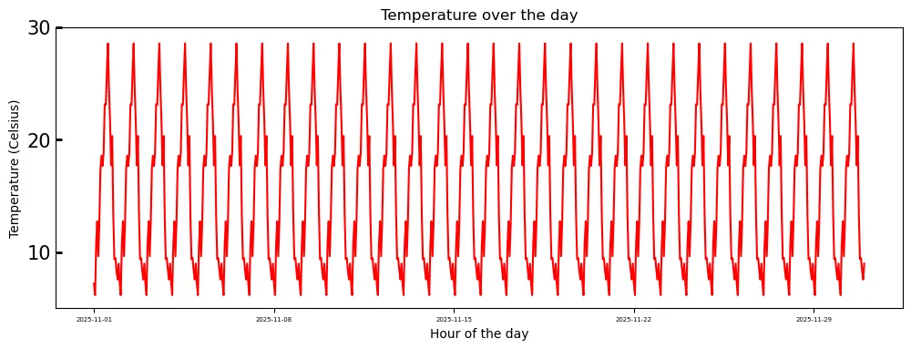
以及,刻度显示的坐标轴。
plt.figure(figsize=(12, 4))plt.plot(df.index.values, df['Shenzhen'].values, c='r')plt.xlabel('Hour of the day')plt.ylabel('Temperature (Celsius)')plt.title('Temperature over the day')plt.tick_params(axis='both', which='major', labelsize=10, direction='in', bottom=True, top=True, left=True, right=True)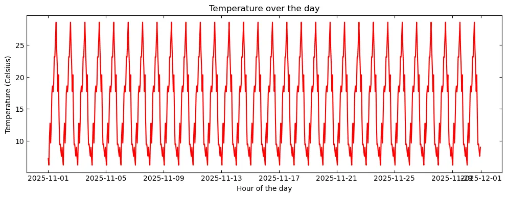
副刻度
副刻度默认是关闭的,可以通过minorticks_on()函数开启。
plt.figure(figsize=(12, 4))plt.plot(df.index.values, df['Shenzhen'].values, c='r')plt.xlabel('Hour of the day')plt.ylabel('Temperature (Celsius)')plt.title('Temperature over the day')plt.minorticks_on()
同样,也可以与主刻度一样进行个性化。
plt.figure(figsize=(12, 4))plt.plot(df.index.values, df['Shenzhen'].values, c='r')plt.xlabel('Hour of the day')plt.ylabel('Temperature (Celsius)')plt.title('Temperature over the day')plt.minorticks_on()plt.tick_params(which='minor', length=8, width=1)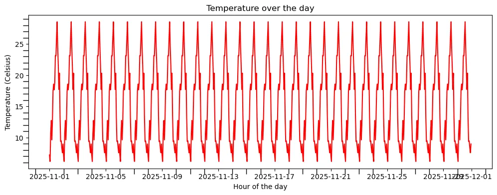
坐标显示范围
很多时候我们并不需要显示完整的数据序列,或者存在个别奇异值导致整个曲线变化幅度很不明显。
这种时候,我们可能需要调整图表的显示范围达到所需的可视化效果。
plt.figure(figsize=(12, 4))plt.plot(df['Shenzhen'], c='r')plt.xlabel('Hour of the day')plt.ylabel('Temperature (Celsius)')plt.title('Temperature over the day')plt.xlim(df.index[0], df.index[7 * 24]) # 显示前7天逐小时气温plt.ylim(0, 35) # 气温显示范围调整为0-35°C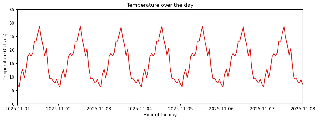
图例
作为图表的重要组成要素,图例是绘图不可或缺的要素之一。
在Matplotlib中,我们只需要在绘图时指定label参数,即可通过legend()函数来创建图例。
plt.figure(figsize=(12, 4))plt.plot(df['Beijing'], c='tab:green', label='Beijing')plt.plot(df['Shenzhen'], c='r', label='Shenzhen')plt.xlabel('Hour of the day')plt.ylabel('Temperature (Celsius)')plt.title('Temperature over the day')plt.xticks(['2025-11-01', '2025-11-08', '2025-11-15', '2025-11-22', '2025-11-29'])plt.yticks([10, 20, 30])plt.legend()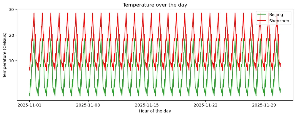
通过进一步指定参数,可以调整图例样式。常见参数包括:
loc:图例位置,可以是best、upper right、upper left、lower left、lower right、right、center left、center right、lower center、upper center、centerncol:图例列数fontsize:字体大小frameon:是否显示边框(True或False)
plt.figure(figsize=(12, 4))plt.plot(df['Beijing'], c='tab:green', label='Beijing')plt.plot(df['Shenzhen'], c='r', label='Shenzhen')plt.xlabel('Hour of the day')plt.ylabel('Temperature (Celsius)')plt.title('Temperature over the day')plt.xticks(['2025-11-01', '2025-11-08', '2025-11-15', '2025-11-22', '2025-11-29'])plt.yticks([0, 10, 20, 30])plt.legend(loc='upper right', ncol=2, frameon=False)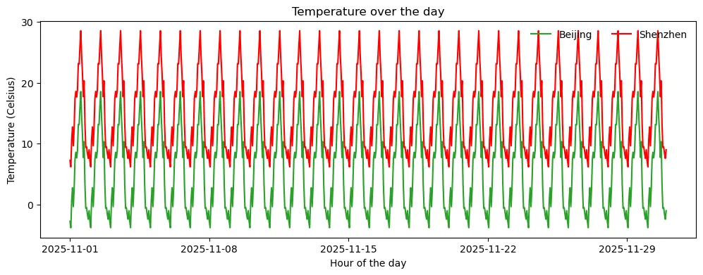
网格与外框
给图形添加网格是一种常见的绘图方式,可以更精细地观察数据分布。
Matplotlib中提供了grid()函数,可以简易地添加网格。
plt.figure(figsize=(12, 4))plt.plot(df['Beijing'], c='tab:green', label='Beijing')plt.plot(df['Shenzhen'], c='r', label='Shenzhen')plt.xlabel('Hour of the day')plt.ylabel('Temperature (Celsius)')plt.title('Temperature over the day')plt.xticks(['2025-11-01', '2025-11-08', '2025-11-15', '2025-11-22', '2025-11-29'])plt.yticks([10, 20, 30])plt.legend()plt.grid(True)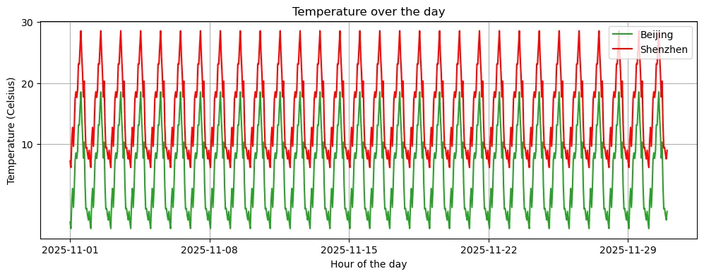
也可以分别对不同的坐标轴单独设置网格线条样式,如果需要同时设置所有坐标轴网格样式,只需移除axis参数即可。
plt.figure(figsize=(12, 4))plt.plot(df['Beijing'], c='tab:green', label='Beijing')plt.plot(df['Shenzhen'], c='r', label='Shenzhen')plt.xlabel('Hour of the day')plt.ylabel('Temperature (Celsius)')plt.title('Temperature over the day')plt.xticks(['2025-11-01', '2025-11-08', '2025-11-15', '2025-11-22', '2025-11-29'])plt.yticks([10, 20, 30])plt.legend()plt.grid(True, linestyle='--', alpha=0.7, which='major', c='tab:blue', axis='x')plt.grid(True, linestyle='--', alpha=0.7, which='major', c='deeppink', axis='y')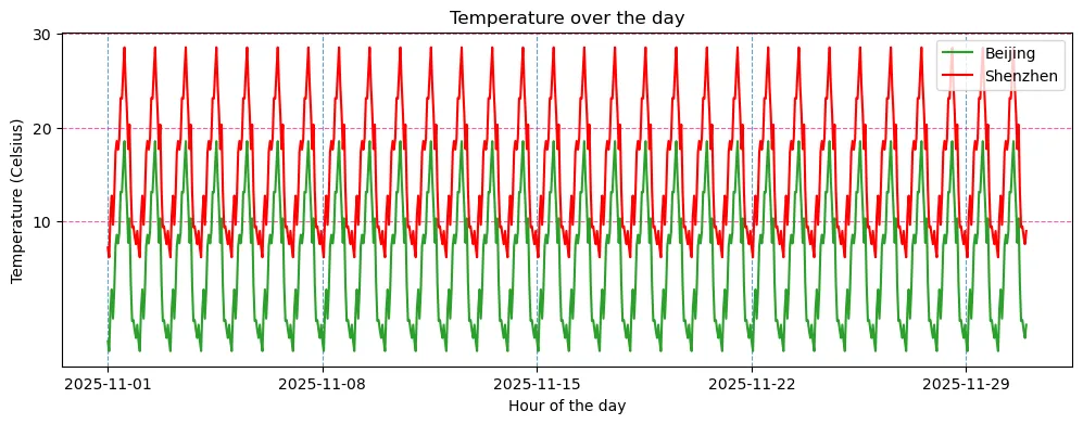
以中学时代学习坐标系的经验出发,上下左右完整的四个坐标轴并非必要,我们可以选择关掉其中的一些。
plt.figure(figsize=(12, 4))plt.plot(df['Beijing'], c='tab:green', label='Beijing')plt.plot(df['Shenzhen'], c='r', label='Shenzhen')plt.xlabel('Hour of the day')plt.ylabel('Temperature (Celsius)')plt.title('Temperature over the day')plt.xticks(['2025-11-01', '2025-11-08', '2025-11-15', '2025-11-22', '2025-11-29'])plt.yticks([10, 20, 30])plt.ylim(-5, 30)plt.legend()plt.gca().spines['top'].set_visible(False)plt.gca().spines['right'].set_visible(False) 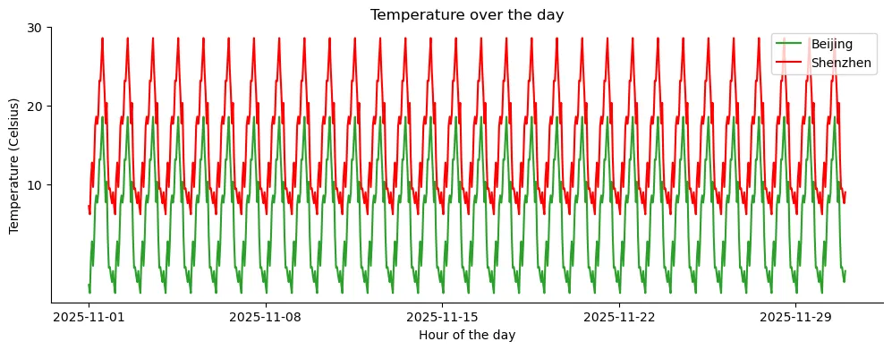
其中,gca()函数用于获取当前的坐标轴,spines属性用于获取坐标轴的边框,set_visible方法用于设置边框的可见性。
子图
最后,我们简要引入一下子图。这里仅作展示,更详细的内容我们后续专栏报道。
很多时候,我们需要将多个图画在同一个画布上,这时候就需要用到子图(Subplot)。我们可以使用 subplots() 函数来创建子图,并指定行数和列数。
fig, axes = plt.subplots(2, 4, figsize=(16, 10)) # 创建2行4列的子图,并设置子图的尺寸为(16, 10)fig.subplots_adjust(wspace=0.1, hspace=0.05)# 创建2个列表,分别存储不同色彩映射的函数cmaps = [[plt.cm.viridis, plt.cm.plasma, plt.cm.inferno, plt.cm.magma], [plt.cm.cividis, plt.cm.Greys, plt.cm.Purples, plt.cm.Blues]]# 遍历绘制子图,分别设置标题和色彩映射for i in range(2):for j in range(4): ax = axes[i, j]# imshow()函数用于绘制二维数组 h = ax.imshow(np.random.rand(100, 100), cmap=cmaps[i][j]) ax.set_title(f"({i}, {j})") fig.colorbar(h, ax=ax, orientation="horizontal", shrink=0.8, pad=0.1)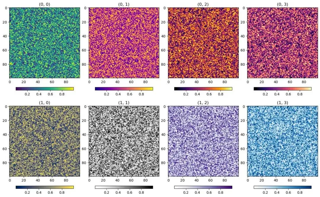
❝
plt与ax这里需要注意到,相比之前设置各项图形符号等要素使用的都是从
plt模块中调用的函数,我们这里是基于ax对象的方法来设置图形符号等要素。二者的区别在于,
plt仅作用于最后一个图形区域,而ax对象通过指定不同的图形区域名称可以作用于不同的图形区域。
如下面的例子,我们可以指定ax代表的图形区域来修改特定的图形。
fig, axes = plt.subplots(2, 4, figsize=(20, 6))fig.subplots_adjust(wspace=0.15, hspace=0.25)cs = [['tab:red', 'tab:blue', 'tab:green', 'tab:orange', 'tab:purple'], ['tab:pink', 'tab:gray', 'tab:olive', 'tab:brown', 'tab:cyan']]for i in range(2):for j in range(4): ax = axes[i, j] h = ax.plot(np.random.rand(100), c=cs[i][j]) ax.set_title(f"({i}, {j})") ax.spines['top'].set_visible(False) ax.spines['right'].set_visible(False) ax.set_ylim(0, 1) ax.set_xlim(0, 100)# 在第0行第1列的图中追加一条曲线ax = axes[0, 1]ax.plot(np.random.rand(100), c='deeppink')# 可为所有子图设置一个大标题plt.suptitle("Random Plot", fontsize=16)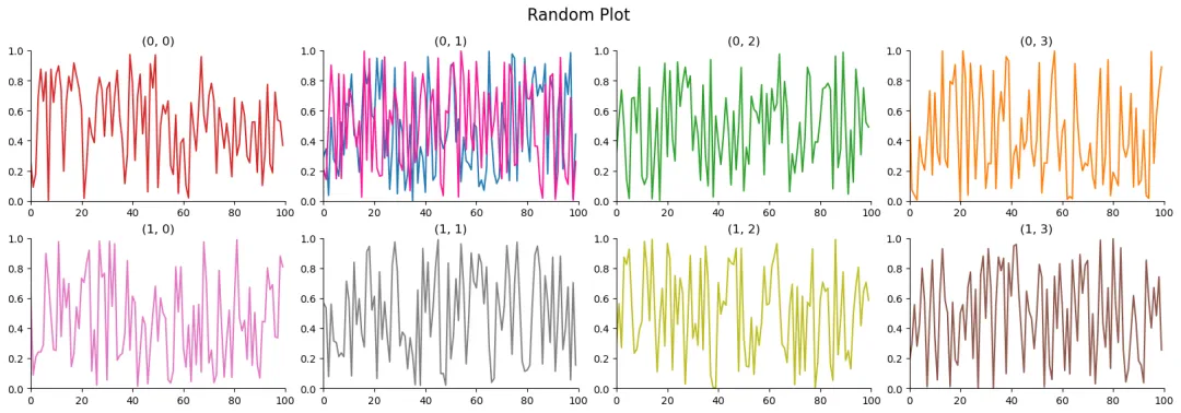
保存图像
最后是绘制的图形保存的问题,可以使用savefig()函数将图形保存为特定格式文件。
同时,还可以对参数进行一些设置,如:
format:设置图像的格式,默认为pngdpi:设置图像的分辨率,默认为100transparent:设置背景是否透明,默认为False
fig, axes = plt.subplots(1, 2, figsize=(8, 4))fig.subplots_adjust(wspace=0.1, hspace=0.1)ax = axes[0]h = ax.plot(np.random.rand(100), c='deeppink')ax.set_title(f"Line Plot")ax.spines['top'].set_visible(False)ax.spines['right'].set_visible(False)ax.set_ylim(0, 1)ax.set_xlim(0, 100)ax = axes[1]h = ax.imshow(np.random.rand(100, 100), cmap='RdYlBu_r')ax.set_title(f"Imshow Plot")plt.suptitle("Combine Plot", fontsize=16)plt.savefig("CombinePlot.png", dpi=400, transparent=True)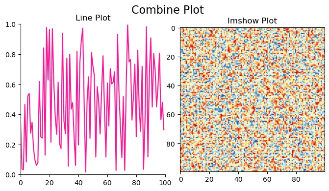
后日谈
以上就是我对Python可视化基本框架的一些理解,后续我们便可基于这一框架开展不同类型的可视化探索。
个中函数我列出的只是一些我比较常用的参数,还有很多参数没有提及,如有需要还请自行探索。
本次开更后,由于基础性的科学计算内容我们已经系统性介绍过了,后续希望能够更新一些更贴近地球科学领域的内容。
下次再见。
Manuscript: RitasCake
Proof: Philero(你什么开始更新?); RitasCake
获取更多资讯,欢迎订阅微信公众号:Westerlies
「阅读原文」跳转和鲸社区,云端运行本文案例。
SC.Pandas 03 | 如何使用Pandas分析时间序列数据?
SC.Pandas 02 | 如何使用Pandas计算、统计地球科学数据?
SC.Pandas 01 | 如何使用Pandas分析地球科学数据?
SC.NumPy 04 | 重构地球科学数据的一千〇一种方式 100%
SC.NumPy 03 | 重构地球科学数据的一千〇一种方式 ½

随机文章
-
 10个月宝宝每天需要喝多少奶粉?
- 我天,Python 已沦为老二..
- 在两种不同的Linux发行版查找已安装软件的命令
- Python+Selenium 模拟浏览器操作完全指南
- AlpineLinux安装部署zabbix
- Python定时任务神器:schedule库入门实战指南
- Shell 命令全解:Linux/Unix 命令行终极指南
- Linux一句话上线 + 上线提醒机器人 + 全新BOF SleepMask 对标Cobalt Strike4.9.1 | Cobalt Strike 1.9正式发布!
- Linux yum-utils工具集
- Python新手看过来,is和== 到底差在哪
- Linux 逻辑卷管理器(LVM)
