期刊图片复现|Python绘制基于边缘分布与残差分析的回归拟合图
- 2026-06-29 06:52:47
期刊图片复现|Python绘制基于边缘分布与残差分析的回归拟合图

论文:Genome-scale community modelling reveals conserved metabolic cross-feedings in epipelagic bacterioplankton communities 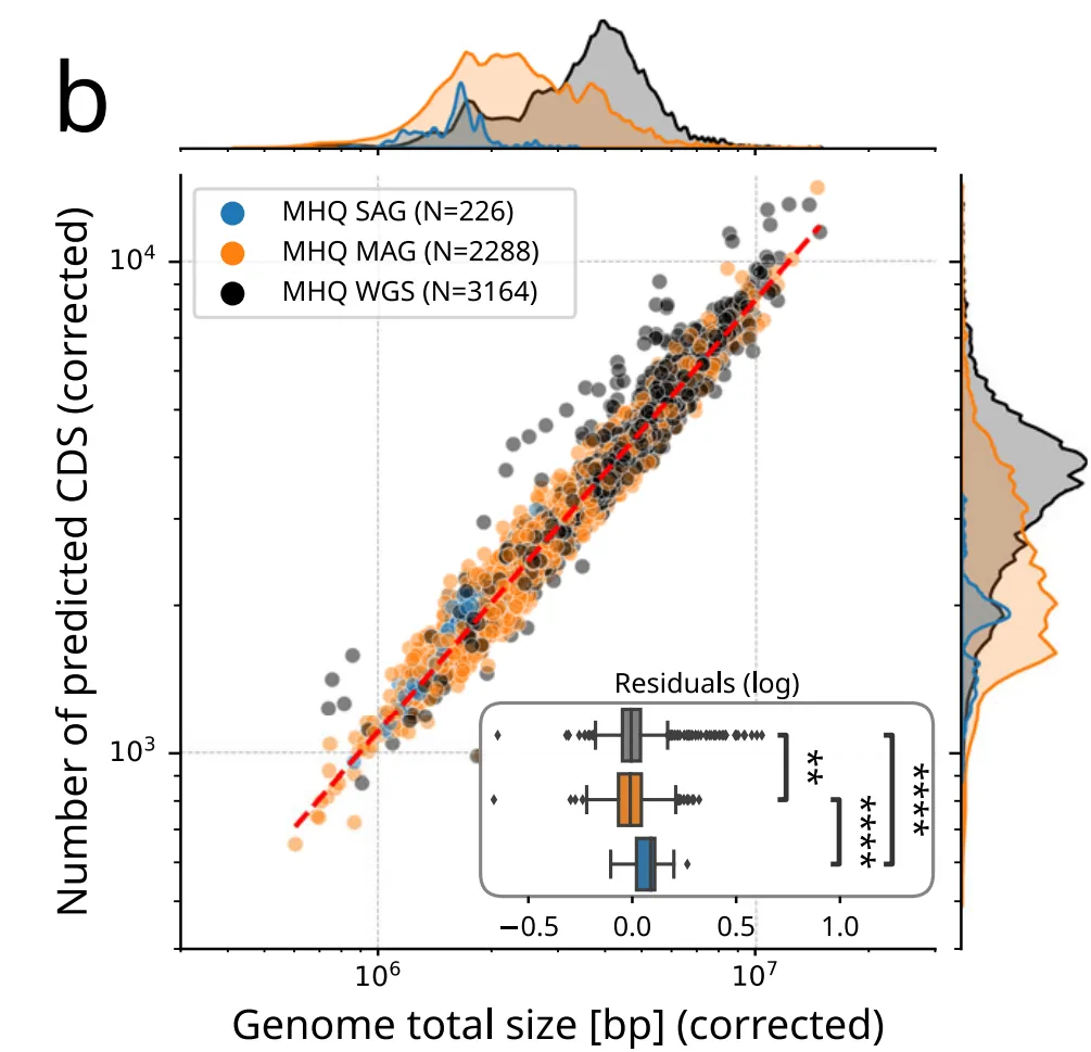
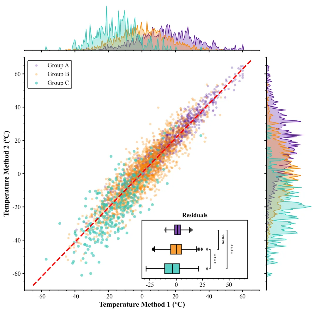
论文原图 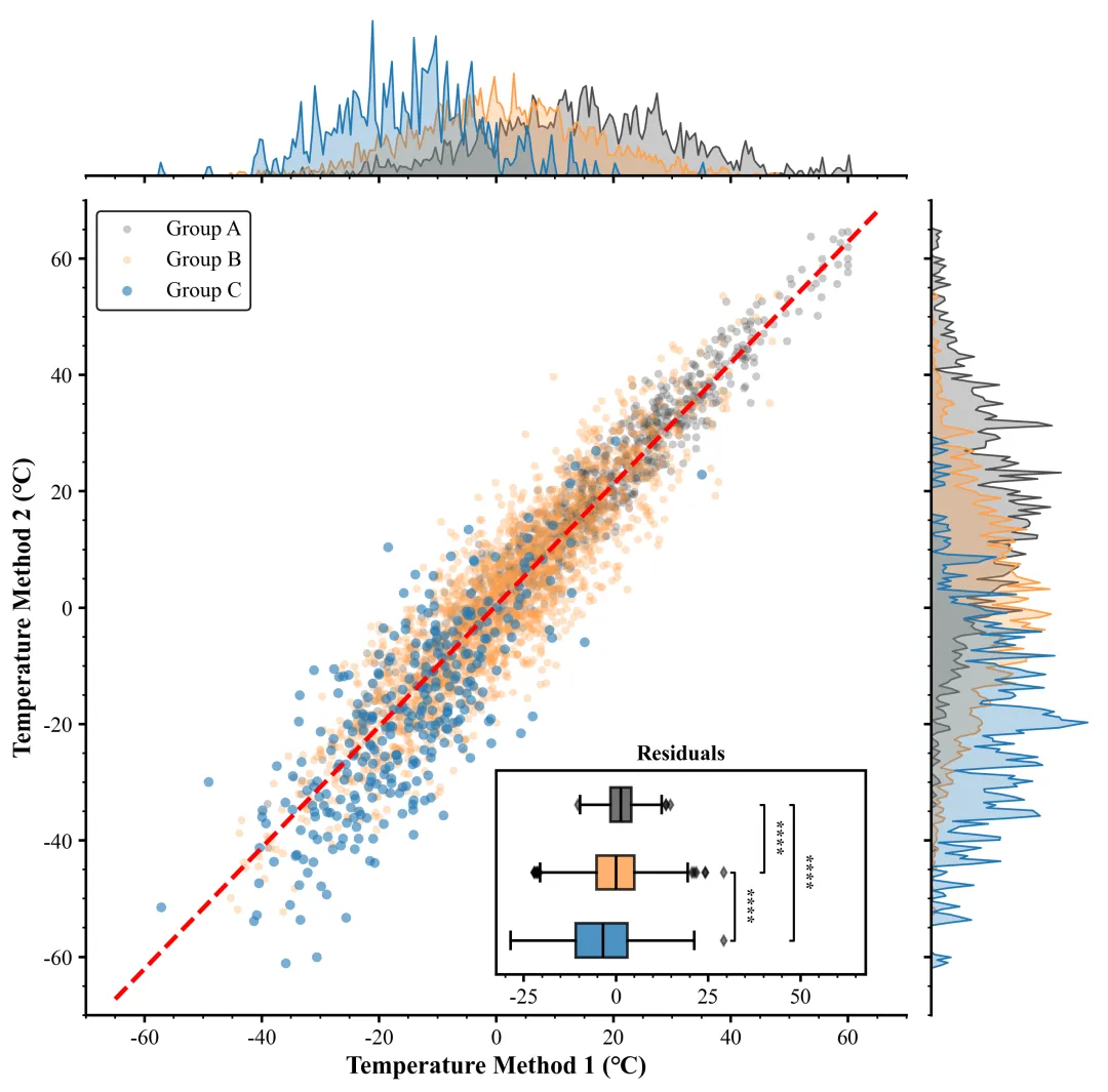
仿图 这张图表展示了一幅包含边缘分布和残差分析的综合统计图,旨在评估两种温度测量方法在三个独立组别中的相关性与差异。主图部分为散点图,横轴代表“Temperature Method 1 (°C)”,纵轴代表“Temperature Method 2 (°C)”,其中灰色、橙色和蓝色散点分别对应A、B 和 C 区域的数据,贯穿图表的红色虚线是基于所有数据拟合的线性回归线,作为基准来反映两种方法之间存在的强正线性相关趋势。主图上方和右侧的边缘图是对应颜色的核密度估计曲线,分别展示了数据在 X 轴和 Y 轴上的分布密度,这些填充曲线直观地反映了各组温度数据的集中区间与离散程度(曲线的锯齿状特征源于较小的带宽设置,意在捕捉数据分布的细节)。主图右下角嵌入的子图标题为“Residuals”的水平箱线图,用于量化分析各组数据偏离回归线的程度,箱体描绘了残差的中位数、四分位距以及菱形异常值;箱线图旁的括弧与星号表示组间独立样本 t 检验的统计显著性,四个星号代表 p 值小于 0.0001,这说明 A、B、C 三组相对于拟合线的偏差存在极显著的统计学差异,提示不同组别间可能存在系统性的测量误差偏移。 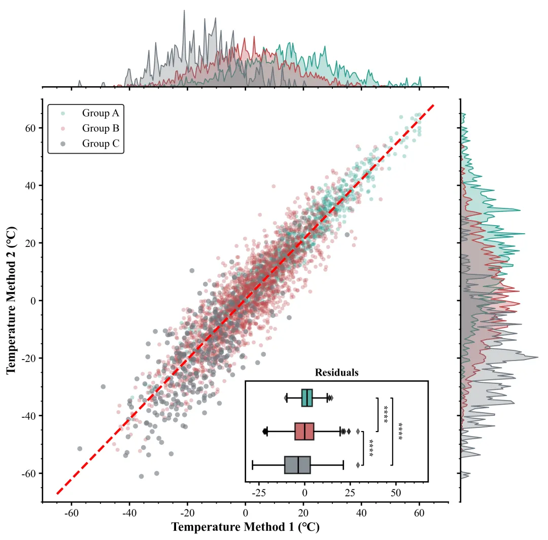
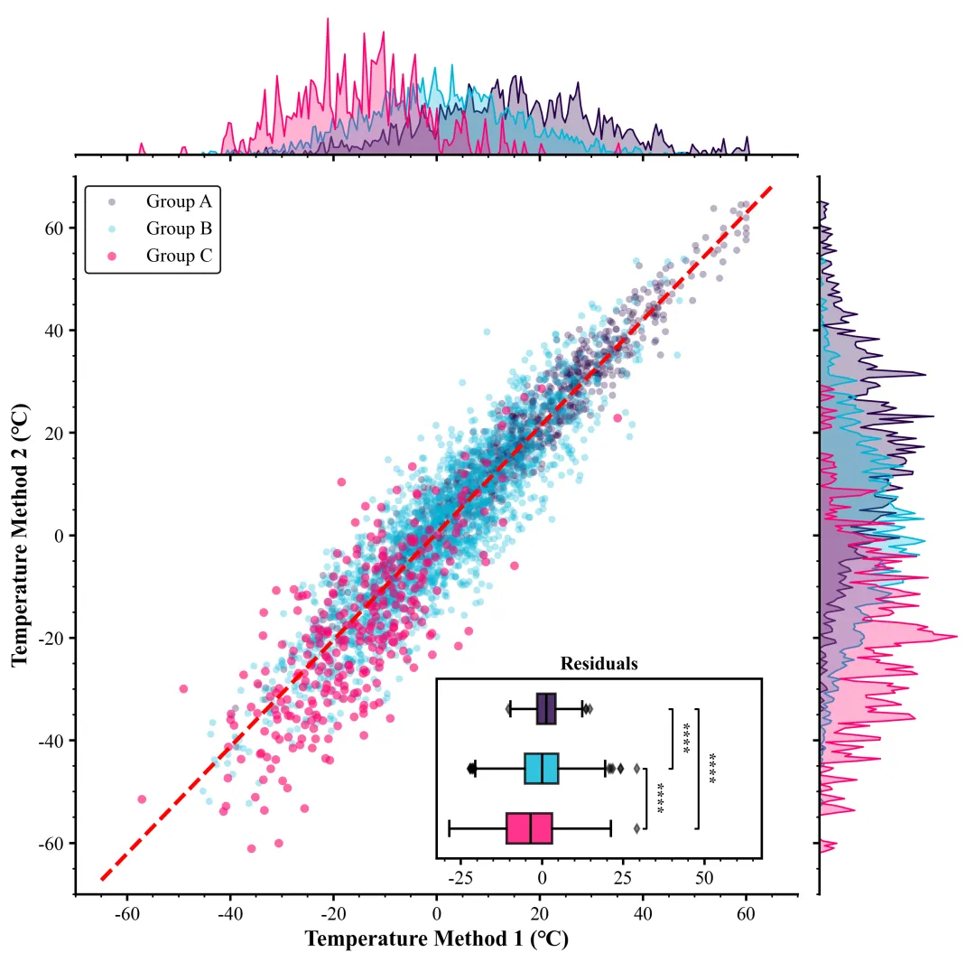
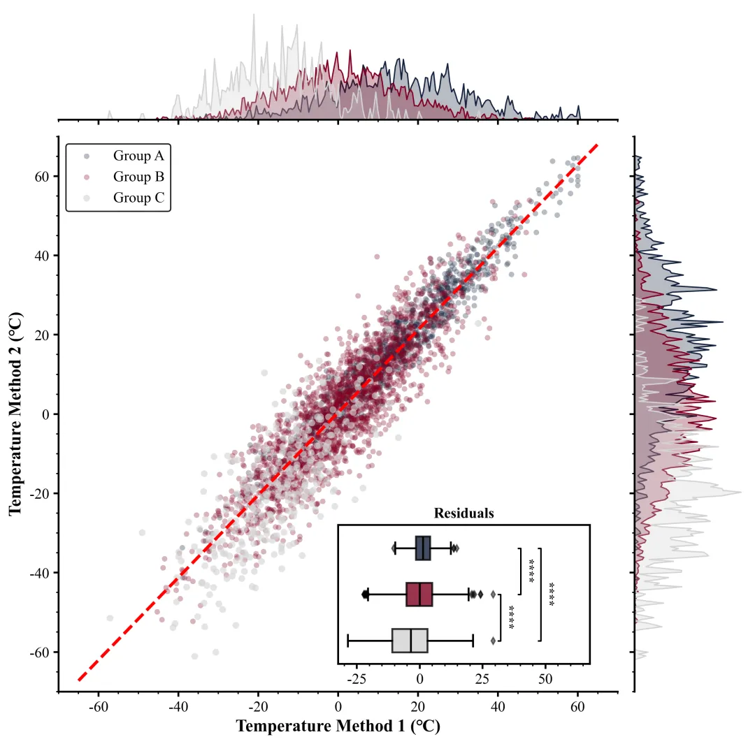
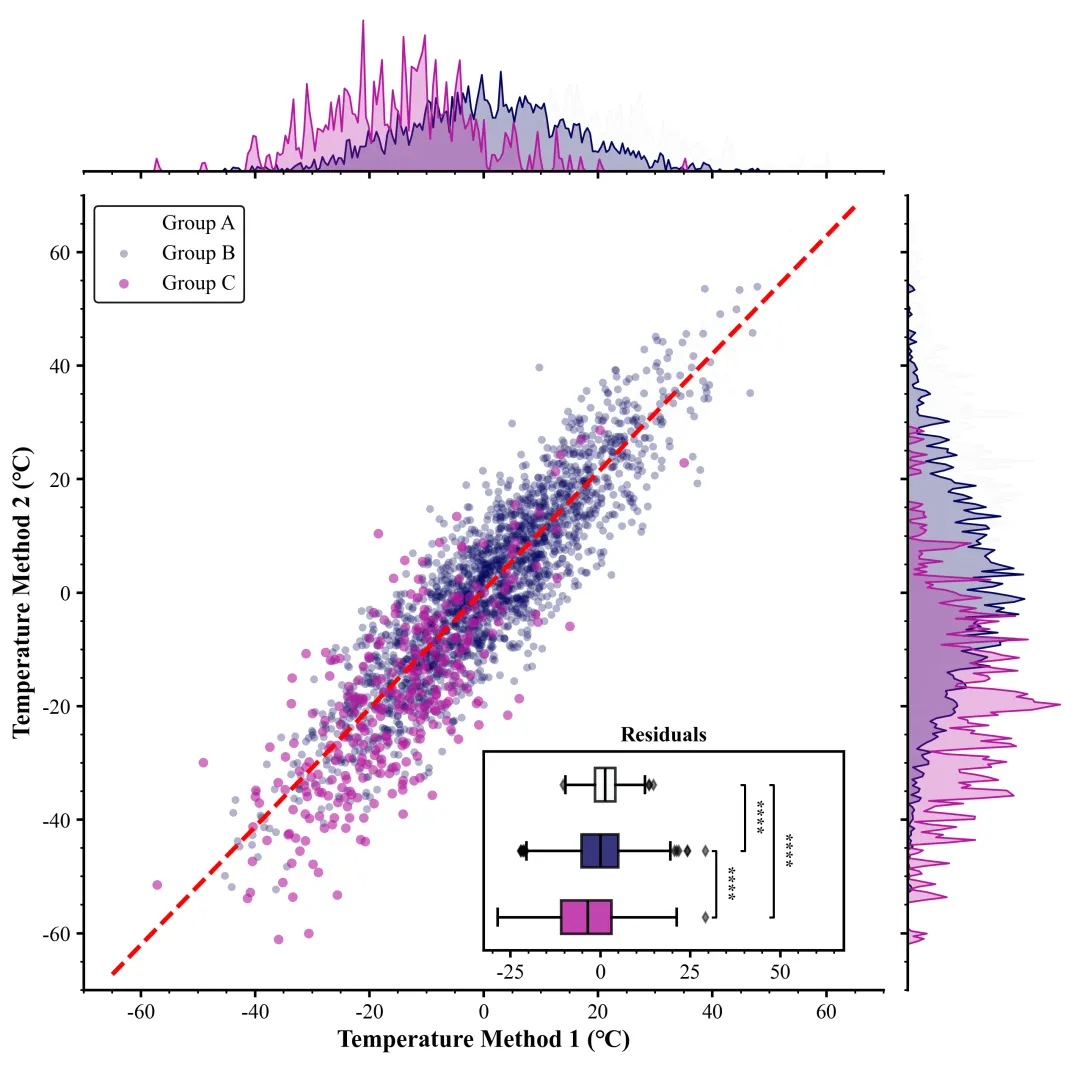
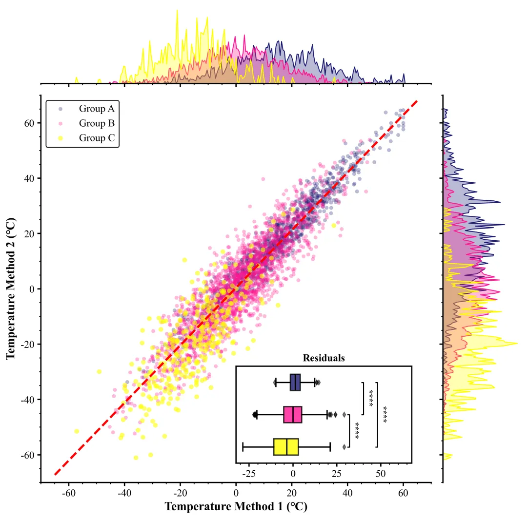
多种配色 


库的导入以及字体设置 

颜色库的设置以及配色方案的选择 

画布与布局初始化,定义核心绘图函数,解包数据,设置画布大小,使用


期刊图片复现|Python绘制二维偏依赖PDP图 期刊复现|python绘制基于SHAP分析和GAM模型拟合的单特征依赖图 期刊图片复现|python绘制带有渐变颜色shap特征重要性组合图(条形图+蜂巢图) 期刊复现|用Python绘制SHAP特征重要性总览图、依赖图、双特征交互效应SHAP图,解锁XGBoost模型的终极奥秘 期刊图片复现|Python绘制shap重要性蜂巢图+单特征依赖图+交互效应强度气泡图+交互效应依赖图(回归+二分类+分类) 

公众号中的所有所有的免费代码都已经下架了,都并入到付费部分里了,付费合集代码和数据的购买通道已经开通,全部合集100元,后续将会持续更新,决定购买请后台私信我,注意只会分享练习数据和代码文件,不会提供答疑服务,代码文件中已经包含了每行代码的完整注释,购买前请确保真的需要!!!
代码绘制成果展示
代码解释
第一部分
# =========================================================================================# ====================================== 1. 环境设置 =======================================# =========================================================================================import numpy as npimport matplotlib.pyplot as pltimport seaborn as snsfrom matplotlib.gridspec import GridSpecfrom scipy import statsimport pandas as pdimport matplotlibmatplotlib.rcParams['pdf.fonttype'] = 42matplotlib.rcParams['ps.fonttype'] = 42import osplt.rcParams['font.family'] = 'serif'plt.rcParams['font.serif'] = ['Times New Roman']plt.rcParams['axes.unicode_minus'] = Falseplt.rcParams['mathtext.fontset'] = 'stix'plt.rcParams['font.size'] = 12
第二部分
# =========================================================================================# ======================================2.颜色库=======================================# =========================================================================================COLOR_SCHEMES= {1: ['#4d4d4d', '#ff9f4b', '#1f77b4'],}scheme_index= 40#选择配色方案
第三部分
画布与布局初始化,定义核心绘图函数,解包数据,设置画布大小,使用 GridSpec 创建一网格布局。
# =========================================================================================# ======================================3.绘图函数=========================================# =========================================================================================def plot_simulation_results(data):c_a, c_b, c_c = colors[0], colors[1], colors[2] #分配颜色fig = plt.figure(figsize=(10, 10)) #创建画布# 定义网格布局gs = GridSpec(2, #行2, #列figure=fig, # 绑定到当前figurehspace=0.05, #子图垂直间距wspace=0.05, #子图水平间距height_ratios=[1, 5], # 设置行高比例,顶部边际图占1份,主图占5份width_ratios=[5, 1]) # 设置列宽比例,主图占5份,右侧边际图占1份ax_main = fig.add_subplot(gs[1, 0]) # 添加主散点图坐标轴ax_top = fig.add_subplot(gs[0, 0], sharex=ax_main) # 添加顶部KDE图坐标轴,与主图共享X轴ax_right = fig.add_subplot(gs[1, 1], sharey=ax_main) # 添加右侧KDE图坐标轴,与主图共享Y轴
第四部分
绘制三组数据的散点图,以及全局的线性回归拟合线
# 绘制A组散点图ax_main.scatter(grp_a_x, #X坐标grp_a_y, #Y坐标c=c_a, #颜色alpha=0.3, #透明度s=20, #点的大小label=f'Group A', #图例标签edgecolors='none') #无边框# 绘制B组散点图ax_main.scatter(grp_b_x, #X坐标grp_b_y, #Y坐标c=c_b, #颜色alpha=0.3, #透明度s=20, #点的大小label=f'Group B', #图例标签edgecolors='none') #无边框# 绘制C组散点图ax_main.scatter(grp_c_x, #X坐标grp_c_y, #Y坐标c=c_c, #颜色alpha=0.6, #透明度s=30, #点的大小label=f'Group C', #图例标签edgecolors='none') #无边框ax_main.set_xlim(-70, 70) #主图X轴范围ax_main.set_ylim(-70, 70) #主图Y轴范围
第五部分
绘制边缘密度图,在顶部和右侧绘制数据的核密度估计曲线,展示数据的分布情况。
bandwidth = 0.05 #KDE的带宽调节参数#顶部A组X轴数据的密度曲线sns.kdeplot(grp_a_x, #数据ax=ax_top, #指定坐标轴color=c_a, #颜色fill=True, #填充曲线下方alpha=0.3, #透明度linewidth=1, #线宽bw_adjust=bandwidth) #带宽#顶部图B组X轴数据的密度曲线sns.kdeplot(grp_b_x, #数据ax=ax_top, #指定坐标轴color=c_b, #指定颜色fill=True, #填充曲线下方alpha=0.3, #透明度linewidth=1, #线宽bw_adjust=bandwidth) #带宽#顶部C组X轴数据的密度曲线sns.kdeplot(grp_c_x, #数据ax=ax_top, #坐标轴color=c_c, #颜色fill=True, #填充曲线下方alpha=0.3, #透明度linewidth=1, #线宽bw_adjust=bandwidth) # 带宽参数
第六部分
绘制嵌入式箱线图,在主图中创建一个嵌入子图,用于展示三组数据残差的箱线图,以分析回归模型的误差分布。
# 在主图中创建嵌入式坐标轴ax_inset = ax_main.inset_axes([0.5,#左0.05,#下0.45,#宽0.25])#高flierprops=dict(marker='d', #异常值点设为菱形markersize=4, #异常点大小markerfacecolor='black', #异常点颜色alpha=0.5), #异常点透明度boxprops=dict(linewidth=1.5), #箱体边框线宽medianprops=dict(linewidth=1.5, #中位数线宽color='black'), #中位数线颜色whiskerprops=dict(linewidth=1.5), # 线线宽capprops=dict(linewidth=1.5)) #须线末端横杠线宽ax_inset.set_title("Residuals", #嵌入图标题fontsize=12, #字体大小fontweight='bold') #加粗ax_inset.set_yticks([]) # 隐藏嵌入图Y轴刻度ax_inset.set_xlabel("") # 清空嵌入图X轴标签
第七部分
显著性检验函数定义,为了在箱线图上标注组间差异的显著性,定义了两个辅助函数:一个将P值转换为星号,另一个执行检验并绘制标记线。
#显著性标记函数def get_stars(p):if p < 0.0001:return "****"elif p < 0.001:return "***"elif p < 0.01:return "**"elif p < 0.05:return "*"else:return "ns"ax.text(x_line + 1.5, #X坐标(y1 + y2) / 2, #Y坐标star, #星号ha='left', # 水平对齐va='center', # 垂直对齐rotation=270, # 旋转fontsize=10, # 字体大小fontweight='bold') # 字体加粗
第八部分
执行显著性标记与图表美化,调用上述函数添加显著性标记,并对所有坐标轴进行统一的边框、刻度样式调整,最后保存绘图结果。
#添加C和B的显著性标记add_sig(ax_inset,resid_c, resid_b, 1, 2, 1)#添加B和A的显著性标记add_sig(ax_inset,resid_b,resid_a, 2,3,2)#添加C和A的显著性标记add_sig(ax_inset, resid_c,resid_a,1,3,3)curr_xlim = ax_inset.get_xlim() # 获取当前嵌入图X轴范围#设置范围ax_inset.set_xlim(curr_xlim[0], curr_xlim[1] * 1.3)# 收集所有坐标轴对象all_axes = [ax_main,ax_top,ax_right,ax_inset]ax.minorticks_on() # 开启次刻度#保存plt.savefig(fr"{scheme_index}.png", dpi=300, bbox_inches='tight')plt.savefig(fr"{scheme_index}.pdf", bbox_inches='tight')
第九部分
主程序执行部分,读取数据,进行全局线性回归,然后按组分割数据并计算残差,最后打包数据调用绘图函数进行绘图
# =========================================================================================# ======================================4.执行部分=========================================# =========================================================================================if __name__ == "__main__":df = pd.read_excel(r"data.xlsx") # 读取数据all_x = df['X'].values #Xall_y = df['Y'].values #Yslope_fit, intercept_fit, r_value, p_value, std_err = stats.linregress(all_x, all_y) #线性回归拟合print(f"回归模型拟合完成: y = {slope_fit:.4f}x + {intercept_fit:.4f}")#数据处理函数def process_group(group_name):sub_df = df[df['Group'] == group_name] # 筛选出指定组名的数据子集if sub_df.empty: # 如果为空return np.array([]), np.array([]), np.array([]) # 返回空的数组x = sub_df['X'].values #Xy = sub_df['Y'].values #Ypred = slope_fit * x + intercept_fit # 根据模型计算预测值resid = y - pred # 计算残差return x, y, resid # 返回X数据,Y数据和残差grp_a_x, grp_a_y, resid_a = process_group('A') #处理A组数据grp_b_x, grp_b_y, resid_b = process_group('B') #处理B组数据grp_c_x, grp_c_y, resid_c = process_group('C') #处理C组数据# 将处理后的数据打包成字典data_pack = {'grp_a': (grp_a_x, grp_a_y, resid_a), # A组数据包'grp_b': (grp_b_x, grp_b_y, resid_b), # B组数据包'grp_c': (grp_c_x, grp_c_y, resid_c), # C组数据包'reg': (slope_fit, intercept_fit), # 回归参数包'all_resid': np.concatenate([resid_a, resid_b, resid_c]) # 合并所有残差用于后续计算范围}# 调用绘图函数plot_simulation_results(data_pack)
如何应用到你自己的数据
1.设置颜色方案:
scheme_index= 40#选择配色方案2.设置绘图结果的保存地址:
plt.savefig(fr"{scheme_index}.png", dpi=300, bbox_inches='tight')plt.savefig(fr"{scheme_index}.pdf", bbox_inches='tight')
3.设置原始数据的保存路径:
df = pd.read_excel(r"data.xlsx") # 读取数据3.设置x、y轴的数据:
all_x = df['X'].values #Xall_y = df['Y'].values #Y
推荐
获取方式
本文来自网友投稿或网络内容,如有侵犯您的权益请联系我们删除,联系邮箱:wyl860211@qq.com 。

