一般都是用excel制作图表,但python制作图表的优势在于可以学习如何使用python,可以更加自动化的改变图表内容。以下是这个图表的代码,欢迎有兴趣的读者来沟通交流。import matplotlib.pyplot as plt
# 年份
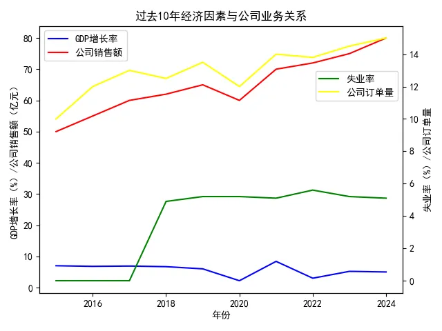
years = [2015, 2016, 2017, 2018, 2019, 2020, 2021, 2022, 2023, 2024]
# GDP增长率
gdp_growth_rate = [7, 6.8, 6.9, 6.7, 6, 2.2, 8.4, 3, 5.2, 5.0]
# 公司销售额
company_sales = [50, 55, 60, 62, 65, 60, 70, 72, 75, 80]
# 失业率
unemployment_rate = [None, None, None, 4.9, 5.2, 5.2, 5.1, 5.6, 5.2, 5.1]
# 处理None值
unemployment_rate = [x if x is not None else 0 for x in unemployment_rate]
# 公司订单量
company_orders = [10, 12, 13, 12.5, 13.5, 12, 14, 13.8, 14.5, 15]
# 设置中文字体
plt.rcParams['font.sans-serif'] = ['SimHei']
# 解决负号显示问题
plt.rcParams['axes.unicode_minus'] = False
# 绘制GDP增长率和公司销售额折线图
fig, ax1 = plt.subplots()
line1 = ax1.plot(years, gdp_growth_rate, label='GDP增长率', color='blue')
line2 = ax1.plot(years, company_sales, label='公司销售额', color='red')
ax1.set_xlabel('年份')
ax1.set_ylabel('GDP增长率(%)/公司销售额(亿元)', color='black')
# 绘制失业率和公司订单量折线图,使用双坐标轴
ax2 = ax1.twinx()
line3 = ax2.plot(years, unemployment_rate, label='失业率', color='green')
line4 = ax2.plot(years, company_orders, label='公司订单量', color='yellow')
ax2.set_ylabel('失业率(%)/公司订单量', color='black')
# 设置标题
plt.title('过去10年经济因素与公司业务关系')
# 合并图例
lines1 = line1 + line2
labels1 = [l.get_label() for l in lines1]
ax1.legend(lines1, labels1, loc='upper left')
lines2 = line3 + line4
labels2 = [l.get_label() for l in lines2]
ax2.legend(lines2, labels2,bbox_to_anchor=(1, 0.85))
# 显示图形
plt.tight_layout()
plt.show()