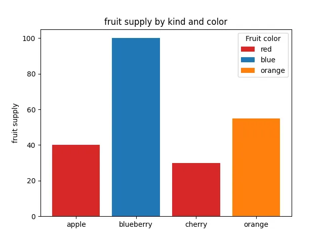
本示例展示了如何使用bar中的color 和 label参数来控制条形条颜色和图例条目。请注意,带前划线的标签不会出现在图例中,比如本例中的_red。import matplotlib.pyplot as pltfig, ax = plt.subplots()fruits = ['apple', 'blueberry', 'cherry', 'orange']counts = [40, 100, 30, 55]bar_labels = ['red', 'blue', '_red', 'orange']bar_colors = ['tab:red', 'tab:blue', 'tab:red', 'tab:orange']ax.bar(fruits, counts, label=bar_labels, color=bar_colors)ax.set_ylabel('fruit supply')ax.set_title('Fruit supply by kind and color')ax.legend(title='Fruit color')plt.show()
# 1. 导入库import matplotlib.pyplot as plt# 2. 创建图形和坐标轴fig, ax = plt.subplots()# 3. 定义数据fruits = ['apple', 'blueberry', 'cherry', 'orange'] # 水果名称列表,将作为 x 轴的刻度标签counts = [40, 100, 30, 55] # 对应每种水果的供应数量,将决定条形的高度bar_labels = ['red', 'blue', '_red', 'orange'] # 每个条形对应的颜色标签,用于图例。# 注意:第三个元素是 '_red',以下划线开头的标签会被 matplotlib 自动忽略,不会显示在图例中(这是一个隐藏条目的技巧)。bar_colors = ['tab:red', 'tab:blue', 'tab:red', 'tab:orange'] # 每个条形使用的实际颜色,来自 matplotlib 的默认颜色表(tab:red 等)。这些颜色将应用于对应的条形。# 4. 绘制条形图ax.bar(fruits, counts, label=bar_labels, color=bar_colors)# ax.bar() 创建垂直条形图。# 第一个参数 fruits 指定每个条形的 x 轴位置(这里用水果名称作为类别)。# 第二个参数 counts 指定条形的高度(即供应数量)。# label=bar_labels:为每个条形设置图例标签。bar_labels 列表与条形一一对应,但第三个标签 '_red' 由于以下划线开头,不会出现在图例中。# color=bar_colors:为每个条形指定填充颜色,与 bar_colors 列表一一对应。因此:# 5. 设置坐标轴标签和标题ax.set_ylabel('fruit supply') # 设置 y 轴的标签为 "fruit supply"ax.set_title('fruit supply by kind and color') # 设置整个图表的标题为 "Fruit supply by kind and color"# 6. 添加图例ax.legend(title='Fruit color')# title='Fruit color' 为图例设置标题。# 图例会显示所有有效的 label 条目。# 由于第三个条形使用了隐藏标签 '_red',它对应的颜色(红色)将不会出现在图例中,但图中仍显示为红色条形。# 7. 显示图形plt.show()

 10个月宝宝每天需要喝多少奶粉?
