Python绘制高颜值相关性气泡图
- 2026-06-28 12:28:42
Python绘制高颜值相关性气泡图

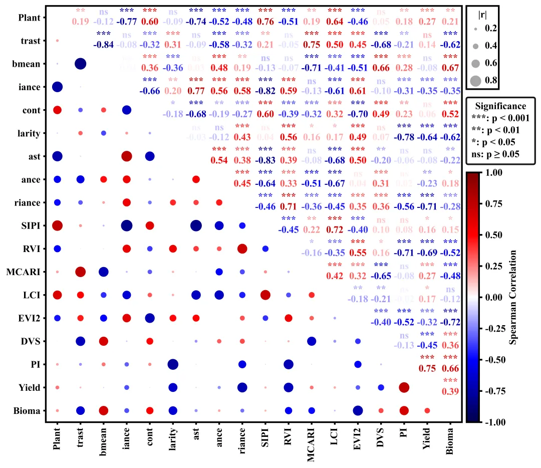
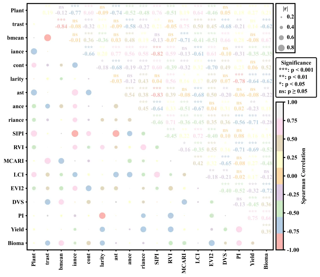
绘图结果 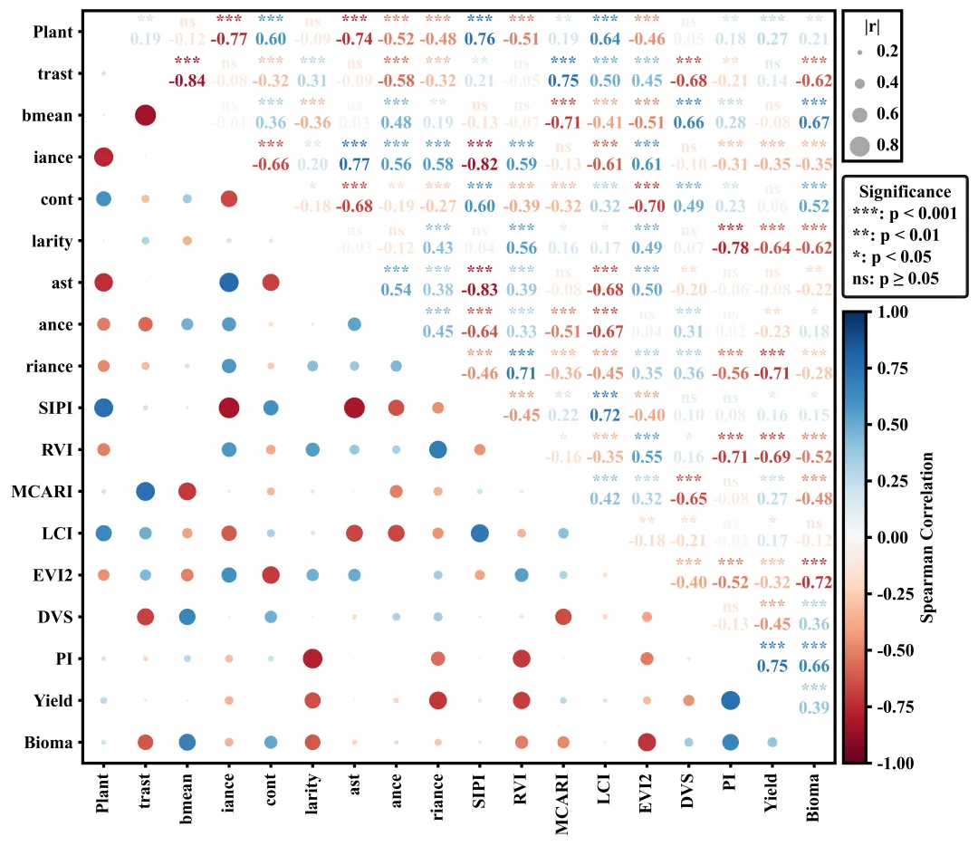
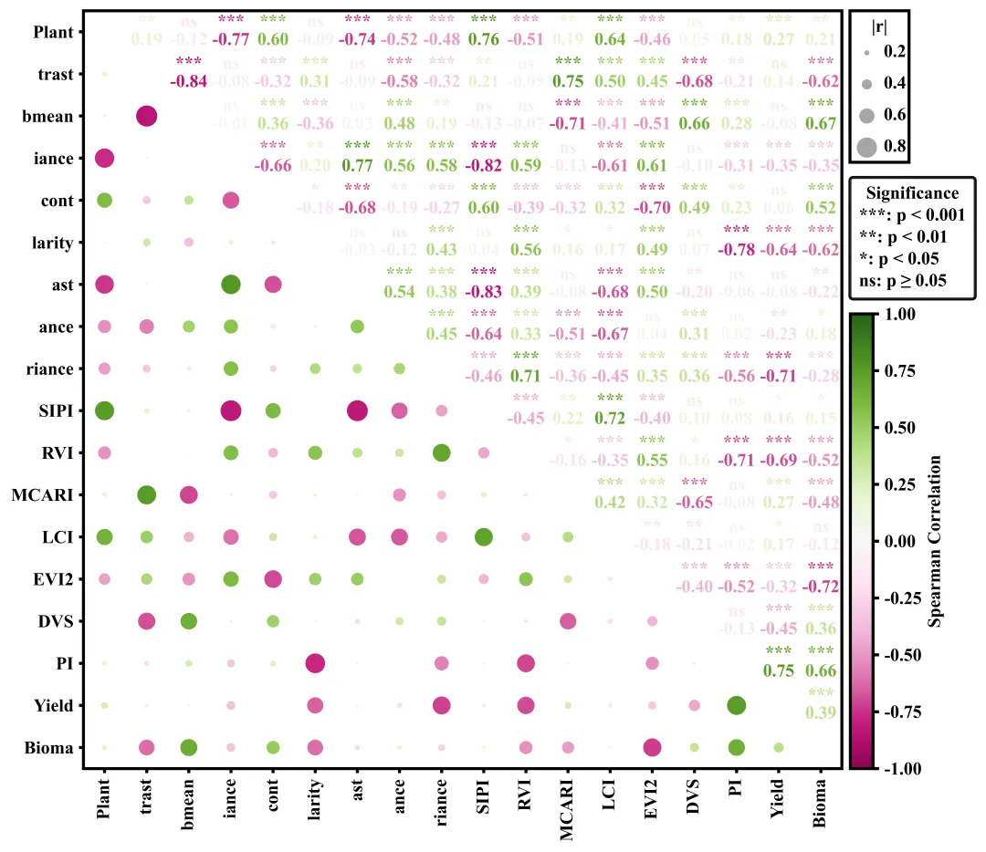
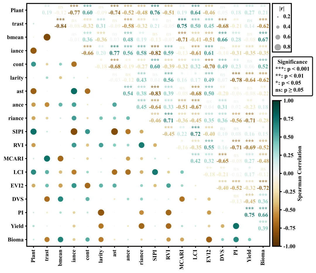
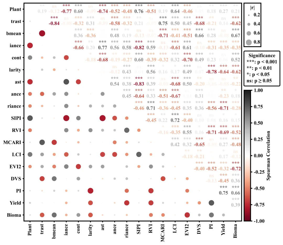
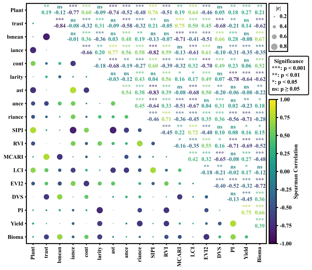
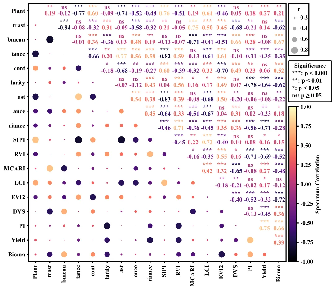
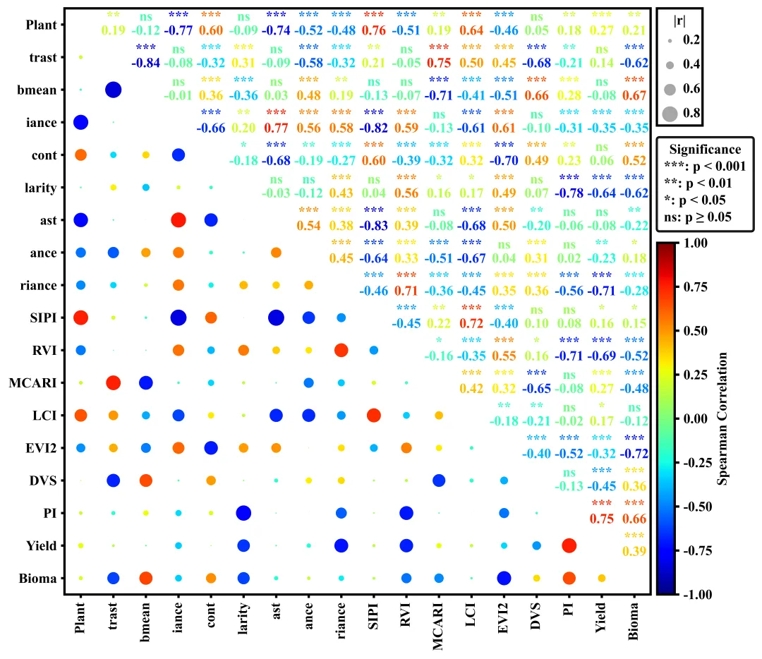
多种配色 


库的导入以及字体设置 

颜色库的设置以及配色方案的选择与提取 

相关性计算函数 

相关性计算函数 

绘图函数:画布初始化与坐标轴框架设置 

绘图函数:遍历绘制气泡(下三角)与数值文本(上三角) 

绘图函数:刻度与标签设置 

绘图函数:绘制自定义气泡图例 

绘图函数:添加显著性文字图例 

绘图函数:颜色条设置与保存 

执行部分 


期刊图片复现|Python绘制二维偏依赖PDP图 期刊复现|python绘制基于SHAP分析和GAM模型拟合的单特征依赖图 期刊图片复现|python绘制带有渐变颜色shap特征重要性组合图(条形图+蜂巢图) 期刊复现|用Python绘制SHAP特征重要性总览图、依赖图、双特征交互效应SHAP图,解锁XGBoost模型的终极奥秘 期刊图片复现|Python绘制shap重要性蜂巢图+单特征依赖图+交互效应强度气泡图+交互效应依赖图(回归+二分类+分类) 

公众号中的所有所有的免费代码都已经下架了,都并入到付费部分里了,付费合集代码和数据的购买通道已经开通,全部合集100元,后续将会持续更新,决定购买请后台私信我,注意只会分享练习数据和代码文件,不会提供答疑服务,代码文件中已经包含了每行代码的完整注释,购买前请确保真的需要!!!
代码绘制成果展示
代码解释
第一部分
# =========================================================================================# ====================================== 1. 环境设置 =======================================# =========================================================================================import numpy as npimport pandas as pdimport matplotlib.pyplot as pltimport matplotlib.patches as mpatchesimport matplotlib.lines as mlinesfrom scipy.stats import spearmanrplt.rcParams['font.family'] = 'Times New Roman'plt.rcParams['axes.unicode_minus'] = Falseimport matplotlibmatplotlib.rcParams['pdf.fonttype'] = 42matplotlib.rcParams['ps.fonttype'] = 42
第二部分
# =========================================================================================# ======================================2.颜色库=======================================# =========================================================================================COLOR_SCHEMES = {1: 'seismic',}scheme_id = 2 #要使用的配色方案cmap_name = COLOR_SCHEMES.get(scheme_id, 'seismic') #获取配色方案cmap = plt.get_cmap(cmap_name) #获取对应的颜色映射象
第三部分
# =========================================================================================# ======================================3.相关性计算函数=======================================# =========================================================================================def corr_pvalues(df):cols = df.columns #列名n = len(cols) #变量的数量corr_matrix = np.zeros((n, n)) #用于存储相关系数pval_matrix = np.zeros((n, n)) #用于存储p值for i in range(n): # 遍历行索引for j in range(n): # 遍历列if i == j: #对角线corr_matrix[i, j] = 1.0 #相关系数pval_matrix[i, j] = 0.0 #p值corr_df = pd.DataFrame(corr_matrix, columns=cols, index=cols) #将相关系数矩阵转化为带行列名的DataFrame数据框pval_df = pd.DataFrame(pval_matrix, columns=cols, index=cols) #将p值矩阵转化为带行列名的DataFrame数据框return corr_df, pval_df
第四部分
# =========================================================================================# ======================================4.显著性设置函数=======================================# =========================================================================================def significance_marker(p):if p < 0.001:return '***' #elif p < 0.01:return '**'elif p < 0.05:return '*'else:return 'ns'
第五部分
# =========================================================================================# ======================================5.绘图函数=======================================# =========================================================================================def plot_correlation_matrix(corr_df, pval_df):vars_order = corr_df.columns.tolist() #获取相关性矩阵中的变量名列表n = len(vars_order) #变量的数量#创建画布fig, ax = plt.subplots(figsize=(15, 8))ax.set_frame_on(True) #开启边框#边框线设置for spine in ax.spines.values():spine.set_linewidth(2)ax.set_xticks([]) #清空x轴的刻度ax.set_yticks([]) #清空y轴的刻度ax.set_aspect('equal') #纵横比例
第六部分
for i in range(n): #遍历行for j in range(n): #遍历列if i == j: #对角线continuer = corr_df.iloc[i, j] #获取相关系数p = pval_df.iloc[i, j] #获取p值# 获取对应p值的星号sig_marker = significance_marker(p)#上半三角else:#文本绘制ax.text(x, #xy, #yf"{sig_marker}\n{r:.2f}", #文本内容ha='center', #水平va='center', #垂直fontsize=12, #大小fontweight='bold', #加粗color=cmap((r + 1) / 2)) #字体颜色
第七部分
ax.set_xticks(range(n)) #x轴刻度位置ax.set_yticks(range(n)) #y轴刻度位置#刻度线的样式ax.tick_params(axis='both', #应用于x轴和y轴which='major', #主刻度线length=3, #长度width=2) #宽度ax.set_xlim(-0.5, n - 0.5) #设置x轴的显示范围ax.set_ylim(-0.5, n - 0.5) #设置y轴的显示范围plt.tight_layout(rect=[0, 0, 0.75, 1]) #自动调整子图参数fig.canvas.draw() #渲染
第八部分
box = ax.get_position() #获取主图坐标轴在整个图中的相对位置边界框align_x_fig = box.x1 + 0.005 #计算右侧图例整体对齐的x坐标align_x_axes = (align_x_fig - box.x0) / box.width #将图相对坐标转换为基于主坐标轴宽度的相对坐标inv_trans = ax.transData.inverted() #获取数据坐标变换的逆变换对象align_x_data, _ = inv_trans.transform(fig.transFigure.transform((align_x_fig, 0))) #把图坐标系统转换为实际的Data坐标系统ax.add_artist(rect_bubble) #添加到主坐标系# 设置气泡图例标题的x位置,即矩形框宽度的中点ax.text(align_x_data + box_width / 2, #xbox_top - 0.4, #y"|r|", #文本内容ha='center', #水平va='center', #垂直fontsize=12, #大小fontweight='bold', #加粗clip_on=False, #防止文本超出坐标轴时被截断隐藏zorder=11)#层级ax.add_artist(circle) #添加到坐标系中#绘制刻度数值ax.text(align_x_data + 0.8, #xy_pos, #yf"{r_val}", #数值ha='left', #水平va='center', #垂直fontsize=12, #大小fontweight='bold', #加粗clip_on=False, #允许绘制在主坐标系外zorder=11) #层级
第九部分
# 显著性图例sig_labels = ['***: p < 0.001','**: p < 0.01','*: p < 0.05','ns: p ≥ 0.05']# 利用空线条对象作为显著性图例句柄sig_handles = [mlines.Line2D([], [], color='none', label=lbl) for lbl in sig_labels]sig_y_axes = (box_bottom - (-0.5)) / n - 0.02 #显著性图例区域左上角位置#图例标题legend_sig.set_title("Significance", prop={'size': 12, 'weight': 'bold'})ax.add_artist(legend_sig) #重新添加legend_sig.get_frame().set_linewidth(2) #图例外边框线宽legend_sig.get_frame().set_edgecolor('black') #图例外边框颜色
第十部分
norm = plt.Normalize(vmin=-1, vmax=1) #数值区间用于颜色条范围设置sm = plt.cm.ScalarMappable(cmap=cmap, norm=norm) #创建颜色映射对象sm.set_array([])for label in cbar.ax.get_yticklabels():label.set_fontweight('bold')cbar_height = box.height * 0.6 # 获取主图坐标轴高度的35%数值,作为待会重置颜色条高度的基准#左, 下, 宽, 高cbar.ax.set_position([align_x_fig-0.015, box.y0, 0.025, cbar_height])
第十一部分
# =========================================================================================# ======================================6.执行部分=======================================# =========================================================================================if __name__ == '__main__':excel_path = r'data.xlsx' #原始数据路径df = pd.read_excel(excel_path) #读取数据df = df.iloc[:, :] #读取数据框中所有的行和列corr_df, pval_df = corr_pvalues(df) #计算相关系数和p值#执行绘图函数plot_correlation_matrix(corr_df, pval_df)
如何应用到你自己的数据
1.设置配色方案:
scheme_id = 2 #要使用的配色方案2.设置绘图结果的保存地址:
plt.savefig(fr'correlation{scheme_id}.png', dpi=1080, bbox_inches='tight', bbox_extra_artists=(legend_sig,))3.设置原始数据的保存路径:
excel_path = r'data.xlsx' #原始数据路径推荐
获取方式
本文来自网友投稿或网络内容,如有侵犯您的权益请联系我们删除,联系邮箱:wyl860211@qq.com 。
随机文章
-
 10个月宝宝每天需要喝多少奶粉?
- 90 分钟攻破 20 年 Linux 漏洞!Claude 5.0 惊现内测,Anthropic 都害怕
- 90分钟攻破20年Linux漏洞!Claude5.0内测吓坏硅谷:入职三周工程师曝一行代码不写!
- 【干货】9个一用就GG的Linux命令
- 无源项一维波动问题的PINN的Python torch实现
- 跟着大佬学习python!!!
- 新手必学:5个Python实用小项目,练手+接单两不误
- 一起学Python(008):站在巨人的肩膀上编程@Python库引用
- 90分钟的Linux漏洞探索说明了什么
- 在Linux服务器中部署omicverse-web,助力组学分析
- Linux根目录梳理,新手必存!
