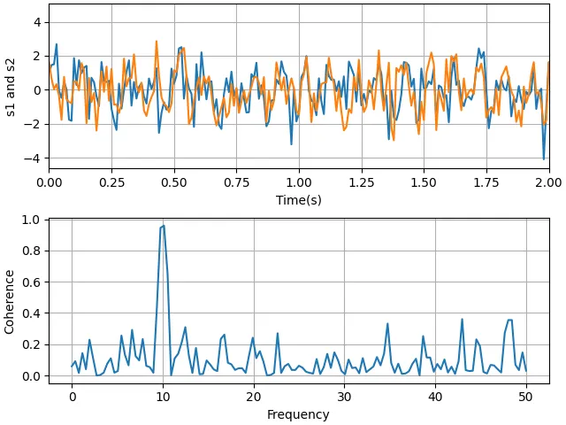
一个示例展示了如何利用cohere方法绘制两个信号相干性的图。import matplotlib.pyplot as pltimport numpy as np# Fixing random state for reproducibilitynp.random.seed(19680801)dt = 0.01t = np.arange(0, 30, dt)nse1 = np.random.randn(len(t)) # white noise 1nse2 = np.random.randn(len(t)) # white noise 2# Two signals with a coherent part at 10 Hz and a random parts1 = np.sin(2 * np.pi * 10 * t) + nse1s2 = np.sin(2 * np.pi * 10 * t) + nse2fig, axs = plt.subplots(2, 1, layout='constrained')axs[0].plot(t, s1, t, s2)axs[0].set_xlim(0, 2)axs[0].set_xlabel('Time (s)')axs[0].set_ylabel('s1 and s2')axs[0].grid(True)cxy, f = axs[1].cohere(s1, s2, NFFT=256, Fs=1. / dt)axs[1].set_ylabel('Coherence')plt.show()
# 1. 导入库import matplotlib.pyplot as pltimport numpy as np# 2. 固定随机种子np.random.seed(19680801) # 固定 NumPy 随机数生成器的种子,使得每次运行代码时生成的随机噪声完全相同。这保证了结果的可重现性。# 3. 生成时间轴和噪声信号dt = 0.01 # 采样间隔(秒)。dt 决定了采样频率 Fs = 1/dt = 100 Hz。t = np.arange(0, 30, dt) # 时间数组,从 0 到 30 秒,步长 0.01 秒 → 3000 个点。t 共有 3000 个采样点,覆盖 30 秒。nse1 = np.random.randn(len(t)) # 白噪声1,标准正态分布(均值为0,方差为1)nse2 = np.random.randn(len(t)) # 白噪声2,与 nse1 独立# 4. 构造两个信号s1 = np.sin(2 * np.pi * 10 * t) + nse1s2 = np.sin(2 * np.pi * 10 * t) + nse2# 两个信号都包含一个 10 Hz 的正弦波(相干部分)和各自独立的 白噪声。# 因此 s1 和 s2 在 10 Hz 上具有很强的相干性,而其它频率上相干性较弱(因为噪声是独立的)。# 5. 创建子图布局fig, axs = plt.subplots(2, 1, layout='constrained')# subplots(2,1):生成一个包含 2 行 1 列子图的图形对象 fig 和子图数组 axs。# layout='constrained':使用 Matplotlib 的“constrained layout”引擎,# 自动调整子图位置,避免标签、轴、标题等重叠。这是更现代的布局方式(替代 tight_layout)# 6. 绘制时域信号(第一个子图)axs[0].plot(t, s1, t, s2) # plot(t, s1, t, s2):在一次调用中绘制两条曲线,默认颜色不同。axs[0].set_xlim(0, 2) # 只显示前 2 秒,便于观察信号的细节(因为 30 秒太长,会挤在一起)。axs[0].set_xlabel('Time(s)') # 设置x坐标轴标签axs[0].set_ylabel('s1 and s2') # 设置y坐标轴标签axs[0].grid(True) # 显示网格线,便于读取数值。# 7. 计算并绘制相干性(第二个子图)cxy, f = axs[1].cohere(s1, s2, NFFT=256, Fs=1. / dt)# axs[1].cohere() 是 Matplotlib 提供的一个便捷方法,它:# 计算两个信号的 幅度平方相干性 (Magnitude Squared Coherence, MSC):# 返回两个数组:cxy(每个频率点的相干系数,范围 0~1)和 f(对应的频率数组,单位 Hz)。# 参数:# NFFT=256:计算每个段的 FFT 长度(256 点)。实际会对信号分段(有重叠,默认 50%),每段做 256 点 FFT,然后平均得到相干性估计。# 采样率 Fs = 1/dt = 100 Hz,所以频率分辨率为 100 / 256 ≈ 0.39 Hz。# Fs=1./dt:明确告知采样率。axs[1].set_ylabel('Coherence')# 设置纵轴标签。Matplotlib 会自动使用 f 作为横轴(频率),并设置横轴标签为 Frequency。# 8. 显示图形plt.show()
cohere() 是 Matplotlib 提供的一个便捷方法,它:
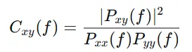
其中Pxx,Pyy 是自功率谱密度,Pxy是互功率谱密度。其中:A是振幅,f是频率(单位:Hz,即每秒周期数),φ是初相位,t是时间(单位:秒)cohere 使用的采样频率 Fs=100 Hz,奈奎斯特频率 = 50 HzMatplotlib 的 cohere 方法默认只显示这个有效频段(超过 Fs/2Fs/2的频率是混叠的、无物理意义的镜像频率)。因此,子图 2 的横轴自动被限制在 0 ~ 50 Hz。