
使用 Python 对鸢尾花(Iris)数据集进行 PCA 降维并画图,主要分为四个步骤:加载数据、数据标准化、PCA 降维、以及可视化绘图。
这里为你提供一个完整且规范的代码示例,你可以直接在 Python 环境中运行:
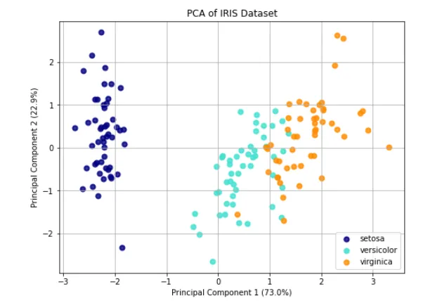
import matplotlib.pyplot as pltfrom sklearn import datasetsfrom sklearn.decomposition import PCAfrom sklearn.preprocessing import StandardScaler# 1. 加载鸢尾花数据集iris = datasets.load_iris()X = iris.data # 原始特征数据 (150个样本, 4个特征)y = iris.target # 类别标签 (0, 1, 2)target_names = iris.target_names # 类别名称# 2. 数据标准化 (PCA对数据的量纲非常敏感,标准化是必要步骤)scaler = StandardScaler()X_scaled = scaler.fit_transform(X)# 3. 使用PCA将数据降维到2维,便于可视化pca = PCA(n_components=2)X_pca = pca.fit_transform(X_scaled)# 4. 绘制降维后的散点图plt.figure(figsize=(8, 6))colors = ['navy', 'turquoise', 'darkorange']# 遍历每一个类别,分别绘制散点for i, color, species in zip(range(3), colors, target_names): plt.scatter(X_pca[y == i, 0], X_pca[y == i, 1], color=color, alpha=0.8, lw=2, label=species)# 添加坐标轴标签,并显示主成分的方差解释比例plt.xlabel(f'Principal Component 1 ({pca.explained_variance_ratio_[0]*100:.1f}%)')plt.ylabel(f'Principal Component 2 ({pca.explained_variance_ratio_[1]*100:.1f}%)')plt.title('PCA of IRIS Dataset')plt.legend(loc='best', shadow=False, scatterpoints=1)plt.grid(True)plt.show()
💡 代码关键点解析:
- 为什么要标准化 (
StandardScaler): PCA 是一种基于方差来寻找数据“主方向”的算法。如果某个特征的数值范围特别大(比如几千),而另一个特征数值很小(比如零点几),PCA 会错误地认为数值大的特征更重要。标准化将所有特征缩放到同一尺度,确保每个特征平等参与计算。 n_components=2: 指定将原本的 4 个特征压缩成 2 个主成分(PC1 和 PC2),这样我们才能将其画在二维平面直角坐标系中。- 方差解释比例 (
explained_variance_ratio_): 在坐标轴标签中,我们通常会标注该主成分保留了多少原始数据的信息(方差)。对于鸢尾花数据集,前两个主成分通常能保留 95% 以上的原始信息,这意味着降维后的二维图能非常真实地反映原始高维数据的分布情况。
运行这段代码后,你会看到一张清晰的散点图,三种不同颜色的点代表了三种鸢尾花,它们在二维空间中呈现出明显的聚类效果。
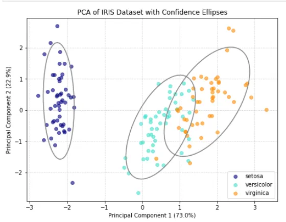
优化:用灰色线圈把同一类别的数据点圈起来
用灰色线圈起来的应该是同一类别的数据点。在 PCA 降维图中,我们通常会用椭圆或轮廓线把同一品种(如 setosa, versicolor, virginica)的样本圈起来,以便直观地看出它们的聚类范围和分布情况。
在 Python 中,最简单的方法是使用 matplotlib.patches.Ellipse 为每个类别绘制一个置信椭圆(类似于统计学中的标准差范围)。
以下是为你修改后的完整代码,在原有基础上增加了绘制灰色线圈的功能:
import matplotlib.pyplot as pltimport numpy as npfrom matplotlib.patches import Ellipsefrom sklearn import datasetsfrom sklearn.decomposition import PCAfrom sklearn.preprocessing import StandardScaler# 1. 加载并预处理数据iris = datasets.load_iris()X = iris.datay = iris.targettarget_names = iris.target_names# 数据标准化scaler = StandardScaler()X_scaled = scaler.fit_transform(X)# 2. PCA 降维pca = PCA(n_components=2)X_pca = pca.fit_transform(X_scaled)# 3. 绘制散点图plt.figure(figsize=(8, 6))colors = ['navy', 'turquoise', 'darkorange']# 辅助函数:计算并绘制置信椭圆def plot_confidence_ellipse(points, ax, n_std=2.0, edgecolor='gray', **kwargs): # 计算协方差矩阵和均值(圆心) cov = np.cov(points, rowvar=False) mean = np.mean(points, axis=0) # 计算特征值和特征向量,用于确定椭圆的大小和旋转角度 vals, vecs = np.linalg.eigh(cov) order = vals.argsort()[::-1] vals, vecs = vals[order], vecs[:, order] # 计算椭圆的旋转角度 theta = np.degrees(np.arctan2(*vecs[:, 0][::-1])) # 计算椭圆的宽和高 (n_std 代表包含多少个标准差,2.0 大约包含 95% 的点) width, height = 2 * n_std * np.sqrt(vals) # 创建椭圆对象 ellipse = Ellipse(xy=mean, width=width, height=height, angle=theta, edgecolor=edgecolor, facecolor='none', lw=1.5, **kwargs) ax.add_patch(ellipse)ax = plt.gca()# 4. 遍历每个类别,绘制散点并圈出椭圆for i, color, species in zip(range(3), colors, target_names): # 提取当前类别的点 current_points = X_pca[y == i] # 绘制散点 plt.scatter(current_points[:, 0], current_points[:, 1], color=color, alpha=0.6, label=species) # 绘制灰色线圈(置信椭圆) plot_confidence_ellipse(current_points, ax, n_std=2.0, edgecolor='gray')# 5. 完善图表信息plt.xlabel(f'Principal Component 1 ({pca.explained_variance_ratio_[0]*100:.1f}%)')plt.ylabel(f'Principal Component 2 ({pca.explained_variance_ratio_[1]*100:.1f}%)')plt.title('PCA of IRIS Dataset with Confidence Ellipses')plt.legend(loc='best')plt.grid(True, linestyle='--', alpha=0.5)plt.show()


 10个月宝宝每天需要喝多少奶粉?
