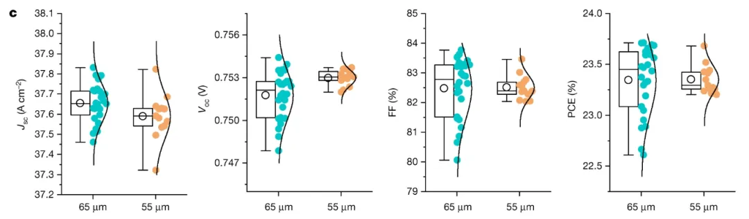
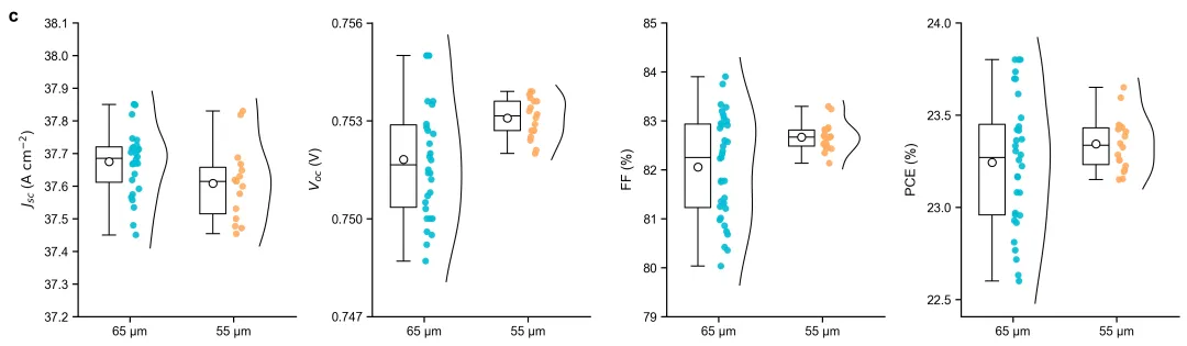
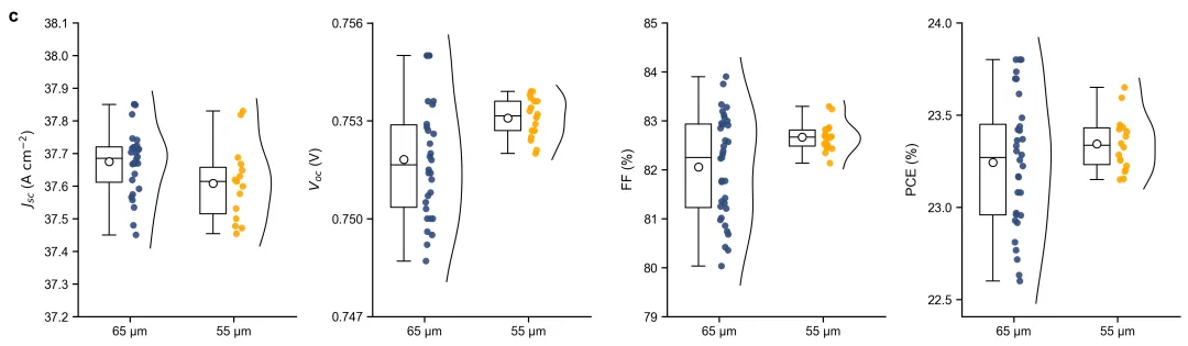
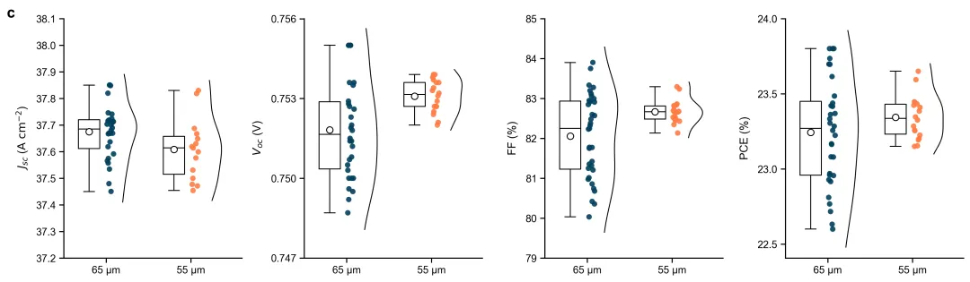
import osimport numpy as npimport pandas as pdimport matplotlib.pyplot as pltfrom matplotlib.gridspec import GridSpecfrom scipy.stats import gaussian_kde# ==============================================================================# 1. 20种符合主流期刊标准的专业科研配色方案# ==============================================================================PALETTES = { 1: {"65 µm": "#00bcd4", "55 µm": "#ffab60"}, # 方案1:青蓝与暖橙 (高对比度,Nature/Science常用)}# 依照要求选择方案 1colors = PALETTES[4]# ==============================================================================# 2. 自动读取同目录下的 data.xlsx# ==============================================================================excel_path = 'data.xlsx'if not os.path.exists(excel_path): raise FileNotFoundError(f"未在当前目录下找到 '{excel_path}' 文件,请确保该 Excel 文件已存在。")print(f"正在从 {excel_path} 读取数据...")try: df_read = pd.read_excel(excel_path, sheet_name='AllDataLong')except Exception: print("未找到 'AllDataLong' 工作表,尝试读取默认第一张工作表...") df_read = pd.read_excel(excel_path)# ==============================================================================# 3. 自动创建 图表 文件夹# ==============================================================================chart_dir = '图表'if not os.path.exists(chart_dir): os.makedirs(chart_dir) print(f"已创建 '{chart_dir}' 文件夹。")# ==============================================================================# 4. 基于 Excel 数据生成学术图表# ==============================================================================print("正在基于 Excel 数据生成高还原度学术图表...")plt.rcParams['font.family'] = 'sans-serif'plt.rcParams['font.sans-serif'] = ['Arial', 'Liberation Sans', 'DejaVu Sans']plt.rcParams['axes.unicode_minus'] = Falsefig = plt.figure(figsize=(15, 4.5), dpi=300)gs = GridSpec(1, 4, figure=fig, wspace=0.35)metrics_config = { 'Jsc': {'ylabel': r'$J_{sc}$ ($\mathrm{A\ cm^{-2}}$)', 'yticks': np.arange(37.2, 38.2, 0.1), 'fmt': '%.1f'}, 'Voc': {'ylabel': r'$V_{oc}$ (V)', 'yticks': [0.747, 0.750, 0.753, 0.756], 'fmt': '%.3f'}, 'FF': {'ylabel': 'FF (%)', 'yticks': np.arange(79, 86, 1), 'fmt': '%d'}, 'PCE': {'ylabel': 'PCE (%)', 'yticks': np.arange(22.5, 24.5, 0.5), 'fmt': '%.1f'}}conditions = ['65 µm', '55 µm']for i, (metric, config) in enumerate(metrics_config.items()): ax = fig.add_subplot(gs[i]) df_metric = df_read[df_read['Metric'] == metric] for idx, cond in enumerate(conditions): cond_data = df_metric[df_metric['Condition'] == cond]['Value'].dropna().values if len(cond_data) == 0: continue x_base = idx + 1 # A. 绘制自定义箱线图 box_x = x_base - 0.2 q1, q3 = np.percentile(cond_data, [25, 75]) med = np.median(cond_data) mean_val = np.mean(cond_data) low_whisker = np.min(cond_data[cond_data >= q1 - 1.5 * (q3 - q1)]) high_whisker = np.max(cond_data[cond_data <= q3 + 1.5 * (q3 - q1)]) box_width = 0.25 ax.plot([box_x - box_width / 2, box_x + box_width / 2, box_x + box_width / 2, box_x - box_width / 2, box_x - box_width / 2], [q1, q1, q3, q3, q1], color='black', linewidth=1) ax.plot([box_x - box_width / 2, box_x + box_width / 2], [med, med], color='black', linewidth=1) ax.plot([box_x, box_x], [q3, high_whisker], color='black', linewidth=1) ax.plot([box_x, box_x], [q1, low_whisker], color='black', linewidth=1) ax.plot([box_x - box_width / 4, box_x + box_width / 4], [high_whisker, high_whisker], color='black', linewidth=1) ax.plot([box_x - box_width / 4, box_x + box_width / 4], [low_whisker, low_whisker], color='black', linewidth=1) ax.plot(box_x, mean_val, marker='o', markerfacecolor='white', markeredgecolor='black', markersize=7, zorder=5) # B. 绘制数据散点 scatter_x_center = x_base + 0.05 np.random.seed(42) jitter = np.random.uniform(-0.04, 0.04, size=len(cond_data)) ax.scatter(scatter_x_center + jitter, cond_data, color=colors[cond], s=35, edgecolor='none', alpha=0.9, zorder=4) # C. 绘制半边分布曲线 (KDE) curve_x_start = x_base + 0.18 if len(cond_data) > 1: kde = gaussian_kde(cond_data) y_span = np.max(cond_data) - np.min(cond_data) y_grid = np.linspace(np.min(cond_data) - y_span * 0.1, np.max(cond_data) + y_span * 0.1, 200) kde_vals = kde(y_grid) kde_vals_scaled = (kde_vals / np.max(kde_vals)) * 0.18 ax.plot(curve_x_start + kde_vals_scaled, y_grid, color='black', linewidth=1, zorder=3) # D. 坐标轴与边框精细化配置 ax.set_ylabel(config['ylabel'], fontsize=12, labelpad=8) ax.set_yticks(config['yticks']) ax.set_yticklabels([config['fmt'] % y for y in config['yticks']], fontsize=10) ax.set_xticks([1, 2]) ax.set_xticklabels(conditions, fontsize=11) ax.set_xlim(0.5, 2.6) ax.spines['top'].set_visible(False) ax.spines['right'].set_visible(False) ax.spines['left'].set_linewidth(1.2) ax.spines['bottom'].set_linewidth(1.2) ax.tick_params(direction='out', length=5, width=1.2, labelsize=11) if i == 0: ax.text(-0.32, 1.05, 'c', transform=ax.transAxes, fontsize=16, fontweight='bold', va='top')# ==============================================================================# 5. 保存图像# ==============================================================================output_path = os.path.join(chart_dir, 'figure_c.png')fig.subplots_adjust(left=0.08, right=0.98, top=0.92, bottom=0.12)plt.savefig(output_path, bbox_inches='tight')plt.close()print(f"绘图成功,图片已保存至: {output_path}")


 10个月宝宝每天需要喝多少奶粉?
