期刊图片复现|Python绘制多面板配对箱线图
- 2026-06-30 01:43:25
期刊图片复现|Python绘制多面板配对箱线图

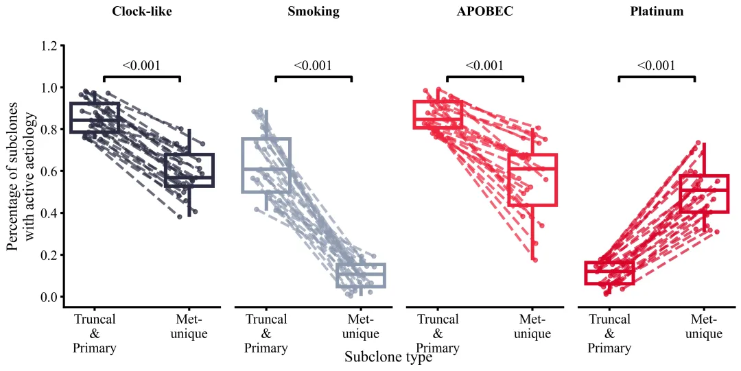
论文:Evolutionary characterization of lung cancer metastasis 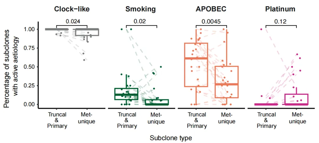
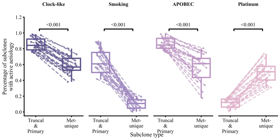
论文原图 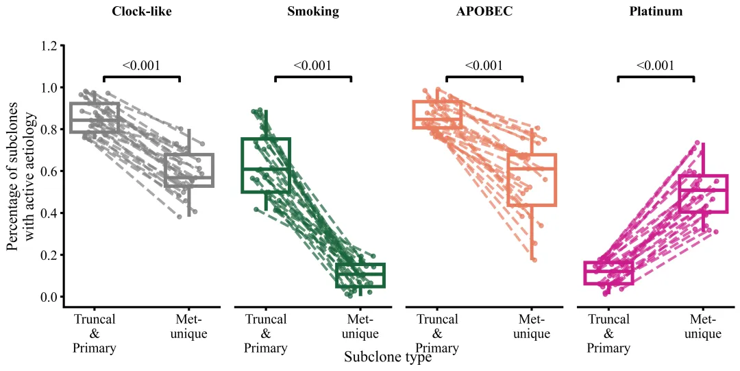
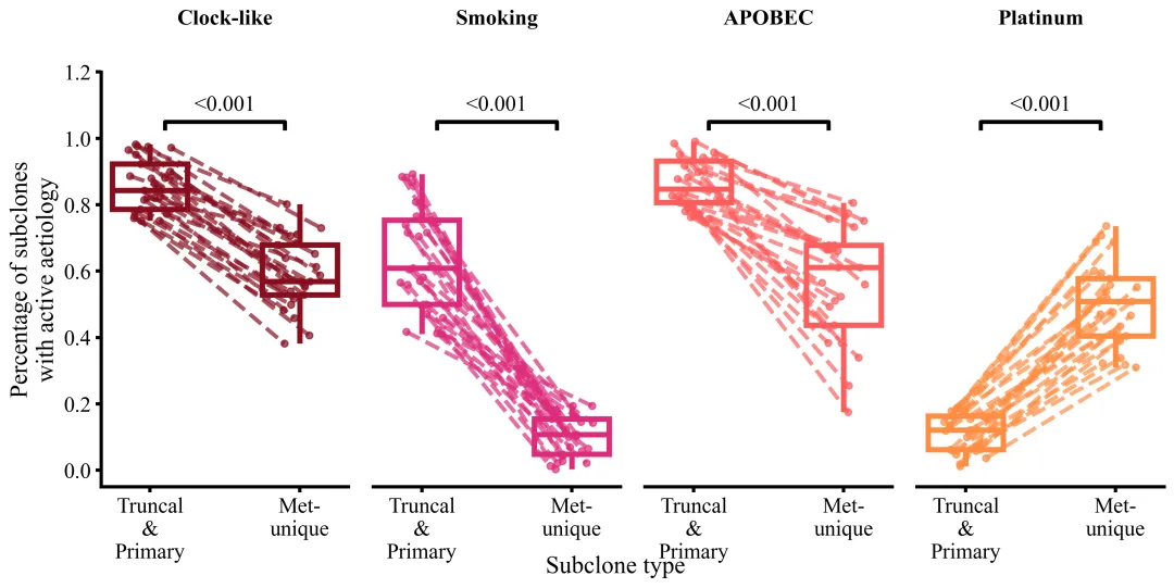
仿图 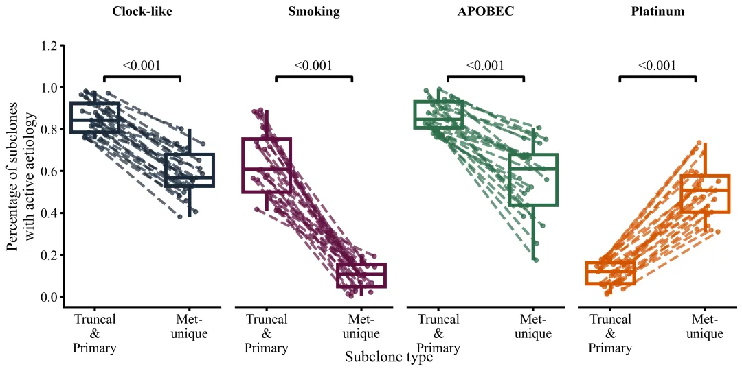
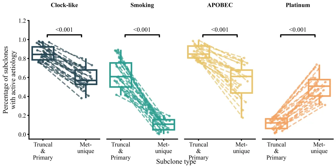
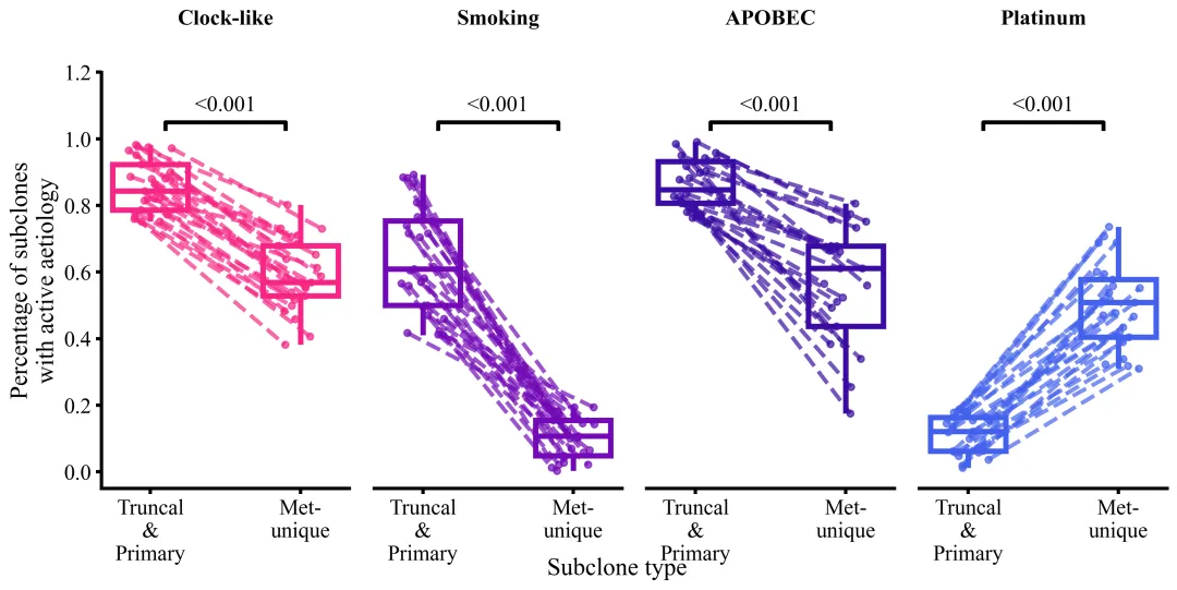
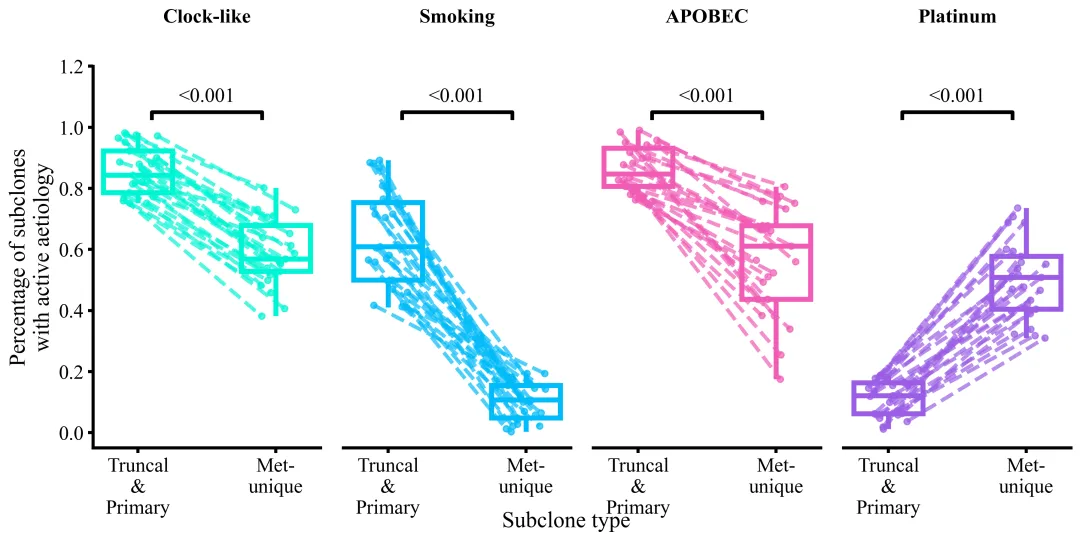
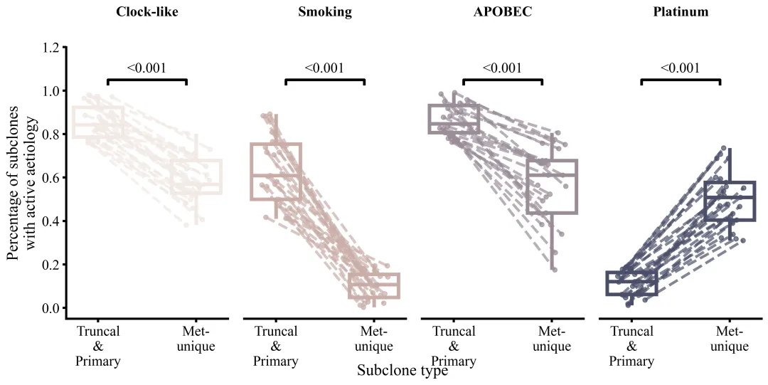
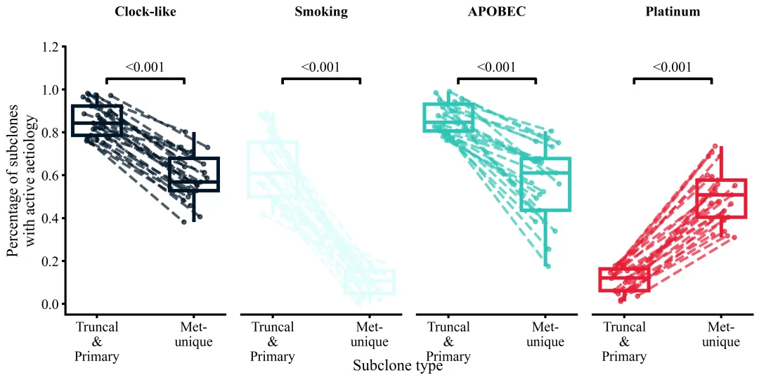
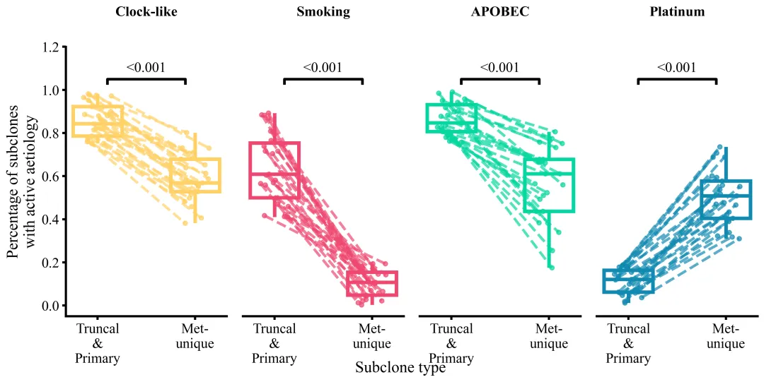
多种配色 


库的导入以及字体设置 

设置颜色库 

绘图函数:初始化画布与获取基本信息 

绘图函数:绘制箱线图 

绘图函数:绘制配对散点及连线 

绘图函数:计算p值并绘制显著性标记 

绘图函数:坐标轴与图框设置 

绘图函数:坐标轴与图框设置 


期刊图片复现|Python绘制二维偏依赖PDP图 期刊复现|python绘制基于SHAP分析和GAM模型拟合的单特征依赖图 期刊图片复现|python绘制带有渐变颜色shap特征重要性组合图(条形图+蜂巢图) 期刊复现|用Python绘制SHAP特征重要性总览图、依赖图、双特征交互效应SHAP图,解锁XGBoost模型的终极奥秘 期刊图片复现|Python绘制shap重要性蜂巢图+单特征依赖图+交互效应强度气泡图+交互效应依赖图(回归+二分类+分类) 

公众号中的所有所有的免费代码都已经下架了,都并入到付费部分里了,付费合集代码和数据的购买通道已经开通,全部合集100元,后续将会持续更新,决定购买请后台私信我,注意只会分享练习数据和代码文件,不会提供答疑服务,代码文件中已经包含了每行代码的完整注释,购买前请确保真的需要!!!
代码绘制成果展示
代码解释
第一部分
# =========================================================================================# ====================================== 1. 环境设置 =======================================# =========================================================================================import numpy as npimport pandas as pdimport matplotlib.pyplot as pltimport seaborn as sns
第二部分
# =========================================================================================# ======================================2.颜色库=======================================# =========================================================================================COLOR_SCHEMES = {1: ['#808080', '#1A653B', '#E97D5E', '#CC1C8C'],}
第三部分
# =========================================================================================# ======================================3.绘图函数======================================# =========================================================================================def plot_advanced_forest_chart(df_plot, scheme_id):#提取配色方案selected_colors = COLOR_SCHEMES[scheme_id]fig, axes = plt.subplots(1,#行order = list(df_plot['Type'].unique())#获取Type列去重值aetiologies = df_plot['Aetiology'].unique()#获取Aetiology不重复类别
第四部分
#开始变量子图和类别名for idx, (ax, aetiology) in enumerate(zip(axes, aetiologies)):color = selected_colors[idx % len(selected_colors)]#子图颜色#遍历子图箱线图for patch in ax.patches:patch.set_edgecolor(color)#边框色patch.set_facecolor('none')#只留外框线#遍历线for line in ax.lines:line.set_color(color)#颜色
第五部分
y_truncal_list = []#存放左侧数值y_met_list = []#存放右侧数值#随机数种子,用于后续散点抖动位置设计np.random.seed(42)#遍历id号for patient in sub_df['Patient'].unique():patient_data = sub_df[sub_df['Patient'] == patient]#提取改id数据y_truncal = patient_data[patient_data['Type'] == order[0]]['Percentage'].values#左侧数据y_met = patient_data[patient_data['Type'] == order[1]]['Percentage'].values#右侧数据#检查是否都有数据if len(y_truncal) > 0 and len(y_met) > 0:#保存数据
第六部分
#默认p值文本p_text = "N.S."#检查数据量if len(y_truncal_list) > 0 and len(y_met_list) > 0:diffs = np.array(y_truncal_list) - np.array(y_met_list) #两组数据一一对应的差值else:p_text = f"{p_val:.3g}"#p值文本ax.text(0.5,#xy_text, #yp_text,#文本ha='center',#水平va='bottom',#垂直color='black',#颜色fontsize=12)#字体大小
第七部分
#子图标题ax.set_title(aetiology,#文本fontweight='bold',#加粗fontsize=16,#字体大小pad=35)#间隔ax.set_ylim(-0.05, 1.20)#y轴范围ax.set_xlabel('')#去掉x轴标注#去掉上侧和右侧的图框ax.spines['top'].set_visible(False)#x轴标题fig.text(0.5,#x-0.05,#y'Subclone type',#文本ha='center',#水平fontsize=14#这字体大小)
第八部分
# =========================================================================================# ======================================4.执行部分======================================# =========================================================================================if __name__ == '__main__':excel_path = r"data.xlsx"#原始数据df_real = pd.read_excel(excel_path)#读取数据else:scheme_id = 1print('正在绘制并保存方案:', scheme_id)plot_advanced_forest_chart(df_real, scheme_id)
如何应用到你自己的数据
1.设置原始数据的保存路径,执行部分:
excel_path = r"data.xlsx"#原始数据2.设置是否进行批量绘图,执行部分:
plot_all = True3.设置要读取的基础数据,绘图函数部分:
order = list(df_plot['Type'].unique())#获取Type列去重值aetiologies = df_plot['Aetiology'].unique()#获取Aetiology不重复类别
4.设置绘图结果的保存地址,绘图函数部分:
plt.savefig(fr"plot_scheme_{scheme_id}.png", dpi=300, bbox_inches='tight')推荐
获取方式
本文来自网友投稿或网络内容,如有侵犯您的权益请联系我们删除,联系邮箱:wyl860211@qq.com 。
随机文章
-
 10个月宝宝每天需要喝多少奶粉?
- python常用库总结(六)
- 得“空间”者得天下:Python 地理编码工具链,把凌乱地址一键转为空间面板数据
- Linux多媒体进阶之旅(四):6个角度图解PulseAudio播放链路
- 2026信息素养大赛丝路新程python复赛备战必考
- Python 潮流周刊#154:CPython JIT 被暂时叫停了
- Python学习【181】:从Docker部署到Python查询,Apache Doris极简上手指南
- C 语言 022 | Linux 多线程同步
- 2026年信息素养大赛数字守艺人python小低组复赛备赛(往年真题及答案1)
- RHEL/SLES/Ubuntu主流Linux发行版网络配置与差异
- 6月14日周日 | Python热门项目
