一、为什么需要多子图?
想象一下:你要做一份销售分析报告,需要同时展示趋势图、占比图、对比图、分布图……如果每张图单独保存,读者得来回切换,体验极差。
多子图(Subplot) 就是解决方案——把多个图表像拼图一样拼进一张大图里,一屏看完所有关键信息。
二、两种核心方法:subplot() vs subplots()
💡 推荐:新手先用 subplot() 理解原理,实际项目用 subplots() 更高效。三、subplot():逐个定位法
核心语法
plt.subplot(nrows, ncols, index)# 或简写:plt.subplot(行数, 列数, 位置编号)
1x2 布局: 2x2 布局:┌─────┬─────┐ ┌─────┬─────┐│ 1 │ 2 │ │ 1 │ 2 │└─────┴─────┘ ├─────┼─────┤ │ 3 │ 4 │ └─────┴─────┘
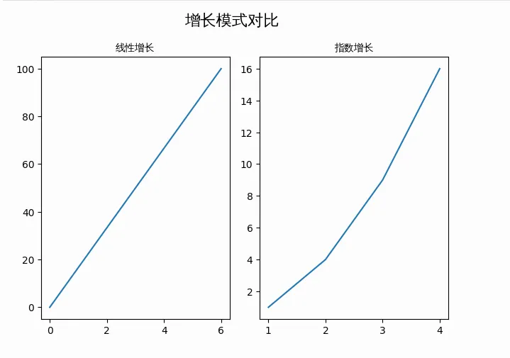
示例 1:1行2列并排对比
import numpy as npimport matplotlib.pyplot as pltimport matplotlib.font_manager as fmimport os# ================= 1. 字体加载(解决中文乱码的核心) =================font_path = "simhei.ttf" # 确保当前目录有 simhei.ttfif not os.path.exists(font_path): font_path = "/usr/share/fonts/truetype/wqy/wqy-zenhei.ttc" # 备用系统字体prop = fm.FontProperties(fname=font_path)plt.rcParams['axes.unicode_minus'] = False# 数据准备x = np.array([0, 6])y1 = np.array([0, 100])x2 = np.array([1, 2, 3, 4])y2 = np.array([1, 4, 9, 16])# 子图1:位置 (1, 2, 1) = 第1行第2列的第1个plt.subplot(1, 2, 1)plt.plot(x, y1)plt.title("线性增长", fontproperties=prop)# 子图2:位置 (1, 2, 2) = 第1行第2列的第2个plt.subplot(1, 2, 2)plt.plot(x2, y2)plt.title("指数增长", fontproperties=prop)# 总标题plt.suptitle("增长模式对比", fontproperties=prop, fontsize=16)plt.tight_layout() # 自动调整间距plt.show()
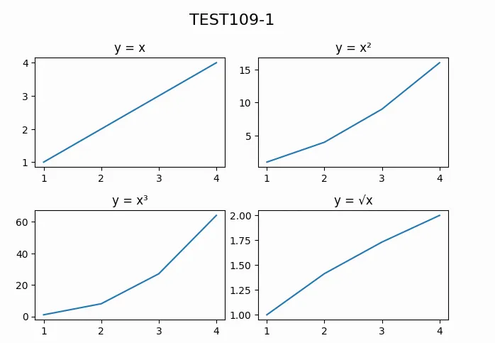
示例 2:2行2列四宫格
# 数据x = np.array([1, 2, 3, 4])# 子图1:左上plt.subplot(2, 2, 1)plt.plot(x, x)plt.title("y = x")# 子图2:右上plt.subplot(2, 2, 2)plt.plot(x, x**2)plt.title("y = x²")# 子图3:左下plt.subplot(2, 2, 3)plt.plot(x, x**3)plt.title("y = x³")# 子图4:右下plt.subplot(2, 2, 4)plt.plot(x, np.sqrt(x))plt.title("y = √x")plt.suptitle("TEST109-1", fontsize=16)plt.tight_layout()plt.show()
四、subplots():批量创建法(推荐)
核心语法
fig, axes = plt.subplots(nrows=1, ncols=1, sharex=False, sharey=False)
| | |
|---|
nrows | | |
ncols | | |
sharex | | False |
sharey | | False |
figsize | | (10, 8) |
dpi | | |
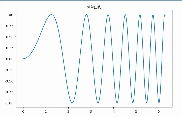
示例 3:基础用法
import numpy as npimport matplotlib.pyplot as pltimport matplotlib.font_manager as fmimport os# ================= 1. 字体加载 =================font_path = "simhei.ttf"if not os.path.exists(font_path): font_path = "/usr/share/fonts/truetype/wqy/wqy-zenhei.ttc"prop = fm.FontProperties(fname=font_path)plt.rcParams['axes.unicode_minus'] = False# 数据x = np.linspace(0, 2*np.pi, 400)y = np.sin(x**2)# 创建 1 个子图fig, ax = plt.subplots(figsize=(8, 5))ax.plot(x, y)ax.set_title('简单曲线', fontproperties=prop)plt.show()
示例 4:1行2列 + 共享Y轴
import numpy as npimport matplotlib.pyplot as pltimport matplotlib.font_manager as fmimport os# ================= 1. 字体加载(解决中文乱码的核心) =================font_path = "simhei.ttf" # 确保你已经在当前目录上传了 simhei.ttfif not os.path.exists(font_path): font_path = "/usr/share/fonts/truetype/wqy/wqy-zenhei.ttc" # 备用系统字体prop = fm.FontProperties(fname=font_path)plt.rcParams['axes.unicode_minus'] = False# ================= 2. 数据准备 =================x = np.linspace(0, 2 * np.pi, 400) # 0 到 2π,400个点y = np.sin(x ** 2) # y = sin(x²),产生漂亮的振荡曲线# ================= 3. 创建 1行2列 子图,共享Y轴 =================fig, (ax1, ax2) = plt.subplots(1, 2, sharey=True, figsize=(12, 5))# ---------- 左图:折线图 ----------ax1.plot(x, y, color='#2E86AB', linewidth=1.5)ax1.set_title('折线图', fontproperties=prop, fontsize=14)ax1.set_xlabel('X 轴(弧度)', fontproperties=prop)ax1.set_ylabel('Y 值', fontproperties=prop)ax1.grid(True, alpha=0.3, linestyle='--')# ---------- 右图:散点图(共享Y轴,刻度对齐) ----------# 为了散点图效果更明显,每隔10个点取一个x_sample = x[::10]y_sample = y[::10]ax2.scatter(x_sample, y_sample, c='#E74C3C', s=20, alpha=0.6, edgecolors='white')ax2.set_title('散点图', fontproperties=prop, fontsize=14)ax2.set_xlabel('X 轴(弧度)', fontproperties=prop)ax2.grid(True, alpha=0.3, linestyle='--')# ================= 4. 总标题与布局 =================plt.suptitle('同一数据的不同展示', fontproperties=prop, fontsize=16, y=1.02)# tight_layout 在 suptitle 之后调用,避免总标题被覆盖plt.tight_layout(rect=[0, 0, 1, 0.98]) # 为总标题留出顶部空间plt.show()
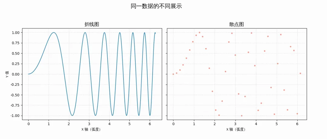 🔥 共享轴的好处:Y轴刻度统一,便于直接对比数值差异。
五、共享轴的4种模式详解
| | |
|---|
sharex=False | | |
sharex='all' | | |
sharex='col' | | |
sharex='row' | | |
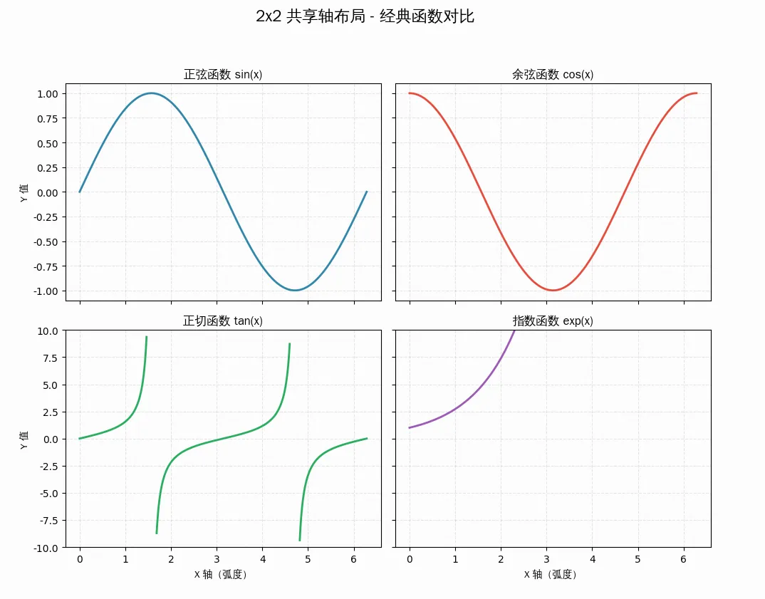
import numpy as npimport matplotlib.pyplot as pltimport matplotlib.font_manager as fmimport os# ================= 1. 字体加载(解决中文乱码的核心) =================font_path = "simhei.ttf" # 确保你已经在当前目录上传了 simhei.ttfif not os.path.exists(font_path): font_path = "/usr/share/fonts/truetype/wqy/wqy-zenhei.ttc" # 备用系统字体prop = fm.FontProperties(fname=font_path)plt.rcParams['axes.unicode_minus'] = False# ================= 2. 数据准备 =================x = np.linspace(0, 2 * np.pi, 400) # 0 到 2π,400个点# ================= 3. 创建 2x2 布局,按列共享X轴,按行共享Y轴 =================fig, axes = plt.subplots(2, 2, sharex='col', sharey='row', figsize=(10, 8))# ---------- 左上:sin(x) ----------axes[0, 0].plot(x, np.sin(x), color='#2E86AB', linewidth=2)axes[0, 0].set_title('正弦函数 sin(x)', fontproperties=prop, fontsize=12)axes[0, 0].set_ylabel('Y 值', fontproperties=prop)axes[0, 0].grid(True, alpha=0.3, linestyle='--')# ---------- 右上:cos(x) ----------axes[0, 1].plot(x, np.cos(x), color='#E74C3C', linewidth=2)axes[0, 1].set_title('余弦函数 cos(x)', fontproperties=prop, fontsize=12)axes[0, 1].grid(True, alpha=0.3, linestyle='--')# 注意:由于 sharey='row',右上与左上共享Y轴,右侧Y轴刻度自动隐藏# ---------- 左下:tan(x)(限制范围避免无穷大)----------# tan(x) 在 π/2, 3π/2 处有渐近线,需要截断y_tan = np.tan(x)y_tan[np.abs(y_tan) > 10] = np.nan # 超过10的值设为NaN,避免画出垂直线axes[1, 0].plot(x, y_tan, color='#27AE60', linewidth=2)axes[1, 0].set_title('正切函数 tan(x)', fontproperties=prop, fontsize=12)axes[1, 0].set_xlabel('X 轴(弧度)', fontproperties=prop)axes[1, 0].set_ylabel('Y 值', fontproperties=prop)axes[1, 0].set_ylim(-10, 10) # 限制Y轴范围axes[1, 0].grid(True, alpha=0.3, linestyle='--')# ---------- 右下:exp(x) ----------y_exp = np.exp(x)axes[1, 1].plot(x, y_exp, color='#9B59B6', linewidth=2)axes[1, 1].set_title('指数函数 exp(x)', fontproperties=prop, fontsize=12)axes[1, 1].set_xlabel('X 轴(弧度)', fontproperties=prop)axes[1, 1].grid(True, alpha=0.3, linestyle='--')# 注意:由于 sharex='col',右下与左下共享X轴,底部X轴刻度已显示# 由于 sharey='row',右下与右上共享Y轴?不对!# sharey='row' 表示:同一行的子图共享Y轴# 所以 左上和右上 共享Y轴,左下和右下 共享Y轴# ================= 4. 总标题与布局 =================plt.suptitle('2x2 共享轴布局 - 经典函数对比', fontproperties=prop, fontsize=16, y=1.02)# tight_layout 在 suptitle 之后调用plt.tight_layout(rect=[0, 0, 1, 0.98])plt.show()
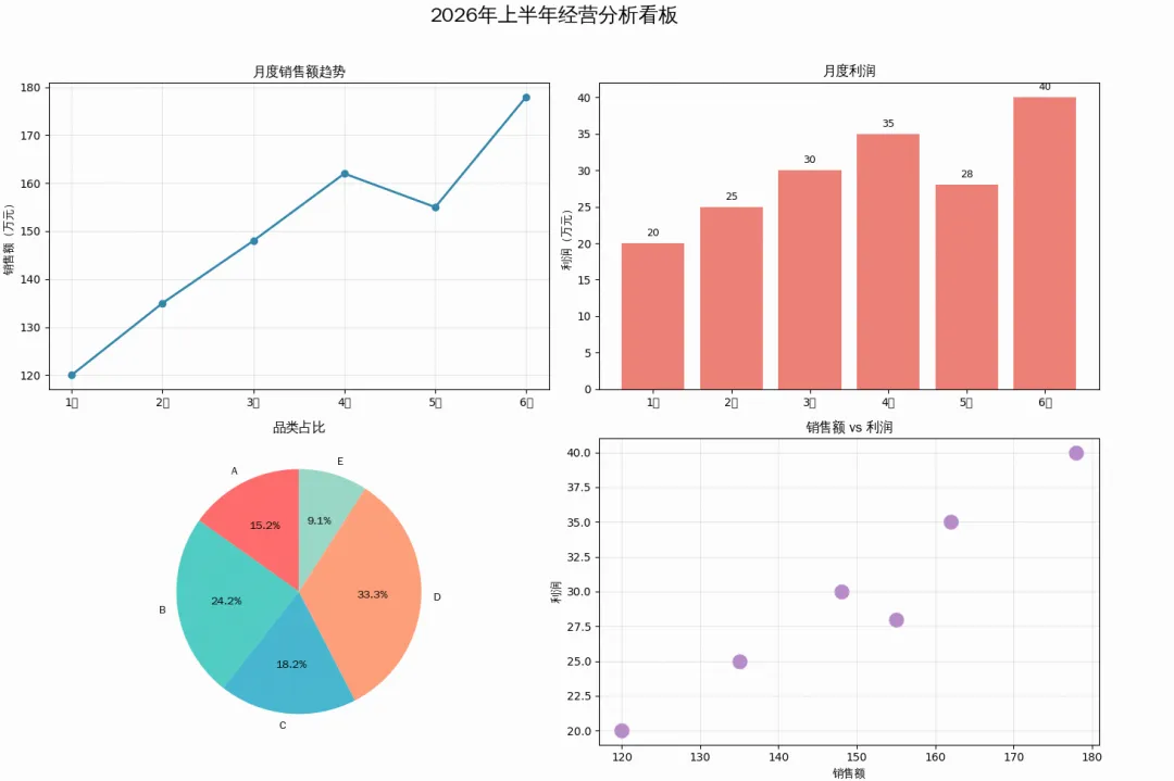
六、实战:一份完整的数据分析看板
import numpy as npimport matplotlib.pyplot as pltimport matplotlib.font_manager as fmimport os# ================= 1. 字体加载 =================font_path = "simhei.ttf"if not os.path.exists(font_path): font_path = "/usr/share/fonts/truetype/wqy/wqy-zenhei.ttc"prop = fm.FontProperties(fname=font_path)plt.rcParams['axes.unicode_minus'] = False# 数据months = ['1月', '2月', '3月', '4月', '5月', '6月']sales = [120, 135, 148, 162, 155, 178]profit = [20, 25, 30, 35, 28, 40]categories = ['A', 'B', 'C', 'D', 'E']values = [25, 40, 30, 55, 15]# 创建 2x2 布局fig, axes = plt.subplots(2, 2, figsize=(14, 10))# ========== 子图1:销售趋势(折线图)==========ax1 = axes[0, 0]ax1.plot(months, sales, marker='o', color='#2E86AB', linewidth=2)ax1.set_title('月度销售额趋势', fontproperties=prop, fontsize=12)ax1.set_ylabel('销售额(万元)', fontproperties=prop)ax1.grid(True, alpha=0.3)# ========== 子图2:利润趋势(柱状图)==========ax2 = axes[0, 1]bars = ax2.bar(months, profit, color='#E74C3C', alpha=0.7)ax2.set_title('月度利润', fontproperties=prop, fontsize=12)ax2.set_ylabel('利润(万元)', fontproperties=prop)for bar in bars: height = bar.get_height() ax2.text(bar.get_x() + bar.get_width()/2., height + 1, f'{height}', ha='center', fontsize=9)# ========== 子图3:品类占比(饼图)==========ax3 = axes[1, 0]colors = ['#FF6B6B', '#4ECDC4', '#45B7D1', '#FFA07A', '#98D8C8']ax3.pie(values, labels=categories, colors=colors, autopct='%1.1f%%', startangle=90, textprops={'fontproperties': prop})ax3.set_title('品类占比', fontproperties=prop, fontsize=12)# ========== 子图4:销售vs利润(散点图)==========ax4 = axes[1, 1]ax4.scatter(sales, profit, s=200, c='#9B59B6', alpha=0.7, edgecolors='white')ax4.set_title('销售额 vs 利润', fontproperties=prop, fontsize=12)ax4.set_xlabel('销售额', fontproperties=prop)ax4.set_ylabel('利润', fontproperties=prop)ax4.grid(True, alpha=0.3)# 总标题fig.suptitle('2026年上半年经营分析看板', fontproperties=prop, fontsize=18, y=0.98)plt.tight_layout(rect=[0, 0, 1, 0.96]) # 为总标题留出空间plt.show()
参数速查卡
# subplot 快速定位plt.subplot(2, 2, 1) # 2行2列第1个# subplots 批量创建fig, axes = plt.subplots(2, 2, sharex=True, sharey=True, figsize=(10, 8))# 访问子图axes[0, 0].plot(...) # 第一行第一列axes[1, 1].scatter(...) # 第二行第二列# 调整布局plt.tight_layout() # 自动紧凑plt.subplots_adjust(hspace=0.3, wspace=0.3) # 手动调间距
十、今日练习
基础题:用 subplot() 创建 1行3列 的并排子图
进阶题:用 subplots() 创建 2x2 布局,并共享X轴
挑战题:制作一份包含折线、柱状、饼图、散点的数据分析看板
十一、总结
今天我们掌握了 Matplotlib 多子图的核心技能:
✅ plt.subplot() —— 逐个定位,适合简单场景
✅ plt.subplots() —— 批量创建,面向对象,推荐日常使用
✅ sharex / sharey —— 共享轴,让对比更直观
✅ plt.tight_layout() —— 自动调整,告别重叠
✅ 字体加载 —— FontProperties 加载 simhei.ttf,中文显示无忧
🎯 今日金句:单图是数据的独白,多子图是数据的交响——学会布局,才能让数据讲出完整的故事。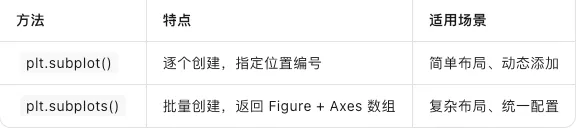

 10个月宝宝每天需要喝多少奶粉?
