期刊图片复现|Python绘制高颜值双向棒棒糖图
- 2026-09-02 16:54:03
期刊图片复现|Python绘制高颜值双向棒棒糖图

论文:PSATluca is a Nomogram Predictor of Survival and Treatment of Lung Cancer Patients Based on Serum and Clinical Characters 论文原图 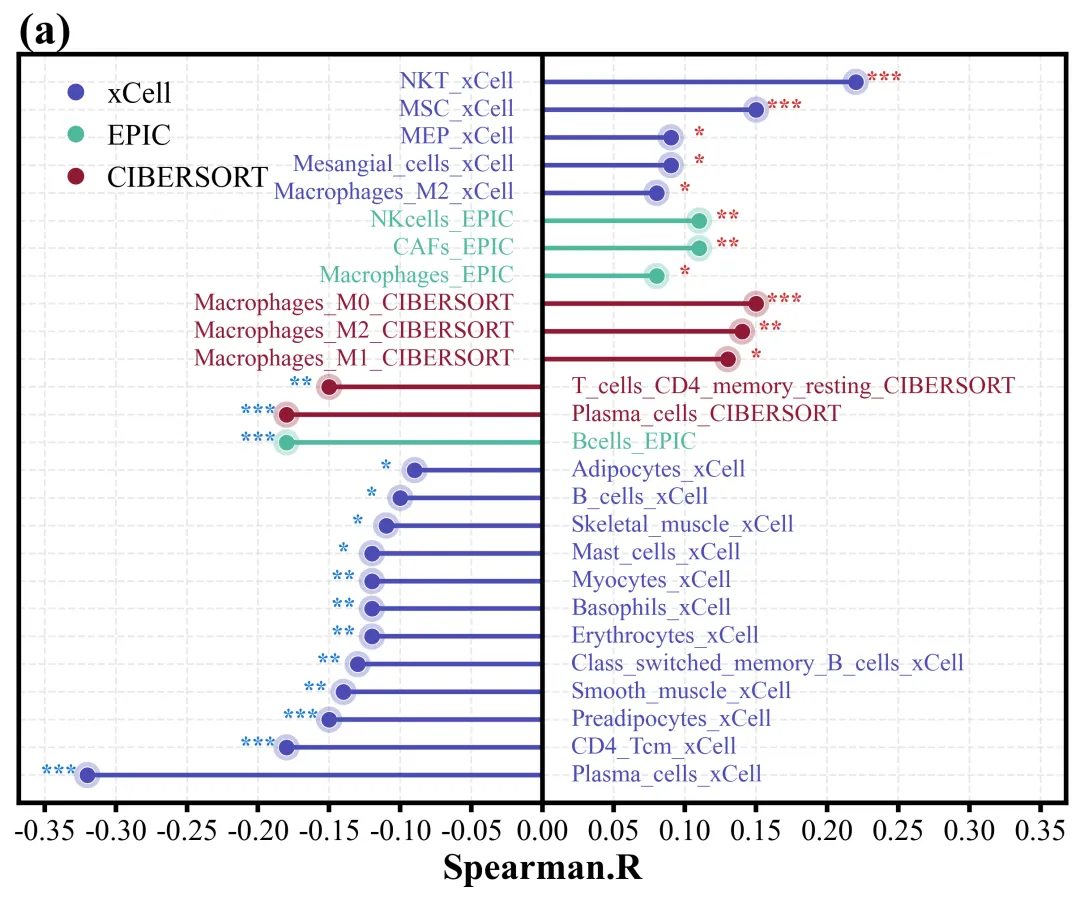
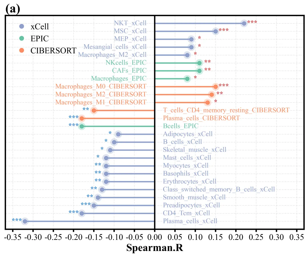
此图直观地展示了斯皮尔曼相关系数及其显著性。图表的底部X轴表示相关系数的大小,图中央有一条垂直的黑色粗基准线代表相关系数为0。左上角的图例明确了不同颜色代表不同组特征。同时在散点的外侧标注了特征名称以及显著性星号,从而保证了每一个数据点、文本标签和显著性标记都清晰易读且互不遮挡。 仿图 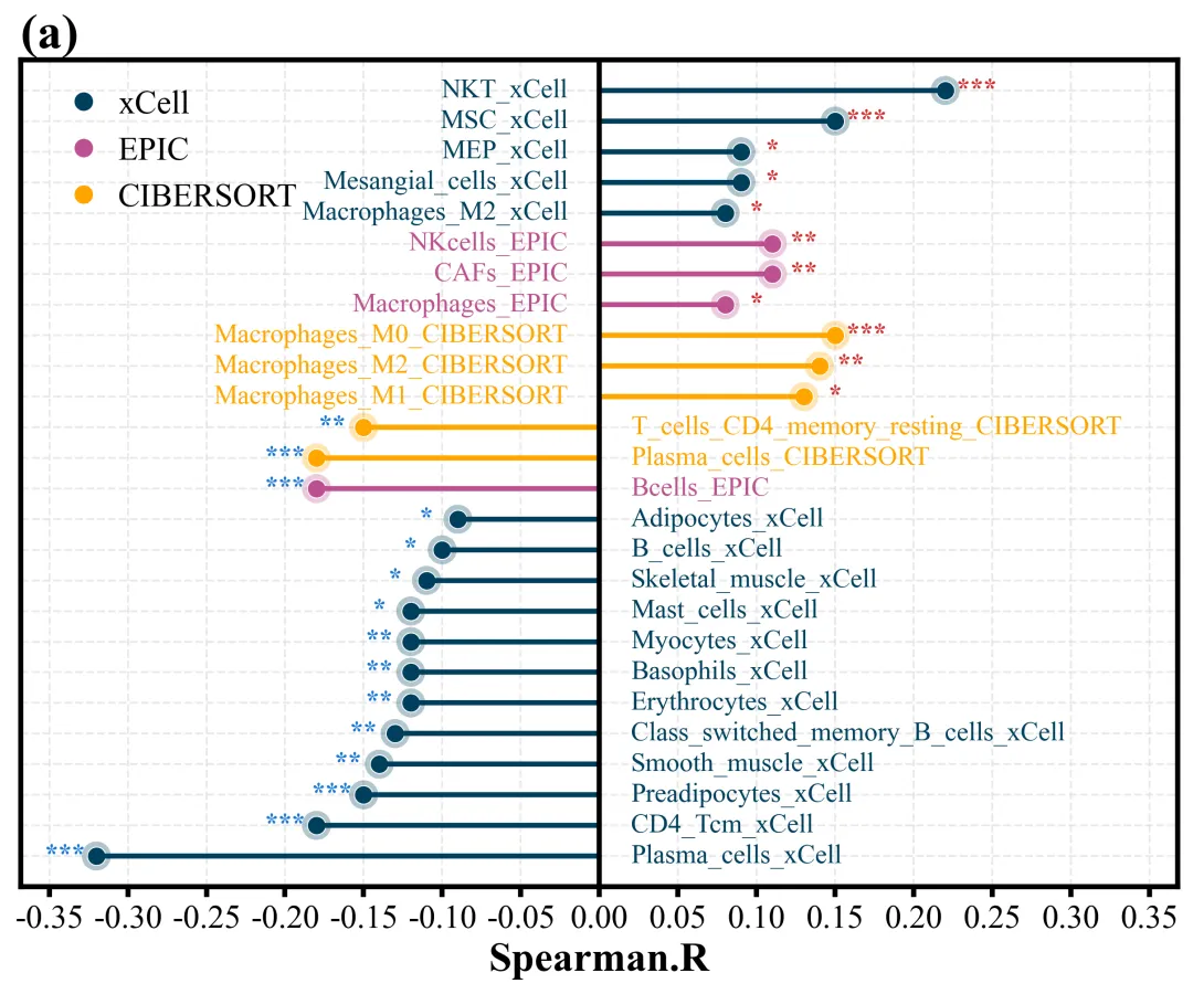
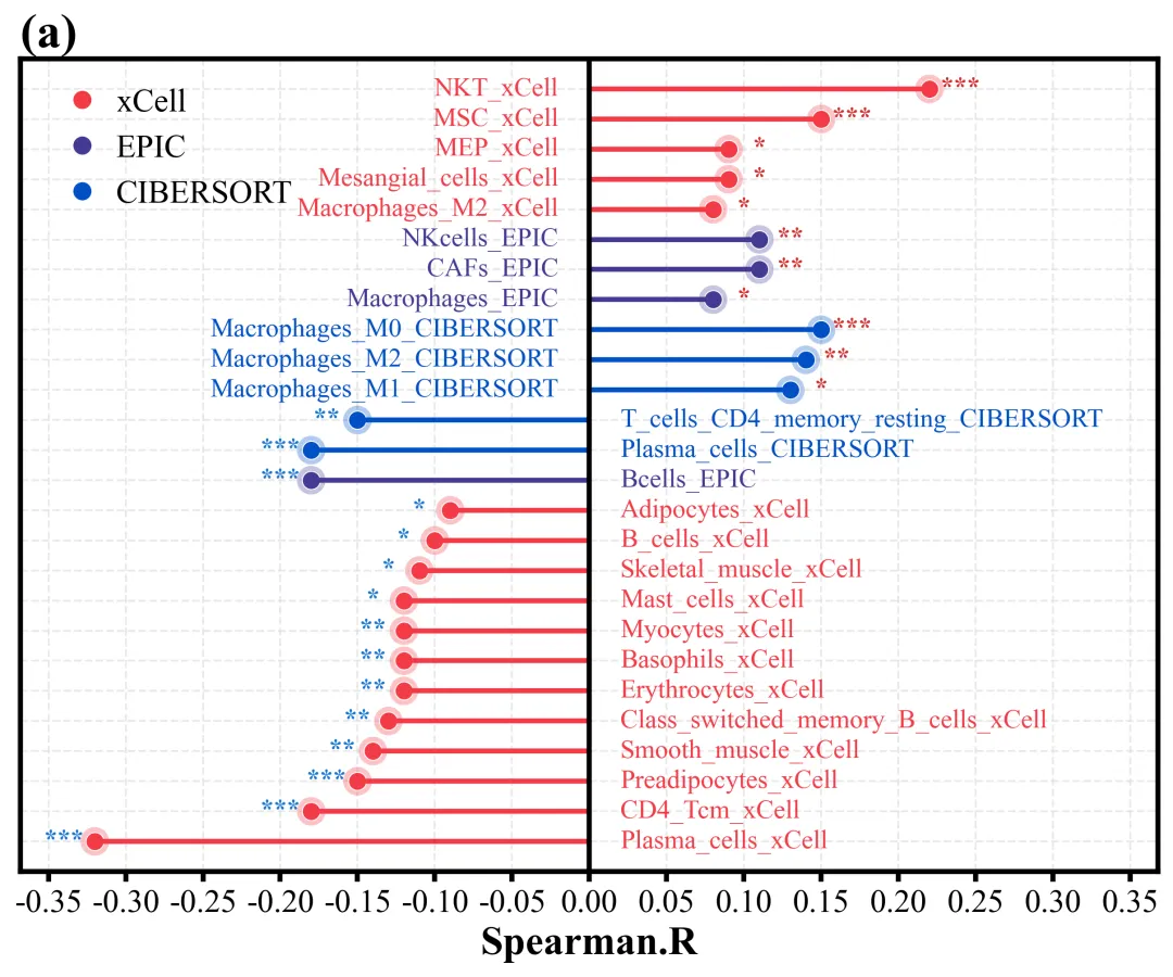
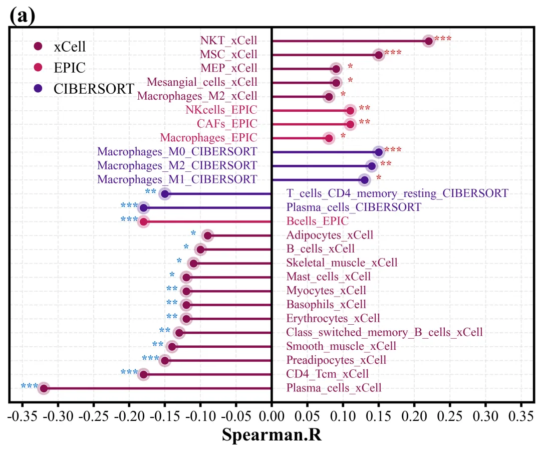
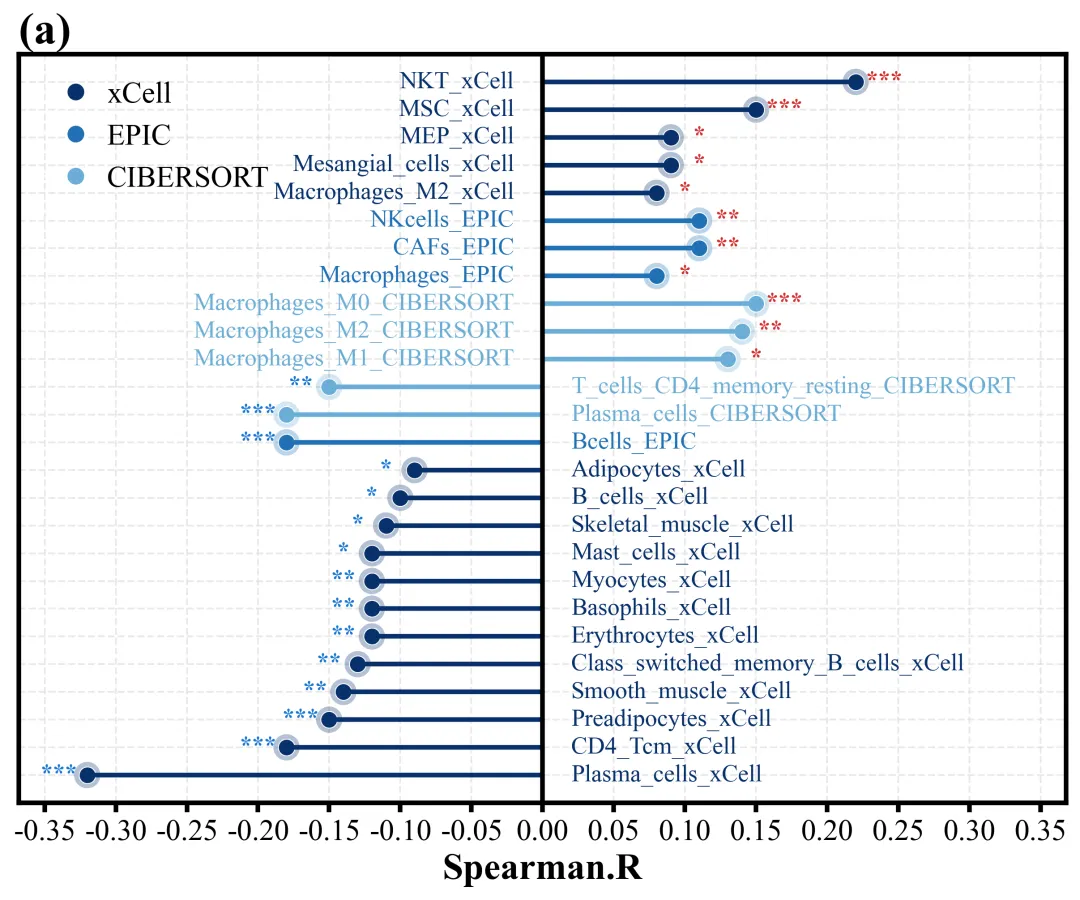
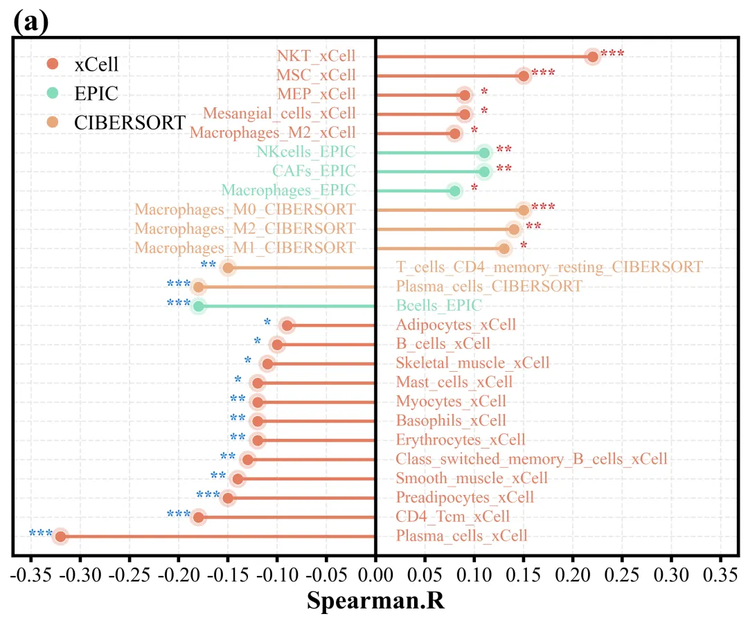
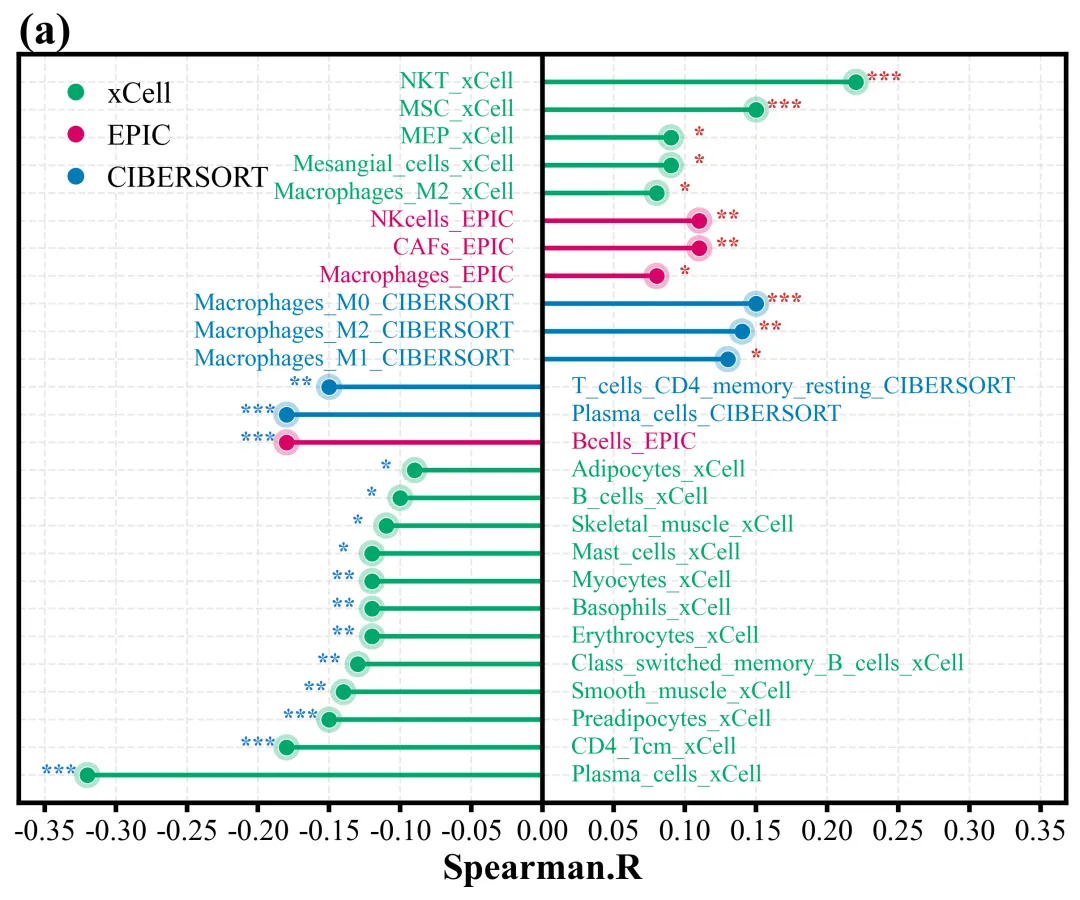
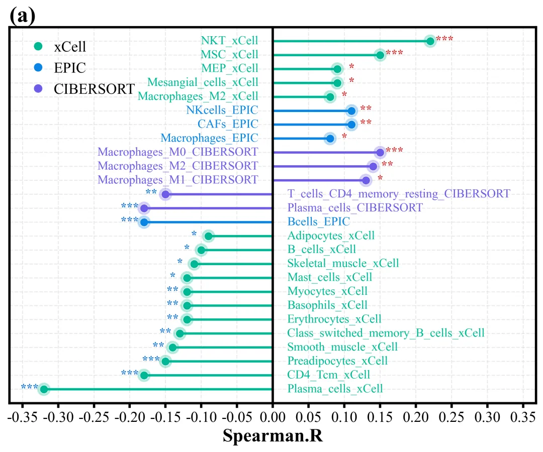
多种配色 



库的导入以及字体设置 

设置颜色库 

绘图函数:颜色映射与画布创建 

绘图函数:数据遍历与图形绘制,绘制线条与数据点 

绘图函数:文本与标记添加 

绘图函数:坐标轴和刻度设置,标题添加,网格线设置 

绘图函数:图例设置以及绘图结果保存 

执行部分 



期刊图片复现|Python绘制二维偏依赖PDP图 期刊复现|python绘制基于SHAP分析和GAM模型拟合的单特征依赖图 期刊图片复现|python绘制带有渐变颜色shap特征重要性组合图(条形图+蜂巢图) 期刊复现|用Python绘制SHAP特征重要性总览图、依赖图、双特征交互效应SHAP图,解锁XGBoost模型的终极奥秘 期刊图片复现|Python绘制shap重要性蜂巢图+单特征依赖图+交互效应强度气泡图+交互效应依赖图(回归+二分类+分类) 

公众号中的所有所有的免费代码都已经下架了,都并入到付费部分里了,付费合集代码和数据的购买通道已经开通,全部合集100元,后续将会持续更新,决定购买请后台私信我,注意只会分享练习数据和代码文件,不会提供答疑服务,代码文件中已经包含了每行代码的完整注释,购买前请确保真的需要!!!
代码绘制成果展示
代码解释
第一部分
# =========================================================================================# ====================================== 1. 环境设置 =======================================# =========================================================================================import matplotlib.pyplot as pltimport pandas as pdimport numpy as np
第二部分
# =========================================================================================# ======================================2.颜色库=======================================# =========================================================================================COLOR_SCHEMES = {1: ["#4B4CB5", "#4FB99F", "#901A34", "#E27D60", "#85DCBA", "#E8A87C"],}
第三部分
# =========================================================================================# ======================================3.绘图函数=======================================# =========================================================================================def plot_advanced_forest_chart(df, scheme_id, color_list):unique_algos = df['Algo'].unique() #分组color_map = {algo: color_list[i % len(color_list)] for i, algo in enumerate(unique_algos)} #映射颜色#创建画布fig, ax = plt.subplots(figsize=(8.4, 6.8))y_positions = np.arange(len(df)) #生成Y轴位置
第四部分
#遍历数据for i, row in df.iterrows():c_color = color_map[row['Algo']] #颜色#上面点ax.scatter(x, #xy, #ycolor=c_color, #颜色s=80, #大小edgecolors='white', #边框linewidth=0.5) #边框粗细
第五部分
if x > 0:#文本ax.text(-0.02, #xy, #yrow['CellType'], #文本ha='right', #水平va='center', #垂直color=c_color, #颜色fontsize=13) #字体大小#标记ax.text(x - 0.02, #xy, #yrow['Sig'], #文本ha='center', # 水平va='center', # 垂直color='#1976D2', #颜色fontsize=13, #字体大小fontweight='bold') #加粗
第六部分
#x=0辅助线ax.axvline(0, #xcolor='black', #颜色linewidth=2.5) #线宽max_x = df['SpearmanR'].abs().max() #X轴绝对值最大值ax.set_yticks(y_positions) #y轴刻度位置ax.set_yticklabels([]) #去掉y轴标注#遍历边框for spine in ax.spines.values():spine.set_color('#000000') #颜色spine.set_linewidth(2.5) #线宽
第七部分
ax.set_title("(a)", loc='left', fontsize=24, fontweight='bold') #子图编号# 设图例内容ax.legend(handles=legend_elements, #句柄loc='best', #位置frameon=False, #边框fontsize=16, #字体大小handletextpad=0.05) #间距
第八部分
# =========================================================================================# ======================================4.执行部分=======================================# =========================================================================================if __name__ == "__main__":df_real = pd.read_excel(r'data.xlsx') #读取数据scheme_id = 1selected_hex_colors = COLOR_SCHEMES[scheme_id]print('正在绘制并保存方案:', scheme_id)plot_advanced_forest_chart(df_real, scheme_id, selected_hex_colors)
如何应用到你自己的数据
1.设置原始数据的保存路径,执行部分:
df_real = pd.read_excel(r'data.xlsx') #读取数据2.设置是否要进行批量绘图,执行部分:
plot_all = True3.设置绘图函数的保存地址,绘图函数部分:
fig.savefig(fr'scheme_{scheme_id}.png', dpi=300, bbox_inches='tight')推荐
获取方式
本文来自网友投稿或网络内容,如有侵犯您的权益请联系我们删除,联系邮箱:596563534@qq.com 。
随机文章
-
 10个月宝宝每天需要喝多少奶粉?
- 手头有 VPS 用户注意了!Linux KVM 曝十年级逃逸漏洞 Januscape,或致宿主机崩溃!
- 你会吗?更快更系统的学Python,还不拿走
- Python纯小白入门第28课 函数的参数
- 想学 Python 别闭门造车,高效学习思路分享
- ANSYS仿真报告找峰值不用拖鼠标!Python一键跳转极值
- 普通人一定要狠狠抓住Python大风口!搞副业周入5000邪修方法
- 潜伏16年的Linux KVM漏洞可致虚拟机逃逸,威胁宿主机内核安全
- 哭死,原来处理万行数据只需要4步Python代码:(附源码)
- 你的 Python 技术栈已被悄然替换
- 用Python做AI Infra的人,迟早要面对三个字:性能不够