复杂时空数据怎么画?Python 复现两类进阶科研图
- 2026-10-11 06:30:47
复杂时空数据怎么画?Python 复现两类进阶科研图



点击蓝字
关注我们
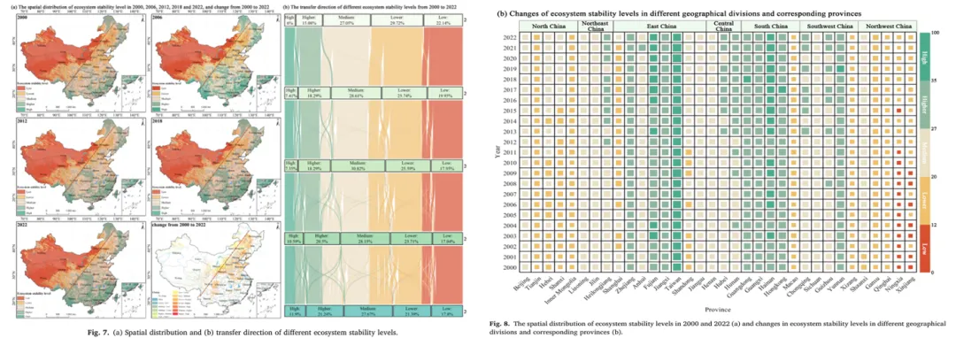
大家好,本期主要是学习顶刊作图思路,激发作图灵感!今天复现的是Environmental Technology & Innovation(中科院2区 Top、JCR Q1)科研图表,其元素搭配、布局以及配色具有很高的参考性!
本期教程图形来源于该文章的Fig.7b,Fig.8b。
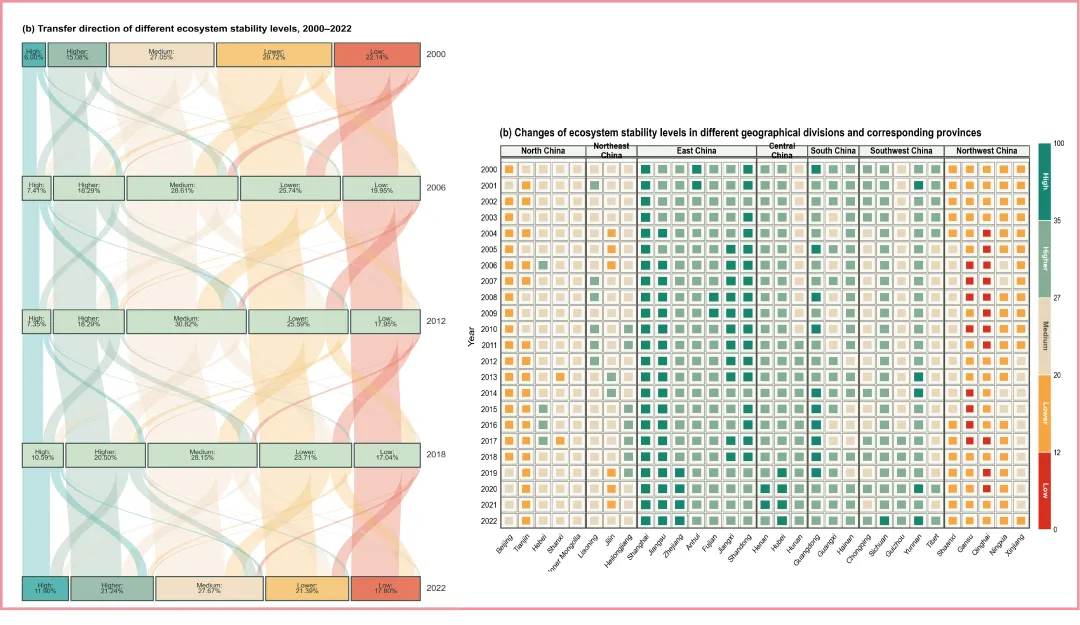
以下展示笔者使用 Python 复现的两幅科研图表,绘图主要使用python的 Matplotlib 库。
·成果图·
我已将本次复现所需的完整python代码整理完毕。感兴趣的读者可以关注公众号,后台发送”冲积图“或”等级矩阵图“,即可获取相关资料。
本文代码主要依赖两个 Python 库:
python -m pip install numpy matplotlib复现代码
案例一冲击图核心代码如下:
"""使转移矩阵的行和、列和匹配相邻年份的等级比例。"""matrix = seed.astype(float).copy()for _ in range(iterations):matrix *= (row_target / matrix.sum(axis=1))[:, None]matrix *= (col_target / matrix.sum(axis=0))[None, :]return matrixdef build_transition_matrices():index = np.arange(len(CLASSES))# 相邻等级具有较高的转移权重affinity = np.exp(-1.25 * np.abs(index[:, None] - index[None, :]))rng = np.random.default_rng(2022)matrices = []for t in range(len(YEARS) - 1):seed = affinity * rng.uniform(0.82, 1.18, affinity.shape)matrix = ipf(seed,PERCENT[t],PERCENT[t + 1],)matrices.append(matrix)return matricesdef ipf(seed, row_target, col_target, iterations=1000):"""使转移矩阵的行和、列和匹配相邻年份的等级比例。"""matrix = seed.astype(float).copy()for _ in range(iterations):matrix *= (row_target / matrix.sum(axis=1))[:, None]matrix *= (col_target / matrix.sum(axis=0))[None, :]return matrixdef build_transition_matrices():index = np.arange(len(CLASSES))# 相邻等级具有较高的转移权重affinity = np.exp(-1.25 * np.abs(index[:, None] - index[None, :]))rng = np.random.default_rng(2022)matrices = []for t in range(len(YEARS) - 1):seed = affinity * rng.uniform(0.82, 1.18, affinity.shape)matrix = ipf(seed,PERCENT[t],PERCENT[t + 1],)matrices.append(matrix)return matricesfrom matplotlib.path import Pathfrom matplotlib.patches import PathPatchdef draw_ribbon(ax,x0_left,x0_right,y0,x1_left,x1_right,y1,color,):dy = y1 - y0curvature = 0.46vertices = [(x0_left, y0),(x0_left, y0 + curvature * dy),(x1_left, y1 - curvature * dy),(x1_left, y1),(x1_right, y1),(x1_right, y1 - curvature * dy),(x0_right, y0 + curvature * dy),(x0_right, y0),(x0_left, y0),]codes = [Path.MOVETO,Path.CURVE4,Path.CURVE4,Path.CURVE4,Path.LINETO,Path.CURVE4,Path.CURVE4,Path.CURVE4,Path.CLOSEPOLY,]patch = PathPatch(Path(vertices, codes),facecolor=color,edgecolor="none",alpha=0.38,)ax.add_patch(patch)
案例二等级矩阵图核心代码如下:
from matplotlib.colors import BoundaryNorm, ListedColormapBOUNDS = [0, 12, 20, 27, 35, 100]COLORS = ["#D7301F", # Low"#F7A541", # Lower"#E8D7BC", # Medium"#83AE94", # Higher"#16856F", # High]cmap = ListedColormap(COLORS)norm = BoundaryNorm(BOUNDS, cmap.N)import matplotlib.pyplot as pltfrom matplotlib.patches import Rectanglefig, ax = plt.subplots(figsize=(7.2, 5.6))n_years, n_provinces = values.shapefor row in range(n_years):for column in range(n_provinces):value = values[row, column]# 外层网格ax.add_patch(Rectangle((column - 0.46, row - 0.46),0.92,0.92,facecolor="#FAF8F1",edgecolor="#7E837C",linewidth=0.42,))# 平方根变换使方块面积近似对应原始数值side = 0.34 + 0.34 * np.sqrt(np.clip(value, 0, 100) / 100)# 内层方块ax.add_patch(Rectangle((column - side / 2, row - side / 2),side,side,facecolor=cmap(norm(value)),edgecolor="none",))ax.set_xlim(-0.5, n_provinces - 0.5)ax.set_ylim(n_years - 0.5, -0.5)ax.set_xticks(np.arange(n_provinces))ax.set_xticklabels(PROVINCES,rotation=48,ha="right",fontsize=6,)ax.set_yticks(np.arange(n_years))ax.set_yticklabels(YEARS, fontsize=6)ax.set_xlabel("Province")ax.set_ylabel("Year")
往期推荐
图绘科研|MATLAB科研绘图:地理探测器交互作用矩阵图绘制教程
图绘科研|Origin科研绘图:三维立体地形图绘制与美化教程
后续将继续更新 Origin 科研绘图、论文图表美化、GIS制图表达与数据可视化 等相关内容。由于个人水平有限,文中如有不足之处,欢迎各位老师、同学和同行批评指正、交流讨论。
END
本文来自网友投稿或网络内容,如有侵犯您的权益请联系我们删除,联系邮箱:596563534@qq.com 。
随机文章
-
 10个月宝宝每天需要喝多少奶粉?
- [PHP]文章数据加密方案
- 深入底层:Linux 内核中,10 个夯爆了的设计
- 想入行网安渗透测试,谁没被Kali Linux给狠狠劝退过?
- 计算机入门必看,一张图吃透Linux所有命令
- 搞定这23个Linux故障,你的运维水平已经超过90%的人
- 终于有人把网安排查的Linux命令讲清楚了!按场景分类,不用死背
- 每天一个知识点:linux编译安装和快速安装的区别
- Linux 搭建 ELK
- Linux 最新资讯 20260713——GNOME OS 创建“Test Center”效仿 Apple TestFlight 用于实验软件
- 复现与修复指南:Linux内核UAF漏洞GhostLock(CVE-2026-43499)