一起学Python第118天:Seaborn 入门——用3行代码画出"杂志级"统计图表
- 2026-10-08 15:44:53
📅 系列:一起学Python | 难度:⭐⭐⭐
🔗 上期回顾:第117天:中文显示终极指南
一、为什么你需要 Seaborn?
学了十几天的 Matplotlib,你可能已经发现:原生的 Matplotlib 画图"能用",但不够"好看"。
配色默认蓝、网格线要手动调、统计图(如箱线图、小提琴图)写起来很繁琐……而 Seaborn 就是来解决这些痛点的。
Seaborn 是什么?
建立在 Matplotlib 之上的高级统计可视化库
默认主题美观,配色经过专业设计
一行代码画出箱线图、热力图、小提琴图等复杂统计图
与 Pandas DataFrame 无缝配合
一句话:Matplotlib 是"画笔",Seaborn 是"模板"——它让你用更少的代码,画出更专业的图。
二、安装与导入
pip install seabornimport seaborn as snsimport matplotlib.pyplot as pltimport pandas as pdimport numpy as np
三、一键换肤:set_theme() 让图表秒变高级
Seaborn 的 set_theme() 是"一键美化"的核心,可以同时控制 主题(style) 和 模板(context)。
主题 Style(控制背景+网格)
darkgrid | ||
whitegrid | ||
dark | ||
white | ||
ticks |
模板 Context(控制元素大小)
paper | ||
notebook | ||
talk | ||
poster |
# 组合使用:白色网格 + 演讲尺寸sns.set_theme(style="whitegrid", palette="pastel", context="talk")
四、六大核心绘图函数实战
以下所有示例均使用字体文件加载方案,确保中文完美显示:
import matplotlib.font_manager as fmimport os# ================= 1. 字体加载(解决报错的核心) =================font_path = "simhei.ttf"if not os.path.exists(font_path):font_path = "/usr/share/fonts/truetype/wqy/wqy-zenhei.ttc"prop = fm.FontProperties(fname=font_path)plt.rcParams['axes.unicode_minus'] = False
1. 散点图 sns.scatterplot()——探索变量关系
import seaborn as snsimport matplotlib.pyplot as pltimport pandas as pdimport numpy as npimport matplotlib.font_manager as fmimport os# 字体加载font_path = "simhei.ttf"if not os.path.exists(font_path):font_path = "/usr/share/fonts/truetype/wqy/wqy-zenhei.ttc"prop = fm.FontProperties(fname=font_path)plt.rcParams['axes.unicode_minus'] = False# 设置主题sns.set_theme(style="whitegrid", palette="deep")# 生成数据np.random.seed(42)df = pd.DataFrame({'身高': np.random.normal(170, 10, 100),'体重': np.random.normal(65, 15, 100),'性别': np.random.choice(['男', '女'], 100)})plt.figure(figsize=(8, 6))sns.scatterplot(data=df, x='身高', y='体重', hue='性别', s=100)plt.title('身高与体重分布', fontproperties=prop, fontsize=14)plt.xlabel('身高(cm)', fontproperties=prop)plt.ylabel('体重(kg)', fontproperties=prop)# 图例中文plt.legend(prop=prop, title='性别', title_fontproperties=prop)plt.show()
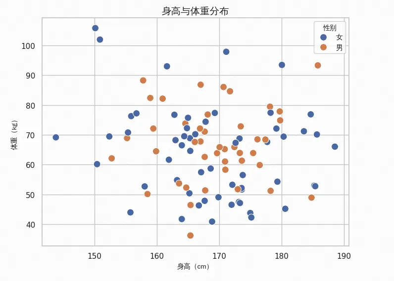
💡 Seaborn 优势:hue='性别' 自动按类别着色并生成图例,Matplotlib 需要手动循环。
2. 折线图 sns.lineplot()——展示趋势
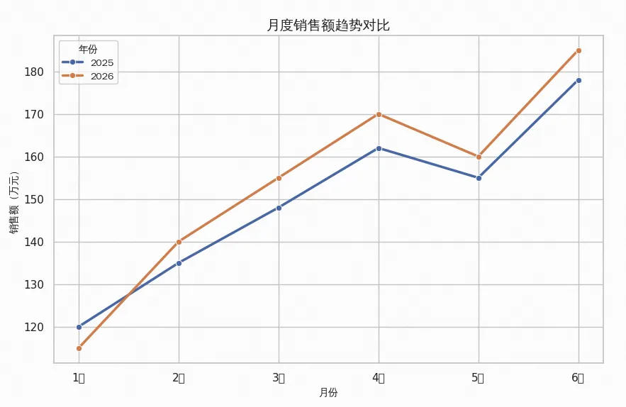
# 字体加载同上(省略)sns.set_theme(style="whitegrid")df = pd.DataFrame({'月份': ['1月', '2月', '3月', '4月', '5月', '6月'] * 2,'销售额': [120, 135, 148, 162, 155, 178, 115, 140, 155, 170, 160, 185],'年份': ['2025'] * 6 + ['2026'] * 6})plt.figure(figsize=(10, 6))sns.lineplot(data=df, x='月份', y='销售额', hue='年份',marker='o', linewidth=2.5)plt.title('月度销售额趋势对比', fontproperties=prop, fontsize=14)plt.xlabel('月份', fontproperties=prop)plt.ylabel('销售额(万元)', fontproperties=prop)plt.legend(prop=prop, title='年份', title_fontproperties=prop)plt.show()
3. 柱状图 sns.barplot()——自动计算均值+误差线
import seaborn as snsimport matplotlib.pyplot as pltimport pandas as pdimport numpy as npimport matplotlib.font_manager as fmimport os# 字体加载font_path = "simhei.ttf"if not os.path.exists(font_path):font_path = "/usr/share/fonts/truetype/wqy/wqy-zenhei.ttc"prop = fm.FontProperties(fname=font_path)plt.rcParams['axes.unicode_minus'] = Falsesns.set_theme(style="whitegrid", palette="pastel")products = ['A', 'A', 'B', 'B', 'C', 'C'] * 5sales = [120, 135, 210, 195, 150, 165,110, 205, 140, 125, 140, 220,200, 155, 170, 115, 215, 145,130, 145, 215, 205, 160, 175,120, 210, 150, 135, 198, 162]df = pd.DataFrame({'产品': products, '销量': sales})plt.figure(figsize=(8, 6))sns.barplot(data=df, x='产品', y='销量', palette='coolwarm')plt.title('各产品平均销量(含置信区间)', fontproperties=prop, fontsize=14)plt.xlabel('产品类别', fontproperties=prop)plt.ylabel('平均销量', fontproperties=prop)plt.tight_layout()plt.show()
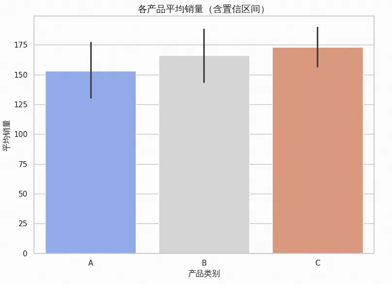
🔥 Seaborn 自动功能:barplot 会自动计算每个类别的均值和95%置信区间(误差线),无需手动聚合!
4. 箱线图 sns.boxplot()——一眼看穿分布与异常值
import seaborn as snsimport matplotlib.pyplot as pltimport pandas as pdimport numpy as npimport matplotlib.font_manager as fmimport os# 字体加载font_path = "simhei.ttf"if not os.path.exists(font_path):font_path = "/usr/share/fonts/truetype/wqy/wqy-zenhei.ttc"prop = fm.FontProperties(fname=font_path)plt.rcParams['axes.unicode_minus'] = Falsesns.set_theme(style="whitegrid", palette="pastel")sns.set_theme(style="whitegrid")df = pd.DataFrame({'班级': ['A'] * 50 + ['B'] * 50 + ['C'] * 50,'成绩': list(np.random.normal(75, 10, 50)) +list(np.random.normal(82, 8, 50)) +list(np.random.normal(70, 15, 50))})plt.figure(figsize=(8, 6))sns.boxplot(data=df, x='班级', y='成绩', palette='Set2')plt.title('各班成绩分布箱线图', fontproperties=prop, fontsize=14)plt.xlabel('班级', fontproperties=prop)plt.ylabel('成绩', fontproperties=prop)plt.tight_layout()plt.show()
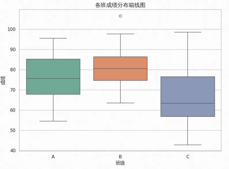
箱线图解读:
箱子中间线 = 中位数
箱子上下边缘 = 上/下四分位数(Q3/Q1)
whisker(须线)= 1.5倍四分位距内的最值
圆点 = 异常值
5. 热力图 sns.heatmap()——相关性矩阵可视化
import seaborn as snsimport matplotlib.pyplot as pltimport pandas as pdimport numpy as npimport matplotlib.font_manager as fmimport os# 字体加载font_path = "simhei.ttf"if not os.path.exists(font_path):font_path = "/usr/share/fonts/truetype/wqy/wqy-zenhei.ttc"prop = fm.FontProperties(fname=font_path)plt.rcParams['axes.unicode_minus'] = Falsesns.set_theme(style="white")# 生成相关性数据np.random.seed(42)data = np.random.randn(100, 5)df = pd.DataFrame(data, columns=['语文', '数学', '英语', '物理', '化学'])corr = df.corr()plt.figure(figsize=(8, 6))sns.heatmap(corr, annot=True, cmap='coolwarm', fmt=".2f",linewidths=0.5, square=True,annot_kws={'fontproperties': prop, 'size': 12})plt.title('学科成绩相关性矩阵', fontproperties=prop, fontsize=14)# 调整坐标轴标签ax = plt.gca()ax.set_xticklabels(ax.get_xticklabels(), fontproperties=prop)ax.set_yticklabels(ax.get_yticklabels(), fontproperties=prop)plt.tight_layout()plt.show()
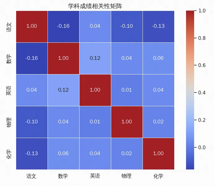
💡 参数解析:
annot=True:在每个格子里显示数值fmt=".2f":保留两位小数linewidths=0.5:格子间加白线分隔square=True:保持正方形
6. 小提琴图 sns.violinplot()——分布形状+密度一目了然
import seaborn as snsimport matplotlib.pyplot as pltimport pandas as pdimport numpy as npimport matplotlib.font_manager as fmimport os# 字体加载font_path = "simhei.ttf"if not os.path.exists(font_path):font_path = "/usr/share/fonts/truetype/wqy/wqy-zenhei.ttc"prop = fm.FontProperties(fname=font_path)plt.rcParams['axes.unicode_minus'] = Falsesns.set_theme(style="whitegrid")df = pd.DataFrame({'科目': ['A'] * 100 + ['B'] * 100 + ['C'] * 100,'分数': list(np.random.normal(78, 12, 100)) +list(np.random.normal(85, 10, 100)) +list(np.random.normal(72, 15, 100))})plt.figure(figsize=(8, 6))sns.violinplot(data=df, x='科目', y='分数', palette='muted', inner='box')plt.title('各科成绩分布小提琴图', fontproperties=prop, fontsize=14)plt.xlabel('科目', fontproperties=prop)plt.ylabel('分数', fontproperties=prop)plt.tight_layout()plt.show()
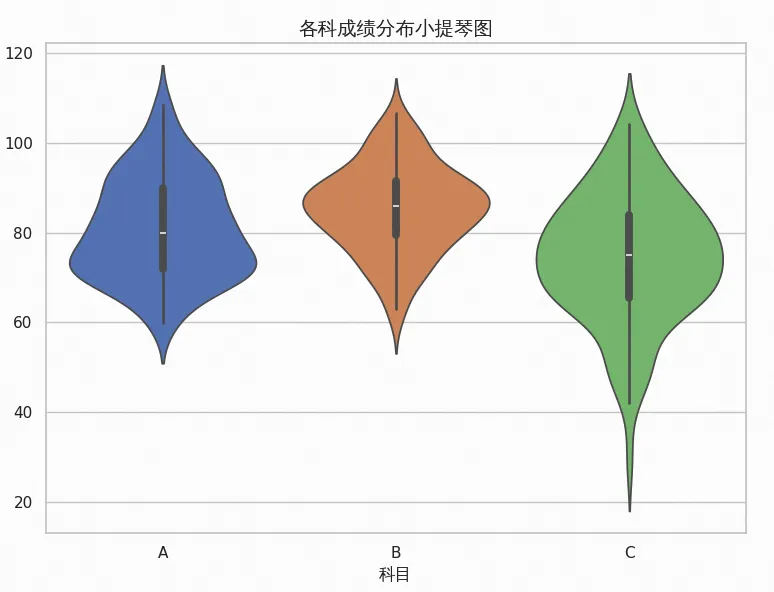
🔥 小提琴图优势:结合了箱线图(中间的箱线)和核密度估计(两侧的"小提琴"轮廓),既能看统计量,又能看分布形状。
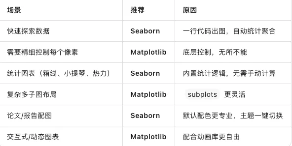
五、Seaborn vs Matplotlib:怎么选?
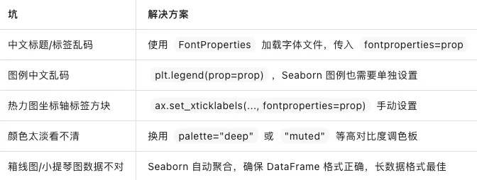
六、避坑指南
七、参数速查卡
# 主题设置sns.set_theme(style="whitegrid", palette="pastel", context="notebook")# 散点图sns.scatterplot(data=df, x='x列', y='y列', hue='分类列', size='大小列')# 折线图sns.lineplot(data=df, x='x列', y='y列', hue='分组列', marker='o')# 柱状图(自动均值+误差线)sns.barplot(data=df, x='类别', y='数值', palette='coolwarm')# 箱线图sns.boxplot(data=df, x='类别', y='数值')# 热力图sns.heatmap(matrix, annot=True, cmap='coolwarm', fmt=".2f")# 小提琴图sns.violinplot(data=df, x='类别', y='数值', inner='box')
总结
今天我们迈入了 Seaborn 的世界:
✅ Seaborn = Matplotlib 的"高级皮肤",专注统计可视化
✅
sns.set_theme()—— 一键切换主题和模板,图表秒变专业✅
scatterplot/lineplot/barplot—— 基础图表,自动美化✅
boxplot/violinplot—— 统计分布,异常值一目了然✅
heatmap—— 相关性矩阵的最佳可视化方式✅ 最佳拍档:Seaborn 快速出图 + Matplotlib 精细调整
关键记忆:探索数据用 Seaborn,精细控制用 Matplotlib,两者配合效率翻倍。

🎯 今日金句:Matplotlib 给了你对每个像素的控制权,而 Seaborn 给了你"不用控制每个像素"的自由——有时候,少即是多,美即是真。
随机文章
-
 10个月宝宝每天需要喝多少奶粉?
- 运维大佬都在用的Linux高级命令!
- 网络会议 - 嵌入式 Linux 集成安全启动、加密和 OP-TEE:通过 meta-toradex-security 轻松实现
- Linux基础知识汇总、有这一篇就够了
- 为什么大多数新手在 2026 年更爱 Linux Mint 而非 Ubuntu
- AMD 向 Linux 内核新增 Zen 6 消费级处理器支持:Olympic Ridge 桌面 CPU 与 Medusa 移动 APU 规格曝光
- Linux 系统门罗币“隐形黑客”如何偷偷借用你的服务器发财?
- OS0.【Linux】服务器基础知识
- Linux 命令常用速查手册,网络工程师必备!
- Linux Audio 子系统更新动态
- 学Linux比玩手机还简单?这真的太有意思了吧!