Python绘制相关性网络图+雷达图组合图
- 2026-10-11 06:15:24
Python绘制相关性网络图+雷达图组合图





库的导入以及字体设置 

颜色库的设置以及配色方案的选择 

画布初始化与布局,初始化画布和划分区域 

绘制相关性热图 通过双重循环在左侧子图绘制相关性矩阵热图,只绘制对角线及下三角部分。手动创建 矩形色块,精确地控制每个格子的边框和位置。色块颜色根据特征间的相关系数通过映射设置。 

绘制网络连线与目标节点 绘制代表目标变量的圆点。然后遍历每一个特征,从热图对角线上的特征节点引出一条弧线连接到目标变量节点。颜色代表正相关或负相关;粗细代表相关性强度;线型代表显著性。 

左侧图坐标轴设置与图例添加 设置X轴和Y轴的范围、刻度及标签。添加子图标题。构建热图颜色条;网络线颜色图例;网络线样式图例。 

雷达图初始化与绘制 

雷达图细节设置 去掉默认的极坐标网格和标签手动绘制虚线圆,径向线、圆形图框。 

雷达图标签添加与保存 

数据分析与主程序执行 定义文件的输入输出路径、特征和目标变量。读取 Excel 数据,计算特征两两之间的相关性;计算每个特征与目标变量的皮尔逊相关系数和显著性 



期刊图片复现|Python绘制二维偏依赖PDP图 期刊复现|python绘制基于SHAP分析和GAM模型拟合的单特征依赖图 期刊图片复现|python绘制带有渐变颜色shap特征重要性组合图(条形图+蜂巢图) 期刊复现|用Python绘制SHAP特征重要性总览图、依赖图、双特征交互效应SHAP图,解锁XGBoost模型的终极奥秘 期刊图片复现|Python绘制shap重要性蜂巢图+单特征依赖图+交互效应强度气泡图+交互效应依赖图(回归+二分类+分类) 

需要的请后台私信我获取详细信息,注意只会分享练习数据和代码文件,不会提供答疑服务,代码文件中已经包含了每行代码的完整注释!!
代码绘制成果展示
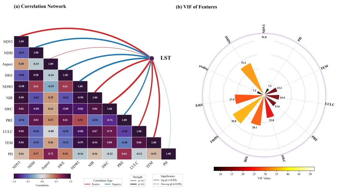
相关性网络热图组合图,分为左右两部分。左图相关性网络图,下三角相关性热图,通过颜色的深浅和具体的数值,展示特征之间的皮尔逊相关系数;网络线部分表示特征与目标之间的相关性。红色弧线表示该特征与LST呈正相关,蓝色弧线表示负相关;线条的粗细直观地反映了相关性的强度,而线型代表统计显著性。图例分别表示了热图颜色、连线颜色以及显著性与线宽的含义。右图特征VIF雷达图,用于诊断变量间的多重共线性。柱子长度代表VIF数值的大小,柱顶标注了具体数值。柱子的颜色越亮代表VIF值越高。
代码解释
第一部分
# =========================================================================================# ====================================== 1. 环境设置 =======================================# =========================================================================================import matplotlib.pyplot as pltimport matplotlib.patches as patchesimport numpy as npimport pandas as pdimport matplotlib.colors as mcolorsimport matplotlib.cm as cmimport matplotlibimport osfrom scipy.stats import pearsonrfrom statsmodels.stats.outliers_influence import variance_inflation_factorfrom statsmodels.tools.tools import add_constantmatplotlib.rcParams['pdf.fonttype'] = 42matplotlib.rcParams['ps.fonttype'] = 42plt.rcParams['font.family'] = 'serif'plt.rcParams['font.serif'] = ['Times New Roman']plt.rcParams['axes.unicode_minus'] = False
第二部分
# =========================================================================================# ====================================== 2. 颜色库设置 ==========================# =========================================================================================COLOR_LIBRARY = {1: {'heatmap_cmap': 'RdBu', 'network_cmap': 'PRGn', 'radar_cmap': 'viridis','node_color': '#333333', 'ring_fill': '#f0f0f0', 'ring_edge': '#bfbfbf', 'grid_color': 'gray','net_pos': '#d62728', 'net_neg': '#1f77b4' # 默认红/蓝},}SCHEME_INDEX = 20# 获取配色方案scheme = COLOR_LIBRARY[SCHEME_INDEX]
第三部分
# =========================================================================================# ====================================== 3. 绘图函数==========================# =========================================================================================def draw_network_heatmap_combo(features, feature_corr, target_name,target_corr, target_p, vif_vals, output_filename, width_ratios=[2, 1],w_space=0.1):#创建画布fig = plt.figure(figsize=(22, 9), facecolor='white')#创建网格布局,1行2列gs = fig.add_gridspec(1, 2, width_ratios=width_ratios, wspace=w_space)#网络热图,左侧#在网格的第1个位置创建子图 ax1ax1 = fig.add_subplot(gs[0])# 设置纵横比相等,保证热图格子是正方形# ax1.set_aspect('equal')
第四部分
#特征数量n = len(features)# 从配色方案中获取热图的colormapcmap_heat = plt.get_cmap(scheme['heatmap_cmap'])# 设置颜色映射的归一化范围,从-1到1norm = mcolors.Normalize(vmin=-1, vmax=1)# 定义网络连线颜色color_pos = scheme['net_pos'] #正相关color_neg = scheme['net_neg'] #负相关#绘制热图for i in range(n):for j in range(n):#仅绘制对角线及下三角区域if i >= j:# 获取特征 i 和特征 j 的相关系数val = feature_corr[i, j]#根据相关系数获取对应颜色color = cmap_heat(norm(val))#计算矩形格子的 Y 坐标rect_y = n - 1 - i#计算矩形格子的 X 坐标rect_x = j# 创建矩形对象位置, 宽, 高, 填充色, 边框色, 线宽rect = patches.Rectangle((rect_x, rect_y), 1, 1,facecolor=color, edgecolor='white', linewidth=0.8)#添加到子图中ax1.add_patch(rect)#格式化相关系数值文本text_val = f"{val:.2f}"#获取当前颜色的RGB值rgb = cmap_heat(norm(val))[:3]# 计算亮度,用于决定字体颜色是黑还是白brightness = sum(rgb) / 3# 如果是对角线if i == j:font_weight = 'bold'text_color = 'white' # 字体白色else:font_weight = 'bold'text_color = 'black' if 0.4 < brightness else 'white'if abs(val) < 0.4: text_color = 'black'#添加文本ax1.text(rect_x + 0.5,rect_y + 0.5,text_val,ha='center',va='center',color=text_color,fontsize=9,fontweight=font_weight)
第五部分
#绘制网络图部分#目标变量节点的X坐标target_x = n * 0.85#Y坐标target_y = n - 2.0#绘制目标变量的节点ax1.scatter(target_x, target_y, s=250, c=scheme['node_color'], zorder=10, edgecolors='white')# 添加目标变量的名称文本ax1.text(target_x + 0.6,target_y,target_name,ha='left',va='center',fontsize=18,fontweight='bold',color='black')#遍历所有特征,绘制连接线for i in range(n):#获取特征与目标变量的相关系数corr_val = target_corr[i]#获取特征与目标变量的P值p_val = target_p[i]#根据相关系数设置颜色if corr_val > 0:line_color = color_poselse:line_color = color_neg# 根据相关系数绝对值设置线宽line_width = 0.5 + abs(corr_val) ** 1.5 * 5.0# 根据P值决定线型line_style = '-' if p_val < 0.05 else '--'#网络线起点的X坐标start_x = i + 0.5#网络线起点的Y坐标start_y = n - 1 - i + 1.0#网络线终点的X坐标end_x = target_x#网络线终点的Y坐标end_y = target_y#计算弧度if i < n / 2:rad = -0.15 - (n / 2 - i) * 0.02else:rad = 0.1 + (i - n / 2) * 0.02#绘制网络线con = patches.ConnectionPatch(xyA=(start_x, start_y), xyB=(end_x, end_y), #坐标coordsA="data", coordsB="data", # 坐标系类型axesA=ax1, axesB=ax1, #关联的坐标轴arrowstyle="-", # 箭头样式connectionstyle=f"arc3,rad={rad}", # 连接样式color=line_color, linewidth=line_width, linestyle=line_style,alpha=1, zorder=5)#添加到 ax1ax1.add_patch(con)
第六部分
#X轴范围ax1.set_xlim(0, n)#Y轴范围ax1.set_ylim(0, n + 3)# X轴刻度ax1.set_xticks(np.arange(n) + 0.5)#X轴刻度标签ax1.set_xticklabels(features, rotation=45, ha='right', fontsize=12)#Y轴刻度ax1.set_yticks(np.arange(n) + 0.5)#Y轴刻度标签ax1.set_yticklabels(features[::-1], fontsize=12)#开启坐标轴ax1.axis('on')# 去掉图框for spine in ax1.spines.values():spine.set_visible(False)#设置刻度线长度ax1.tick_params(length=0)#添加子图的标题ax1.text(0, n + 2.5, "(a) Correlation Network", fontsize=16, fontweight='bold')#创建一个内嵌坐标轴用于放置颜色条 [x, y, 宽, 高]cbar_ax1 = ax1.inset_axes([0.0, -0.12, 0.35, 0.03])#创建颜色条cb1 = plt.colorbar(cm.ScalarMappable(norm=norm, cmap=cmap_heat), cax=cbar_ax1, orientation='horizontal')#设置颜色条标题cb1.set_label('Correlation', fontsize=9)cb1.ax.tick_params(labelsize=8)#网络线颜色图例legend_color_elements = [matplotlib.lines.Line2D([0], [0], color=color_pos, lw=2, label='Positive'),matplotlib.lines.Line2D([0], [0], color=color_neg, lw=2, label='Negative')]#添加ax1.add_artist(legend_color)#显著性图例sig_handles = [matplotlib.lines.Line2D([0], [0], color='gray', lw=2, label='Sig ($p<0.05$)'),matplotlib.lines.Line2D([0], [0], color='gray', lw=2, linestyle='--', label=r'Non-sig ($p \geq 0.05$)')]#创建图例对象legend_sig = ax1.legend(handles=sig_handles,title="Significance",loc='lower right',bbox_to_anchor=(1.05, -0.18),frameon=True,fontsize=8,title_fontsize=9)#添加该图例ax1.add_artist(legend_sig)#相关性强度图例width_handles = [matplotlib.lines.Line2D([0], [0], color='gray', lw=0.5 + 0.5 ** 1.5 * 5, label='|r|=0.5'),matplotlib.lines.Line2D([0], [0], color='gray', lw=0.5 + 0.8 ** 1.5 * 5, label='|r|=0.8')]ax1.legend(handles=width_handles,title="Strength",loc='lower right',bbox_to_anchor=(0.82, -0.18),frameon=True,fontsize=8,title_fontsize=9)
第七部分
# -------------------------------------------------------------------------# VIF图右侧# -------------------------------------------------------------------------# 在网格的第2个位置创建子图ax2 = fig.add_subplot(gs[1], projection='polar')#获取当前ax2的原始位置 [left, bottom, width, height]pos = ax2.get_position()#设置缩放比例scale_factor = 0.8#新的宽度和高度new_width = pos.width * scale_factornew_height = pos.height * scale_factor#新的中心位置,保持居中new_x = pos.x0 + (pos.width - new_width) / 2new_y = pos.y0 + (pos.height - new_height) / 2#应用新的位置ax2.set_position([new_x-0.07, new_y-0.07, new_width, new_height])# 获取变量数量num_vars = len(features)# 计算每个变量的角度angles = np.linspace(0, 2 * np.pi, num_vars, endpoint=False) + np.pi / 2# 获取颜色映射cmap_vif = plt.get_cmap(scheme['radar_cmap'])# 归一化VIF值以映射颜色norm_vif = mcolors.Normalize(vmin=min(vif_vals), vmax=vif_max_val)# 生成每个柱子的颜色colors_vif = [cmap_vif(norm_vif(v)) for v in vif_vals]# 绘制极坐标柱状图ax2.bar(angles, vif_vals, width=width, bottom=0.0, color=colors_vif, alpha=0.9, edgecolor='white', zorder=10)
第八部分
# 移除 Y 轴标签ax2.set_yticklabels([])# 移除 X 轴标签ax2.set_xticklabels([])# 关闭默认网格ax2.grid(False)# 隐藏极坐标的脊柱ax2.spines['polar'].set_visible(False)# 设置径向显示范围ax2.set_ylim(0, plot_limit)# 定义背景网格圈的比例percentages = [0.25, 0.50, 0.75, 1.00]# 计算网格圈的半径grid_radii = [p * vif_max_val for p in percentages]#绘制虚线同心圆网格for r in grid_radii:circle = plt.Circle((0, 0),r,transform=ax2.transData._b,fill=False,edgecolor=scheme['grid_color'],linestyle=':',linewidth=1.2,alpha=0.6,zorder=5)ax2.add_artist(circle)# 定义外环的内半径ring_inner = plot_limit * 0.98# 定义外环的外半径ring_outer = plot_limit * 1.08# 生成外环的角度序列theta_ring = np.linspace(0, 2 * np.pi, 360)# 填充外环颜色ax2.fill_between(theta_ring, ring_inner, ring_outer, color=scheme['ring_fill'], zorder=0)# 绘制外环的内边框线circle_inner = plt.Circle((0, 0),ring_inner,transform=ax2.transData._b,fill=False,edgecolor=scheme['ring_edge'],linewidth=2,zorder=1)# 绘制外环的外边框线circle_outer = plt.Circle((0, 0),ring_outer,transform=ax2.transData._b,fill=False,edgecolor=scheme['ring_edge'],linewidth=2,zorder=1)#添加外圈图框ax2.add_artist(circle_inner)ax2.add_artist(circle_outer)
第九部分
# 遍历角度、VIF值和标签,添加文本for angle, val, label in zip(angles, vif_vals, features):#在柱子上方添加具体的VI 数值ax2.text(angle,val + plot_limit * 0.05,f"{val:.1f}",ha='center',va='center',fontsize=9,fontweight='bold',color='black',zorder=15)# 计算标签位置 (在外环中间)label_pos = (ring_inner + ring_outer) / 1.95# 在外环添加特征名称标签ax2.text(angle,label_pos,label,ha='center',va='center',fontsize=11,fontweight='bold',rotation=rot,rotation_mode='anchor',zorder=15)# 添加标题plt.figtext(0.45, 0.85, "(b) VIF of Features", fontsize=16, fontweight='bold')#颜色条位置cbar_ax2 = ax2.inset_axes([0.1, -0.1, 0.8, 0.03])# 创建 VIF 颜色条cb2 = plt.colorbar(cm.ScalarMappable(norm=norm_vif, cmap=cmap_vif), cax=cbar_ax2, orientation='horizontal')#设置颜色条标题cb2.set_label('VIF Value', fontsize=10)#保存save_path = os.path.join(OUTPUT_DIR, f'{SCHEME_INDEX}.png')save_path_pdf = os.path.join(OUTPUT_DIR, f'{SCHEME_INDEX}.pdf')plt.savefig(save_path, dpi=300, bbox_inches='tight')plt.savefig(save_path_pdf, bbox_inches='tight')
第十部分
;计算每个特征的VIF值。调用函数绘图。# =========================================================================================# ====================================== 4. 数据分析与执行 =================================# =========================================================================================if __name__ == "__main__":# 定义输出路劲OUTPUT_DIR = r'1122-相关性网络图+雷达图组合图'# 定义需要分析的特征列表features_list = ['NDVI', 'NDSI', 'Aspect', 'SWE','NDWI', 'NIR', 'SWC','PRE', 'LULC', 'TEM', 'PH']# 定义目标变量名称target_var = 'LST'MY_WIDTH_RATIOS = [0.8, 1] # 左图宽度,右图宽度MY_W_SPACE = 0.12 # 左右图间距# 读取文件df = pd.read_excel(r'data.xlsx')#计算特征之间的相关性矩阵f_corr = df[features_list].corr().values#计算特征与目标变量的相关性及P值#存储相关系数t_corr = []#存储P值t_p = []# 遍历每个特征for feat in features_list:#计算当前特征与目标变量的皮尔逊相关系数和P值r, p = pearsonr(df[feat], df[target_var])#将r值添加到列表t_corr.append(r)#将p值添加到列表t_p.append(p)# 将列表转换为 numpy 数组t_corr = np.array(t_corr)t_p = np.array(t_p)#计算 VIF#为特征数据添加常数项X = add_constant(df[features_list])# 遍历每一列计算VIFvif_series = pd.Series([variance_inflation_factor(X.values, i) for i in range(X.shape[1])],index=X.columns)#剔除常数项的VIF,只保留特征的 VIF 值vifs = [vif_series[f] for f in features_list]#调用绘图函数draw_network_heatmap_combo(features_list,f_corr,target_var,t_corr,t_p,vifs,"Final_Dictionary_Style",width_ratios=MY_WIDTH_RATIOS,w_space=MY_W_SPACE)
如何应用?
1.选择你想要使用到的配色方案:
SCHEME_INDEX = 202.设置输出路径:
OUTPUT_DIR = r'1122-相关性网络图+雷达图组合图'3.设置特征:
features_list = [ 'NDVI', 'NDSI', 'Aspect', 'SWE', 'NDWI', 'NIR', 'SWC', 'PRE', 'LULC', 'TEM', 'PH']4.设置目标变量:
target_var = 'LST'5.设置左右图子图的比例和间隔:
MY_WIDTH_RATIOS = [0.8, 1] # 左图宽度,右图宽度MY_W_SPACE = 0.12 # 左右图间距
6.读取原始数据:
df = pd.read_excel(r'data.xlsx')推荐
获取方式
本文来自网友投稿或网络内容,如有侵犯您的权益请联系我们删除,联系邮箱:596563534@qq.com 。
