期刊图片复现|Python绘制带有数据标注和误差棒的多面板多重坐标轴的水平柱状图
- 2026-06-27 13:57:27
期刊图片复现|Python绘制带有数据标注和误差棒的多面板多重坐标轴的水平柱状图

论文:Role of Nighttime Precipitation in Mitigating Land Surface Warming on the Tibetan Plateau 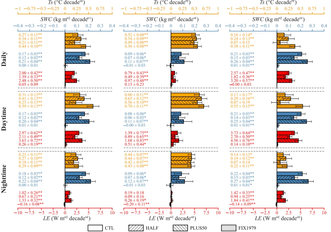
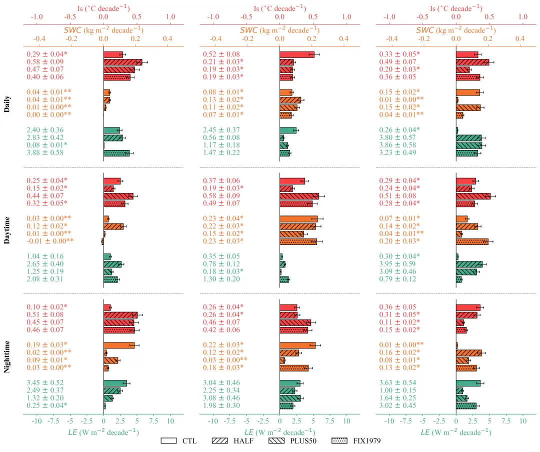
论文原图 此图三行代表三个时间维度的变量线性趋势 。三个独立的坐标轴系统来对应不同颜色的柱状图:顶部橙色轴代表TS趋势,中间蓝色轴代表SWC趋势,底部红色轴代表LE趋势。柱体的填充图案区分了四种情景:白色柱为CT),右斜线纹理(///)代表HALF,左斜线纹理(\\)代表PLUS50,点状纹理(...)代表FIX1979。此外,柱子旁的数字标注了具体的值及其标准误,误差棒表示95%置信区间,数字旁的星号分别表示趋势通过了0.01或0.05水平的显著性检验。 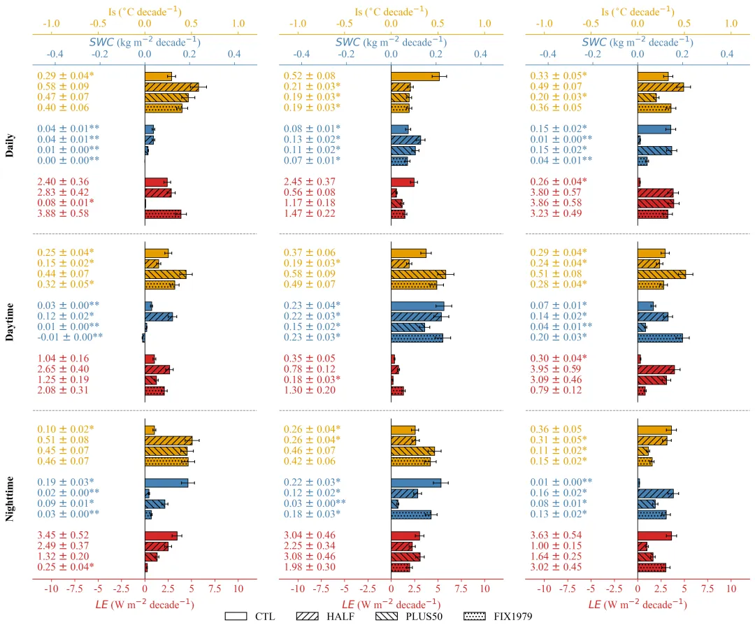
仿图 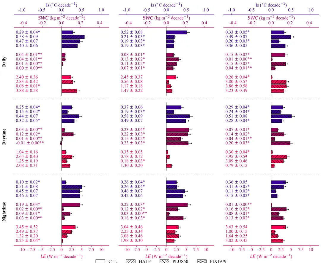
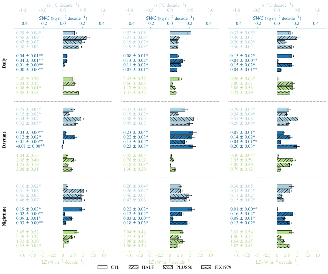
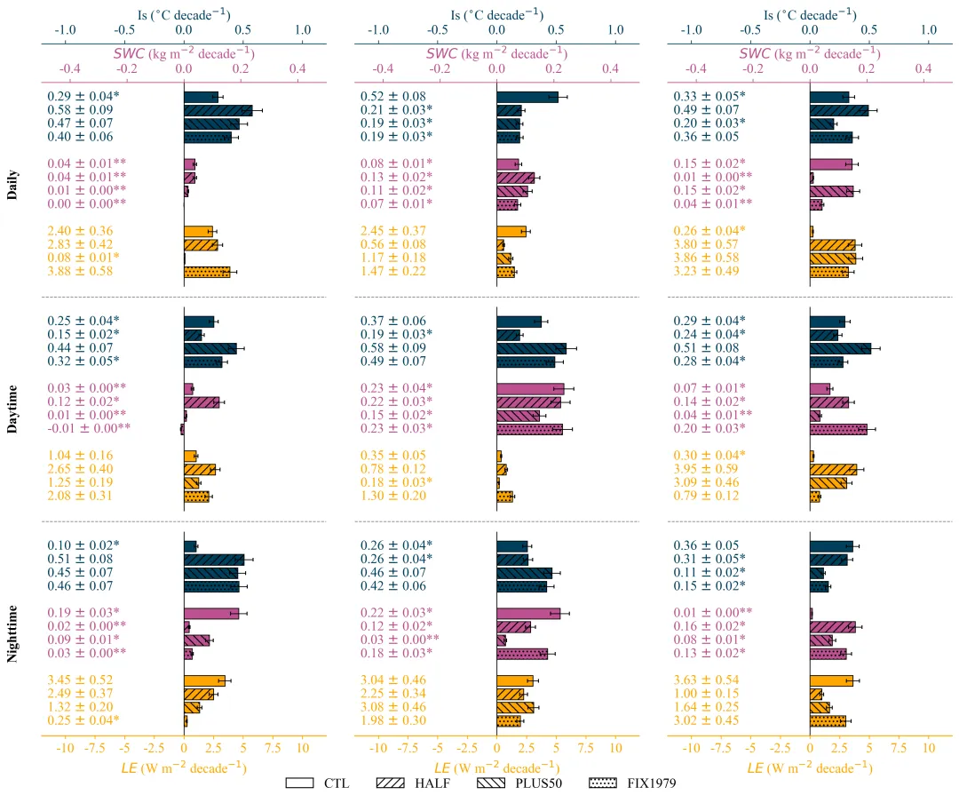
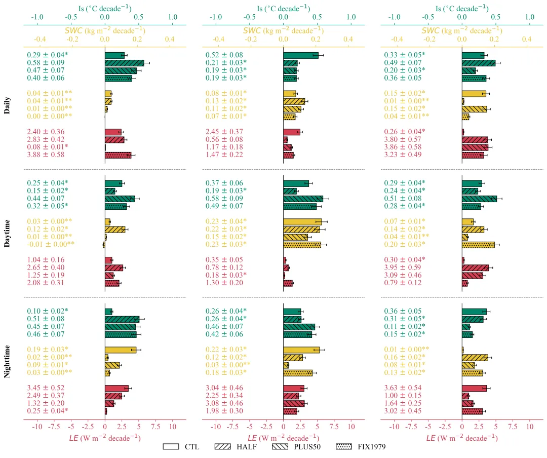
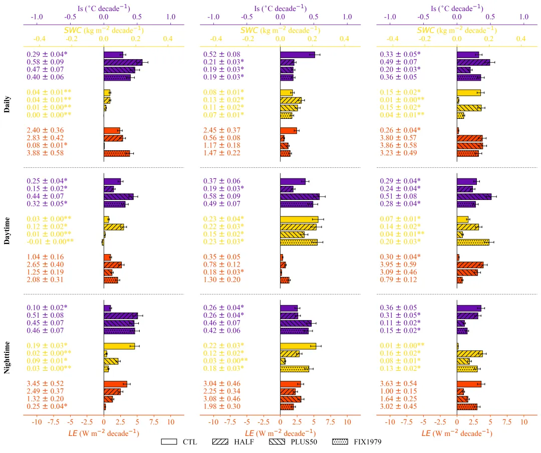
多种配色 


库的导入以及字体设置 

颜色库的设置以及配色方案的选择 

函数定义与画布初始化,辅助函数用于生成带显著性星号标注文本。设置柱状图的填充纹理、设置Y轴基准位置,创建多子图网格,处理单行或单列时的数组维度问题,确保 始终是二维数组。 


执行部分,定义行、列、变量的标签。读取数据,遍历Excel的每一行,将数据精确填入数组对应的位置。最后调用函数进行绘图。 


期刊图片复现|Python绘制二维偏依赖PDP图 期刊复现|python绘制基于SHAP分析和GAM模型拟合的单特征依赖图 期刊图片复现|python绘制带有渐变颜色shap特征重要性组合图(条形图+蜂巢图) 期刊复现|用Python绘制SHAP特征重要性总览图、依赖图、双特征交互效应SHAP图,解锁XGBoost模型的终极奥秘 期刊图片复现|Python绘制shap重要性蜂巢图+单特征依赖图+交互效应强度气泡图+交互效应依赖图(回归+二分类+分类) 

公众号中的所有所有的免费代码都已经下架了,都并入到付费部分里了,付费合集代码和数据的购买通道已经开通,全部合集100元,后续将会持续更新,决定购买请后台私信我,注意只会分享练习数据和代码文件,不会提供答疑服务,代码文件中已经包含了每行代码的完整注释,购买前请确保真的需要!!!
代码绘制成果展示
代码解释
第一部分
# =========================================================================================# ====================================== 1. 环境设置 =======================================# =========================================================================================import matplotlib.pyplot as pltimport numpy as npimport pandas as pdfrom matplotlib.patches import Patchimport matplotlibmatplotlib.rcParams['pdf.fonttype'] = 42matplotlib.rcParams['ps.fonttype'] = 42plt.rcParams['font.family'] = 'Times New Roman'plt.rcParams['axes.unicode_minus'] = False
第二部分
# =========================================================================================# ======================================2.颜色库=======================================# =========================================================================================COLOR_SCHEMES = {1: ['#E69F00', '#4682B4', '#D62728'],}scheme_index = 20 # 选择配色方案#获取颜色selected_colors = COLOR_SCHEMES[scheme_index ]
第三部分
# =========================================================================================# ======================================3.绘图函数=======================================# =========================================================================================def draw_chart(data_means, data_errs, data_pvals, rows_labels, colors):#行数、列数、变量数、实验组数nrows, ncols, nvars, nexps = data_means.shapec_var1, c_var2, c_var3 = colors[0], colors[1], colors[2]#获取当前配色的三个颜色变量#辅助函数,根据P值生成带有显著性标记的文本def get_annot_text(val, err, p_val):# 初始化显著性标记字符串sig_str = ""#根据数值设置显著性标记if pd.isna(p_val):sig_str = ""elif p_val < 0.01:sig_str = "**"elif p_val < 0.05:sig_str = "*"else:sig_str = ""# 返回格式化后的字符串return f"{val:.2f} $\pm$ {err:.2f}{sig_str}"#定义柱状图的填充patterns = ['', '///', '\\\\\\', '...']y_base_1 = 11# 第一组变量组在Y轴上的基准位置y_base_2 = 6# 第二组变量的Y轴基准位置y_base_3 = 1# 第三组变量的Y轴基准位置y_bases = [y_base_1, y_base_2, y_base_3]# 将基准位置放入列表方便遍历bar_height = 0.8#柱子的高度#创建画布和子图网格,根据列数和行数计算画布尺寸fig, axes = plt.subplots(nrows, ncols, figsize=(5 * ncols, 4 * nrows))if nrows == 1 and ncols == 1:# 如果是单行单列,将axes转换为二维数组axes = np.array([[axes]])elif nrows == 1:# 如果是单行多列,增加一个维度使其变为二维axes = np.expand_dims(axes, axis=0)elif ncols == 1:# 如果是多行单列,增加一个维度使其变为二维axes = np.expand_dims(axes, axis=1)
第四部分
坐标轴构建与数据绘制,遍历每一行每一列的子图,隐藏默认边框和刻度,创建两个顶部共享轴,从而在一个子图中拥有三个独立的X轴系统。接着遍历3个变量组,提取对应的均值、误差和P值,绘制水平柱状图、误差棒,并逐个添加数值文本标注。
for r in range(nrows):# 遍历行for c in range(ncols):# 遍历列#获取当前行列对应的子图对象ax_main = axes[r, c]#去掉边框for spine in ax_main.spines.values():spine.set_visible(False)# 去掉主坐标轴的X、y轴刻度ax_main.set_xticks([])ax_main.set_yticks([])#底部轴ax_bottom = ax_main# 顶部轴1ax_top_1 = ax_main.twiny()# 顶部轴2ax_top_2 = ax_main.twiny()# 隐藏所有顶部轴的边框for ax in [ax_top_1, ax_top_2]:for spine in ax.spines.values():spine.set_visible(False)# 在底部轴绘制x=0的参考竖线,颜色为黑色,层级在最下ax_bottom.axvline(x=0,color='black',linewidth=0.8,zorder=0)# 将三个轴对象放入列表,顺序对应变量组顺序axes_list = [ax_top_2, ax_top_1, ax_bottom]# 遍历三个变量组进行绘图for group_idx in range(3):# 获取当前变量组对应的坐标轴current_ax = axes_list[group_idx]# 获取当前变量组对应的颜色color = colors[group_idx]# 获取当前变量组对应的Y轴基准位置y_base = y_bases[group_idx]#获取均值数据并反转顺序vals = data_means[r, c, group_idx, :][::-1]#获取误差数据并反转顺序errs = data_errs[r, c, group_idx, :][::-1]#获取P值数据并反转顺序pvals = data_pvals[r, c, group_idx, :][::-1]#生成Y轴坐标位置y_locs = np.arange(4) + y_base# 设置文本标注的X轴位置text_x_pos = 0.02# 遍历每个柱子的数值,添加文本标签for i, val in enumerate(vals):# 获取格式化后的文本,传入对应的P值进行判断txt = get_annot_text(val, errs[i], pvals[i])#文字标注ax_main.text(text_x_pos, #Xy_locs[i], #Ytxt, #文本字#坐标变换transform=ax_main.get_yaxis_transform(),color=color, #字体颜色fontsize=14, #字体大小fontweight='normal', #字体粗细ha='left', # 水平对齐va='center' # 垂直对齐)
第五部分
坐标轴美化与标签设置,仅在第一行显示顶部的两个坐标轴,在最后一行显示底部的坐标轴。在第一列添加左侧的行分类标签。在子图之间添加虚线作为分隔符。
#顶部轴2X轴范围ax_top_2.set_xlim(-1.2, 1.2)#顶部轴1的X轴范围ax_top_1.set_xlim(-0.5, 0.5)#底部轴的X轴范围ax_bottom.set_xlim(-12, 12)#处理顶部轴if r == 0:# 显示顶部边框ax_top_2.spines['top'].set_visible(True)# 边框向外偏移ax_top_2.spines['top'].set_position(('outward', 40))# 边框颜色ax_top_2.spines['top'].set_color(c_var1)# 设置刻度参数ax_top_2.tick_params(axis='x', #仅针对 X 轴进行colors=c_var1, # 颜色labelsize=14, # 字体大小top=True, # 顶部刻度线labeltop=True, # 顶部标签bottom=False, # 底部刻度线labelbottom=False # 底部标签)# 设置X轴标题ax_top_2.set_xlabel("Is ($^{\circ}$C decade$^{-1}$)",color=c_var1,fontsize=14,labelpad=5)# 设置标签位置在顶部ax_top_2.xaxis.set_label_position('top')# 配置顶部轴1ax_top_1.spines['top'].set_visible(True)# 显示顶部边框ax_top_1.spines['top'].set_position(('outward', 0))# 设置边框向外偏移ax_top_1.spines['top'].set_color(c_var2)# 设置边框颜色#设置标签位置在顶部ax_top_1.xaxis.set_label_position('top')else:#如果不是第一行,隐藏ax_top_2.set_xticks([])#如果不是第一行,隐藏ax_top_1.set_xticks([])#处理底部轴if r == nrows - 1:ax_bottom.spines['bottom'].set_visible(True)# 显示底部边框ax_bottom.spines['bottom'].set_color(c_var3)# 设置底部边框颜色ax_bottom.spines['bottom'].set_linewidth(1.0)# 设置底部边框线宽ticks = np.arange(-10, 10.1, 2.5)# 设置自定义刻度范围# 应用自定义刻度ax_bottom.set_xticks(ticks)# 生成刻度标签列表labels = [f"{x:g}" for x in ticks]# 应用刻度标签ax_bottom.set_xticklabels(labels)# 设置底部轴刻度参数ax_bottom.tick_params(axis='x',colors=c_var3,labelsize=14,bottom=True,labelbottom=True,top=False,labeltop=False,direction='out')# 设置底部轴标签ax_bottom.set_xlabel("$LE$ (W m$^{-2}$ decade$^{-1}$)",color=c_var3,fontsize=14,labelpad=5)else:# 如果不是最后一行,隐藏底部刻度ax_bottom.set_xticks([])# 隐藏底部边框ax_bottom.spines['bottom'].set_visible(False)# 左侧行标签if c == 0: # 仅在每一行的第一列ax_main.text(-0.1, # X坐标0.5, # Y坐标rows_labels[r], # 标签文本transform=ax_main.transAxes, #使用轴坐标系fontsize=14, # 字体大小fontweight='bold', # 字体加粗rotation=90, # 旋转va='center', # 垂直对齐ha='center' # 水平对齐)#行间分隔线if r < nrows - 1: # 如果当前不是最后一行# 创建虚线line = plt.Line2D([0, 1], # X[0, 0], # Ytransform=ax_main.transAxes, #轴坐标系color='gray', # 线条颜色linestyle='--', #虚线linewidth=0.8, #粗细clip_on=False # 允许线条绘制在子图边框之外)#调整 Y 轴位置line.set_ydata([-0.05, -0.05])# 将创建好的线条对象显式添加到子图中ax_main.add_artist(line)
第六部分
手动创建了带有不同填充纹理的图例元素,以匹配图表中的柱子样式,最后将图片保存为PNG和PDF。
#定义图例元素legend_elements = [Patch(facecolor='white', edgecolor='black', label='CTL'),Patch(facecolor='white', edgecolor='black', hatch='///', label='HALF'),Patch(facecolor='white', edgecolor='black', hatch='\\\\\\', label='PLUS50'),Patch(facecolor='white', edgecolor='black', hatch='...', label='FIX1979')]#绘制图例fig.legend(handles=legend_elements,loc='lower center',ncol=4,frameon=False,fontsize=14,bbox_to_anchor=(0.5, 0.02))# 保存plt.savefig(fr"chart{scheme_index}.png", dpi=300, bbox_inches='tight')plt.savefig(fr"chart{scheme_index}.pdf", bbox_inches='tight')
第七部分
# =========================================================================================# ======================================4.执行部分=======================================# =========================================================================================if __name__ == "__main__":rows_labels = ["Daily", "Daytime", "Nighttime"] # 行标签col_indices = [1, 2, 3] # 列索引# Excel数据文件路径excel_path = r"data.xlsx"var_labels = ["Is", "SWC", "LE"] # 变量标签列表exp_labels = ["CTL", "HALF", "PLUS50", "FIX1979"] # 实验标签列表df = pd.read_excel(excel_path)# 读取数据nrows = len(rows_labels)#行数ncols = len(col_indices)#列数nvars = len(var_labels)#变量数nexps = len(exp_labels)#实验组数row_map = {label: i for i, label in enumerate(rows_labels)}#行标签到索引的映射字典var_map = {label: i for i, label in enumerate(var_labels)}#变量标签到索引的映射字典exp_map = {label: i for i, label in enumerate(exp_labels)}#实验标签到索引的映射字典col_map = {col_idx: i for i, col_idx in enumerate(col_indices)}# 列索引值到数组索引的映射字典data_means = np.zeros((nrows, ncols, nvars, nexps))#均值数据容器data_errs = np.zeros((nrows, ncols, nvars, nexps))#误差数据容器data_pvals = np.full((nrows, ncols, nvars, nexps), np.nan)# P值容器#调用绘图函数draw_chart(data_means=data_means,# 传递均值数据data_errs=data_errs,# 传递误差数据data_pvals=data_pvals,# 传递P值数据rows_labels=rows_labels,# 传递行标签colors=selected_colors,# 传递选定的颜色)
如何应用到你自己的数据
1.设置颜色方案:
scheme_index = 20 # 选择配色方案2.设置行标签:
rows_labels = ["Daily", "Daytime", "Nighttime"] # 行标签3.设置原始数据的路径:
excel_path = r"data.xlsx"4.设置变量名和不同的场景名称:
var_labels = ["Is", "SWC", "LE"] # 变量标签列表exp_labels = ["CTL", "HALF", "PLUS50", "FIX1979"]
5.设置绘图结果的保存路径:
plt.savefig(fr"\chart{scheme_index}.png", dpi=300, bbox_inches='tight')plt.savefig(fr"\chart{scheme_index}.pdf", bbox_inches='tight')
推荐
获取方式
本文来自网友投稿或网络内容,如有侵犯您的权益请联系我们删除,联系邮箱:wyl860211@qq.com 。

