【附代码】气象科研绘图必备:Python colorbar总结
- 2026-07-03 20:55:13
【附代码】气象科研绘图必备:Python colorbar总结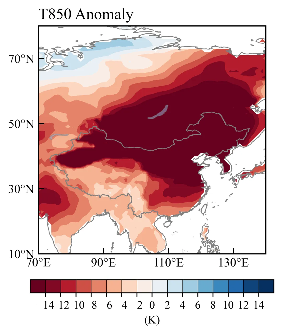
unsetunset导览unsetunset
总结常用的几种colorbar设置,可以应对很多气象论文绘图需求,包括:
Matplotlib Colormaps 色标美化函数 0值左右不对称的色标 0值左右不等间距的色标 正负对称色标(0值左右为白色) 自定义colormap 离散的colormap
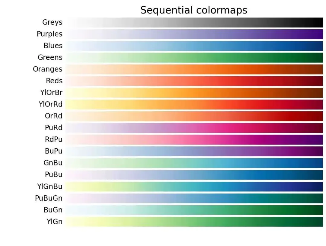
Matplotlib Colormaps
matplotlib colormaps(https://matplotlib.org/stable/users/explain/colors/colormaps.html)官网: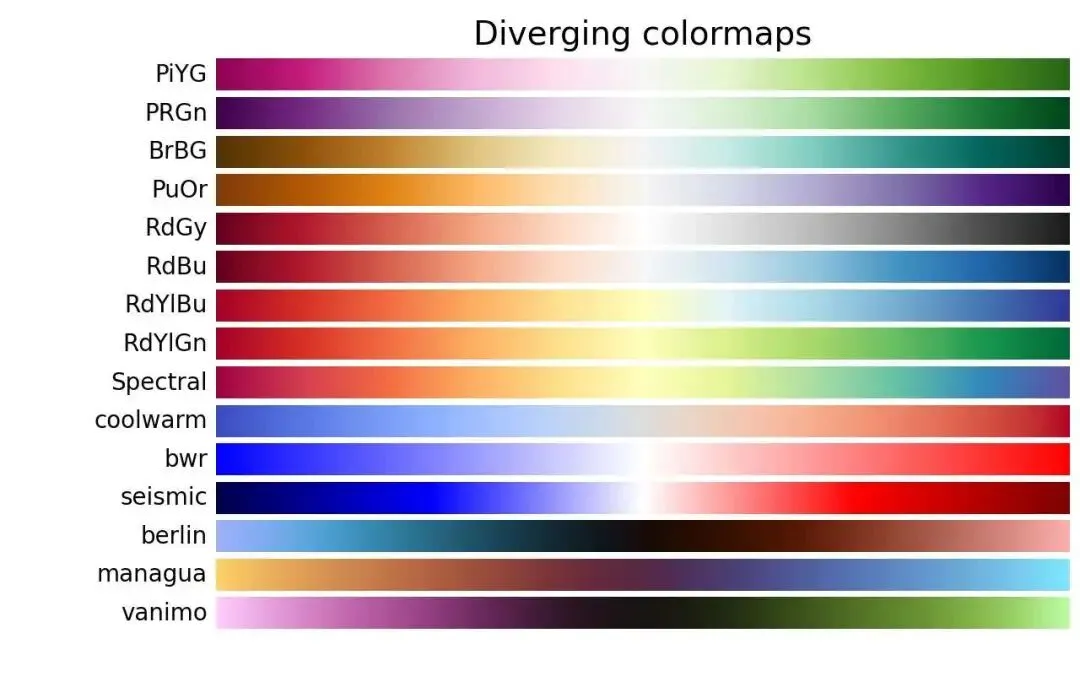
色标美化
以某年气温距平为例,对称色标: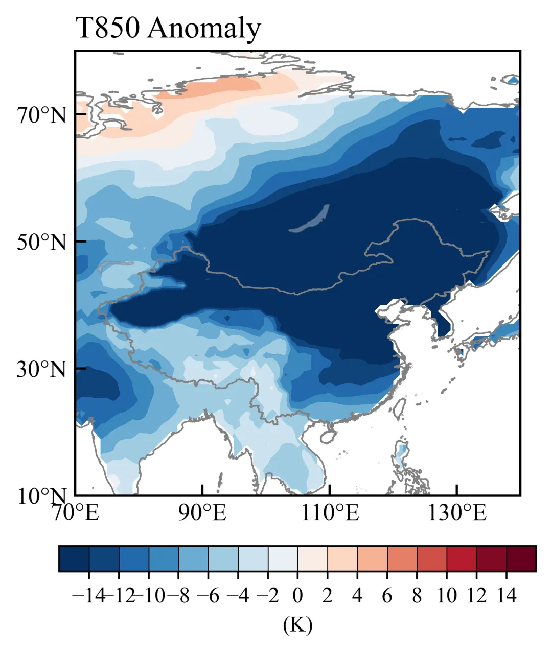
import matplotlib.pyplot as pltcmap = plt.cm.RdBu_rnorm = None #使用默认的线性归一化levels = np.arange(-14,14.1,2)
主要绘图函数:
def draw_info(fig,axes,data_sets,X_axis,Y_axis,levels_np,cmap = plt.cm.RdBu_r,norm=None): #X_axis,Y_axis就是lon lat#去掉白线(在世界地图的范围时) from cartopy.util import add_cyclic_point# 遍历数据集for ax, data_var in data_sets:# 对 var 进行 add_cyclic_point 操作 cycle_var, cycle_lon = add_cyclic_point(data_var, coord=X_axis) cycle_LON, cycle_LAT = np.meshgrid(cycle_lon, Y_axis) c_var = ax.contourf(cycle_LON, cycle_LAT, cycle_var, zorder=0, alpha=1, extend='both',levels = levels_np, transform=ccrs.PlateCarree(), cmap=cmap,norm=norm)return c_var,fig,axes
colorbar美化函数:
def draw_colorbar(c_var,levels_np,fig,axes,position_list=[0.2, 0.05, 0.6, 0.04],unit=None): position = fig.add_axes(position_list) cbar = fig.colorbar(c_var,cax=position,orientation='horizontal', drawedges=True, extendrect=True, extendfrac='auto', extend='both', ticks=levels_np)''' drawedges=True # 显示色标分级边界(每个格子之间有线) extendrect=True # 色标两端扩展部分为矩形 extendfrac='auto'# 自动设置色标两端扩展的长度 extend='both' # 两端显示超出范围的扩展 ticks=levels_np # 设置色标刻度 ''' cbar.outline.set_linewidth(0.8) # 设置色标边框线宽度 cbar.ax.tick_params(labelsize=10) #设置色标刻度字体大小 cbar.set_label(unit, fontsize=10) #设置单位return fig,axes
如果要反转色标颜色,就删除原来的“_r”:
cmap = plt.cm.RdBu #红→蓝0值左右不对称的色标
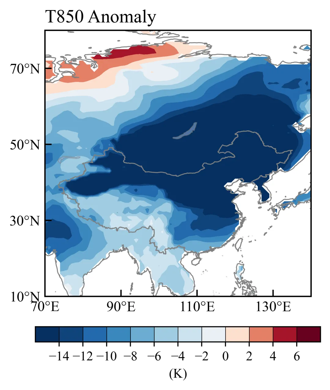
想要将原来的对称色标修改为不对称的,就修改norm参数,用TwoSlopeNorm:以一个中心值vcenter为分界点,分别对左右两侧数据做线性映射到colormap。
from matplotlib.colors import TwoSlopeNormnorm = TwoSlopeNorm( vmin=-14, vcenter=0, vmax=6 )levels = np.arange(-14, 6.1, 2)
0值左右不等间距的色标
修改levels参数,把负值和正值间距设置为不相等的。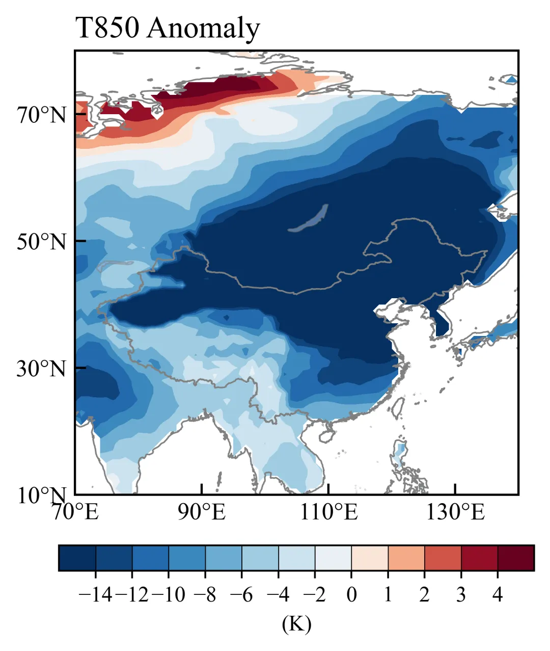
from matplotlib.colors import TwoSlopeNormnorm = TwoSlopeNorm( vmin=-14, vcenter=0, vmax=4 )neg_levels = np.arange(-14, 0, 2) # 负数间隔 2pos_levels = np.arange(0, 4.1, 1) # 正数间隔 1levels = np.concatenate([neg_levels, pos_levels])
设置对称色标0值左右为白色
在matplotlib色标的基础上进行修改,得到: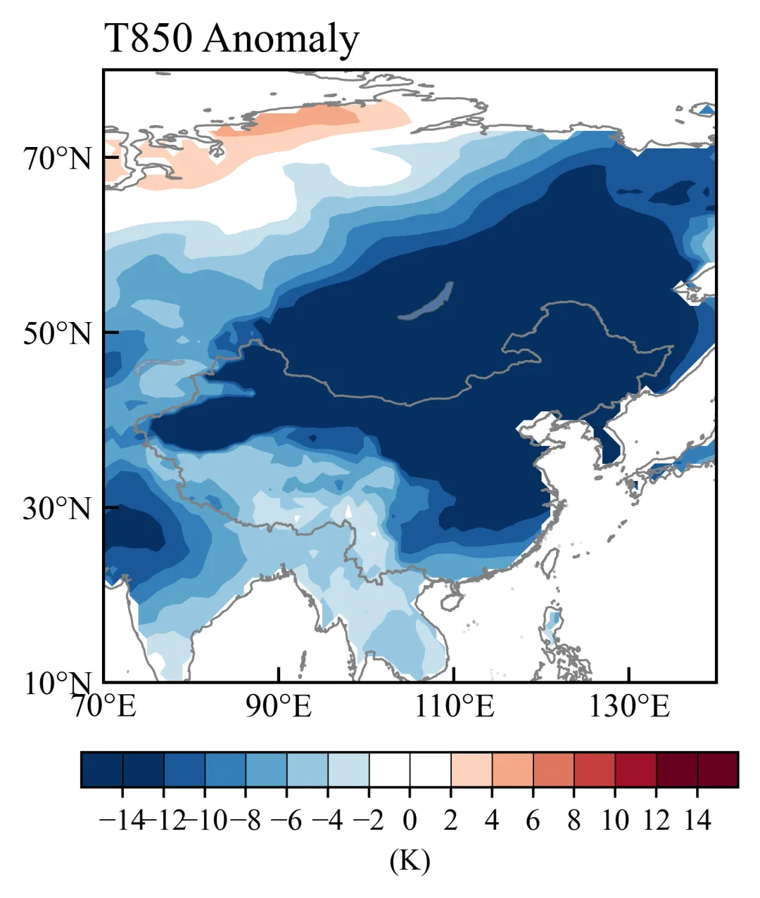
base_cmap = plt.cm.RdBu_r levels = np.arange(-14,14.1,2)# 根据levels生成对应数量的颜色 ncolor = len(levels) - 1 colors = base_cmap(np.linspace(0,1,ncolor))# 找到最接近0的位置 zero_idx = np.argmin(np.abs(levels))# 将0附近设为白色 colors[zero_idx-1:zero_idx+1] = [1,1,1,1] cmap = LinearSegmentedColormap.from_list("RdBu_white", colors, N=ncolor ) norm = None
自定义colormap
调用LinearSegmentedColormap类,可以指定几个关键颜色,然后matplotlib会在这些颜色之间做线性渐变,生成完整的色标。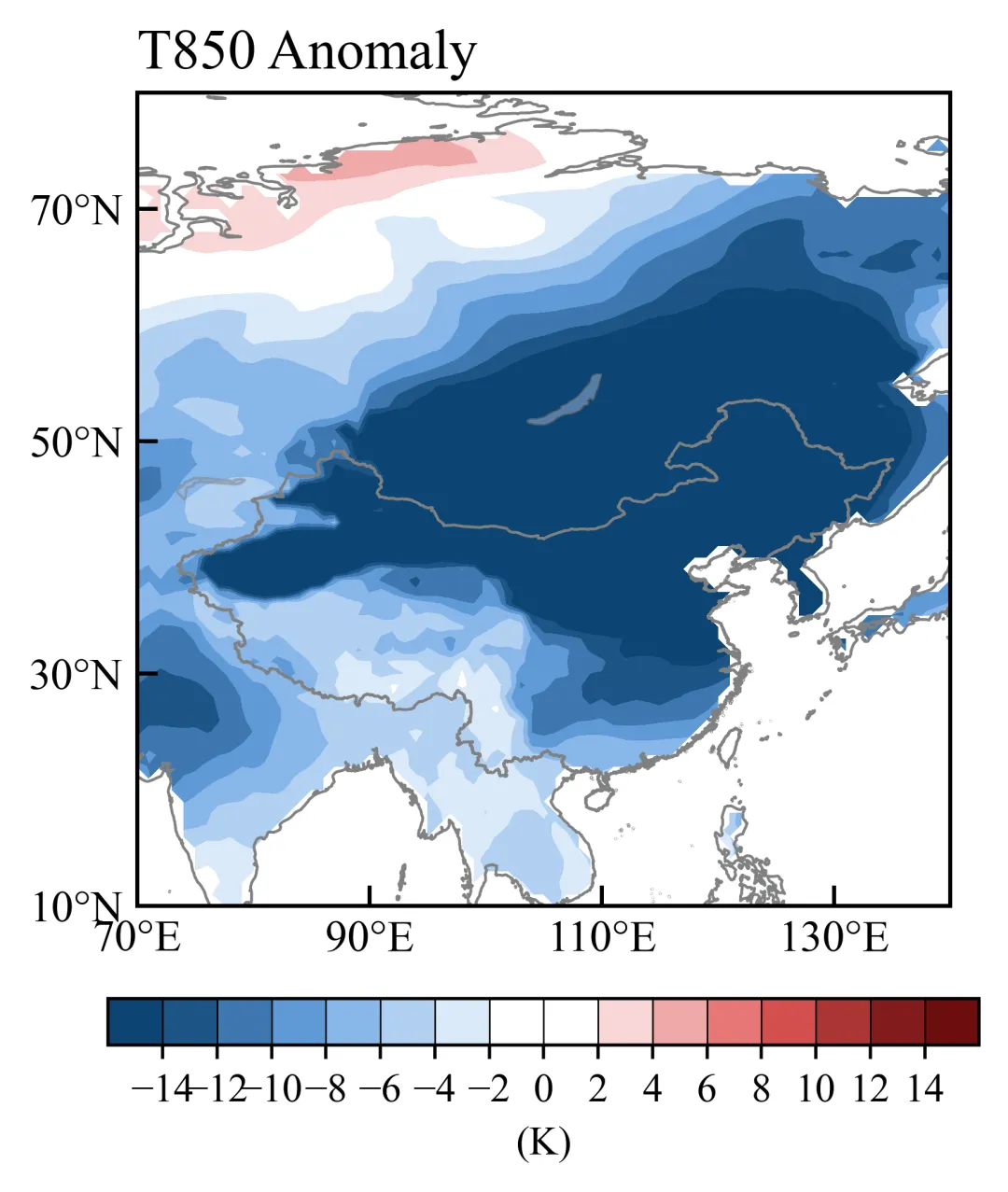
colors = ['#0d4472','#6aa5e5','white','white','#e25858','#6d0e0e']positions = [0,0.2,0.455,0.545,0.8,1.0]cmap = LinearSegmentedColormap.from_list("custom_cmap", list(zip(positions, colors)))norm = Nonelevels = np.arange(-14,14.1,2)
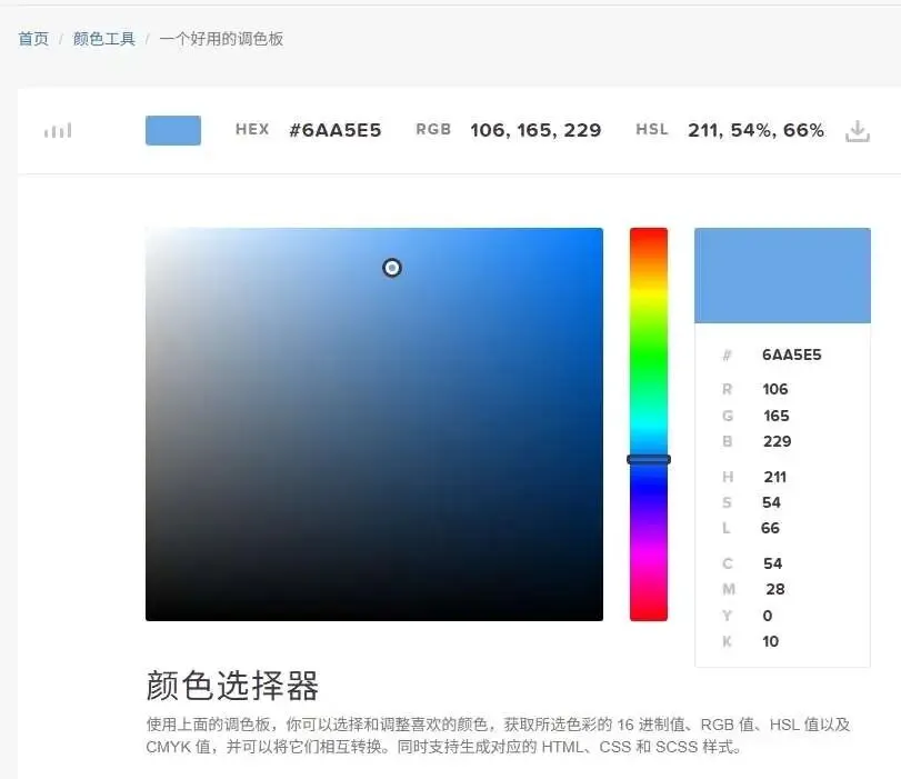
一个好用的调色板网站(https://www.codeeeee.com/color/picker.html)方便选择颜色
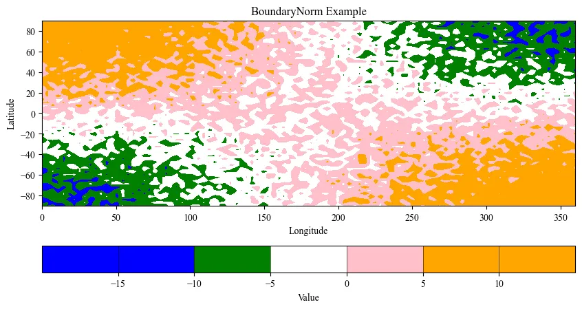
离散的colormap
调用BoundaryNorm,用不同颜色区分范围。
import numpy as np import matplotlib.pyplot as plt from matplotlib.colors import ListedColormap, BoundaryNorm# ===============================# 1. 自定义颜色与区间# =============================== colors = ['blue', 'green', 'white', 'pink', 'orange'] bounds = [-15, -10, -5, 0, 5, 10] # 区间边界,长度 = len(colors)+1 cmap = ListedColormap(colors) norm = BoundaryNorm(bounds, cmap.N)# ===============================# 2. 模拟数据# =============================== lon = np.linspace(0, 360, 100) lat = np.linspace(-90, 90, 60) lon2, lat2 = np.meshgrid(lon, lat)# 示例数据 base_data = 10 * np.sin(np.deg2rad(lat2)) * np.cos(np.deg2rad(lon2 / 2))# 添加小幅随机扰动,让数据不完全规则 noise = np.random.uniform(-5, 5, size=base_data.shape) data = base_data + noise # 最终数据# ===============================# 3. 绘制 contourf# =============================== fig, ax = plt.subplots(figsize=(10,5)) cf = ax.contourf( lon2, lat2, data, levels=bounds, # 使用 bounds 来定义区间 cmap=cmap, norm=norm, extend='both'# 两端超出范围显示 extend ) ax.set_xlabel("Longitude") ax.set_ylabel("Latitude") ax.set_title("BoundaryNorm Example")# ===============================# 4. 添加 colorbar(带 drawedges, extendrect, extendfrac)# =============================== cbar = fig.colorbar( cf, orientation='horizontal', extend='both', drawedges=True, extendrect=True, extendfrac='auto', boundaries=bounds, ticks=bounds ) cbar.set_label("Value") cbar.ax.tick_params(labelsize=10) plt.show()
ENDunsetunset
本文来自网友投稿或网络内容,如有侵犯您的权益请联系我们删除,联系邮箱:wyl860211@qq.com 。
随机文章
-
 10个月宝宝每天需要喝多少奶粉?
- CellChat拉胯后,我靠Python版CellPhoneDB逆袭翻盘
- Python:Picologging 超高性能的日志工具库
- Python入门秘籍
- OpenClaw 反超 React Linux背后的开源泡沫警报!25万Star神话与开源价值泡沫大审判
- 32 位 Linux 3G/1G 虚拟地址,90% 的人都理解错了
- 搞懂Linux设备驱动模型,这篇就够了!
- Linux中断共享技术解析
- 千万别错过!!用Python轻松实现经济自由!
- 音频秒变动画大片!这个Python神器让你的波形图瞬间高大上
- 从 0 到 1 搭建量化环境:Python 与 QMT 对接教程
