专注收集和自写可发表的科研图形的数据和代码分享,该系列的数据均可从以下链接下载:
百度云盘链接: https://pan.baidu.com/s/1M4vgU1ls0tilt0oSwFbqYQ提取码: 请关注WX公zhong号 生信学习者 后台发送 科研绘图 获取提取码
介绍
在数据科学和统计分析领域,R和Python都是广泛使用的编程语言,它们都提供了丰富的数据可视化工具和库。以下是对使用R和Python进行散点图、箱线图、条形图和热图绘制的比较。
每种语言都有其独特的优势和特点。R语言以其统计分析功能和丰富的图形库而闻名,特别适合于数据可视化和图形展示。Python则以其通用性和强大的科学计算库而受到欢迎,其数据可视化库如matplotlib和seaborn提供了灵活的图表定制选项。
我们通过reticulateR包协同Python和R之间数据流转。
加载R包
knitr::opts_chunk$set(message = FALSE, warning = FALSE)library(tidyverse)library(scales)library(reshape2)# rm(list = ls())options(stringsAsFactors = F)options(future.globals.maxSize = 10000 * 1024^2)
加载reticulate包
reticulate协同R和python操作的工具。
# install.packages("reticulate")library(reticulate)
设置python环境
reticulate提供的use_condaenv函数选择python环境(使用conda管理python环境)
use_condaenv("base", required = TRUE)
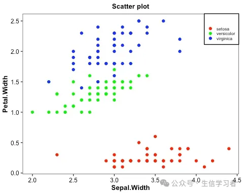
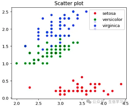
散点图
iris %>% mutate(Species=factor(Species, levels = c("setosa", "versicolor", "virginica"))) %>% ggplot(aes(x=Sepal.Width, y=Petal.Width, color=Species))+ geom_point()+ guides(color=guide_legend("", keywidth = .5, keyheight = .5))+ labs(title = 'Scatter plot')+ theme_bw()+ scale_color_manual(values = c("red", "green", "blue"))+ theme(plot.title = element_text(size = 10, color = "black", face = "bold", hjust = 0.5), axis.title = element_text(size = 10, color = "black", face = "bold"), axis.text = element_text(size = 9, color = "black"), text = element_text(size = 8, color = "black"), strip.text = element_text(size = 9, color = "black", face = "bold"), panel.grid = element_blank(), legend.position = c(1, 1), legend.justification = c(1, 1), legend.background = element_rect(fill="white", color = "black"))
dat = r.iris # Python调用R内嵌数据使用r.dataspecies_map = {'setosa':1, 'versicolor':2, 'virginica':3}dat['Species'] = dat['Species'].map(species_map)import numpy as npimport matplotlib.pyplot as plt# plt.scatter(dat['Sepal.Width'], dat['Petal.Width'], c=dat['Species'],# alpha=0.8, edgecolors='none', s=30, label=["1", "2", "3"])# plt.title('Scatter plot in iris')# plt.xlabel('Sepal.Width (cm)')# plt.ylabel('Petal.Width (cm)')# plt.legend(loc=1)# plt.show()dat1 = (np.array(dat[dat.Species==1]['Sepal.Width']), np.array(dat[dat.Species==1]['Petal.Width']))dat2 = (np.array(dat[dat.Species==2]['Sepal.Width']), np.array(dat[dat.Species==2]['Petal.Width']))dat3 = (np.array(dat[dat.Species==3]['Sepal.Width']), np.array(dat[dat.Species==3]['Petal.Width']))mdat = (dat1, dat2, dat3)colors = ("red", "green", "blue")groups = ("setosa", "versicolor", "virginica")# step1 build figure backgroundfig = plt.figure()# step2 build axisax = fig.add_subplot(1, 1, 1, facecolor='1.0') # step3 build figurefor data, color, group in zip(mdat, colors, groups): x, y = data ax.scatter(x, y, alpha=0.8, c=color, edgecolors='none', s=30, label=group) plt.title('Scatter plot')plt.legend(loc=1) # step4 show figure in the screenplt.show()
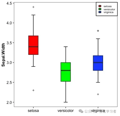
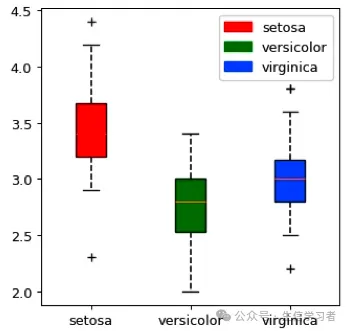
箱形图
iris %>% mutate(Species=factor(Species, levels = c("setosa", "versicolor", "virginica"))) %>% ggplot(aes(x=Species, y=Sepal.Width, fill=Species))+ stat_boxplot(geom = "errorbar", width = .12)+ geom_boxplot(width = .3, outlier.shape = 3, outlier.size = 1)+ guides(fill=guide_legend(NULL, keywidth = .5, keyheight = .5))+ xlab("")+ theme_bw()+ scale_fill_manual(values = c("red", "green", "blue"))+ theme(plot.title = element_text(size = 10, color = "black", face = "bold", hjust = 0.5), axis.title = element_text(size = 10, color = "black", face = "bold"), axis.text = element_text(size = 9, color = "black"), text = element_text(size = 8, color = "black"), strip.text = element_text(size = 9, color = "black", face = "bold"), panel.grid = element_blank(), legend.position = c(1, 1), legend.justification = c(1, 1), legend.background = element_rect(fill="white", color = "black"))
dat = r.iris # Python调用R内嵌数据使用r.dataspecies_map = {'setosa':1, 'versicolor':2, 'virginica':3}dat['Species'] = dat['Species'].map(species_map)import numpy as npimport matplotlib.pyplot as pltimport matplotlib.patches as mpatchesdat11 = (np.array(dat[dat.Species==1]['Sepal.Width']))dat21 = (np.array(dat[dat.Species==2]['Sepal.Width']))dat31 = (np.array(dat[dat.Species==3]['Sepal.Width']))mdat2 = (dat11, dat21, dat31)colors = ("red", "green", "blue")groups = ("setosa", "versicolor", "virginica")fig = plt.figure()axes = fig.add_subplot(facecolor='1.0')bplot = axes.boxplot(mdat2, patch_artist=True, notch=0, sym='+', vert=1, whis=1.5, whiskerprops = dict(linestyle='--',linewidth=1.2, color='black'))# colorfor patch, color in zip(bplot['boxes'], colors): patch.set_facecolor(color)# axes labelsplt.setp(axes, xticks=[1,2,3], xticklabels=["setosa", "versicolor", "virginica"])red_patch = mpatches.Patch(color='red', label='setosa')green_patch = mpatches.Patch(color='green', label='versicolor')blue_patch = mpatches.Patch(color='blue', label='virginica')plt.legend(handles=[red_patch, green_patch, blue_patch], loc=1)plt.show()
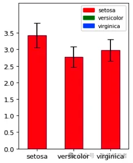
条形图
iris %>% mutate(Species=factor(Species, levels = c("setosa", "versicolor", "virginica"))) %>% select(Species, Sepal.Width) %>% group_by(Species) %>% summarize(avg=mean(Sepal.Width), n=n(), sd=sd(Sepal.Width), se=sd/sqrt(n)) %>% ungroup() %>% ggplot(aes(x=Species, y=avg, fill=Species))+ geom_bar(stat="identity", width=.4, color="black")+ geom_errorbar(aes(ymin=avg-sd, ymax=avg+sd), width=.15, position=position_dodge(.9), linewidth=1)+ guides(fill=guide_legend(NULL, keywidth = .5, keyheight = .5))+ xlab("")+ ylab("Sepal.Width")+ scale_y_continuous(breaks=seq(0, 3.5,0.5), limits=c(0, 4.4),expand = c(0,0))+ theme_bw()+ scale_fill_manual(values = c("red", "green", "blue"))+ theme(axis.title = element_text(size = 10, color = "black", face = "bold"), axis.text = element_text(size = 9, color = "black"), text = element_text(size = 8, color = "black"), strip.text = element_text(size = 9, color = "black", face = "bold"), panel.grid = element_blank(), legend.position = c(1, 1), legend.justification = c(1, 1), legend.background = element_rect(fill="white", color = "black"))
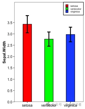
dat = r.iris # Python调用R内嵌数据使用r.dataspecies_map = {'setosa':1, 'versicolor':2, 'virginica':3}dat['Species'] = dat['Species'].map(species_map)import numpy as npimport pandas as pdimport matplotlib.pyplot as pltmean = list(dat['Sepal.Width'].groupby(dat['Species']).mean())sd = list(dat.groupby('Species').agg(np.std, ddof=0)['Sepal.Width'])colors = ["red", "green", "blue"]df = pd.DataFrame({'mean':mean}, index=["setosa", "versicolor", "virginica"])df.plot(kind='bar', alpha=0.75, rot=0, edgecolor='black', yerr=sd, align='center', ecolor='black', capsize=5, color=colors, ylim=(0.0, 4.4), yticks=list(np.arange(0, 4.0, 0.5)))# xlabelplt.xlabel('')plt.ylabel('Sepal.Width')# legendred_patch = mpatches.Patch(color='red', label='setosa')green_patch = mpatches.Patch(color='green', label='versicolor')blue_patch = mpatches.Patch(color='blue', label='virginica')plt.legend(handles=[red_patch, green_patch, blue_patch], # color and group loc=1, # location prop={'size': 8}) # size plt.show()
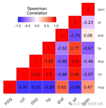
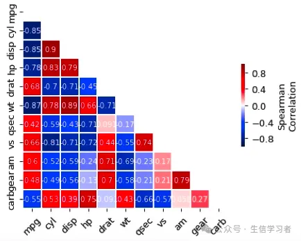
热图
get_upper_tri <- function(x){ x[upper.tri(x)] <- NA return(x)}round(cor(mtcars[, c(1:7)], method = "spearman"), 2) %>% get_upper_tri() %>% reshape2::melt(na.rm = TRUE) %>% ggplot(aes(x=Var1, y=Var2, fill=value))+ geom_tile(color = "white")+ scale_fill_gradient2(low = "blue", high = "red", mid = "white", midpoint = 0, limit = c(-1,1), space = "Lab", name="Spearman\nCorrelation")+ theme_minimal()+ guides(fill = guide_colorbar(barwidth = 7, barheight = 1, title.position = "top", title.hjust = 0.5))+ coord_fixed()+ geom_text(aes(label = value), color = "black", size = 4)+ scale_y_discrete(position = "right") + theme(axis.title.x = element_blank(), axis.title.y = element_blank(), axis.text.x = element_text(angle = 45, vjust = 1, size = 12, hjust = 1), panel.grid.major = element_blank(), panel.border = element_blank(), panel.background = element_blank(), axis.ticks = element_blank(), legend.justification = c(1, 0), legend.position = c(0.6, 0.7), legend.direction = "horizontal")

import pandas as pd import numpy as npimport matplotlib.pyplot as pltimport seaborn as snscorr = r.mtcars.corr()mask = np.zeros_like(corr)mask[np.triu_indices_from(mask)] = Truef, ax = plt.subplots(figsize=(6, 5))heatmap = sns.heatmap(corr, vmin=-1, vmax=1, mask=mask, center=0, # , orientation='horizontal' cbar_kws=dict(shrink=.4, label='Spearman\nCorrelation', ticks=[-.8, -.4, 0, .4, .8]), annot_kws={'size': 8, 'color': 'white'}, #cbar_kws = dict(use_gridspec=False,location="right"), linewidths=.2, cmap = 'seismic', square=True, annot=True, xticklabels=corr.columns.values, yticklabels=corr.columns.values)#add the column names as labelsax.set_xticklabels(corr.columns, rotation = 45)ax.set_yticklabels(corr.columns)sns.set_style({'xtick.bottom': True}, {'ytick.left': True})#heatmap.get_figure().savefig("heatmap.pdf", bbox_inches='tight')plt.show()
 10个月宝宝每天需要喝多少奶粉?
