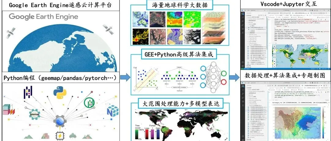
GEE(Python版本)开展全球制图分析中有很多独特优势。除了无需下载数据、消耗配额以外,综合数理统计分析、网格化等制图技巧也是一大亮点。然而,要综合实现这些复杂的功能,需要对多维数据有较为深刻的理解,同时能够对处理好的数据进行数理统计分析。本文以Nature期刊图文为例,综合基于全国的土地利用数据统计分析+网格化制图内容。
我们知道,很多顶级期刊都是做的大范围研究,甚至很多做的是全球范围的研究。有学员就好奇了:这种全球的数据难道需要我们自己下载以后出图吗?这么大的数据量,传统的GIS软件能打开制图分析吗?数据下载需要多久?于是,这便像大范围出图的一个拦路虎,传统出图方法已经无法解决。然而,我们经常看到那些绝美的顶刊论文的图,不仅漂亮美观,而且都是基于大范围乃至全球尺度的,例如: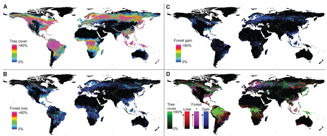
Hansen M C, Potapov P V, Moore R, et al. High-resolution global maps of 21st-century forest cover change[J]. science
PekelJ F, Cottam A, Gorelick N, et al. High-resolution mapping of global surface water and its long-term changes[J]. Nature, 2016, 540(7633): 418-422.
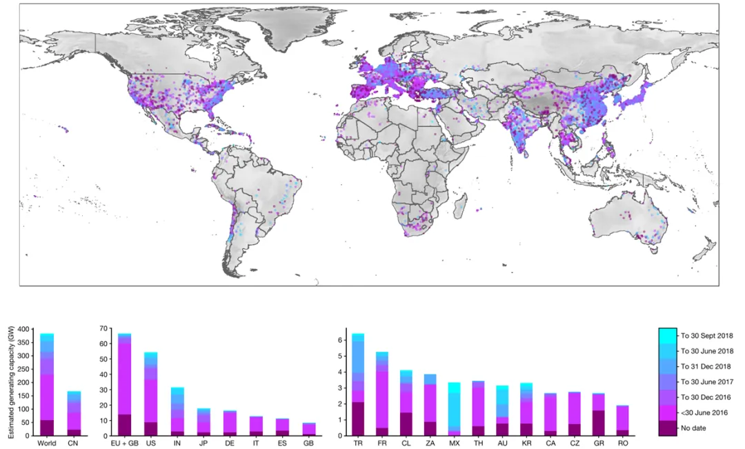
KruitwagenL, Story K T, Friedrich J, et al. A global inventory of photovoltaic solar energy generating units[J]. Nature, 2021, 598(7882): 604-610.
我们知道,GEE可以快速显示全球任意地球的数据,无论是单一数据还是多源数据的叠加,这为GEE大范围(全球)制图提供了思路。然而,GEE官网版本并没有制图分析功能,如何快速制作大范围,多源数理统计分析的格网化SCI论文图呢?这里,我们采用了GEE(Python)版本完美的解决了这个问题。首先,我们基于geemap加载地图和数据,完美的接入了GEE自带的数据,并且可以在这里实现数据处理和专题信息提取;其次,我们可以基于numpy、pandas等开展数理统计分析,而大范围的统计分析我们可以基于经纬度格网实现快速分析,最后用matplotlib和cartopy进行精美制图,这样一个完整的流程就实现了。GEE(Python)多源数据+数理统计分析格网化结果展示:
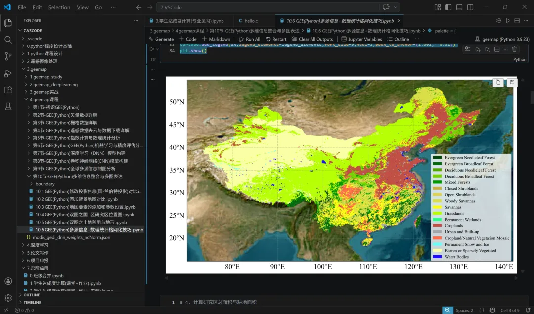
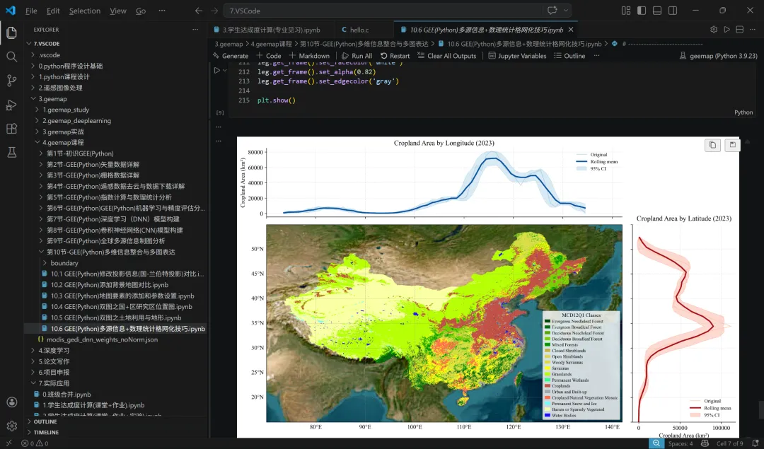
我们以全国的土地利用分类数据为例,首先进行全国制图,核心代码如下:fig = plt.figure(figsize=(12, 12), dpi=300, facecolor="white")# 关键:proj=projn 才是等面积投影制图的核心ax = cartoee.get_map( imgBlend, region=[142, 15, 70, 55], # 当前版本 cartoee 的兼容写法 scale=500, basemap = 'HYBRID', zoom_level=3)# # 用经纬度范围约束投影地图显示区域ax.set_extent(rectangle_roi, crs=ccrs.PlateCarree())# 添加经纬网gl = ax.gridlines( crs=ccrs.PlateCarree(), draw_labels=True, linewidth=0.6, color='gray', alpha=0.5, linestyle='--')# 只显示左侧和底部标签(避免重叠)gl.top_labels = Falsegl.right_labels = Falselegend_elements = legend_elements = [ mpatches.Patch(facecolor=f'#{c}', edgecolor='none', label=lab) for c, lab in zip(palette, labels)]cartoee.add_legend(ax,legend_elements=legend_elements,font_size=9,ncol=1,bbox_to_anchor=(1.001, -0.01))plt.show()
这样,我们得到全国的土地利用专题制图,结果显示如下:我们需要在此基础上进行数理统计+网格化分析,实现经度和维度上的统计。这里我们以耕地信息为例,核心代码如下:# -----------------------------# 经度方向:平滑均值 + 近似95%置信带# -----------------------------# 8. 经度方向统计# -----------------------------grid_lon_stats = grid_lon.map(zonal_cropland_area)df_lon = geemap.ee_to_df(grid_lon_stats)df_lon = df_lon[['xmin', 'cropland_m2', 'cropland_km2', 'cropland_ha']] \ .sort_values(by='xmin') \ .reset_index(drop=True)df_plot = df_lon.copy()# 滑动窗口大小,可调window = 5# 滑动均值df_plot['mean'] = df_plot['cropland_km2'].rolling(window=window, center=True, min_periods=1).mean()# 滑动标准差df_plot['std'] = df_plot['cropland_km2'].rolling(window=window, center=True, min_periods=1).std()# 标准误df_plot['sem'] = df_plot['std'] / np.sqrt(window)# 近似95%置信区间df_plot['upper'] = df_plot['mean'] + 1.96 * df_plot['sem']df_plot['lower'] = df_plot['mean'] - 1.96 * df_plot['sem']# 避免边缘 NaNdf_plot['std'] = df_plot['std'].fillna(0)df_plot['sem'] = df_plot['sem'].fillna(0)df_plot['upper'] = df_plot['upper'].fillna(df_plot['mean'])df_plot['lower'] = df_plot['lower'].fillna(df_plot['mean'])plt.figure(figsize=(12, 6))# 原始折线plt.plot( df_plot['xmin'], df_plot['cropland_km2'], color='#9ecae1', linewidth=1.5, alpha=0.7, label='Original')# 平滑均值线plt.plot( df_plot['xmin'], df_plot['mean'], color='#08519c', linewidth=2.8, label='Rolling mean')# 置信范围带plt.fill_between( df_plot['xmin'], df_plot['lower'], df_plot['upper'], color='#6baed6', alpha=0.25, label='95% CI')plt.xlabel('Longitude', fontsize=12)plt.ylabel('Cropland Area (km²)', fontsize=12)plt.title(f'MCD12Q1 Cropland Area by Longitude ({year})', fontsize=14)plt.grid(True, linestyle='--', alpha=0.3)plt.legend(frameon=False)plt.tight_layout()plt.show()
我们将经度和维度的统计信息进行制图生成,得到基于全国尺度的土地利用分类经纬度网格化SCI高级制图结果:这项研究当然不是只能全国的土地利用制图+统计网格化分析,对于所有的专题制图+数理统计网格化分析都适用。其次,我们还提到了基于GEE(Python版本)的高级制图方法,包括基础原理+颜色、纹理、阴影、透明度、三维等多源数据叠加,生成属于自己科研的SCI精美图。以上只是我们课程的一小章内容,你会发现我们的培训课程干货满满!感兴趣的可以咨询小编: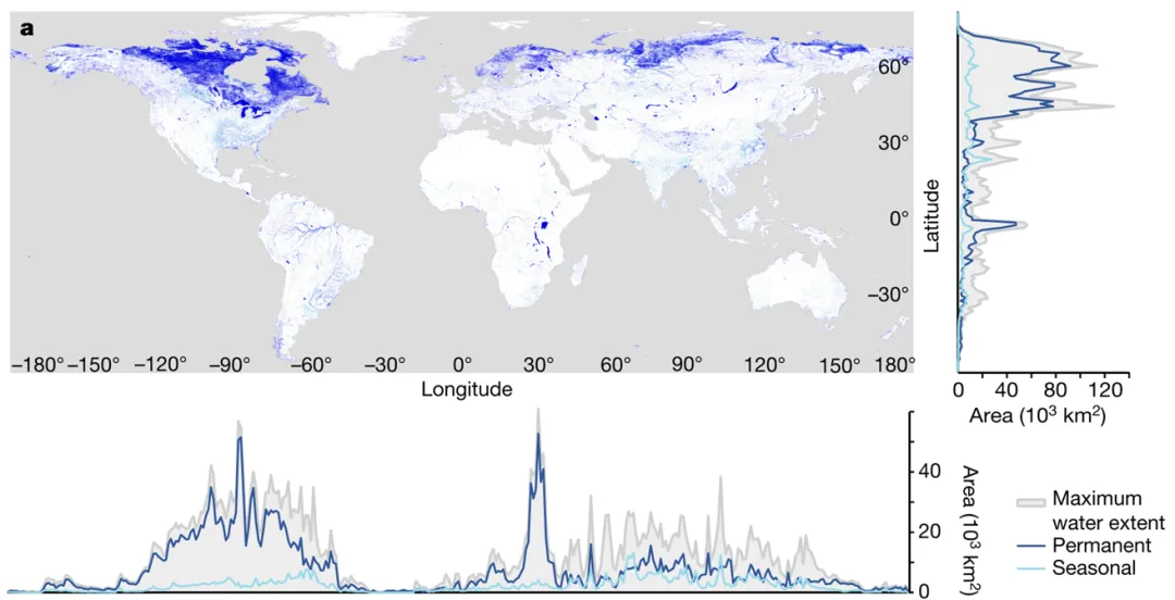
 10个月宝宝每天需要喝多少奶粉?
