期刊图片复现|Python绘制高颜值相关性矩阵图
- 2026-06-28 16:55:29
期刊图片复现|Python绘制高颜值相关性矩阵图

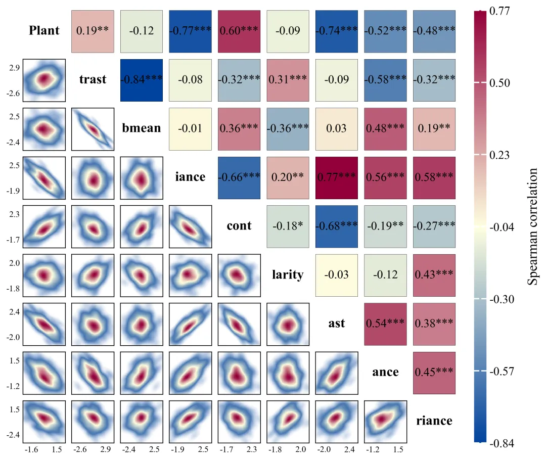
论文:Native nucleosomes intrinsically encode genome organization principles 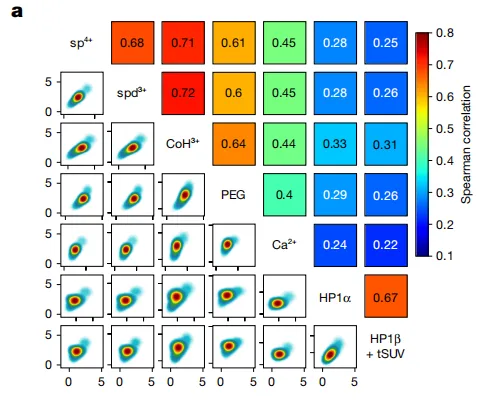
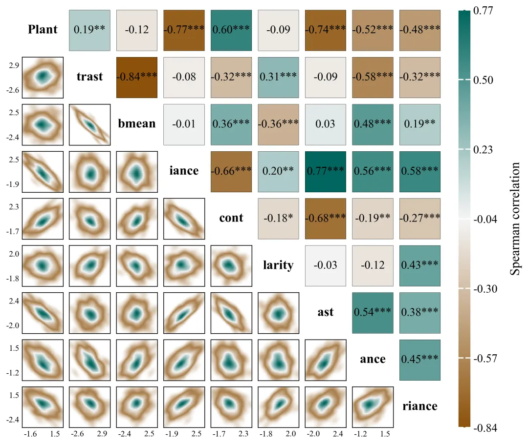
论文原图 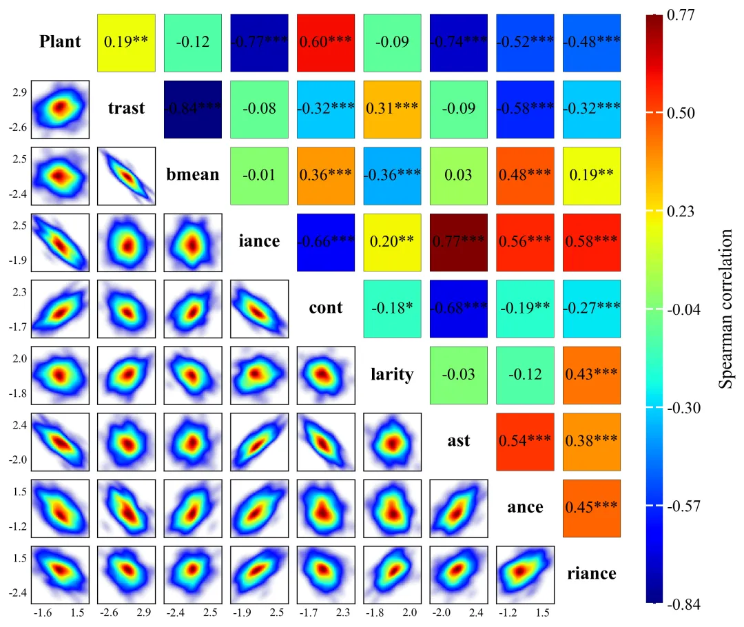
仿图 代码采用Spearman、Pearson、Kendall等三种方法计算多个特征变量之间的相关系数及显著性检验P值,结果图对角线用于标注特征名称,右上角通过映射色块与带星号的数值直观展示相关性强度与显著水平,左下角则利用高斯核密度估计(KDE)绘制出二维密度分布图。 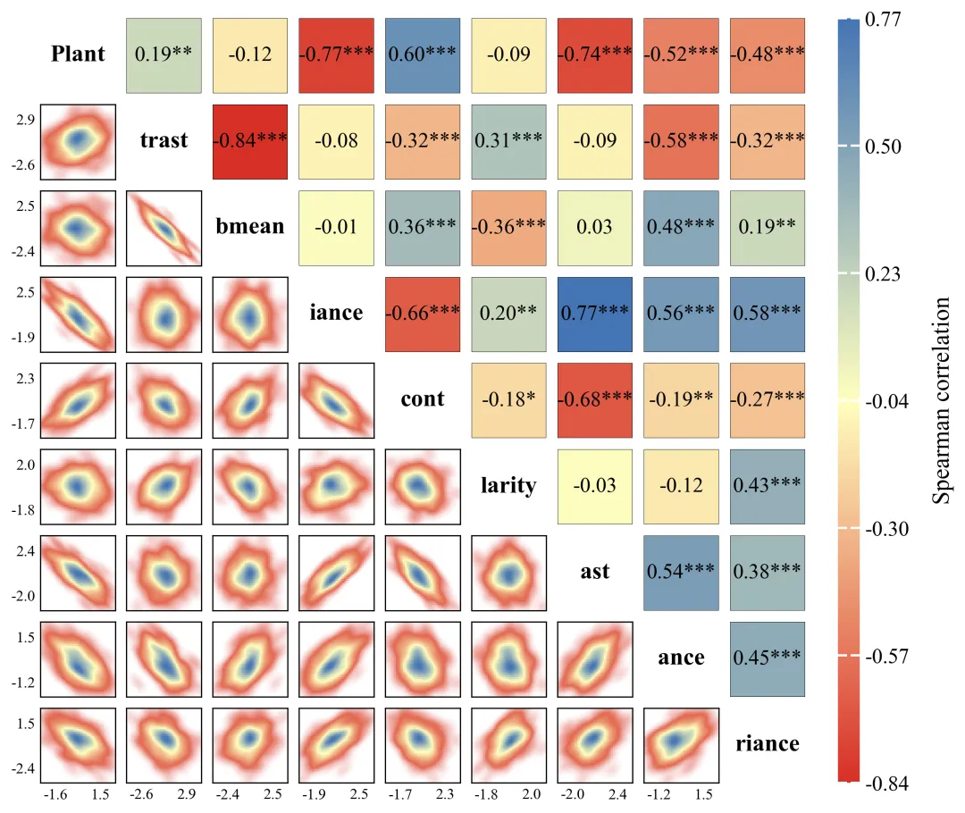
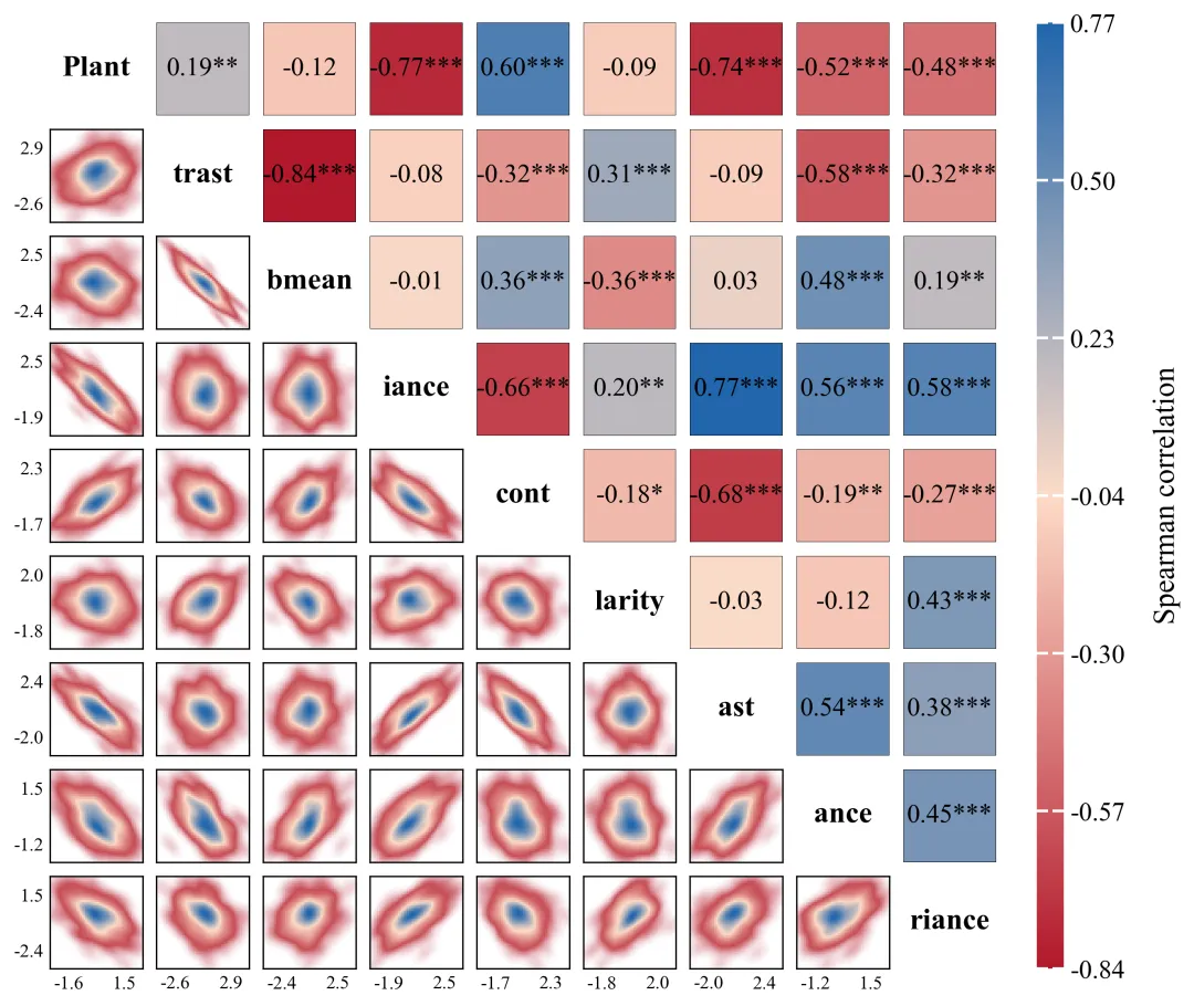
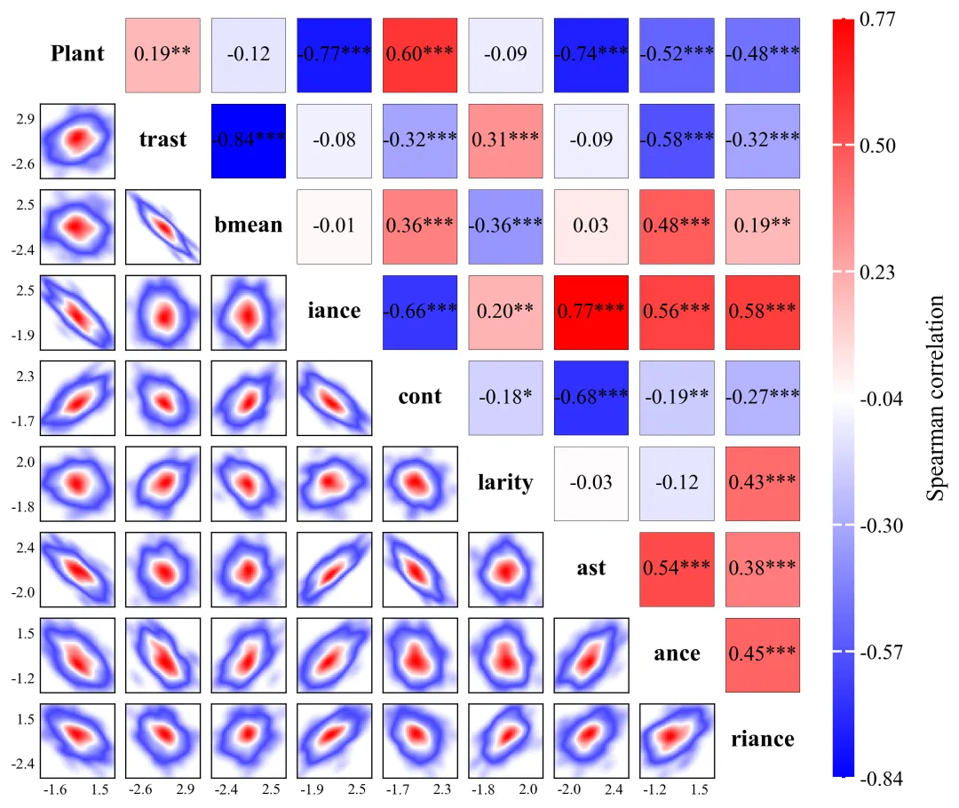
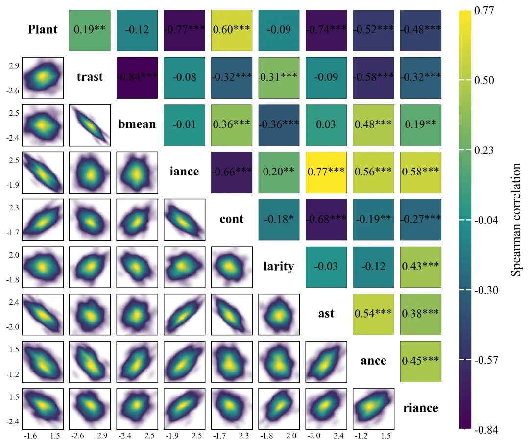
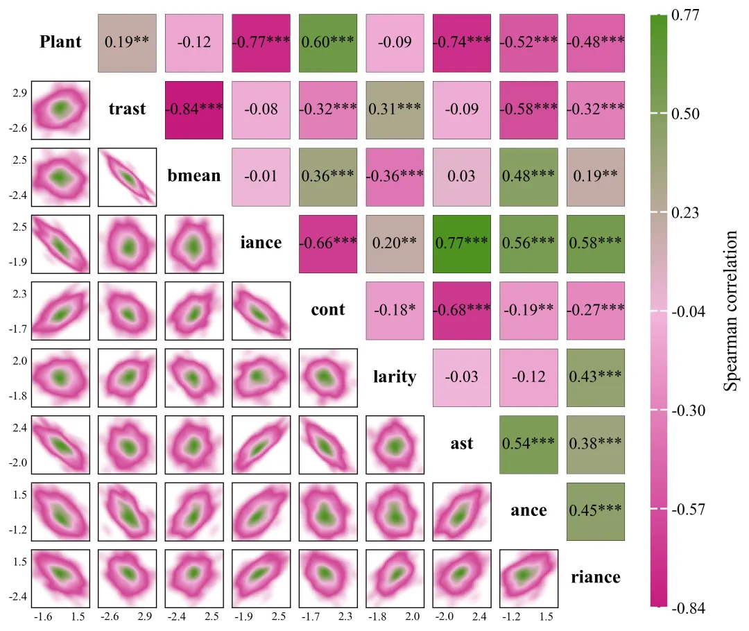
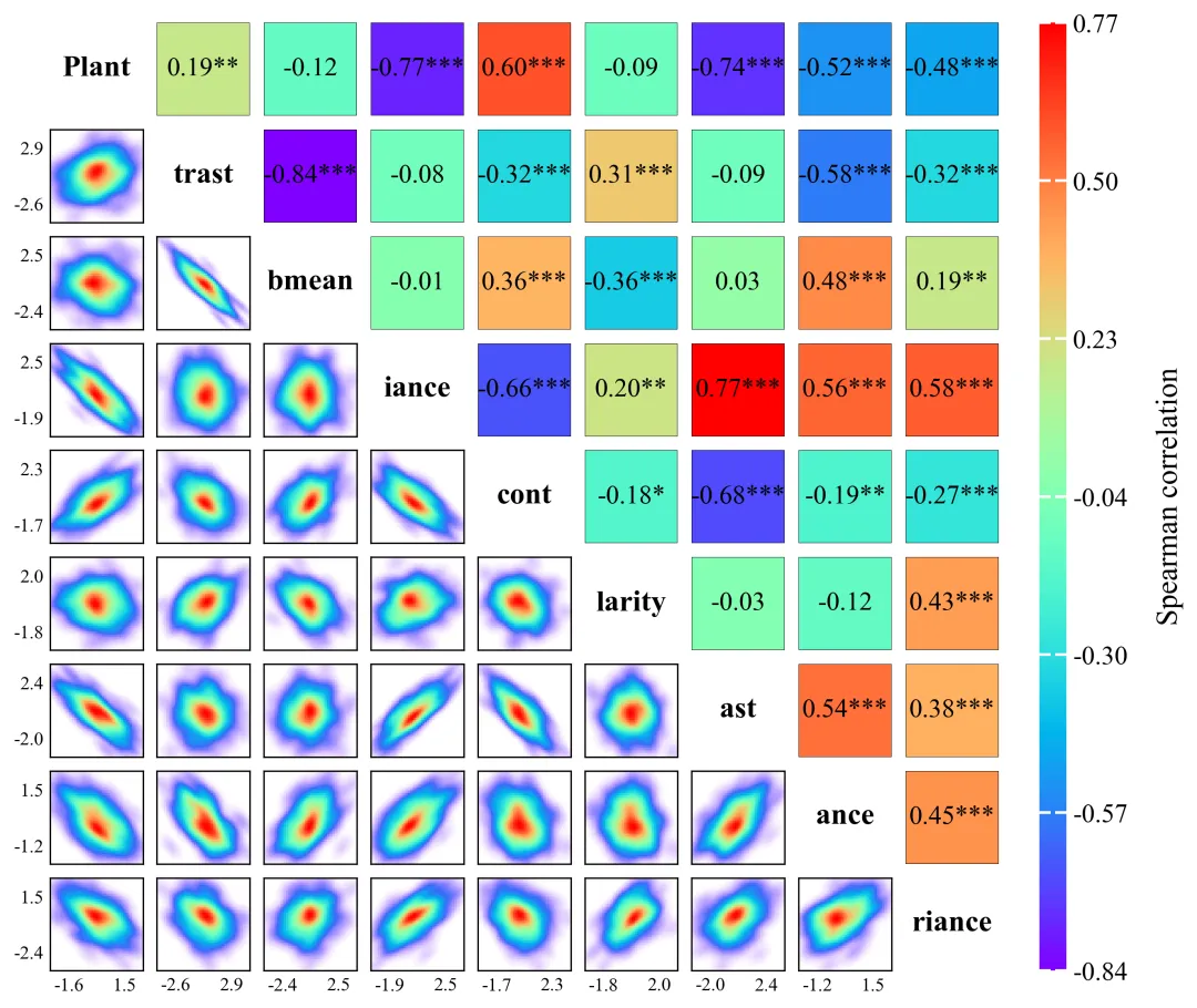
多种配色 


库的导入以及字体设置 

颜色库和方法库的设置,配色方案以及分析方法的选择 

绘图函数:画布创建与布局设置 

绘图函数:对角线设置 

绘图函数:右上角数值标注设置 

绘图函数:左下角核密度图绘制 

绘图函数:颜色条绘制与绘图结果保存 

执行部分 


期刊图片复现|Python绘制二维偏依赖PDP图 期刊复现|python绘制基于SHAP分析和GAM模型拟合的单特征依赖图 期刊图片复现|python绘制带有渐变颜色shap特征重要性组合图(条形图+蜂巢图) 期刊复现|用Python绘制SHAP特征重要性总览图、依赖图、双特征交互效应SHAP图,解锁XGBoost模型的终极奥秘 期刊图片复现|Python绘制shap重要性蜂巢图+单特征依赖图+交互效应强度气泡图+交互效应依赖图(回归+二分类+分类) 

公众号中的所有所有的免费代码都已经下架了,都并入到付费部分里了,付费合集代码和数据的购买通道已经开通,全部合集100元,后续将会持续更新,决定购买请后台私信我,注意只会分享练习数据和代码文件,不会提供答疑服务,代码文件中已经包含了每行代码的完整注释,购买前请确保真的需要!!!
代码绘制成果展示
代码解释
第一部分
# =========================================================================================# ====================================== 1. 环境设置 =======================================# =========================================================================================import numpy as npimport pandas as pdimport matplotlib.pyplot as pltimport matplotlib.colors as mcolors
第二部分
# =========================================================================================# ======================================2.颜色库=======================================# =========================================================================================COLOR_SCHEMES = {1: [],}
第三部分
# =========================================================================================# ======================================4.绘图函数=======================================# =========================================================================================def plot_correlation_matrix():#画布fig, axes = plt.subplots(n_vars, n_vars, figsize=(10, 10))plt.subplots_adjust(left=0.1, #子图左边缘right=0.8, #右边缘bottom=0.1, #下边缘top=0.8, #上边缘wspace=0.15, #水平间距hspace=0.15) #垂直间距
第四部分
# 遍历行for i in range():ax.text(0.5, #X0.5, #Ylabels[i], #变量名称ha='center', #水平va='center', #垂直fontsize=16, #大小fontweight='bold') #加粗
第五部分
#右上角elif i < j:r_val = corr_matrix[i, j] #相关系数p_val = pval_matrix[i, j] #p值color = cmap_bar(norm(r_val)) #依据归一化后的R值映射出具体颜色#设置显著性标记if p_val < 0.001:stars = '***'elif p_val < 0.01:stars = '**'elif p_val < 0.05:stars = '*'else:stars = ''ax.axis('off') #隐藏框线
第六部分
#左下角else:x = df.iloc[:, j].values #提取自变量y = df.iloc[:, i].values #提取因变量x_min_real, x_max_real = x.min(), x.max() #计算当前x轴最小值和最大值y_min_real, y_max_real = y.min(), y.max() #计算当前y轴最小值和最大值x_margin = (x_max_real - x_min_real) * 0.05 #外扩y_margin = (y_max_real - y_min_real) * 0.05 #外扩x_min, x_max = x_min_real - x_margin, x_max_real + x_margin #x轴显示范围y_min, y_max = y_min_real - y_margin, y_max_real + y_margin #y轴显示范围ax.set_xlim(x_min, x_max) #x坐标轴的显示边界ax.set_ylim(y_min, y_max) #y坐标轴的显示边界x_tick_offset = (x_max - x_min) * 0.20 #x坐标轴刻度y_tick_offset = (y_max - y_min) * 0.20 #y坐标轴刻度if j != 0: ax.set_yticklabels([]) # 只要不是左下角第一列,都屏蔽不展示纵坐标文字标签
第七部分
#创建颜色条区域cbar_ax = fig.add_axes([0.83, 0.1, 0.02, 0.7])sm = plt.cm.ScalarMappable(cmap=cmap_bar, norm=norm) #创建可映射的对象#创建颜色条cbar = fig.colorbar(sm, cax=cbar_ax, ticks=ticks_range)cbar.outline.set_visible(False) # 隐去外边框
第八部分
# =========================================================================================# ======================================5.执行部分=======================================# =========================================================================================if __name__ == '__main__':data_path = r'data.xlsx' #原始数据df = pd.read_excel(data_path).dropna() #读取数据labels = df.columns.tolist() #列名称print(labels)color_vmin, color_vmax = -0.84,0.77# 利用这些色彩组建成为一种可以连续线性映射变化的色彩映射规则cmap_bar = mcolors.LinearSegmentedColormap.from_list('custom_cmap', selected_colors)# 将刚才确定的最小值和最大值注册成用于绑定画图着色的归一化规则对象norm = mcolors.Normalize(vmin=color_vmin, vmax=color_vmax)#离散成连续的颜色base_colors = cmap_bar(np.linspace(0, 1, 256))plot_correlation_matrix()
如何应用到你自己的数据
1.设置配色方案:
scheme_id = 60 #要使用的配色方案2.设置分析方法方案:
analysis_method = 1 #选择分析方法3.设置绘图结果的保存路径:
plt.savefig(fr'{scheme_id}.png', dpi=300, bbox_inches='tight')4.设置原始数据路径:
data_path = r'data.xlsx' #原始数据5.设置范围:
color_vmin, color_vmax = -0.84,0.77推荐
获取方式
本文来自网友投稿或网络内容,如有侵犯您的权益请联系我们删除,联系邮箱:wyl860211@qq.com 。
随机文章
-
 10个月宝宝每天需要喝多少奶粉?
- 《Python 从入门到精通》017 | 类型转换:什么时候要用 int()、float()、str()
- Pywebview:用 Python + Web 技术构建炫酷桌面应用
- 耗时 2 天,搭建了一个完整的 Python 知识库~
- Python Matplotlib绘制两个信号的相干性图
- 30个Python核心语法合集
- 每周一课丨计算机等级考试二级python一课通(2026版)
- 基于 Python 实现 Excel 报表自动化,重复工作 100% 解放双手
- 谁懂!刚学 Linux 的时候被一堆命令搞懵..
- 这个网站让我对python自动化的兴趣瞬间达到了1000000%
- python代码做出哪些酷炫的事情?
