期刊图片复现|Python绘制圆环状火柴棒图+热图组合图
- 2026-10-11 07:53:49
期刊图片复现|Python绘制圆环状火柴棒图+热图组合图

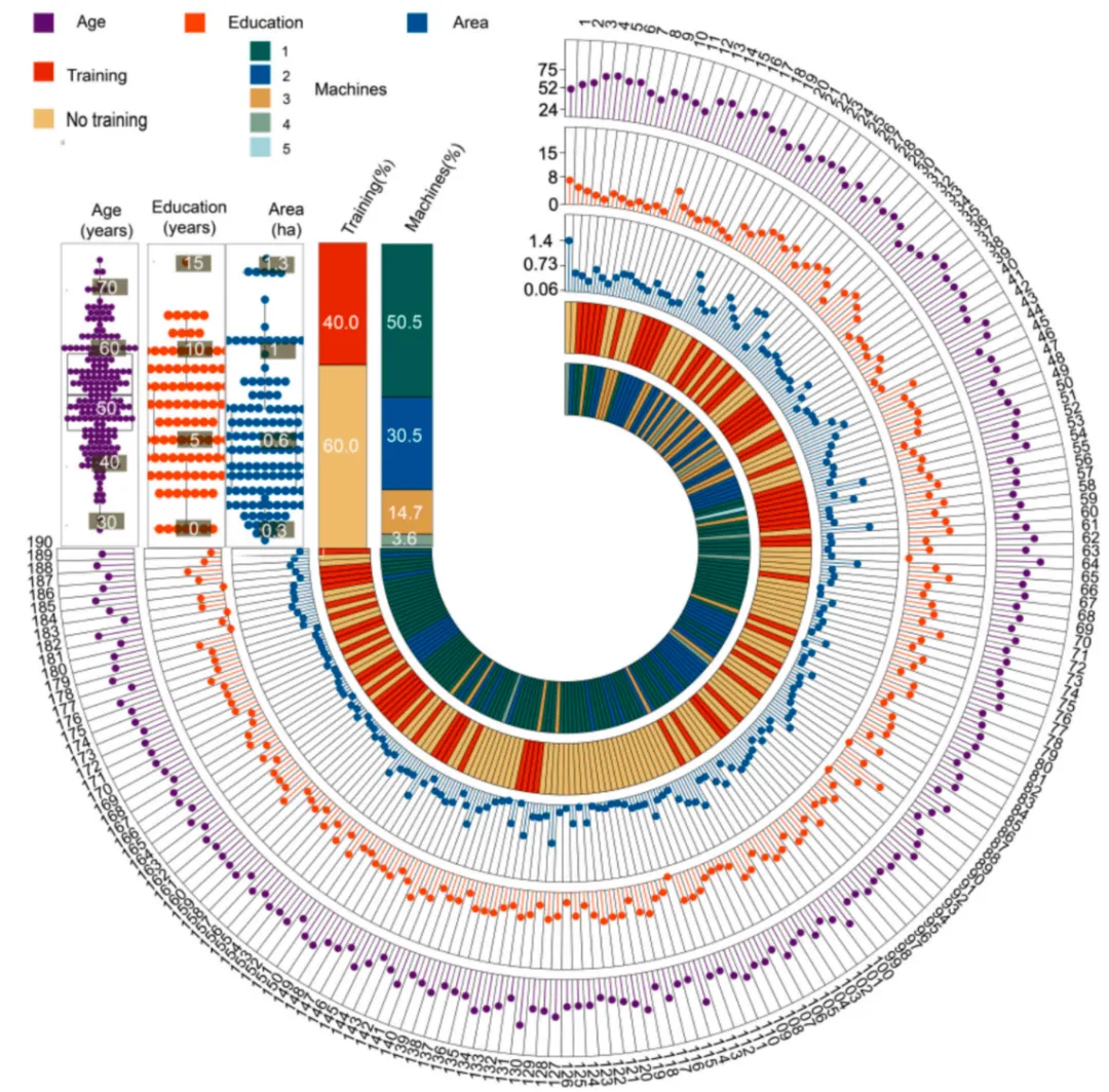
论文原图 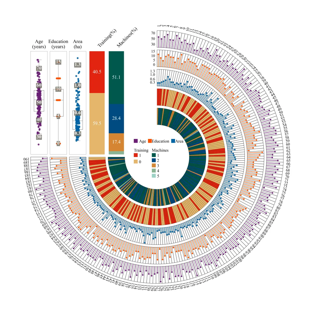
此图最外围的数字代表每一个独立样本的ID编号;外侧的三层火柴棒图分别展示了各个样本在“Age”、“Education”和“Area”三个连续型变量上的具体数值,线段越长代表数值越大,环的起始切口处附有对应的刻度;最内侧的两层实心扇形色环则通过不同的颜色映射,直观展现了对应样本在“Training”和“Machines”这两个分类变量上的归属情况。在图左上角的留白区域,内嵌了五组全局统计子图,其中三个结合了抖动散点的透明箱线图,详细剖析了“Age”、“Education”和“Area”三个连续变量在整体数据中的集中趋势、离散程度及分布极值(背景带有带状刻度标签);其右侧的两个带有具体数值标注的堆叠柱状图,则精准统计并展示了“Training”和“Machines”在总样本中所占的百分比比例;最后,位于圆环内部中心处的图例,为所有连续变量颜色及分类标签提供了颜色对照基准。 仿图 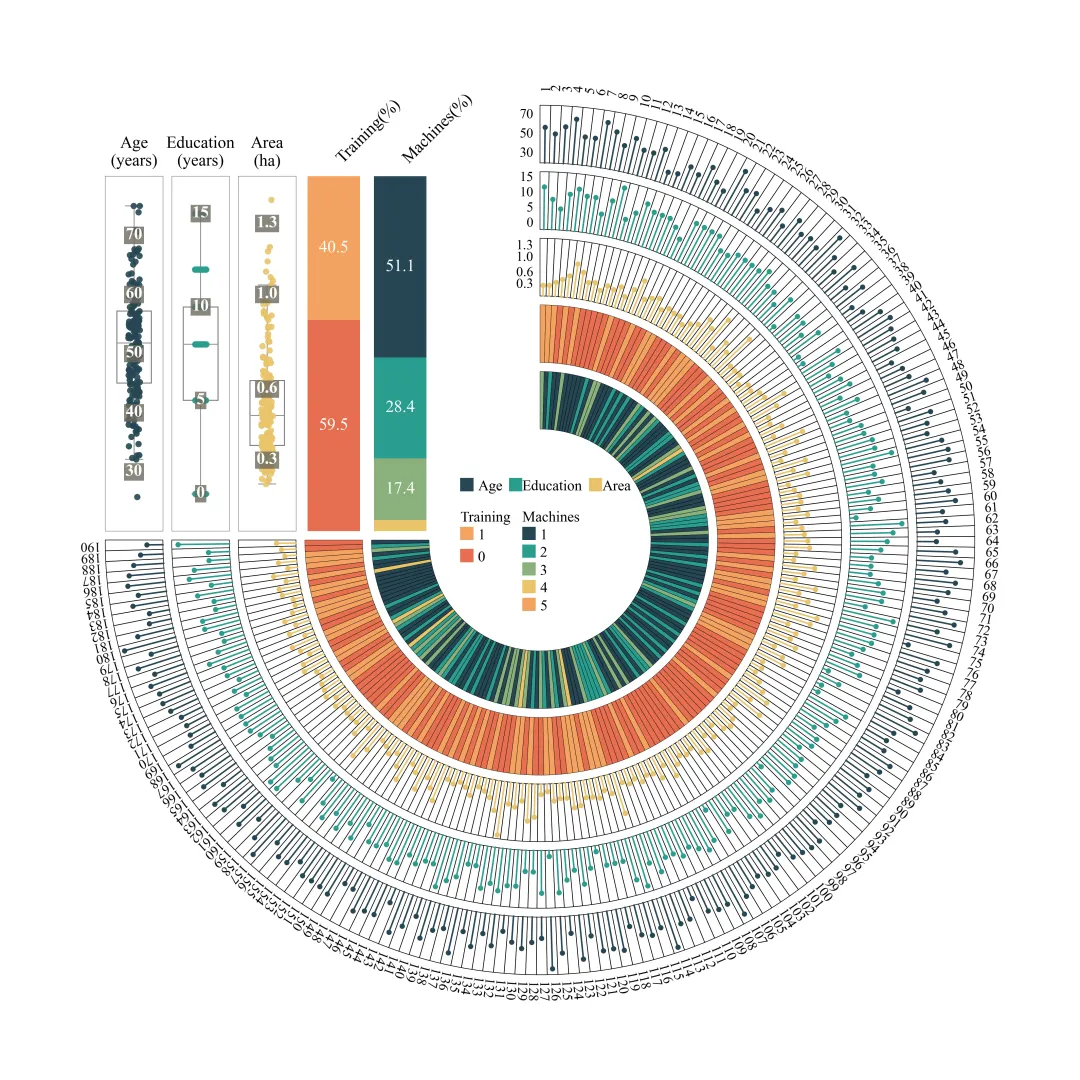

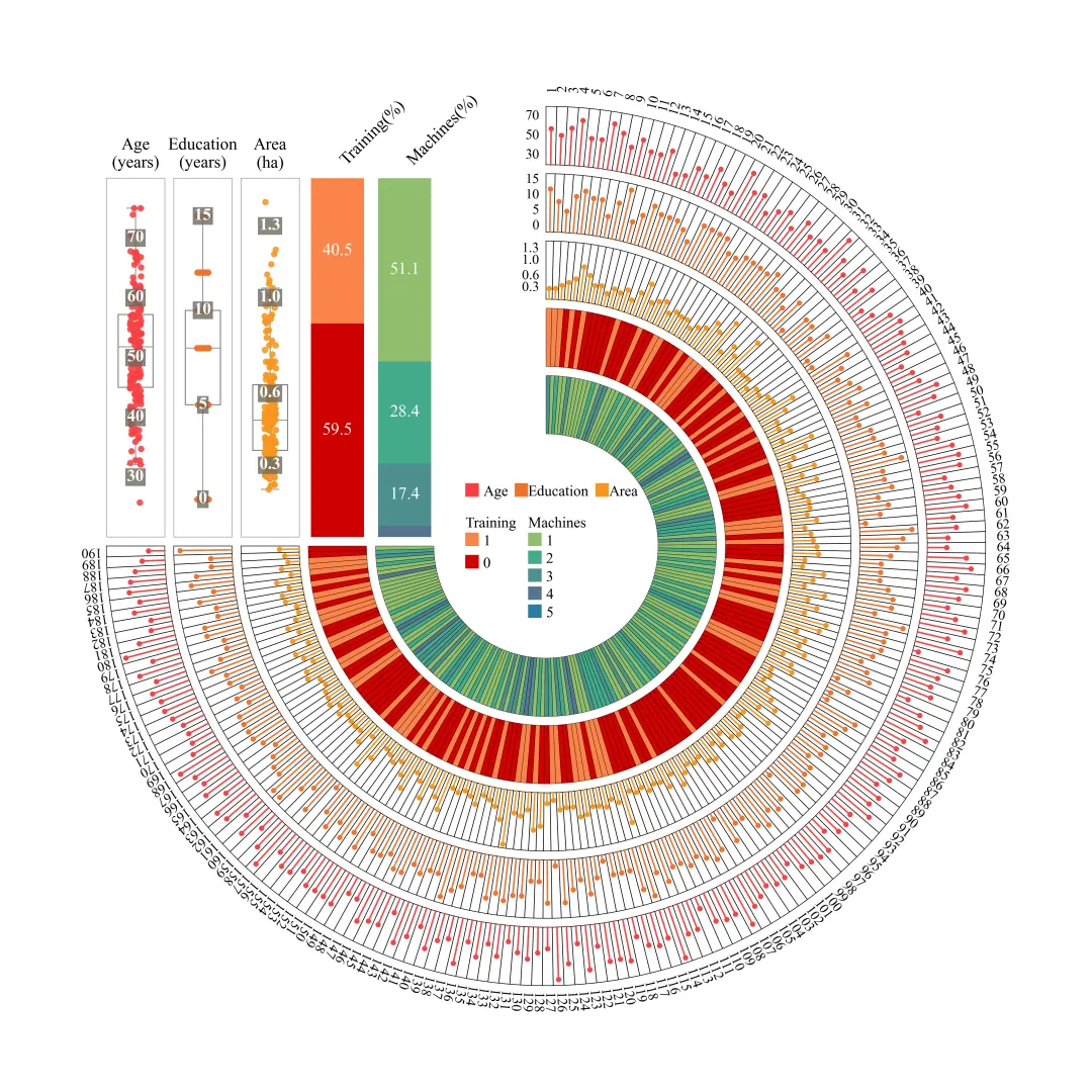
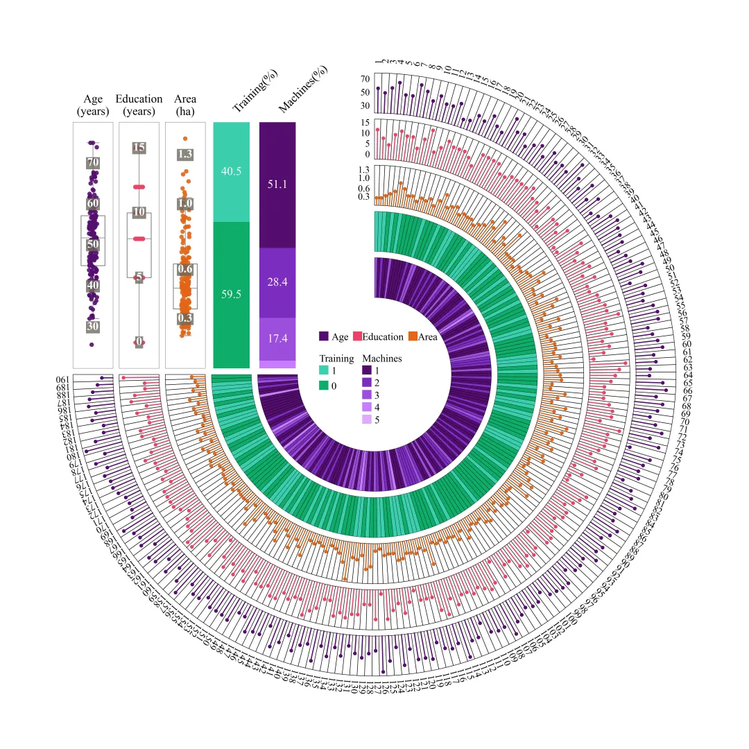
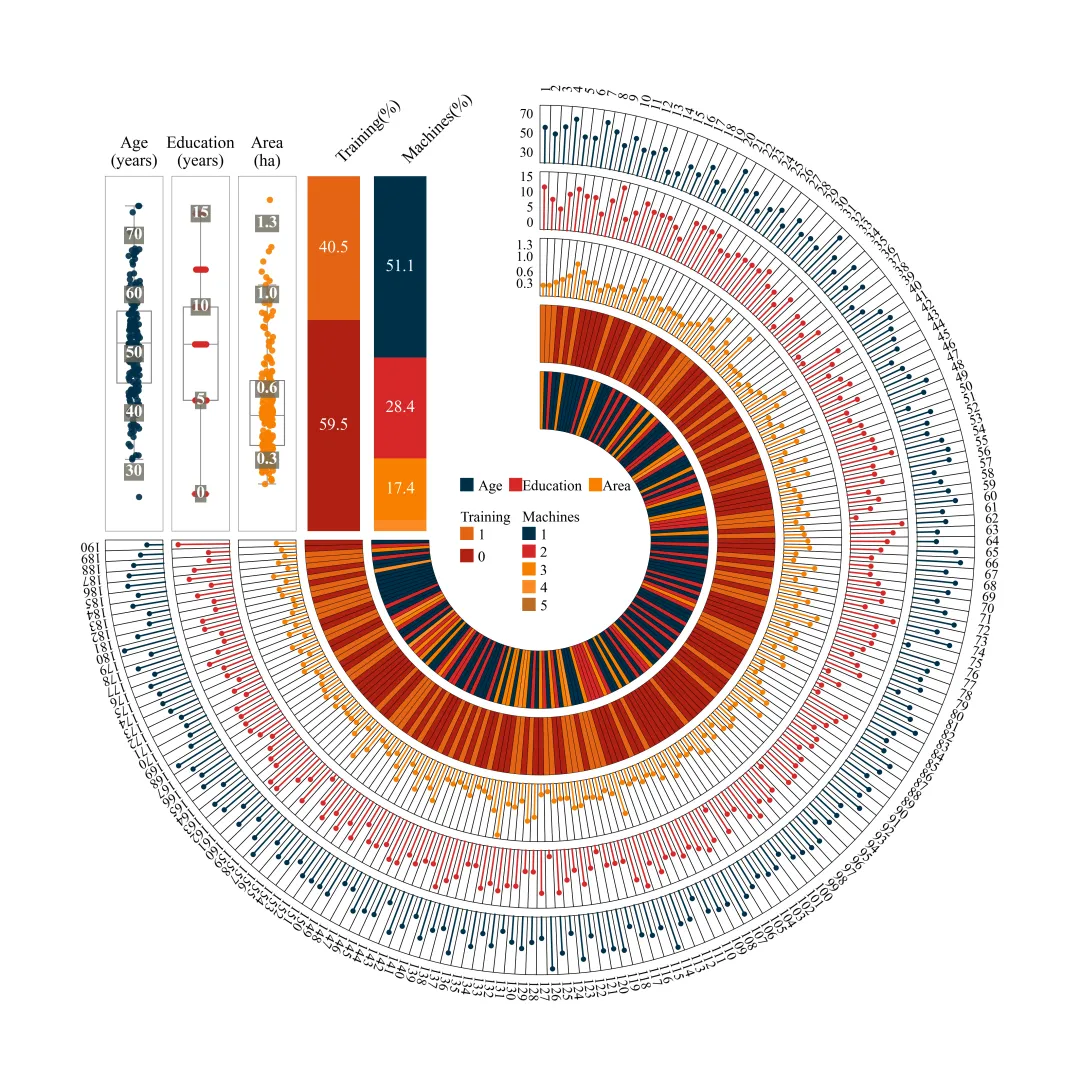
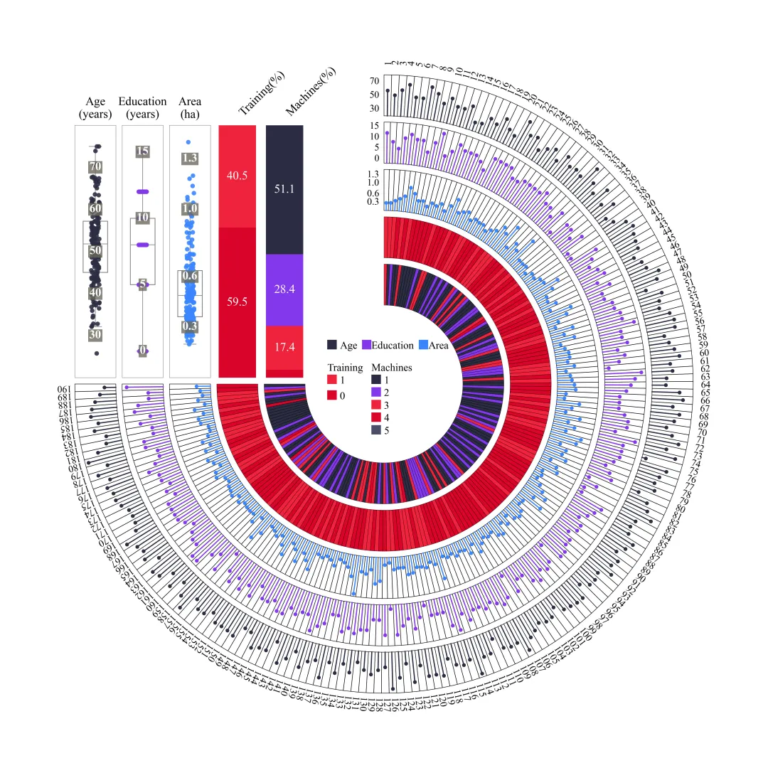

多种配色 



库的导入以及字体设置 

颜色库 

绘图函数:配色方案提取,主画布创建,圆环半径、角度等设计 

绘图函数:绘制内侧的两个分类型热图的扇形色块 

绘图函数:绘制外侧3层连续型数值数据的火柴棒图 

绘图函数:遍历绘制出最外圈的标注 

绘图函数:绘制左上角的箱线图+散点图的组合图 

绘图函数:绘制左上角堆叠柱状图 

绘图函数:绘制自定义的图例以及绘图结果保存 

绘图函数:绘制自定义的图例以及绘图结果保存 



期刊图片复现|Python绘制二维偏依赖PDP图 期刊复现|python绘制基于SHAP分析和GAM模型拟合的单特征依赖图 期刊图片复现|python绘制带有渐变颜色shap特征重要性组合图(条形图+蜂巢图) 期刊复现|用Python绘制SHAP特征重要性总览图、依赖图、双特征交互效应SHAP图,解锁XGBoost模型的终极奥秘 期刊图片复现|Python绘制shap重要性蜂巢图+单特征依赖图+交互效应强度气泡图+交互效应依赖图(回归+二分类+分类) 

公众号中的所有所有的免费代码都已经下架了,都并入到付费部分里了,付费合集代码和数据的购买通道已经开通,全部合集100元,后续将会持续更新,决定购买请后台私信我,注意只会分享练习数据和代码文件,不会提供答疑服务,代码文件中已经包含了每行代码的完整注释,购买前请确保真的需要!!!
代码绘制成果展示
论文:Closing maize yield gaps in North China plain: Based on plot-scale farmer survey and simulation
代码解释
第一部分
# =========================================================================================# ====================================== 1. 环境设置 =======================================# =========================================================================================import numpy as npimport pandas as pdimport matplotlib.pyplot as plt
第二部分
# =========================================================================================# ======================================2.颜色库=======================================# =========================================================================================color_schemes = {1: {'Age': '#691F73', 'Education': '#FF5000', 'Area': '#0062A5', 'Train_Yes': '#E22510', 'Train_No': '#E4B66B','Mach_1': '#00584D', }
第三部分
# =========================================================================================# ======================================3.绘图函数=======================================# =========================================================================================def create_plot(df, n, scheme_id=1, ring_thickness=0.8, ring_gap=0.2):colors = color_schemes.get(scheme_id, color_schemes[1]) #提取配色方案#创建画布fig = plt.figure(figsize=(14, 14), facecolor='white')ax = fig.add_axes([0, 0, 1, 1]) #添加轴ax.set_aspect('equal') #设置x轴和y轴的比例一致ax.axis('off') #关闭坐标轴线条、刻度和标签total_radians = 1.5 * np.pi #圆环站的角度d_theta = total_radians / n #每个样本的角度区间大小thetas = np.linspace(np.pi / 2 - d_theta / 2, -np.pi + d_theta / 2, n) #所有样本中心角度
第四部分
#扇形色块的绘制函数def draw_wedge(ax, r_in, r_out, t_start, t_end, color):ax.fill(x, #xy, #ycolor=color, #填颜色edgecolor='black', #边框色lw=0.3) #边框线宽draw_wedge(ax, rings['Machines'][0], rings['Machines'][1], t_start, t_end, m_col)t_col = colors['Train_Yes'] if df['Training'].iloc[i] == 1 else colors['Train_No'] #映射颜色#绘制第二层扇形色块draw_wedge(ax, rings['Training'][0], rings['Training'][1], t_start, t_end, t_col)
第五部分
#遍历外层火柴棒环名称、数据列名、数据范围和刻度信息for ring_name, data_col, v_lims, ring_ticks in zip(['Area', 'Education', 'Age'], #圆环名['Area', 'Education', 'Age'], #数据列名[(0, 1.5), (-2, 17), (20, 80)], #数据范围#刻度值[[0.3, 0.6, 1.0, 1.3],[0, 5, 10, 15],[30, 50, 70]]):ax.plot(x_box, #xy_box, #ycolor='black', #颜色lw=0.6, #线宽zorder=0) #层val = df[data_col].iloc[i] #提取当前样本在该指标下的具体数值r_val = r_in + (val - v_lims[0]) / (v_lims[1] - v_lims[0]) * (r_out - r_in) #将该数值映射到该圆环内的特定半径上#绘制火柴棒线部分ax.plot([r_in * np.cos(t_center), r_val * np.cos(t_center)], #x[r_in * np.sin(t_center), r_val * np.sin(t_center)], #ycolor=colors[ring_name], #颜色lw=1.5, #线宽zorder=1) #层#点部分ax.plot(r_val * np.cos(t_center), #xr_val * np.sin(t_center), #y'o', #样式color=colors[ring_name], #颜色markersize=4, #大小zorder=2) #层
第六部分
text_radius = rings['Age'][1] + 0.4 #外圈文本标注半径#遍历所有样本数据添加ID文本ax.text(x_text, #xy_text, #ystr(df['ID'].iloc[i]), #文本rotation=rot_deg, #旋转ha='center', #水平va='center', #垂直fontsize=13) #字体大小
第七部分
#箱型图和散点图组合图绘制函数def create_vertical_swarm(ax_sub, data, color, title, unit, ylim, ticks):ax_sub.set_ylim(ylim) #y轴范围#标题ax_sub.set_title(f"{title}\n({unit})",fontsize=16,pad=10)ax_sub.set_xticks([]) #隐藏x轴刻度ax_sub.set_yticks([]) #隐藏y轴刻度ax_sub.set_ylabel('') #y轴标题#设置边框for spine in ax_sub.spines.values():spine.set_color('gray') #颜色spine.set_linewidth(0.5) #宽度zorder=3, #层#背景框属性bbox=dict(facecolor='#6d6a5d', #背景颜色edgecolor='none', #背景框线pad=1.5, #背景框的内边距alpha=0.8)) #透明度#创建Age箱线图轴ax_age = ax.inset_axes([-rings['Age'][1], #x0.2, #yring_thickness, 8.0], #宽度高度transform=ax.transData) #坐标系#绘制create_vertical_swarm(ax_age, #轴df['Age'], #数据colors['Age'], #颜色'Age', #标题'years', #单位[20, 80], #y轴范围[30, 40, 50, 60, 70]) #刻度#Educationax_edu = ax.inset_axes([-rings['Education'][1], 0.2, ring_thickness,8.0],transform=ax.transData)create_vertical_swarm(ax_edu, df['Education'],colors['Education'], 'Education', 'years',[-2, 17],[0, 5, 10, 15])ax_area = ax.inset_axes([-rings['Area'][1],0.2,ring_thickness, 8.0],transform=ax.transData)create_vertical_swarm(ax_area,df['Area'],colors['Area'], 'Area','ha', [0, 1.5],[0.3, 0.6, 1.0, 1.3])
第八部分
ax_train = ax.inset_axes([-rings['Training'][1],0.2, ring_thickness,8.0],transform=ax.transData)train_counts = df['Training'].value_counts(normalize=True) * 100 #转换为百分数t_0 = train_counts.get(0, 0) #0的百分比t_1 = train_counts.get(1, 0) #1的百分比if t_1 > 5:ax_train.text(0, #xt_0 + t_1 / 2, #yf"{t_1:.1f}", #文本ha='center', #水平va='center', #垂直color='white', #颜色fontsize=16) #大小#标题ax_train.set_title("Training(%)", #文本rotation=45, #旋转ha='left', #水平y=1.02, #yfontsize=16) #大小ax_train.axis('off') #去掉边框与轴线ax_train.set_ylim(0, 100) #y轴范围#插入子图轴ax_mach = ax.inset_axes([-rings['Machines'][1], 0.2, ring_thickness, 8.0], transform=ax.transData)mach_counts = df['Machines'].value_counts(normalize=True) * 100 #百分比btm += p #更新#标题ax_mach.set_title("Machines(%)", #文本rotation=45, #旋转ha='left', #水平y=1.02, #yfontsize=16) #大小ax_mach.axis('off') #去掉边框、坐标刻度ax_mach.set_ylim(0, 100) #y轴范围
第九部分
ax_leg = ax.inset_axes([-1.8, -1.5, 3.6, 3.0], transform=ax.transData) #图例轴ax_leg.axis('off') #去掉轴显示ax_leg.set_xlim(0, 3.6) #x范围ax_leg.set_ylim(0, 3.0) #y范围 facecolor=colors['Age'])) #填充色#ax_leg.text(0.4, #x2.7, #y'Age', #文本va='center', #垂直fontsize=14) #大小ax_leg.add_patch(Rectangle((0.0, 1.0),w,h, facecolor=colors['Train_No']))ax_leg.text(0.4,1.1,'0',va='center',fontsize=14)ax_leg.text(1.4,2.0,'Machines',va='center',fontsize=14)#配置颜色m_list = [colors['Mach_1'],colors['Mach_2'],colors['Mach_3'],colors['Mach_4'],]
第十部分
# =========================================================================================# ======================================4.执行部分=======================================# =========================================================================================if __name__ == "__main__":RING_THICKNESS = 1.3 #圆环厚度RING_GAP = 0.2 #圆环间隔df_real_data = pd.read_excel(r'data.xlsx') #读取数据n = len(df_real_data) #样本数用于划分圆环区域#设置是否批量绘图plot_all = Trueif plot_all:for i in color_schemes.keys():create_plot(df_real_data, n, scheme_id=i, ring_thickness=RING_THICKNESS,ring_gap=RING_GAP)else:TARGET_SCHEME = 1create_plot(df_real_data, n, scheme_id=TARGET_SCHEME, ring_thickness=RING_THICKNESS,ring_gap=RING_GAP)
如何应用到你自己的数据
1.设置原始数据的保存路径,执行部分:
df_real_data = pd.read_excel(r'data.xlsx') #读取数据2.提取热图部分数据映射颜色,绘图函数部分:
m_col = [colors['Mach_1'], colors['Mach_2'], colors['Mach_3'], colors['Mach_4']][df['Machines'].iloc[i] - 1] 3.定义连续型数据列名,绘图函数部分:
['Area', 'Education', 'Age'], #数据列名4.定义绘图结果的保存地址,绘图函数部分:
plt.savefig(fr'plot_{scheme_id}.png', dpi=300,bbox_inches='tight')推荐
获取方式
本文来自网友投稿或网络内容,如有侵犯您的权益请联系我们删除,联系邮箱:596563534@qq.com 。
随机文章
-
 10个月宝宝每天需要喝多少奶粉?
- 深度学习 Python 配置方法对比(Config/argparse/simple-parsing/Pydantic/OmegaConf)
- 难怪都说GitHub是学Python的天堂
- 24.Python实战__判断“回文数”
- 3. 用Python+大模型分析用户评论:自动提取情绪与高频问题
- Python基础笔记4——进制与分支
- 中南大学的大佬终于把Python做成了APP!!
- Python3.15进入功能冻结阶段首个测试版发布
- Python 数据分析 列表字典解析 + 批量字段拆分
- 专业书推荐|5本Python必看好书,看完少走一半弯路
- 想学设计模式但觉得和Python无关?用Python重写23种经典模式里的6个常见模式,码感直接拉升一个水准