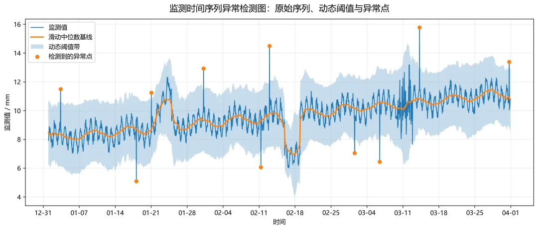
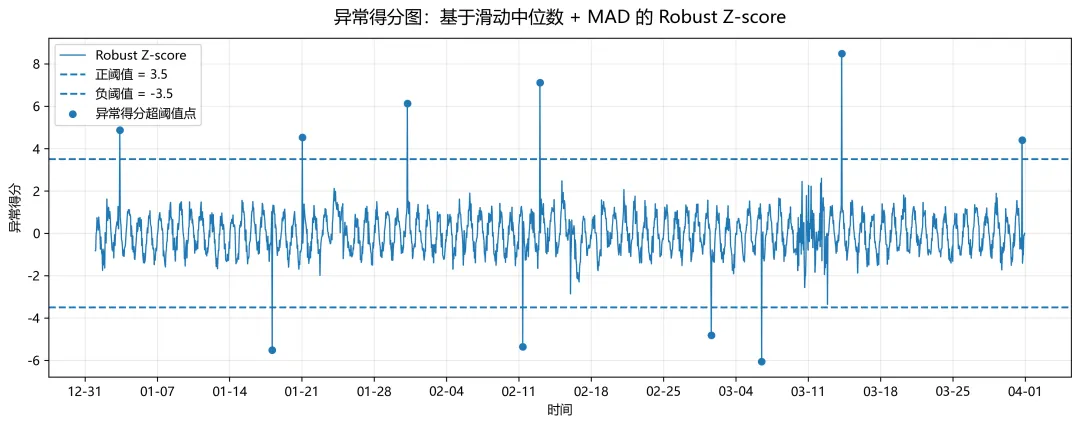
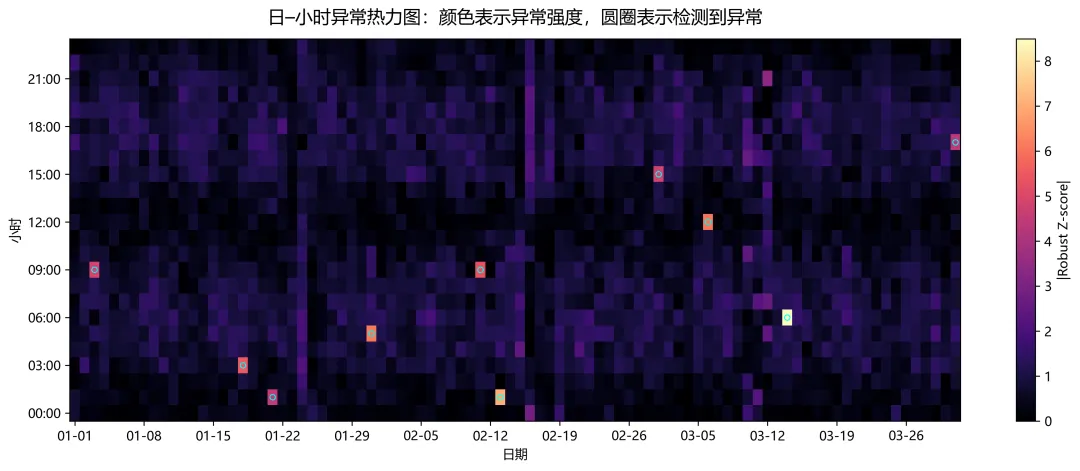
import osimport numpy as npimport pandas as pdimport matplotlib.pyplot as pltimport matplotlib.dates as mdatesnp.random.seed(2026)plt.rcParams["font.sans-serif"] = ["Microsoft YaHei", "SimHei", "Arial Unicode MS", "DejaVu Sans"]plt.rcParams["axes.unicode_minus"] = Falseplt.rcParams["figure.dpi"] = 150plt.rcParams["savefig.dpi"] = 300out_dir = "time_series_anomaly_figures"os.makedirs(out_dir, exist_ok=True)# 构造模拟监测数据 这里假设是“位移监测值(mm)”n_days = 90freq = "H" # 每小时一条time_index = pd.date_range("2025-01-01 00:00:00", periods=24 * n_days, freq=freq)t = np.arange(len(time_index))# 基础成分:长期缓慢趋势 + 日周期 + 周周期 + 随机噪声trend = 8.0 + 0.0015 * tdaily_cycle = 0.65 * np.sin(2 * np.pi * t / 24)weekly_cycle = 0.40 * np.sin(2 * np.pi * t / (24 * 7))noise = np.random.normal(0, 0.18, size=len(t))value = trend + daily_cycle + weekly_cycle + noise# 加入异常spike_idx = np.random.choice(len(t), size=10, replace=False)spike_amp = np.random.choice([2.8, -2.8, 3.5, -3.5, 4.2, -4.2], size=10)value[spike_idx] += spike_ampdrift_start = 24 * 20drift_end = 24 * 24value[drift_start:drift_end] += np.linspace(0, 2.8, drift_end - drift_start)step_start = 24 * 46step_end = 24 * 49value[step_start:step_end] -= 2.5vol_start = 24 * 68vol_end = 24 * 71value[vol_start:vol_end] += np.random.normal(0, 0.95, size=vol_end - vol_start)df = pd.DataFrame({ "time": time_index, "value": value}).set_index("time")# 稳健异常检测window = 72 # 72小时窗口,约3天threshold = 3.5df["baseline"] = df["value"].rolling(window=window, center=True, min_periods=24).median()df["residual"] = df["value"] - df["baseline"]abs_res = df["residual"].abs()df["mad"] = abs_res.rolling(window=window, center=True, min_periods=24).median()df["mad"] = df["mad"].replace(0, np.nan)df["mad"] = df["mad"].bfill().ffill()df["robust_sigma"] = 1.4826 * df["mad"]df["robust_z"] = df["residual"] / df["robust_sigma"]df["upper"] = df["baseline"] + threshold * df["robust_sigma"]df["lower"] = df["baseline"] - threshold * df["robust_sigma"]df["anomaly"] = df["robust_z"].abs() > threshold# 方便后面热力图使用df["date"] = df.index.datedf["hour"] = df.index.hourdf["abs_score"] = df["robust_z"].abs()df.to_csv(os.path.join(out_dir, "simulated_monitoring_data_with_anomaly_score.csv"), encoding="utf-8-sig")# 图1:原始时间序列 + 动态阈值带 + 异常点fig, ax = plt.subplots(figsize=(12, 5.2))ax.plot(df.index, df["value"], linewidth=1.2, label="监测值")ax.plot(df.index, df["baseline"], linewidth=2.0, label="滑动中位数基线")ax.fill_between(df.index, df["lower"], df["upper"], alpha=0.25, label="动态阈值带")anomaly_df = df[df["anomaly"]]ax.scatter(anomaly_df.index, anomaly_df["value"], s=30, zorder=5, label="检测到的异常点")ax.set_title("监测时间序列异常检测图:原始序列、动态阈值与异常点", fontsize=14, pad=12)ax.set_xlabel("时间")ax.set_ylabel("监测值 / mm")ax.grid(alpha=0.25)ax.legend(frameon=True, loc="upper left")ax.xaxis.set_major_locator(mdates.WeekdayLocator(interval=1))ax.xaxis.set_major_formatter(mdates.DateFormatter("%m-%d"))plt.setp(ax.get_xticklabels(), rotation=0)plt.tight_layout()plt.savefig(os.path.join(out_dir, "01_time_series_dynamic_threshold.png"), bbox_inches="tight")# (Robust Z-score)fig, ax = plt.subplots(figsize=(12, 4.8))ax.plot(df.index, df["robust_z"], linewidth=1.0, label="Robust Z-score")ax.axhline(threshold, linestyle="--", linewidth=1.5, label=f"正阈值 = {threshold}")ax.axhline(-threshold, linestyle="--", linewidth=1.5, label=f"负阈值 = -{threshold}")ax.scatter(anomaly_df.index, anomaly_df["robust_z"], s=26, zorder=5, label="异常得分超阈值点")ax.fill_between( df.index, df["robust_z"], threshold, where=df["robust_z"] > threshold, alpha=0.25, interpolate=True)ax.fill_between( df.index, df["robust_z"], -threshold, where=df["robust_z"] < -threshold, alpha=0.25, interpolate=True)ax.set_title("异常得分图:基于滑动中位数 + MAD 的 Robust Z-score", fontsize=14, pad=12)ax.set_xlabel("时间")ax.set_ylabel("异常得分")ax.grid(alpha=0.25)ax.legend(frameon=True, loc="upper left")ax.xaxis.set_major_locator(mdates.WeekdayLocator(interval=1))ax.xaxis.set_major_formatter(mdates.DateFormatter("%m-%d"))plt.setp(ax.get_xticklabels(), rotation=0)plt.tight_layout()plt.savefig(os.path.join(out_dir, "02_robust_zscore_anomaly_plot.png"), bbox_inches="tight")# 日-小时异常热力图heatmap_data = df.pivot_table(index="hour", columns="date", values="abs_score", aggfunc="mean")heatmap_flag = df.pivot_table(index="hour", columns="date", values="anomaly", aggfunc="max")fig, ax = plt.subplots(figsize=(13, 5.2))im = ax.imshow( heatmap_data.values, origin="lower", aspect="auto", cmap="magma")# 叠加异常位置标记flag_y, flag_x = np.where(heatmap_flag.values == 1)ax.scatter(flag_x, flag_y, s=18, facecolors="none", edgecolors="cyan", linewidths=0.8)# x轴日期标签稀疏显示date_labels = [str(d)[5:] for d in heatmap_data.columns]xticks = np.arange(0, len(date_labels), 7)ax.set_xticks(xticks)ax.set_xticklabels([date_labels[i] for i in xticks], rotation=0)ax.set_yticks(np.arange(0, 24, 3))ax.set_yticklabels([f"{h:02d}:00" for h in range(0, 24, 3)])ax.set_title("日–小时异常热力图:颜色表示异常强度,圆圈表示检测到异常", fontsize=14, pad=12)ax.set_xlabel("日期")ax.set_ylabel("小时")cbar = plt.colorbar(im, ax=ax)cbar.set_label("|Robust Z-score|")plt.tight_layout()plt.savefig(os.path.join(out_dir, "03_day_hour_anomaly_heatmap.png"), bbox_inches="tight")

 10个月宝宝每天需要喝多少奶粉?
