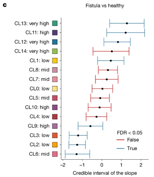
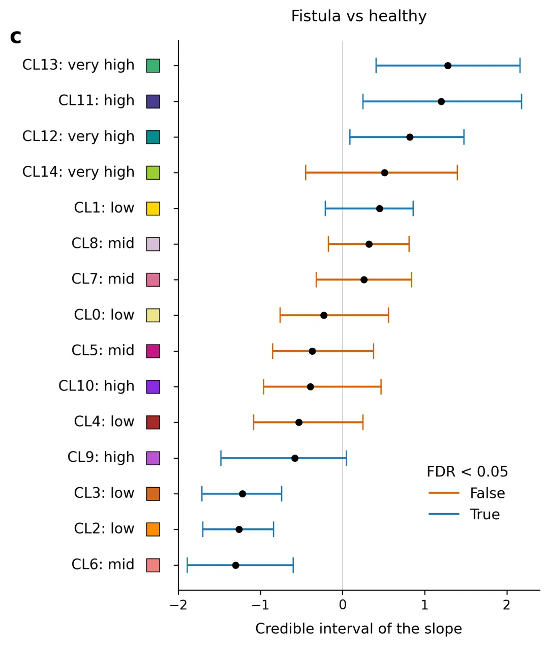
import osimport numpy as npimport pandas as pdimport matplotlib.pyplot as plt# 1. 自动创建图表目标文件夹output_dir = "图表"os.makedirs(output_dir, exist_ok=True)# 2. 读取本地 data.xlsx 数据excel_filename = "data.xlsx"if not os.path.exists(excel_filename): raise FileNotFoundError(f"未找到数据文件:'{excel_filename}',请确保该 Excel 文件放置在与本脚本相同的目录下。")print(f"正在从 {excel_filename} 读取数据...")excel_df = pd.read_excel(excel_filename)# 3. 解析并提取绘图字段参数clusters = excel_df["Cluster"].tolist()levels = excel_df["Abundance Level"].tolist()mean_slope = excel_df["Mean Slope"].to_numpy()ci_lower = excel_df["95% CI Lower"].to_numpy()ci_upper = excel_df["95% CI Upper"].to_numpy()color_hex = excel_df["Cluster Color (Hex)"].tolist()if excel_df["FDR < 0.05"].dtype == bool: fdr_sig = excel_df["FDR < 0.05"].to_numpy()else: fdr_sig = excel_df["FDR < 0.05"].map({'True': True, 'False': False}).to_numpy()x_errors = np.array([mean_slope - ci_lower, ci_upper - mean_slope])# 反转数组,确保 Excel 中顶部的行在图表中绘制在最上方clusters = clusters[::-1]levels = levels[::-1]mean_slope = mean_slope[::-1]x_errors = x_errors[:, ::-1]fdr_sig = fdr_sig[::-1]color_hex = color_hex[::-1]# 4. 符合主流期刊标准的专业科研配色方案字典 (FDR < 0.05 分类颜色: [False, True])COLOR_PALETTES = { 1: {"colors": ["#D95F02", "#1F78B4"], "desc": "方案1: 经典精选期刊风格,高对比度珊瑚红与经典科技蓝"}, 2: {"colors": ["#E41A1C", "#377EB8"], "desc": "方案2: Nature/Science 常用高对比度红蓝方案"}, 3: {"colors": ["#D55E00", "#0072B2"], "desc": "方案3: Colorblind-friendly 色盲友好方案,深橙与暗蓝"}, 4: {"colors": ["#E64B35", "#4DBBD5"], "desc": "方案4: NEJM (新英格兰医学杂志) 风格橙红与浅天蓝"}, 5: {"colors": ["#00A087", "#3C5488"], "desc": "方案5: Lancet (柳叶刀) 风格深湖绿与深海军蓝"}, 6: {"colors": ["#E64B35", "#00A087"], "desc": "方案6: JCO (临床肿瘤学杂志) 经典红绿高对比度配色"}, 7: {"colors": ["#F8766D", "#00BFC4"], "desc": "方案7: ggplot2 经典默认高级学术红绿蓝互补色"}, 8: {"colors": ["#7570B3", "#1B9E77"], "desc": "方案8: Cell 风格浆果紫与学术深薄荷绿"}, 9: {"colors": ["#B3E2CD", "#FDCDAC"], "desc": "方案9: 柔和粉色系低饱和度学术配色,温和视觉风格"}, 10: {"colors": ["#222222", "#888888"], "desc": "方案10: 经典高级黑灰单色调方案,适合严谨纯学术黑白印刷"}}# 默认使用方案 1selected_palette_idx = 8selected_colors = COLOR_PALETTES[selected_palette_idx]["colors"]false_color = selected_colors[0]true_color = selected_colors[1]# 5. 开始重绘科学图表fig, ax = plt.subplots(figsize=(6.5, 7), dpi=300)for i in range(len(clusters)): line_color = true_color if fdr_sig[i] else false_color ax.errorbar( x=mean_slope[i], y=i, xerr=x_errors[:, i:i + 1], fmt='o', color=line_color, ecolor=line_color, elinewidth=1.5, capsize=6, mfc='black', mec='black', ms=4.5, zorder=3 )ax.set_yticks(range(len(clusters)))ax.set_yticklabels([])# 混合轴坐标系排版:将名称右对齐,颜色块紧跟其右侧(与主图表坐标轴左侧保持固定间距)for i in range(len(clusters)): label_text = f"{clusters[i]}: {levels[i]}" # 1. 绘制文字:采用右对齐 (ha='right'),固定放置在坐标轴左侧外围 -0.12 的位置 ax.text(-0.12, i, label_text, fontsize=11, va='center', ha='right', transform=ax.get_yaxis_transform()) # 2. 绘制颜色方块:放置在文字和坐标轴线之间(-0.07 位置),从而实现文字右对齐紧靠颜色块 ax.plot(-0.07, i, marker='s', color=f"#{color_hex[i]}", markersize=10, markeredgecolor='black', markeredgewidth=0.6, clip_on=False, transform=ax.get_yaxis_transform(), zorder=4)# 设定 X 轴范围、主刻度及标签ax.set_xlim(-2.0, 2.4)ax.set_xticks([-2, -1, 0, 1, 2])ax.set_xlabel("Credible interval of the slope", fontsize=11, labelpad=8)# 绘制垂直零基准参考线ax.axvline(x=0, color='gray', linestyle='-', linewidth=0.5, alpha=0.4, zorder=1)# 顶部标题ax.set_title("Fistula vs healthy", fontsize=12, pad=15)# 左上角文章小图标号 "c":固定在 Y 轴最左侧外围上方ax.text(-0.45, len(clusters) - 0.2, "c", fontsize=16, fontweight='bold', ha='center', va='center', transform=ax.get_yaxis_transform())# 构建基于所选方案颜色的图例from matplotlib.lines import Line2Dlegend_elements = [ Line2D([0], [0], color=false_color, lw=1.5, label='False'), Line2D([0], [0], color=true_color, lw=1.5, label='True')]leg = ax.legend(handles=legend_elements, title="FDR < 0.05", loc="lower right", bbox_to_anchor=(0.95, 0.1), frameon=False, fontsize=11)leg.get_title().set_fontsize(11)# 去除顶部和右侧外边框线ax.spines['top'].set_visible(False)ax.spines['right'].set_visible(False)ax.spines['left'].set_linewidth(0.8)ax.spines['bottom'].set_linewidth(0.8)plt.tight_layout()# 6. 保存图像output_png_path = os.path.join(output_dir, "fistula_vs_healthy_plot.png")plt.savefig(output_png_path, bbox_inches='tight')plt.close()print(f"图表已生成,保存路径: {output_png_path}")


 10个月宝宝每天需要喝多少奶粉?
