期刊图片复现|Python绘制小提琴图+相关性矩阵图组图
- 2026-07-02 19:05:24
期刊图片复现|Python绘制小提琴图+相关性矩阵图组图
论文:The classification and determinants of the 15-minute city across 339 Chinese cities 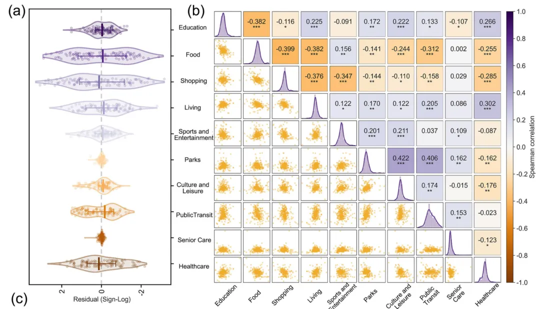
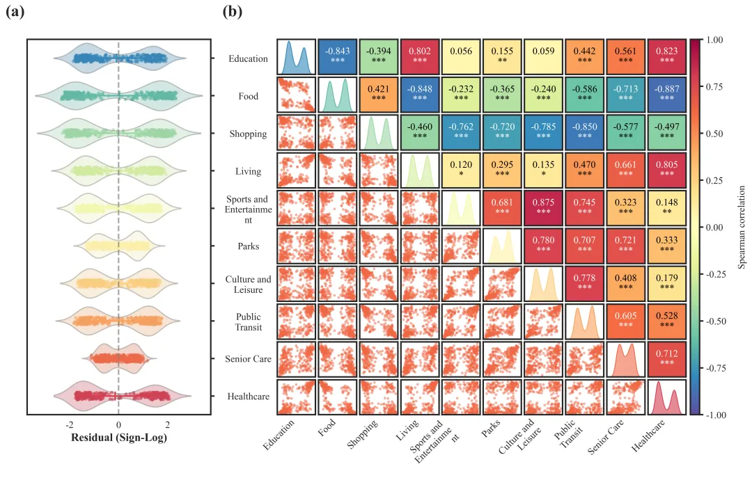
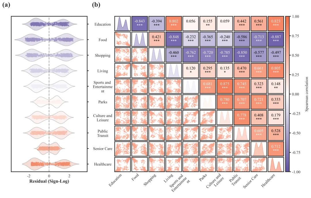
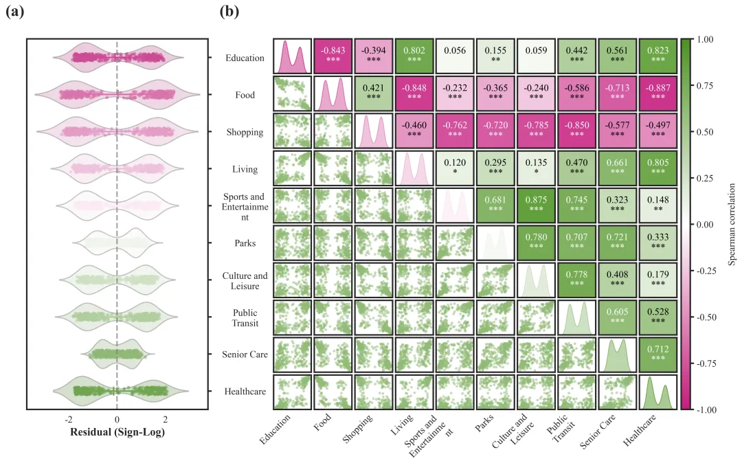
论文原图 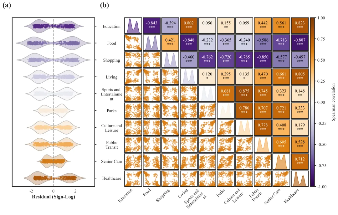
仿图 这张图表由左右两个子图构成,全面展示了10个类别变量的残差分布与相互间的斯皮尔曼相关性。左侧的子图(a)通过水平小提琴图、抖动散点以及带有均值标记的误差线,直观地呈现了各类别在残差上的分布情况,可以看出所有变量的数据点均以0(灰色虚线)为中心呈相对对称的双峰或宽幅分布,且数值大部分集中在-2到2的区间内。右侧的子图(b)是一个复杂的多变量相关性矩阵图:其对角线上的核密度估计(KDE)曲线再次印证了各变量普遍存在的双峰数据分布特征;左下角的散点图矩阵展示了不同变量两两之间的二维分布趋势;而右上角的热图则量化了这些变量间的斯皮尔曼相关系数及显著性水平(***代表具有极高的统计学显著性)。 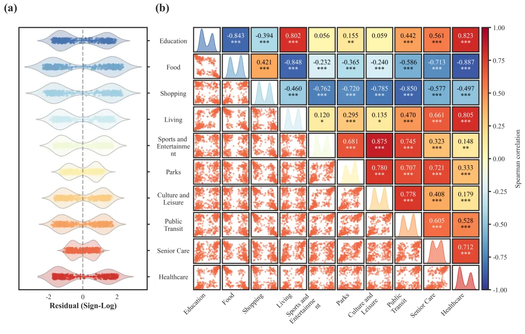
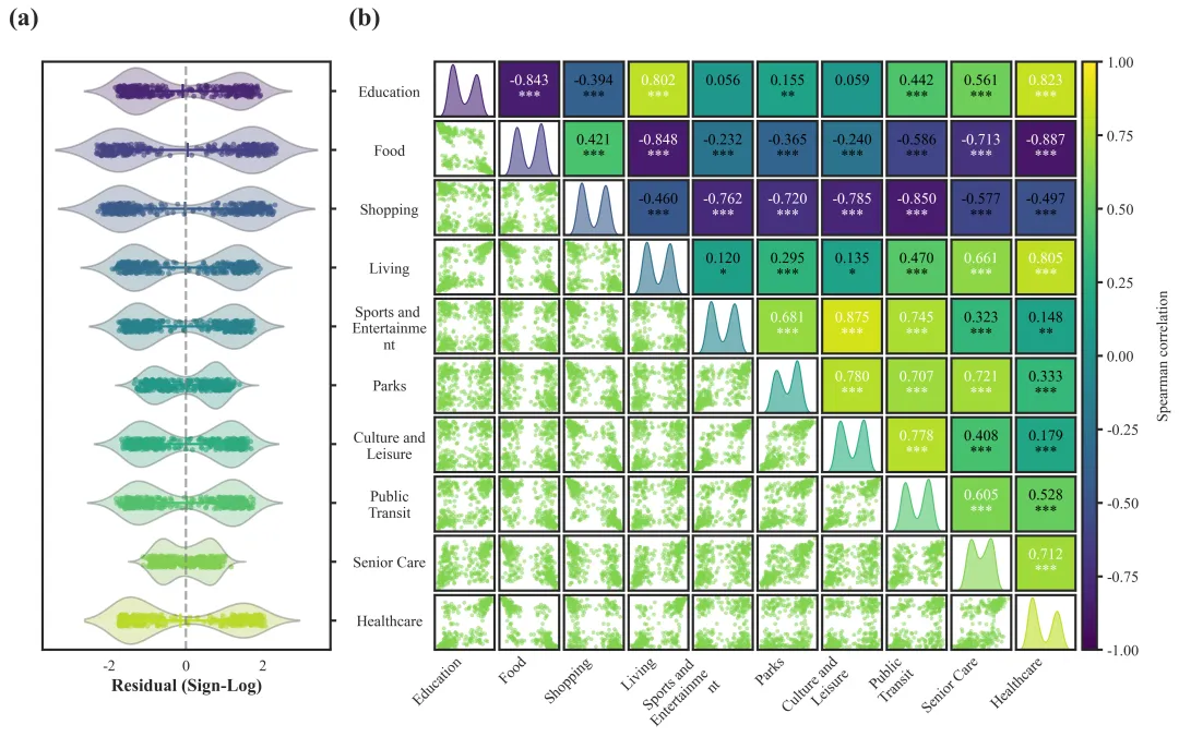
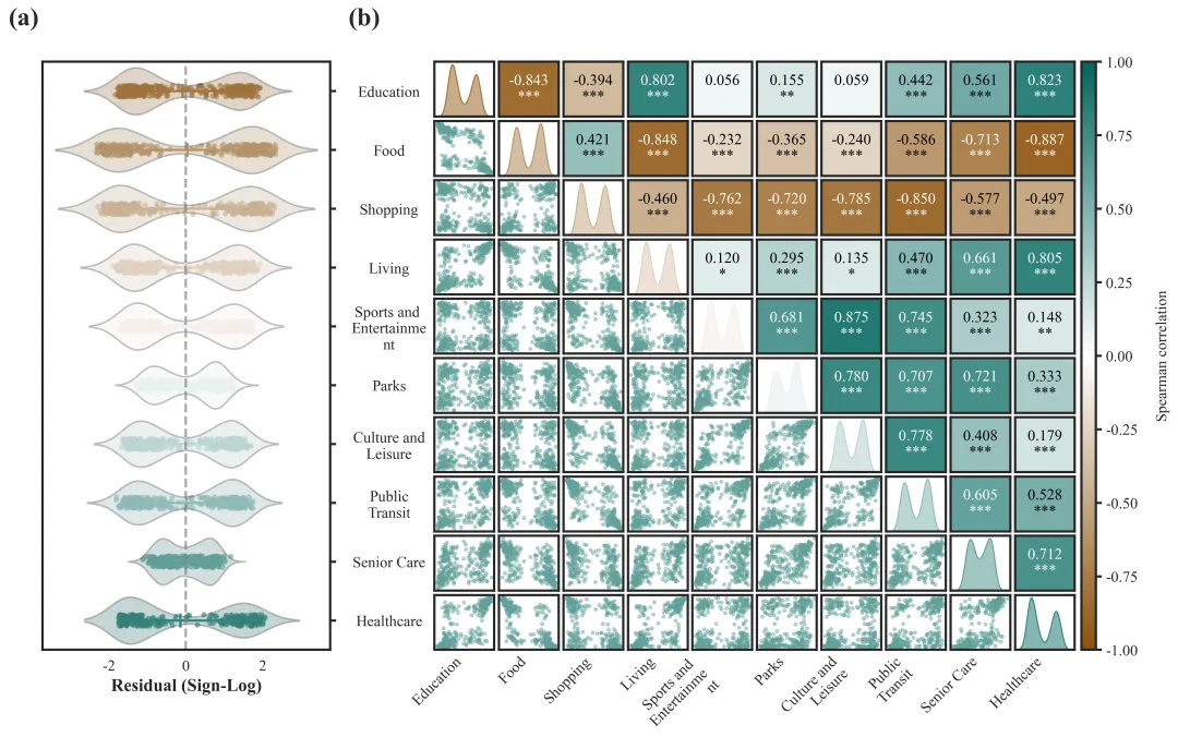
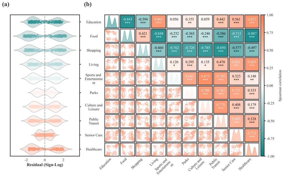
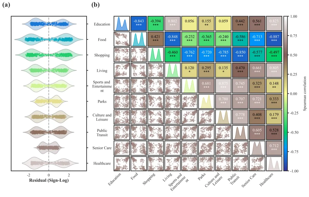
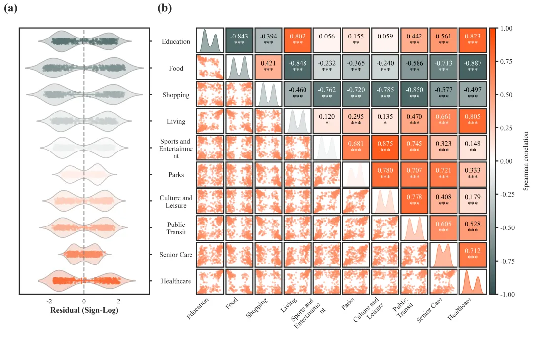

多种配色 


库的导入以及字体设置 

设置颜色库 

绘图函数:变量初始化与数据预处理 

绘图函数:绘制组合图左侧小提琴+散点+点图组合图 

绘图函数:绘制组合图右侧相关性散点图矩阵以及相关性分析 

绘图函数:子图边框、刻度设置、颜色条绘制 

绘图函数:子图编号设置,绘图结果保存 

执行部分 


期刊图片复现|Python绘制二维偏依赖PDP图 期刊复现|python绘制基于SHAP分析和GAM模型拟合的单特征依赖图 期刊图片复现|python绘制带有渐变颜色shap特征重要性组合图(条形图+蜂巢图) 期刊复现|用Python绘制SHAP特征重要性总览图、依赖图、双特征交互效应SHAP图,解锁XGBoost模型的终极奥秘 期刊图片复现|Python绘制shap重要性蜂巢图+单特征依赖图+交互效应强度气泡图+交互效应依赖图(回归+二分类+分类) 

公众号中的所有所有的免费代码都已经下架了,都并入到付费部分里了,付费合集代码和数据的购买通道已经开通,全部合集100元,后续将会持续更新,决定购买请后台私信我,注意只会分享练习数据和代码文件,不会提供答疑服务,代码文件中已经包含了每行代码的完整注释,购买前请确保真的需要!!!
代码绘制成果展示
代码解释
第一部分
# =========================================================================================# ====================================== 1. 环境设置 =======================================# =========================================================================================import numpy as npimport pandas as pdimport matplotlib.pyplot as pltimport seaborn as snsfrom scipy.stats import spearmanr, linregressimport matplotlib.gridspec as gridspec
第二部分
# =========================================================================================# ======================================2.颜色库=======================================# =========================================================================================COLOR_SCHEMES = {1: 'RdYlBu_r',}
第三部分
# =========================================================================================# ======================================3.绘图函数=======================================# =========================================================================================def plot_advanced_forest_chart(df, scheme_id):cmap_source = COLOR_SCHEMES[scheme_id] #提取配色方案if isinstance(cmap_source, str):cmap = plt.get_cmap(cmap_source)else:cmap = cmap_sourcewrap_threshold = 11 #y轴文本单行长度scatter_color = palette[-2] if num_vars > 1 else palette[0] #设置散点的默认颜色
第四部分
#创建画布fig = plt.figure(figsize=(16, 9))gs = gridspec.GridSpec(1, 2, width_ratios=[1, 2.3], wspace=0.22) #创建网格布局ax_a = fig.add_subplot(gs[0]) #左侧小提琴图#0值参考线ax_a.axvline(0, #xcolor='gray', #颜色linestyle='--', #样式alpha=0.7, #透明度linewidth=2) #粗细#x轴标题ax_a.set_xlabel("Residual (Sign-Log)", #文本fontsize=15, #大小fontweight='bold') #粗细ax_a.tick_params(axis='y', #轴which='major', #主刻度pad=45, #间隔length=0) #长度#x轴刻度设置ax_a.tick_params(axis='x', #轴labelsize=13) #大小
第五部分
#设置右侧热图网格布局gs_right = gridspec.GridSpecFromSubplotSpec(1, #行2, #列subplot_spec=gs[1], #位置width_ratios=[2.2, 0.05], #比例wspace=0.02) #间距#相关性散点矩阵布局gs_b = gridspec.GridSpecFromSubplotSpec(num_vars, #行num_vars, #列subplot_spec=gs_right[0], #位置wspace=0.08, #水平间距hspace=0.08 #垂直间距)norm = mcolors.Normalize(vmin=-1, vmax=1) #创建一个标准化对象为后续色彩映射做准备else:r, p = spearmanr(df.iloc[:, j], df.iloc[:, i]) #斯皮尔曼分析ax.set_facecolor(cmap(norm(r))) #当前网格单元的背景色#显著性设置if p < 0.001:stars = "***"elif p < 0.01:stars = "**"elif p < 0.05:stars = "*"else:stars = ""#文本颜色设置text_color = "black" if abs(r) < 0.6 else "white"#相关性文本设置ax.text(0.5, #x0.5, #yf"{r:.3f}\n{stars}", #文本ha='center', #水平va='center', #垂直fontsize=13, #大小color=text_color, #颜色transform=ax.transAxes, #坐标系)#轴刻度
第六部分
# 遍历所有子图for ax in fig.axes:#设置边框for spine in ax.spines.values():spine.set_linewidth(2)#设置刻度ax.tick_params(axis='both', #轴which='major', #主刻度length=5, # 长width=2) #宽# 设置颜色条刻度cbar.ax.tick_params(width=2,#粗细length=5, #长度labelsize=13) #大小cbar.outline.set_linewidth(2) #边框线
第七部分
#子图编号fig.text(0.1, #x0.95, #y'(a)', #编号fontsize=22, #大小fontweight='bold', #加粗va='top') #垂直fig.text(0.35, #x0.95, #y
第八部分
# =========================================================================================# ======================================4.执行部分======================================# =========================================================================================if __name__ == '__main__':df= pd.read_excel(r"Residual_Results.xlsx") #原始数据#是否批量绘图else:scheme_id = 1print('正在绘制并保存方案:', scheme_id)plot_advanced_forest_chart(df, scheme_id)
如何应用到你自己的数据
1.设置原始数据的保存路径,执行部分:
df= pd.read_excel(r"Residual_Results.xlsx") #原始数据2.设置是否要进行批量绘图,执行部分:
plot_all = True3.设置绘图结果的保存地址,绘图函数部分:
plt.savefig(fr"Result_Scheme_{scheme_id}.pdf", bbox_inches='tight'推荐
获取方式
本文来自网友投稿或网络内容,如有侵犯您的权益请联系我们删除,联系邮箱:wyl860211@qq.com 。
随机文章
-
 10个月宝宝每天需要喝多少奶粉?
- 信息素养大赛_丝路新程_小高Python_模拟题_1
- Python零基础入门(八):Pillow图片处理基础
- Python爬虫实战:一套代码跑通公开音频保存流程
- Python开发者必存:106个HTML标签速查
- Python全网电影爬取,6分钟试看太难受?帮你把整部剧“搬”回家,实现观影自由!
- Python基础知识应知应会100个知识点
- Python 3.12.0免费安装包和安装教程分享(附全部版本安装包)
- 清华大佬终于把Python整理成漫画书了!
- Python私房笔记:函数全景、闭包、装饰器与高级特性(第七篇)
- 图形化打包Python程序,还能加密+授权一步到位
