一起学Python第111天:柱状图进阶指南——从"蓝柱子"到"数据可视化大片"
- 2026-10-11 05:58:19
一起学Python第111天:柱状图进阶指南——从"蓝柱子"到"数据可视化大片"二、核心 API:

🎯 今日金句:柱状图是数据世界的身高尺——它不问你是谁,只告诉你站在哪里。
📅 系列:一起学Python | 难度:⭐⭐ | 预计阅读:5分钟
🔗 上期回顾:第110天:散点图
一、柱状图:最直观的数据对比武器
柱状图是数据可视化的"基本功",但它绝不只是几根蓝色柱子。
核心优势:人类对"高度"的感知比对"角度"(饼图)和"长度"(表格)更敏感。柱状图让谁高谁低,一目了然。
二、核心 API:bar() vs barh()
plt.bar(x, height) | ||
plt.barh(y, width) |
matplotlib.pyplot.bar(x, height, width=0.8, bottom=None,align='center', color=None, edgecolor=None)
x | ||
height | ||
width | 0.8 | |
bottom | 0 | |
align | center居中/edge边缘 | center |
color | ||
edgecolor | None |
三、从入门到精通:6个实战示例
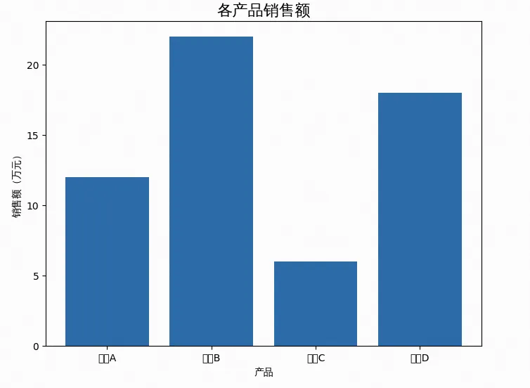
示例 1:基础柱状图(入门)
import numpy as npimport matplotlib.pyplot as pltimport matplotlib.font_manager as fmimport os# ================= 1. 字体加载(解决报错的核心) =================font_path = "simhei.ttf" # 确保你已经在当前目录上传了 simhei.ttfif not os.path.exists(font_path):font_path = "/usr/share/fonts/truetype/wqy/wqy-zenhei.ttc" # 备用系统字体prop = fm.FontProperties(fname=font_path)plt.rcParams['axes.unicode_minus'] = False# 数据categories = ['产品A', '产品B', '产品C', '产品D']sales = [12, 22, 6, 18]plt.figure(figsize=(8, 6))plt.bar(categories, sales)plt.title('各产品销售额', fontproperties=prop, fontsize=16)plt.xlabel('产品', fontproperties=prop)plt.ylabel('销售额(万元)', fontproperties=prop)plt.show()
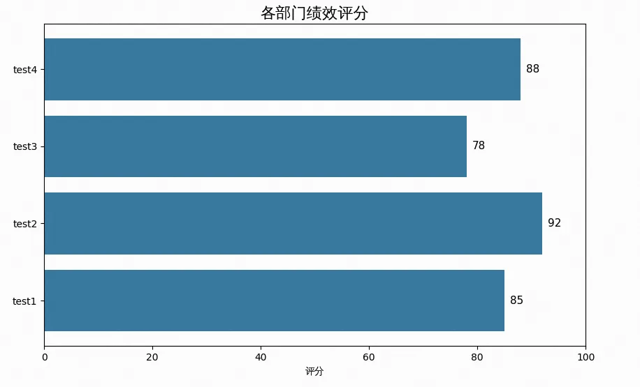
示例 2:水平条形图——标签太长怎么办?
categories = ['test1', 'test2','test3', 'test4']scores = [85, 92, 78, 88]plt.figure(figsize=(10, 6))plt.barh(categories, scores, color='#2E86AB')plt.title('各部门绩效评分', fontproperties=prop, fontsize=16)plt.xlabel('评分', fontproperties=prop)# 在条形右侧添加数值for i, v in enumerate(scores):plt.text(v + 1, i, str(v), va='center', fontsize=11)plt.xlim(0, 100)plt.show()
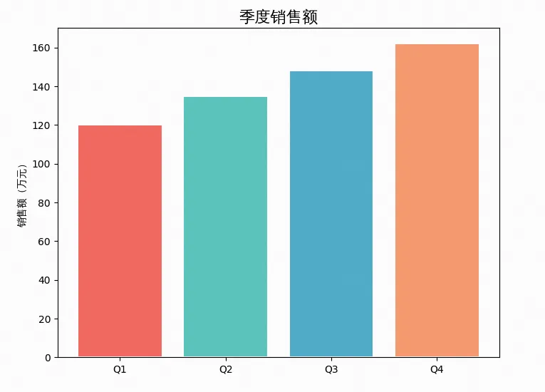
示例 3:自定义颜色——告别"蓝柱子"
categories = ['Q1', 'Q2', 'Q3', 'Q4']sales = [120, 135, 148, 162]plt.figure(figsize=(8, 6))# 统一颜色plt.bar(categories, sales, color='#4CAF50', edgecolor='white', linewidth=1.5)# 或:每个柱子不同颜色colors = ['#FF6B6B', '#4ECDC4', '#45B7D1', '#FFA07A']plt.bar(categories, sales, color=colors, edgecolor='white', linewidth=1.5)plt.title('季度销售额', fontproperties=prop, fontsize=16)plt.ylabel('销售额(万元)', fontproperties=prop)plt.show()
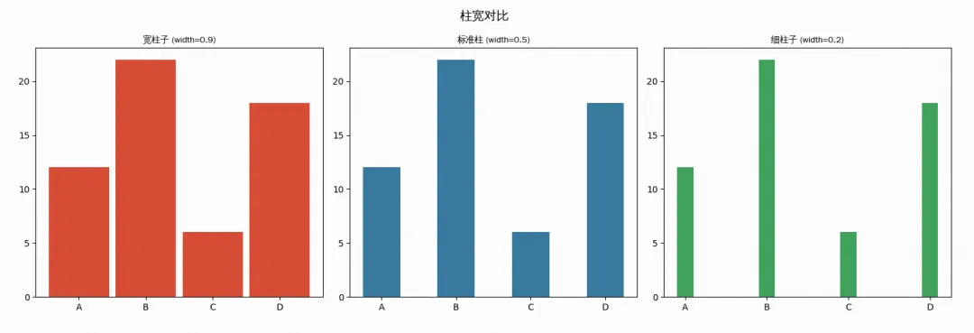
示例 4:调整柱宽——从"胖子"到"瘦子"
categories = ['A', 'B', 'C', 'D']values = [12, 22, 6, 18]fig, axes = plt.subplots(1, 3, figsize=(15, 5))# 宽柱子(width=0.9)axes[0].bar(categories, values, width=0.9, color='#E74C3C')axes[0].set_title('宽柱子 (width=0.9)', fontproperties=prop)# 标准柱子(width=0.5)axes[1].bar(categories, values, width=0.5, color='#2E86AB')axes[1].set_title('标准柱 (width=0.5)', fontproperties=prop)# 细柱子(width=0.2)axes[2].bar(categories, values, width=0.2, color='#27AE60')axes[2].set_title('细柱子 (width=0.2)', fontproperties=prop)plt.suptitle('柱宽对比', fontproperties=prop, fontsize=14)plt.tight_layout()plt.show()
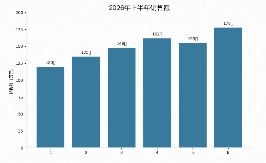
示例 5:数值标注——让柱子"开口说话"
categories = ['1月', '2月', '3月', '4月', '5月', '6月']sales = [120, 135, 148, 162, 155, 178]plt.figure(figsize=(10, 6))bars = plt.bar(categories, sales, color='#2E86AB', edgecolor='white', linewidth=1.5)# 在柱子顶部添加数值for bar in bars:height = bar.get_height()plt.text(bar.get_x() + bar.get_width()/2., height + 3,f'{height}万', ha='center', va='bottom', fontsize=10, color='#333')plt.title('2026年上半年销售额', fontproperties=prop, fontsize=16)plt.ylabel('销售额(万元)', fontproperties=prop)plt.ylim(0, 200)# 移除上方和右方边框ax = plt.gca()ax.spines['top'].set_visible(False)ax.spines['right'].set_visible(False)plt.show()
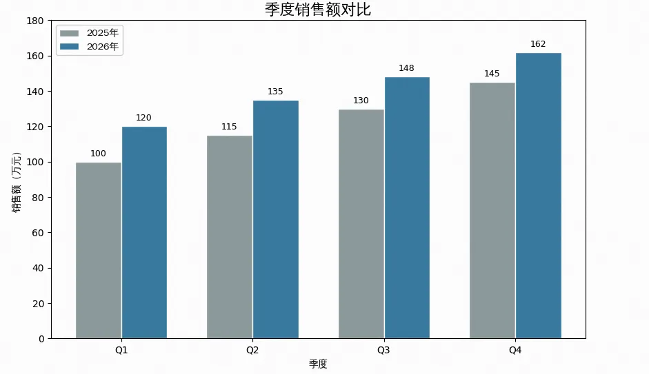
示例 6:分组柱状图——对比多组数据
categories = ['Q1', 'Q2', 'Q3', 'Q4']sales_2025 = [100, 115, 130, 145]sales_2026 = [120, 135, 148, 162]x = np.arange(len(categories))width = 0.35plt.figure(figsize=(10, 6))bars1 = plt.bar(x - width/2, sales_2025, width, label='2025年',color='#95A5A6', edgecolor='white')bars2 = plt.bar(x + width/2, sales_2026, width, label='2026年',color='#2E86AB', edgecolor='white')# 添加数值for bar in bars1:height = bar.get_height()plt.text(bar.get_x() + bar.get_width()/2., height + 2,f'{height}', ha='center', va='bottom', fontsize=9)for bar in bars2:height = bar.get_height()plt.text(bar.get_x() + bar.get_width()/2., height + 2,f'{height}', ha='center', va='bottom', fontsize=9)plt.title('季度销售额对比', fontproperties=prop, fontsize=16)plt.xlabel('季度', fontproperties=prop)plt.ylabel('销售额(万元)', fontproperties=prop)plt.xticks(x, categories)plt.legend(prop=prop)plt.ylim(0, 180)plt.show()
四、柱状图 vs 条形图:怎么选?
五、参数速查卡
# 垂直柱状图plt.bar(x, height, width=0.8, color='blue', edgecolor='white',bottom=0, align='center')# 水平条形图plt.barh(y, width, height=0.8, color='green', edgecolor='white')# 常用美化组合plt.bar(categories, values,color='#2E86AB', # 填充色edgecolor='white', # 边框色linewidth=1.5, # 边框宽度width=0.6, # 柱宽alpha=0.9) # 透明度
六、避坑指南
width 参数,推荐 0.5~0.8 | |
plt.xticks(rotation=45) | |
plt.ylim() 上限,留出空间 | |
x - width/2 和 x + width/2 错位 | |
总结
今天我们掌握了 Matplotlib 柱状图的核心技能:
✅
plt.bar()—— 垂直柱状图,最常用✅
plt.barh()—— 水平条形图,长标签救星✅
width/height—— 控制柱宽,影响视觉密度✅
color+edgecolor—— 配色美化,告别默认蓝✅ 数值标注 —— 让数据"开口说话"
✅ 分组柱状图 —— 多组数据对比利器
关键记忆:垂直用 bar(),水平用 barh(),柱宽 0.6~0.8 最美观,数值标注不可少
本文来自网友投稿或网络内容,如有侵犯您的权益请联系我们删除,联系邮箱:596563534@qq.com 。
