一起学Python第119天:Matplotlib 函数速查手册
- 2026-09-10 21:34:43
一起学Python第119天:Matplotlib 函数速查手册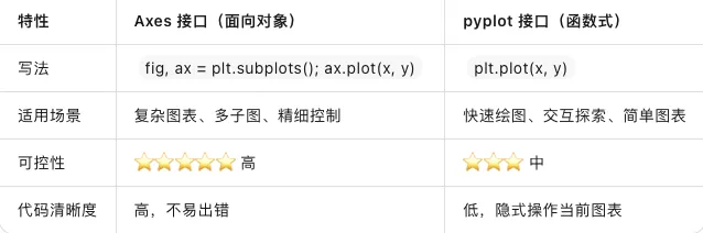
💡 最佳实践:复杂项目用 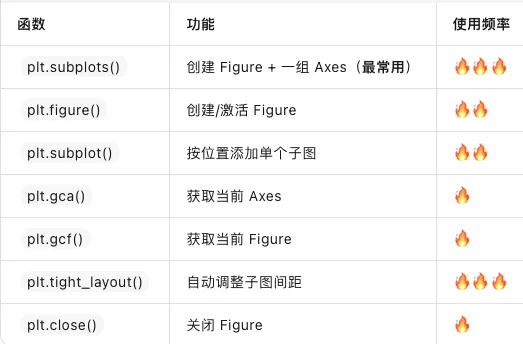
当你使用
💡 记忆技巧:Axes 方法几乎都在 pyplot 函数前加

📅 系列:一起学Python | 难度:⭐⭐⭐
🔗 上期回顾:第118天:Seaborn 入门
一、为什么你需要这份速查表?
学了十几天的 Matplotlib,你可能已经发现:API 太多太杂,每次画图都要翻文档。
折线用 plot(),散点用 scatter(),保存用 savefig() 还是 imsave()?subplot() 和 subplots() 到底有什么区别?
今天这期,我们把 Matplotlib 的核心 API 全部整理成速查表,建议收藏,随查随用。
二、两大编程接口:该用哪个?
Matplotlib 提供两种使用方式,官方推荐面向对象接口(Axes),但快速原型用 pyplot 更方便。
fig, ax = plt.subplots(),快速测试用 plt.plot()。三、pyplot 核心函数速查表(按场景分类)
1. Figure 与 Axes 管理
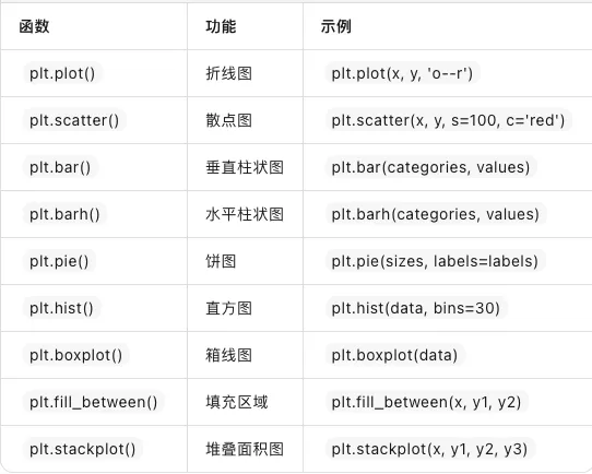
2. 基本绘图(最常用)
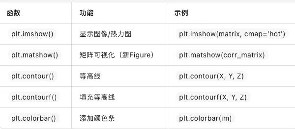
3. 图像与矩阵
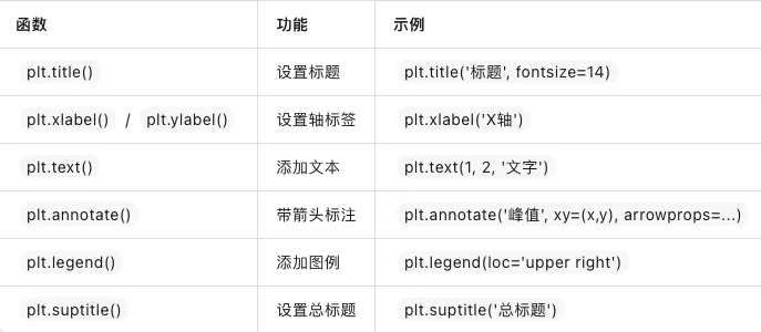
4. 文本与标注
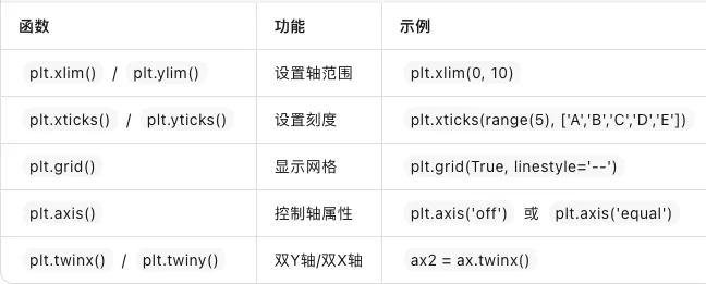
5. 坐标轴控制
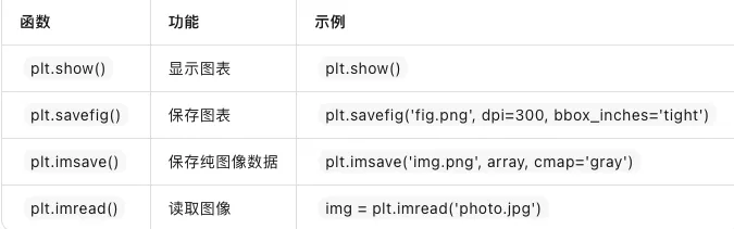
6. 保存与显示
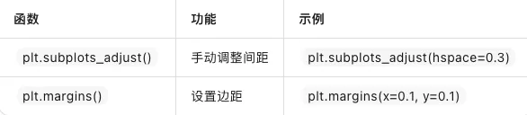
7. 布局调整
四、Axes 对象核心方法速查
当你使用 fig, ax = plt.subplots() 时,调用的是 Axes 方法:
ax.plot() | plt.plot() | |
ax.scatter() | plt.scatter() | |
ax.bar() | plt.bar() | |
ax.set_title() | plt.title() | |
ax.set_xlabel() | plt.xlabel() | |
ax.set_ylabel() | plt.ylabel() | |
ax.set_xlim() | plt.xlim() | |
ax.set_ylim() | plt.ylim() | |
ax.set_xticks() | plt.xticks() | |
ax.set_xticklabels() | ||
ax.grid() | plt.grid() | |
ax.legend() | plt.legend() | |
ax.text() | plt.text() | |
ax.annotate() | plt.annotate() | |
ax.imshow() | plt.imshow() | |
ax.hist() | plt.hist() | |
ax.pie() | plt.pie() | |
ax.set_aspect() | ||
ax.set_facecolor() | ||
ax.spines['top'].set_visible(False) | ||
ax.twinx() | plt.twinx() | |
ax.inset_axes() |
💡 记忆技巧:Axes 方法几乎都在 pyplot 函数前加 set_(如 set_title、set_xlim),少数同名(如 plot、scatter)。
五、Figure 对象核心方法
fig.savefig() | fig.savefig('output.png', dpi=300) | |
fig.suptitle() | fig.suptitle('总标题', fontsize=16) | |
fig.subplots_adjust() | fig.subplots_adjust(hspace=0.3) | |
fig.set_size_inches() | fig.set_size_inches(10, 6) | |
fig.set_facecolor() | fig.set_facecolor('white') | |
fig.colorbar() | fig.colorbar(im, ax=axes) | |
fig.legend() | fig.legend(handles, labels) | |
fig.text() | fig.text(0.5, 0.95, '文字') |
六、样式与配色速查
内置样式表
plt.style.use('ggplot') # R语言风格plt.style.use('seaborn-v0_8') # Seaborn风格plt.style.use('dark_background') # 深色背景plt.style.use('fivethirtyeight') # 数据新闻风格plt.style.use('grayscale') # 灰度(适合打印)
常用 rcParams 配置
plt.rcParams['figure.figsize'] = [10, 6] # 默认图尺寸plt.rcParams['figure.dpi'] = 100 # 默认分辨率plt.rcParams['font.size'] = 12 # 全局字体大小plt.rcParams['axes.grid'] = True # 默认显示网格plt.rcParams['axes.spines.top'] = False # 隐藏顶部边框plt.rcParams['axes.spines.right'] = False # 隐藏右侧边框plt.rcParams['savefig.dpi'] = 300 # 保存分辨率plt.rcParams['image.cmap'] = 'viridis' # 默认颜色映射
Colormap 推荐
viridis | ||
hotinferno | ||
coolwarmRdBu | ||
tab10Set2 | ||
jetrainbow |
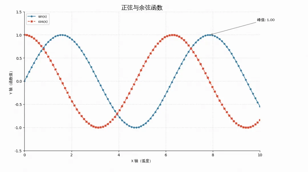
七、实战示例:一张图串起所有核心API
import matplotlib.pyplot as pltimport matplotlib.font_manager as fmimport numpy as npimport os# ================= 1. 字体加载(解决报错的核心) =================font_path = "simhei.ttf"if not os.path.exists(font_path):font_path = "/usr/share/fonts/truetype/wqy/wqy-zenhei.ttc"prop = fm.FontProperties(fname=font_path)plt.rcParams['axes.unicode_minus'] = False# 数据准备x = np.linspace(0, 10, 100)y1 = np.sin(x)y2 = np.cos(x)# ========== Figure + Axes(面向对象接口)==========fig, ax = plt.subplots(figsize=(10, 6), layout='constrained')# 绘图ax.plot(x, y1, 'o-', label='sin(x)', color='#2E86AB', markersize=4)ax.plot(x, y2, 's--', label='cos(x)', color='#E74C3C', markersize=4)# 标注峰值peak_idx = np.argmax(y1)ax.annotate(f'峰值: {y1[peak_idx]:.2f}',xy=(x[peak_idx], y1[peak_idx]),xytext=(x[peak_idx] + 2, y1[peak_idx] + 0.3),arrowprops=dict(arrowstyle='->', color='gray'),fontproperties=prop)# 文本装饰ax.set_title('正弦与余弦函数', fontproperties=prop, fontsize=16)ax.set_xlabel('X 轴(弧度)', fontproperties=prop)ax.set_ylabel('Y 轴(函数值)', fontproperties=prop)ax.legend(prop=prop)# 坐标轴控制ax.set_xlim(0, 10)ax.set_ylim(-1.5, 1.5)ax.grid(True, alpha=0.3, linestyle='--')# 隐藏边框ax.spines['top'].set_visible(False)ax.spines['right'].set_visible(False)# 保存fig.savefig('runoob_demo.png', dpi=300, bbox_inches='tight')plt.show()
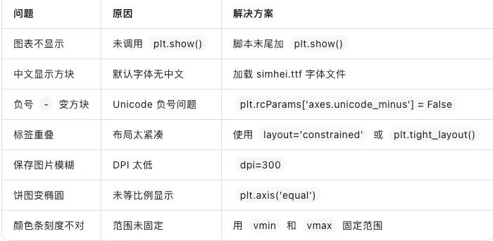
八、常见问题速查
九、总结
今天我们整理了一份 Matplotlib 的核心 API 速查手册:
✅ 两大接口:pyplot(快速) vs Axes(精细控制)
✅ pyplot 函数:按场景分类(绘图、图像、文本、轴控制、保存)
✅ Axes 方法:
set_前缀 + 同名方法✅ Figure 方法:全局控制(保存、总标题、布局、颜色条)
✅ 样式配置:
plt.style.use()+rcParams全局设置✅ Colormap:
viridis首选,jet避免
建议收藏本文,下次画图时直接Ctrl+F搜索关键词,效率翻倍。
🎯 今日金句:Matplotlib 的 API 像一本厚重的词典——你不需要背下每一个单词,但你需要知道如何快速查到它。而速查表,就是你与数据可视化之间的翻译官。
本文来自网友投稿或网络内容,如有侵犯您的权益请联系我们删除,联系邮箱:596563534@qq.com 。
随机文章
-
 10个月宝宝每天需要喝多少奶粉?
- Python版ChemApp的简介
- Python零基础入门(十二):Python操作Excel
- PHP修复三个漏洞:SQL注入、内存损坏与服务器崩溃
- AMD 推出首批 Linux 内核补丁,为 RDNA 5 全新 DCN6 显示引擎提供支持
- Rust编写模拟器让 Linux 也吃上"苹果"闭源软件,这次真的行吗?
- 你们知道吗?Linux Mint 曾被寄予厚望取代 Windows
- Winux高仿win11的Linux
- Linux 系统快照与还原——Timeshift 与 Btrfs 快照回退
- 网络服务器搭建、配置与管理——Linux(RHEL 9/CentOS Stream 9)(微课版)(第5版)
- Linux启动过程详解:面试经常被问又容易忽略的核心知识